


简介
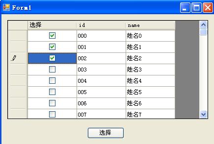
CheckBox控件就是一个复选框,它的主要作用就是简化操作,提高用户体验,同时给用户很直观的感受。如图:我们只要在上面点击复选框,我们就知道是否完成了某些操作。
RadioButton和RadioGroup一起使用可以完成单选互斥功能,RadioButton很少单独使用,我们需要的主要是RadioButton的单选功能。其它功能完全可以使用其它按钮控件代替。
GIF演示
自定义控件
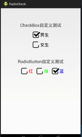
Android系统提供给我们的是属于能用但是不好看的,所以很多时候我们需要自定义控件,才能让我们的页面更加好看,当然了,我上面的是我自己用PS抠图,想要更好看,看你自己的美术功底了。
自定义控件不复杂,需要注意的是CheckBox和RadioButton都有一个特殊的属性:android:checked,表示控件是否被选中。
自定义控件分为以下三步:
① 准备素材:没选中和选中的素材图片
② XML资源 : 将素材图片用于XML资源中的item中,设置选中和未选中的时候的图片显示
③ 用XML资源用于控件 android:button=”@drawable/xxx”
XML资源代码:
<?xml version="1.0" encoding="utf-8"?>
<selector xmlns:android="http://schemas.android.com/apk/res/android">

    <!-- 选中时效果 -->
    <item android:drawable="@drawable/checked" android:state_checked="true"/>
    <item android:drawable="@drawable/unchecked" android:state_checked="false"/>
    <!-- 未选中时效果 -->

</selector>
XML布局中使用:
<LinearLayout xmlns:android="http://schemas.android.com/apk/res/android"
    xmlns:tools="http://schemas.android.com/tools"
    android:layout_width="match_parent"
    android:layout_height="match_parent"
    android:orientation="vertical"
    android:padding="20dip" >

    <TextView
        android:layout_width="wrap_content"
        android:layout_height="wrap_content"
        android:layout_gravity="center"
        android:layout_marginTop="60dip"
        android:text="CheckBox自定义测试"
        android:textSize="25sp" />

    <CheckBox
        android:layout_width="wrap_content"
        android:layout_height="wrap_content"
        android:layout_marginTop="20dip"
        android:layout_gravity="center"
        android:button="@drawable/def"
        android:checked="true"
        android:text="男生"
        android:textSize="25sp" />

    <CheckBox
        android:layout_width="wrap_content"
        android:layout_height="wrap_content"
        android:layout_gravity="center"
        android:layout_marginTop="20dip"
        android:button="@drawable/def"
        android:text="女生"
        android:textSize="25sp" />

    <TextView
        android:layout_width="wrap_content"
        android:layout_height="wrap_content"
        android:layout_gravity="center"
        android:layout_marginTop="60dip"
        android:text="RadioButton自定义测试"
        android:textSize="25sp" />

    <RadioGroup
        android:layout_width="wrap_content"
        android:layout_height="wrap_content"
        android:layout_gravity="center"
        android:layout_marginTop="20dip"
        android:orientation="horizontal" >

        <RadioButton
            android:layout_width="wrap_content"
            android:layout_height="wrap_content"
            android:layout_marginLeft="20dip"
            android:button="@drawable/def"
            android:text="红"
            android:textColor="#ff0000"
            android:textSize="25sp" />

        <RadioButton
            android:layout_width="wrap_content"
            android:layout_height="wrap_content"
            android:layout_marginLeft="20dip"
            android:button="@drawable/def"
            android:text="绿"
            android:textColor="#00ff00"
            android:textSize="25sp" />

        <RadioButton
            android:layout_width="wrap_content"
            android:layout_height="wrap_content"
            android:layout_marginLeft="20dip"
            android:button="@drawable/def"
            android:text="蓝"
            android:textColor="#0000ff"
            android:textSize="25sp" />
    </RadioGroup>

</LinearLayout>
收工
控件的使用很简单,上面罗列了主要的代码,使用时,忘了如何使用的时候,看下博文,应该能够瞬间秒懂吧。
技术因分享而饱含生机


 1879
1879

 被折叠的 条评论
为什么被折叠?
被折叠的 条评论
为什么被折叠?
 到【灌水乐园】发言


