


1 浏览器兼容属性
transition:1s; //相当于JS中的animation
-webkit-transition://Chrome
-moz-transition: //FireFox
-o-transition: //opera
-ms-transition //IE
类似属性有:gradient(渐变)
2选择器
p:nth-child(2n):{background:red}//选择p标签父级元素下第2n个元素,并且这些元素还是p元素,若其中不是p元素,则样式不改变
p:nth-last-child(2n)://从后往前
p:nth-of-type(2)//选择p标签父级元素下第2个p元素
body *:nth-of-type(2)//选择body下所有类型各自的第二个元素
例如:
body *:nth-of-type(2){background: red;}
p{ width: 100%; height: 30px;}
<body>
        <p>p1</p>
        <h1>h1</h1>
        <p>p2</p>
        <h1>h2</h1>
        <p>p3</p>
        <h1>h3</h1>
        <p>p4</p>
        <h1>h4</h1>
</body>
first-chilid===nth-child(1)
last-chilid===nth-last-child(1)
first-of-type===nth-of-type(1)
last-of-type===nth-last-of-type(1)
3伪类应用
模拟单选框
<style>
label{ float:left;margin:0 5px; overflow:hidden; position:relative;}
label input{ position:absolute;left:-50px;top:-50px;}
span{float:left;width:50px;height:50px;border:3px solid #000;}
input:checked~span {background:red;}//关键
</style>
<body>
<label>
    <input type="radio" name="tab" />
    <span></span>
</label>
<label>
    <input type="radio" name="tab" />
    <span></span>
</label>
<label>
    <input type="radio" name="tab" />
    <span></span>
</label>
</body>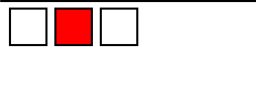


 扫一扫
扫一扫
 7万+
7万+

 被折叠的 条评论
为什么被折叠?
被折叠的 条评论
为什么被折叠?
 到【灌水乐园】发言


