


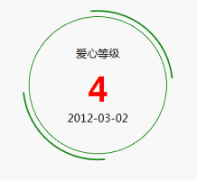
效果:
index.html
<!DOCTYPE html>
<html lang="en">
<head>
	<meta charset="UTF-8">
	<title>test</title>
	<link rel="stylesheet" type="text/css" href="style.css">
</head>
<body>
	<div class="circle">
		<span>爱心等级</span>
		<strong>4</strong>
		<span>2012-03-02</span>
	</div>
</body>
</html>
style.css
.circle {
	position: relative;
	border: solid 1px green;
	border-radius: 50%;
	height: 200px;
	width: 200px;
	text-align: center;
	display: flex;
	align-items: center;
	justify-content: center;
	flex-direction:column;
	margin: 100px;
}
.circle> strong {
	display: block;
	font-size: 48px;
	margin-top: 10px;
	color: red;
}
.circle:before,
.circle:after
 {
	content: '';
	position: absolute;
	top: 0;
	left: 0;
	right: 0;
	bottom: 0;
	margin: -5%;
	border-radius: 50%;
	box-shadow: inset 0 0 0 2px green;
	animation: rotate 8s linear infinite;
	clip: rect(0, 110px, 110px, 0);

}
.circle:before {
	clip: rect(0, 110px, 110px, 0);
}
.circle:after {
	clip: rect(110px, 220px, 220px, 110px);
}

@keyframes rotate{
	0% {
		transform: rotate(0deg);
	}
	100% {
		transform: rotate(360deg);
	}
}


 扫一扫
扫一扫
 1231
1231

 被折叠的 条评论
为什么被折叠?
被折叠的 条评论
为什么被折叠?
 到【灌水乐园】发言


