


文章目录
matplotlib中有很多个作图元素,如下图:
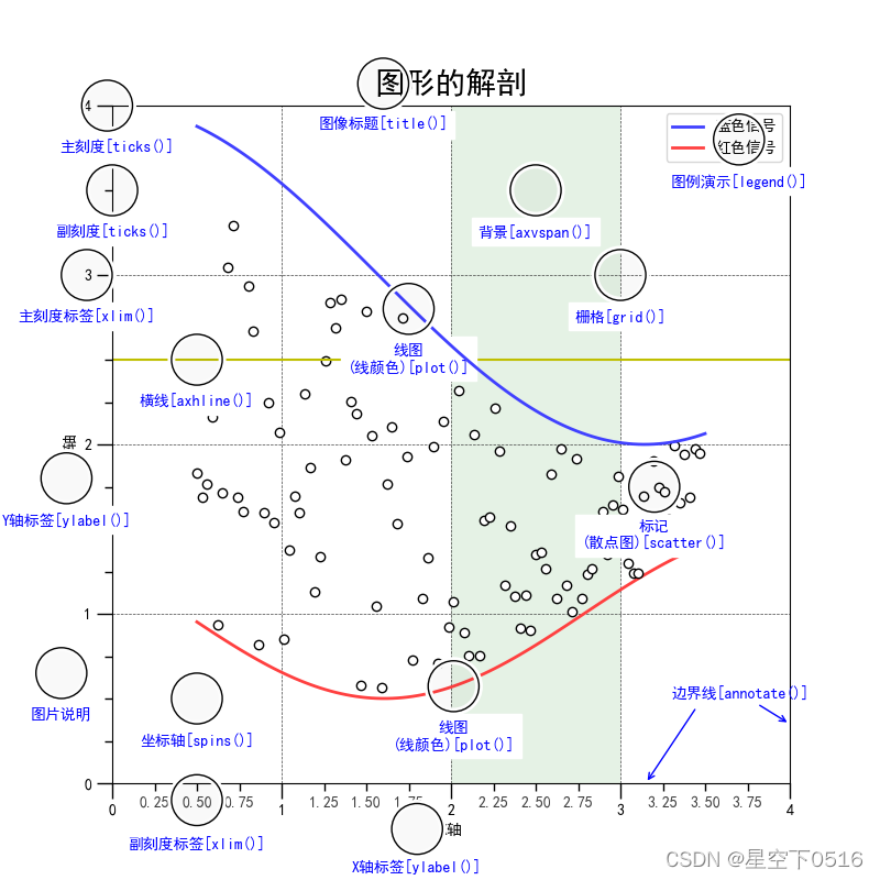
上图中涵盖了最基本的作图元素,其实还有更多的元素需要注意的,下面我们针对每个元素进行详细说明。
图像里的各种元素
在绘制图像时,会对图像有各种需求,比如线图、点图、横纵坐标、标题等等。
1.1 函数plot() - 将变量的变化趋势展现出来
- 函数功能:展现自变量和因变量之间的变化趋势
- 调用方法:plt.plot(x, y, c=‘r’, ls=’-’, lw=2, label = ‘plot’)
- 参数说明:
x: 自变量,或者x轴上的量;
y: 因变量,或者y轴上的量;
c: 折线颜色;
ls: 折线图的线条风格,默认是线图;
lw: 线宽;
label: 图片的标签。

1.2 函数scatter() - 画散点图
- 函数功能:以散点的形式展现数据的位置
- 调用方法:plt.scatter(x, y, c=‘b’, label = ‘plot’)
- 参数说明:
x: 自变量,或者x轴上的量;
y: 因变量,或者y轴上的量;
c: 散点颜色;
label: 图片的标签。

1.3 函数xlim()、ylim() - 设置x、y轴的数值显示范围
- 函数功能:设置横纵坐标轴显示范围
- 调用方法:plt.xlim(xmin, xmax), plt.ylim(ymin, ymax)
- 参数说明:
xmin、xmax: x轴上最小值、最小值
ymin、ymax: y轴上最小值、最大值
1.4 函数xlabel()、ylabel() - 设置x、y轴的标签
- 函数功能:设置x、y的标签
- 调用方法:plt.xlabel(string), plt.ylabel(string)
- 参数说明:
string: 标签内容
1.5 函数grid() - 绘制图像网格
- 函数功能:绘制图像网格
- 调用方法:plt.grid(linestyle = ‘:’, color=‘r’)
- 参数说明:
linestyle: 网格线的风格
color: 网格颜色

1.6 函数axhline() - 绘制平行于x轴的水平参考线
- 函数功能:绘制平性于x轴的水平线
- 调用方法:plt.axhline(y = 1, c = ‘r’, ls = ‘–’, lw =2)
- 参数说明:
y=1:划线位置
c=‘r’:划线颜色
ls=’–’:线条格式
lw=2:线宽

1.7 函数axvspan() - 绘制垂直于x轴的参考区域
- 函数功能:绘制垂直于x的参考区域
- 调用方法:plt.axvspan(xmin=1.0, xmax=2.0, facecolor=‘y’, alpha=0.3)
- 参数说明:
xmin: 参考区域其实位置
xmax: 参考区域的终止为止
facecolor: 参考区域的填充颜色
alpha = 0.3 : 透明度

1.8 函数annotate() - 添加图像说明细节
- 函数功能:添加图像说明细节文本
- 调用方法:plt.annotate(string, xy=(np.pi/2, 1.0), xytext=((np.pi/2)+0.15, 1.5), weight=‘bold’, color=‘b’
- arrowprops=dict(arrowstyle=’->’, connectionstyle=‘arc3’, color=‘b’))
- 参数说明:
string: 图形说明内容
xy: 被注释图片内容的位置坐标
xytext: 注释文本的位置坐标
weight: 注释文本的字体粗细风格
color: 文本颜色
arrowprops: 指示被注释内容的箭头属性

1.9 函数text() - 添加文本
- 函数功能:添加文本注释
- 调用方法:plt.text(x, y, string, weight = ‘blod’, color=‘b’)
- 参数说明:
x、y: 注释文本位置的横、纵坐标
string: 文本内容
weight: 粗细
color: 颜色

1.10 函数title() - 添加标题
- 函数功能:添加图片标题
- 调用方法:plt.title(string)
- 参数说明:
string: 图片标题
1.11 函数legend() - 标识不同的文字标签
- 函数功能:标识不同图例
- 调用方法:plt.legend(loc=‘lower left’)
- 参数说明:
location: 图例在途中的位置
以上图片程序如下:
# chapter-1: matplotlib图表组成元素
import matplotlib.pyplot as plt
import numpy as np

x = np.linspace(0.5, 3.5, 100) # Returns num evenly spaced samples, calculated over the interval [start, stop].
y = np.sin(x)

y1 = np.random.randn(100) # Return a sample (or samples) from the "standard normal" distribution.

plt.plot(x, y,
	ls='-.', # 折线图的线条风格
 	lw=2,   # 折线图的线宽
 	label='plot figure')
plt.legend()
plt.savefig('1.png')
plt.show()

'''
matplotlib.iines.Line2D.set_linestyle

linestyle		description
'-'or 'solid' 	solid line
'--'or'dashed'	dashed line
'-.'or'dash_dot'	dash-dotted line
':'or'dotted'	dotted line
'None'		draw nothing
' '			draw nothing
''			draw nothing
'''
plt.plot(x, y,
	ls='-.', # 折线图的线条风格
 	lw=2,   # 折线图的线宽
 	label='plot figure')
plt.scatter(x, y1, label='scatter figure', marker="*")

## xlim
plt.xlim(0, 1)
plt.ylim(0, 1)

## xlabel
plt.xlabel('x-axis')
plt.savefig('2.png')
plt.show()


## grid 刻度线
plt.plot(x, y,
	ls='-.', # 折线图的线条风格
 	lw=2,   # 折线图的线宽
 	label='plot figure')

plt.grid(color='r', linestyle=':')
plt.savefig('3.png')
plt.show()

## axhline 水平参考线
plt.plot(x, y,
	ls='-.', # 折线图的线条风格
 	lw=2,   # 折线图的线宽
 	label='plot figure')
plt.legend()

plt.axhline(y=0.5,
			color='r',
			xmin=0.5,
			xmax=1,
			linestyle='--',
			linewidth=2)
'''
xmin : scalar, optional, default: 0
Should be between 0 and 1, 0 being the far left of the plot, 1 the far right of the plot.
xmax : scalar, optional, default: 1
Should be between 0 and 1, 0 being the far left of the plot, 1 the far right of the plot.
'''
plt.axvline(4, ymin=0.6,ymax=0.8,color='g',linestyle=":",linewidth=2)
plt.savefig('4.png')
plt.show()


## axvspan 竖直参考区域
plt.plot(x, y,
	ls='-.', # 折线图的线条风格
 	lw=2,   # 折线图的线宽
 	label='plot figure')

plt.legend()
plt.axvspan(xmin=4, # 起始位置
			xmax=6,	# 终止位置
			ymin=0,
			ymax=0.6,
			facecolor='y', # 填充颜色
			alpha=0.3) # 填充透明度

plt.axhspan(ymin=0,ymax=0.6,xmin=4,xmax=6,facecolor='g',alpha=0.3)
plt.savefig('5.png')
plt.show()


## annotate 指向型文本注释
plt.plot(x, y,
	ls='-.', # 折线图的线条风格
 	lw=2,   # 折线图的线宽
 	label='plot figure')
plt.legend()

plt.annotate('maximum',
			xy=(np.pi/2, 1.0), # 被注释图像内容的位置坐标 (箭头指向的地方,即需要标注的坐标点)
			xytext=((np.pi/2)+1.0, 0.8), # 注释文本的位置坐标(箭头开始指的地方,即放置注释文本的地方)
			color='b',	# 注释文本的颜色
			arrowprops=dict(arrowstyle='->', connectionstyle='arc3',color='b')) # 箭头的属性字典

plt.savefig('6.png')
plt.show()


## text 无指向性文本注释
plt.plot(x, y,
	ls='-.', # 折线图的线条风格
 	lw=2,   # 折线图的线宽
 	label='plot figure')
plt.legend()
plt.title('y=sin(x)')
plt.text(x=np.pi, y=0.0, s='y=sin(x)', weight='bold', color='b')
plt.savefig('7.png')
plt.show()


 4万+
4万+


 被折叠的 条评论
为什么被折叠?
被折叠的 条评论
为什么被折叠?
 到【灌水乐园】发言


