


一、ArkTs
1.1 简介
ArkTS是HarmonyOS的应用开发语言,它在保持
TypeScript(简称TS)基本语法风格的基础上,对TS的动态类型特性施加了更严格的约束,并引入了静态类型。
1.2 关键特性
-
声明式UI、自定义组件、动态扩展UI元素
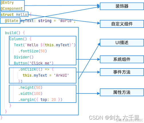
ArkTS定义了声明式UI描述、自定义组件和动态扩展UI元素的能力,再配合ArkUI开发框架中的系统组件及其相关的事件方法、属性方法等共同构成了UI开发的主体。下面是一个示例,是一个基础的ArkTs书写的代码片段,展示了ArkTs声明式UI的能力:
@Entry @Component struct MyComponent { @State private text: string = 'Hello, HarmonyOS!'; build() { Row() { Text(this.text) .fontSize(20) .fontWeight(FontWeight.Bold) .onClick(() => { this.text = 'You clicked me!'; }); } } } -
状态管理
ArkTS提供了多维度的状态管理机制。在UI开发框架中,与UI相关联的数据可以在组件内使用,也可以在不同组件层级间传递,比如父子组件之间、爷孙组件之间,还可以在应用全局范围内传递或跨设备传递。另外,从数据的传递形式来看,可分为只读的单向传递和可变更的双向传递。开发者可以灵活地利用这些能力来实现数据和UI的联动。
-
渲染控制
ArkTS提供了渲染控制的能力。条件渲染可根据应用的不同状态,渲染对应状态下的UI内容。循环渲染可从数据源中迭代获取数据,并在每次迭代过程中创建相应的组件。数据懒加载从数据源中按需迭代数据,并在每次迭代过程中创建相应的组件。
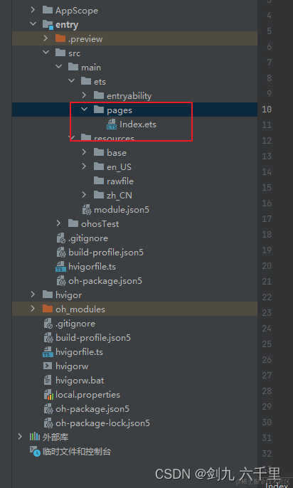
1.3 基础代码结构
1.3.1 示例:
注意:build()函数中只能包含一个根节点
1.3.2 页面组件
// @Entry 装饰器 - 代表入口
@Entry
// @Component 装饰器 - 代表组件
@Component
// struct 声明组件 Index 表示自定义的组件名称
struct Index {
  // @State 装饰器
  @State message: string = '鸿蒙开发'
  @State color: string = 'green'
  // @Builder装饰器:自定义构建函数
  build() {
  	// 只能包含一个根节点
    // 下面的都属于UI描述器,可以理解为HTML中的元素、CSS中的属性
    // Row Column Text 都属于系统组件
    Row() {
      Column() {
        Text(this.message)
          // fontSize 属性,和css中的font-size一致,用来设置文字大小,单位是VP
          .fontSize(50)
          // fontWeight 属性,和css中的font-weight一致,用来设置字体粗细
          .fontWeight(FontWeight.Bold)
          // fontColor 设置字体颜色
          .fontColor(this.color)
          // onClick 点击事件
          .onClick(() => {
            console.log('我被点击了!!!')
          })
      }
      // 设置Column组件宽度,可以是百分数,也可以是具体数值,写具体数值时不带单位
      .width('100%')
    }
    // 设置Row组件高度
    .height('100%')
  }
}
1.3.3 自定义组件
- 首先在入口文件同级下新建一个组件文件
- 选择新建ArkTS File
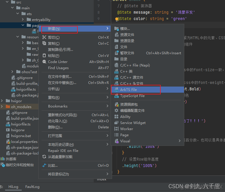
- 自定义文件名称

- 编写代码
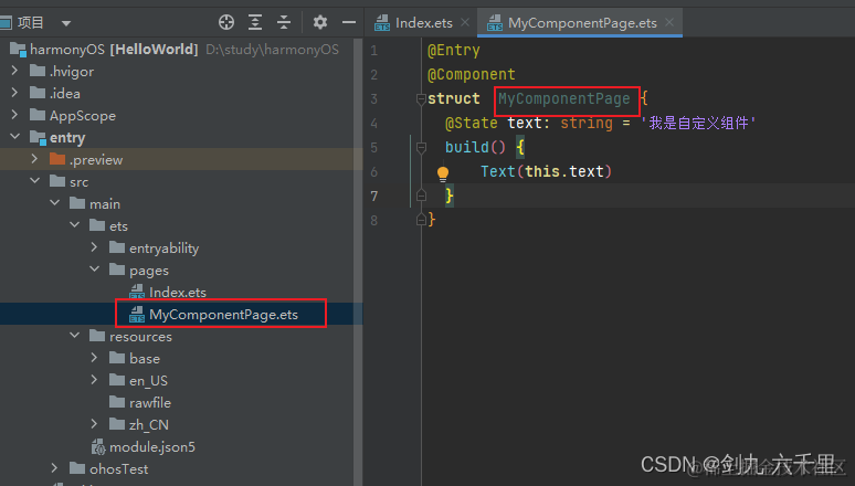
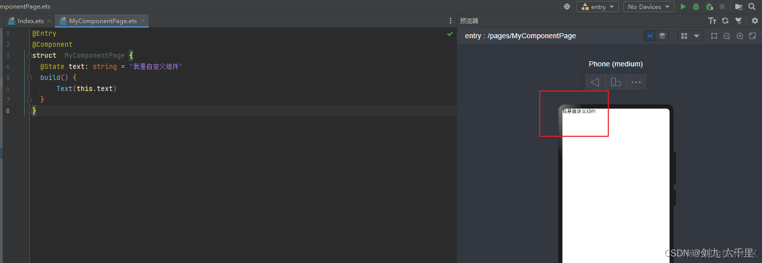
- 预览
双击进入到MyComponentPage.ets文件下,点击右侧预览窗口的刷新
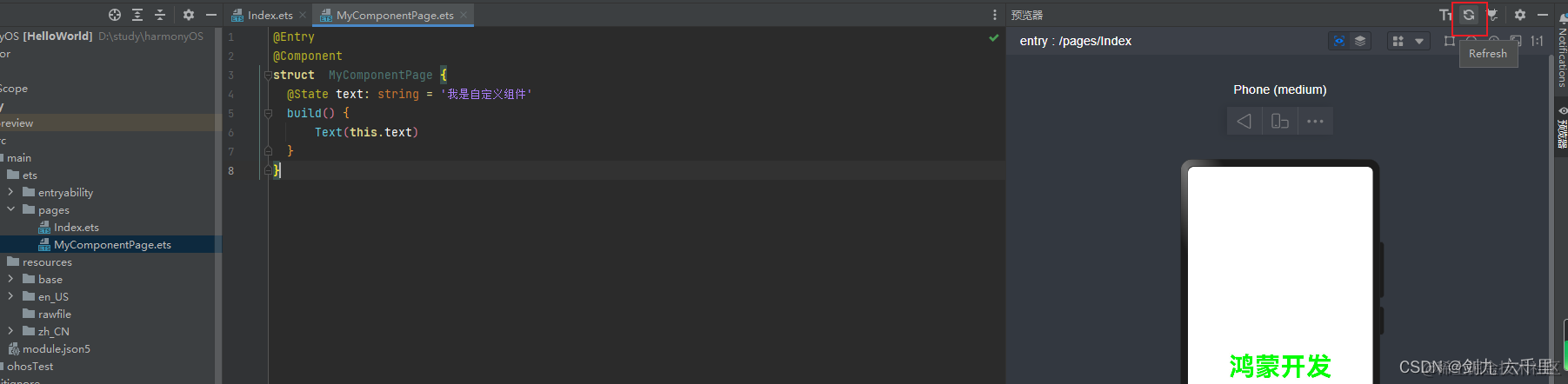
效果已经有了
二、ArkUI
2.1 ArkUI介绍
ArkUI是一套构建分布式应用界面的声明式UI开发框架。它使用极简的UI信息语法、丰富的UI组件、以及实时界面预览工具
2.2 开发范式
ArkUI针对不同的应用场景及技术背景,提供了两种开发范式,分别是基于ArkTS的声明式开发范式(简称“声明式开发范式”)和兼容JS的类Web开发范式(简称“类Web开发范式”)。推荐使用声明式开发范式。
- 声明式开发范式:采用基于TypeScript声明式UI语法扩展而来的ArkTS语言,从组件、动画和状态管理三个维度提供UI绘制能力。
- Web开发范式:原生的html、css、js开发
三、常用组件的使用
这里列举了一些常用的组件,有前端开发经验的同学可以查看官方文档。
3.1 Text组件
文本组件,可以用于放置文本类内容
-
基础用法
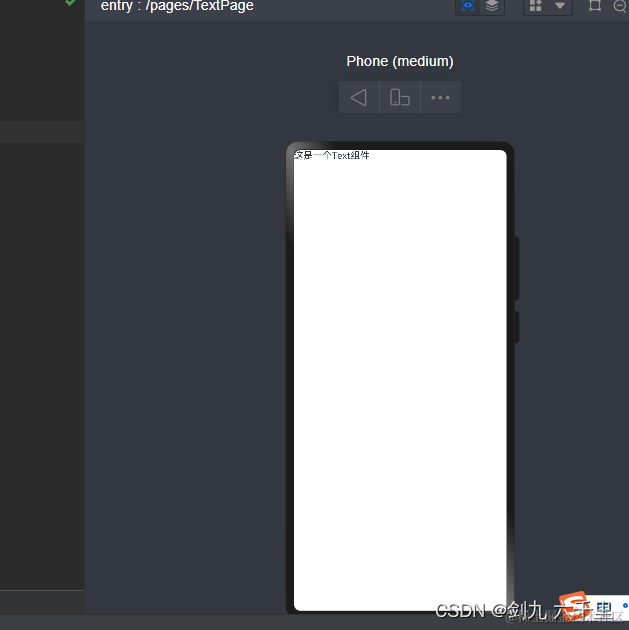
@Entry @Component struct TextPage { build() { Text('这是一个Text组件') } } -
设置一些样式

可以在组件后面链式调用属性:@Entry @Component struct TextPage { build() { Text('这是一个Text组件') .height(150) .width('100%') .backgroundColor('blue') .fontColor('green') .fontSize(40) .border({ width: 1, color: '#f40' }) } } -
也可以插入span组件
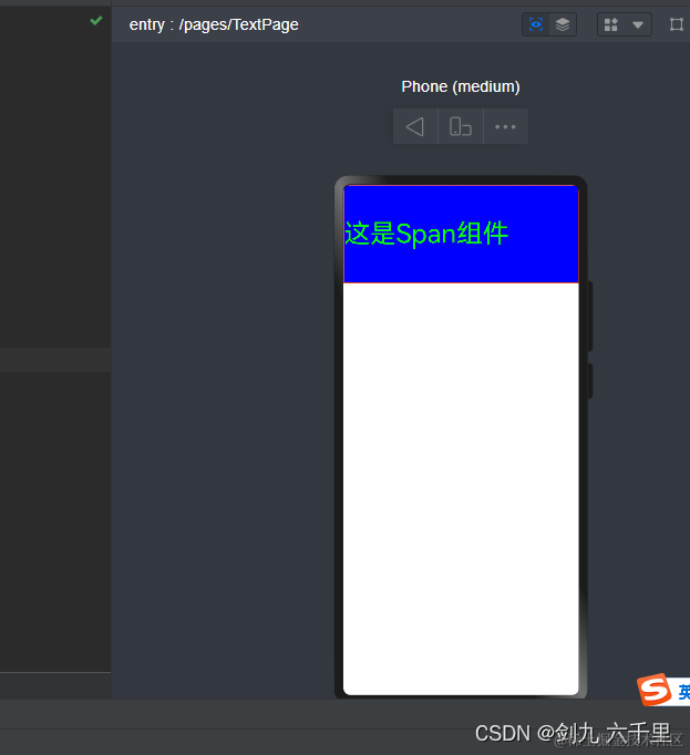
注意:组件有两种方式书写,一种是向上面那种直接写属性、传值,一种是下面这种在组件的{}中书写内容,下面这种写法在花括号中加了span组件之后,Text组件传递的参数就不生效了@Entry @Component struct TextPage { build() { Text('这是一个Text组件') { Span('这是Span组件').height(100).width(100) } .height(150) .width('100%') .backgroundColor('blue') .fontColor('green') .fontSize(40) .border({ width: 1, color: '#f40' }) } }
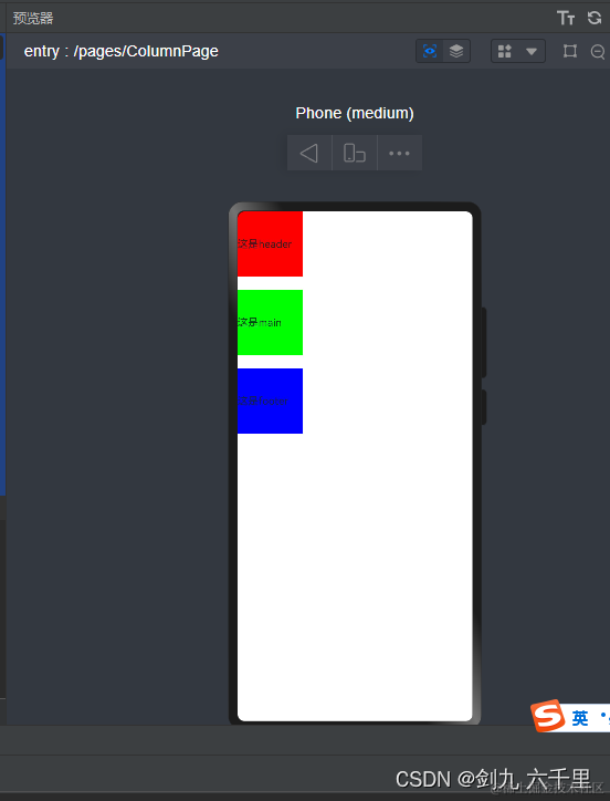
3.2 Column 列组件
纵向排列的组件,主轴是Y,内部可以书写任意组件(注意build组件内只能有一个根组件)
-
基本使用

@Entry @Component struct ColumnPage { build() { Column() { Text('这是header') .backgroundColor('red') .width(100) .height(100) Text('这是main') .backgroundColor('green') .width(100) .height(100) Text('这是footer') .backgroundColor('blue') .width(100) .height(100) } } } -
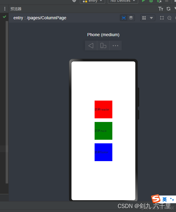
column接收参数,增加间距
传递space参数,改变每个元素之间的间距:@Entry @Component struct ColumnPage { build() { Column({ space: 20 }) { Text('这是header') .backgroundColor('red') .width(100) .height(100) Text('这是main') .backgroundColor('green') .width(100) .height(100) Text('这是footer') .backgroundColor('blue') .width(100) .height(100) } } } -
写一个常见的水平垂直居中布局
此处的.alignItems(HorizontalAlign.Center)和.justifyContent(FlexAlign.Center)可以理解为css中的Flex布局。Flex常用的属性都可以使用,更多使用可以查看官方文档。@Entry @Component struct ColumnPage { build() { Column({ space: 20 }) { Text('这是header') .backgroundColor('red') .width(100) .height(100) Text('这是main') .backgroundColor(Color.Green) .width(100) .height(100) Text('这是footer') .backgroundColor(Color.Blue) .width(100) .height(100) } .width('100%') .height('100%') .alignItems(HorizontalAlign.Center) // .alignItems(HorizontalAlign.Start) // .alignItems(HorizontalAlign.End) .justifyContent(FlexAlign.Center) // .justifyContent(FlexAlign.End) // .justifyContent(FlexAlign.SpaceBetween) } }
一般来说Column组件搭配Row组件一起使用,来实现一些常见的布局样式。
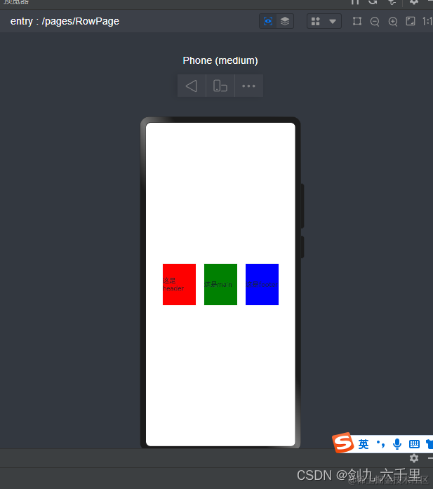
3.3 Row 行组件
水平排列的组件,主轴是X,内部可以书写任意组件(注意build组件内只能有一个根组件)
-
基本使用
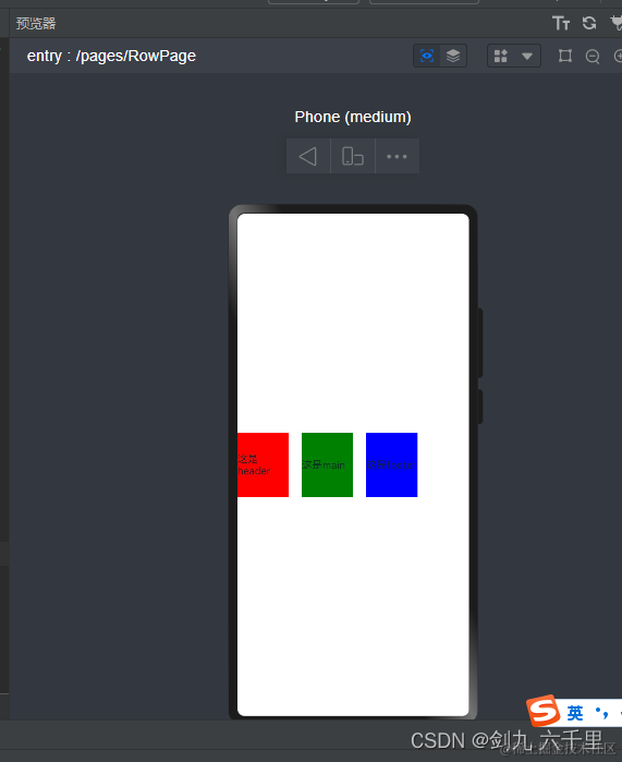
使用方法和Column组件基本一致:@Entry @Component struct RowPage { build() { Row({ space: 20 }) { Text('这是header') .backgroundColor('red') .width(80) .height(100) Text('这是main') .backgroundColor(Color.Green) .width(80) .height(100) Text('这是footer') .backgroundColor(Color.Blue) .width(80) .height(100) } .width('100%') .height('100%') } } -
写一个常见的布局样式
flex布局常见的属性在Row组件中同样适用:@Entry @Component struct RowPage { build() { Row({ space: 20 }) { Text('这是header') .backgroundColor('red') .width(80) .height(100) Text('这是main') .backgroundColor(Color.Green) .width(80) .height(100) Text('这是footer') .backgroundColor(Color.Blue) .width(80) .height(100) } .width('100%') .height('100%') .alignItems(VerticalAlign.Center) .justifyContent(FlexAlign.Center) } }
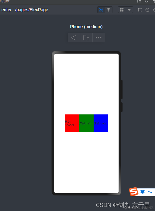
3.4 Flex 以弹性方式容器组件
弹性盒布局,不了解弹性盒布局的同学可先学习一下css中的弹性盒布局。官方推荐使用Row和Column组件。
-
基本使用
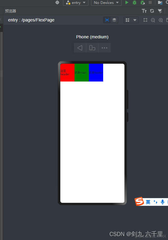
column是一列多行展示,通过Flex组件将其一行展示:@Entry @Component struct FlexPage { build() { Flex() { Column() { Text('这是header') .backgroundColor('red') .width(80) .height(100) } Column() { Text('这是main') .backgroundColor(Color.Green) .width(80) .height(100) } Column() { Text('这是footer') .backgroundColor(Color.Blue) .width(80) .height(100) } } .width('100%') .height('100%') } } -
写一个常见的布局样式(水平垂直居中)
通过Flex组件参数,设置样式:@Entry @Component struct FlexPage { build() { Flex({ direction: FlexDirection.Row, alignItems: ItemAlign.Center, justifyContent: FlexAlign.Center}) { Column() { Text('这是header') .backgroundColor('red') .width(80) .height(100) } Column() { Text('这是main') .backgroundColor(Color.Green) .width(80) .height(100) } Column() { Text('这是footer') .backgroundColor(Color.Blue) .width(80) .height(100) } } .width('100%') .height('100%') } }
3.5 Grid 网格布局组件
注意:Grid组件内部只能使用GridItem组件
Grid组件和css中的display:grid;属性原理基本是一致的。前端同学可以按css中的grid布局来理解这个Grid组件。
-
基本使用
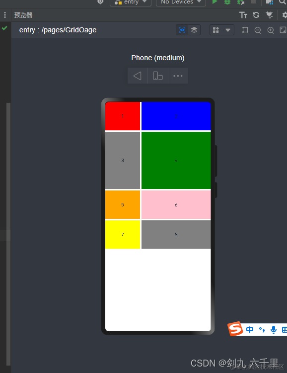
columnsTemplate 写几个参数表示有几列 此处表示有两列:
fr 表示份数,此处表示将宽度等分成3份,第一列占 1/3,第二列占 2/3:
rowsTemplate 写几个参数就有几行 此处表示有四行:
fr 表示份数,此处表示将高度等分成5分,第二行占 2/5,其他行各占 1/5:@Entry @Component struct GridPage { build() { Grid() { GridItem() { Text('1') }.backgroundColor(Color.Red) GridItem() { Text('2') }.backgroundColor(Color.Blue) GridItem() { Text('3') }.backgroundColor(Color.Gray) GridItem() { Text('4') }.backgroundColor(Color.Green) GridItem() { Text('5') }.backgroundColor(Color.Orange) GridItem() { Text('6') }.backgroundColor(Color.Pink) GridItem() { Text('7') }.backgroundColor(Color.Yellow) GridItem() { Text('8') }.backgroundColor(Color.Grey) } .width('100%') .height(500) // columnsTemplate 写几个参数表示有几列 此处表示有两列 // fr 表示份数,此处表示将宽度等分成3份,第一列占 1/3,第二列占 2/3 .columnsTemplate('1fr 2fr') // rowsTemplate 写几个参数就有几行 此处表示有四行 // fr 表示份数,此处表示将高度等分成5分,第二行占 2/5,其他行各占 1/5 .rowsTemplate('1fr 2fr 1fr 1fr') // 列和列之间的间距 .columnsGap(5) // 行和行之间的间距 .rowsGap(5) } } -
写一个常见的布局样式
合并行或者合并列: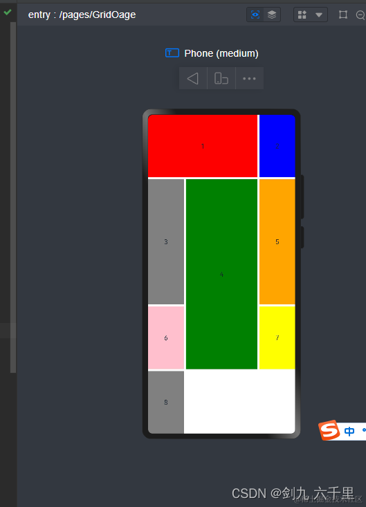
.columnStart(1).columnEnd(2) 表示第一列和第二列盒子合并,第三列会被挤到下一行去:
.rowStart(1).rowEnd(2) 表示当前行和下一行合并:@Entry @Component struct GridPage { build() { Grid() { GridItem() { Text('1') // .columnStart(1).columnEnd(2) 表示第一列和第二列盒子合并,第三列会被挤到下一行去 }.backgroundColor(Color.Red).columnStart(1).columnEnd(2) GridItem() { Text('2') }.backgroundColor(Color.Blue) GridItem() { Text('3') }.backgroundColor(Color.Gray) GridItem() { Text('4') // .rowStart(1).rowEnd(2) 表示当前行和下一行合并 }.backgroundColor(Color.Green).rowStart(1).rowEnd(2) GridItem() { Text('5') }.backgroundColor(Color.Orange) GridItem() { Text('6') }.backgroundColor(Color.Pink) GridItem() { Text('7') }.backgroundColor(Color.Yellow) GridItem() { Text('8') }.backgroundColor(Color.Grey) } .width('100%') .height('100%') // columnsTemplate 写几个参数表示有几列 此处表示有两列 // fr 表示份数,此处表示将宽度等分成3份,第一列占 1/3,第二列占 2/3 .columnsTemplate('1fr 2fr 1fr') // rowsTemplate 写几个参数就有几行 此处表示有四行 // fr 表示份数,此处表示将高度等分成5分,第二行占 2/5,其他行各占 1/5 .rowsTemplate('1fr 2fr 1fr 1fr') // 列和列之间的间距 .columnsGap(5) // 行和行之间的间距 .rowsGap(5) } }
3.6 Button 按钮组件
-
基础用法
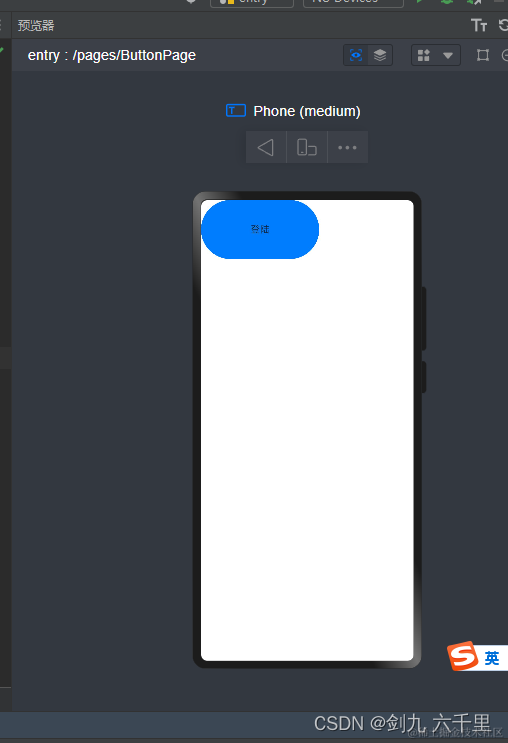
也可以这么使用:Button(‘登陆’) :@Entry @Component struct ButtonPage { build() { Button() { Text('登陆') } .height(100) .width(200) } } 1234567891011 -
事件绑定(支持通用事件)
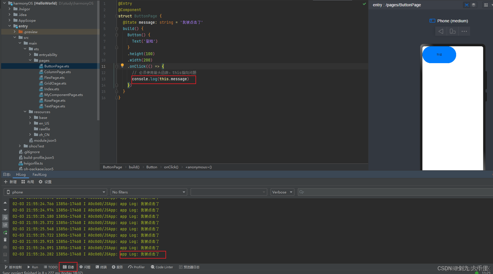
必须使用箭头函数,this指向问题:
接收一个参数,事件对象:@Entry @Component struct ButtonPage { @State message: string = '我被点击了' build() { Button() { Text('登陆') } .height(100) .width(200) .onClick(() => { // 必须使用箭头函数,this指向问题 console.log(this.message) }) } }还有很多的按钮样式属性,可以查看官方文档

3.7 TextInput 输入框组件
-
基本使用
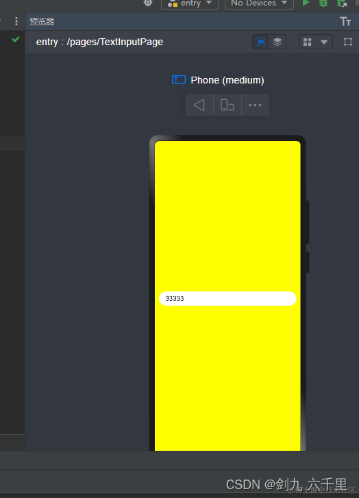
@Entry @Component struct TextInputPage { build() { Row() { TextInput().backgroundColor(Color.White) } .height('100%') .width('100%') .backgroundColor(Color.Yellow) .padding(10) } } 12345678910111213 -
增加placeholder
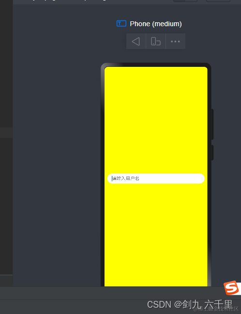
@Entry @Component struct TextInputPage { build() { Row() { TextInput({ placeholder: '请输入用户名'}) .backgroundColor(Color.White) } .height('100%') .width('100%') .backgroundColor(Color.Yellow) .padding(10) } } -
增加默认值
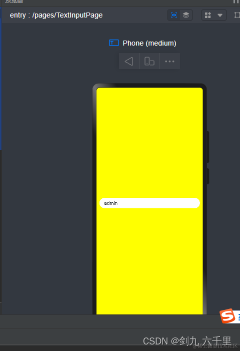
@Entry @Component struct TextInputPage { build() { Row() { TextInput({ placeholder: '请输入用户名', text: 'admin'}) .backgroundColor(Color.White) } .height('100%') .width('100%') .backgroundColor(Color.Yellow) .padding(10) } } -
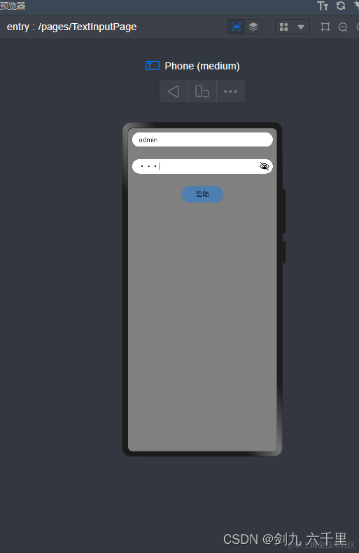
写一个基本的登陆功能

演示了基本的数据声明/数据绑定/事件绑定等:@Entry @Component struct TextInputPage { @State userName: string = '' @State password: string = '' build() { Column({space: 30}) { Row() { TextInput({ placeholder: '请输入用户名', text: 'admin'}) .backgroundColor(Color.White) .onChange(value => { this.userName = value }) } Row() { TextInput({ placeholder: '请输入密码'}) .backgroundColor(Color.White) .type(InputType.Password) .onChange(value => { this.password = value }) } Row() { Button() { Text('登陆') } .width(100) .height(40) .onClick(() => { console.log(this.userName) console.log(this.password) }) } } .height('100%') .width('100%') .backgroundColor(Color.Grey) .padding(10) } }点击登录的时候数据已经是响应式的了:
-
模拟登陆校验
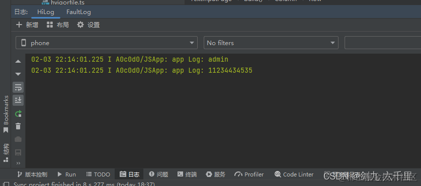
展示了事件的声明及调用,以及一些组合的用法:@Entry @Component struct TextInputPage { @State userName: string = '' @State password: string = '' validate() { return !this.userName || !this.password ? true : false } build() { Column({space: 30}) { Row() { TextInput({ placeholder: '请输入用户名', text: 'admin'}) .backgroundColor(Color.White) .onChange(value => { this.userName = value }) } Row() { TextInput({ placeholder: '请输入密码'}) .backgroundColor(Color.White) .type(InputType.Password) .onChange(value => { this.password = value }) } Row() { Button() { Text('登陆') } .width(100) .height(40) .enabled(this.validate()) .onClick(() => { if(this.userName === 'admin' && this.password === 'admin123') { AlertDialog.show({ message:"登录成功啦" }) } else { AlertDialog.show({ message:"登录失败啦" }) } }) } } .height('100%') .width('100%') .backgroundColor(Color.Grey) .padding(10) } }
3.8 Image 图片组件
3.8.1 网络图片
- 编译器预览:这种方式图片可以正常显示
- 模拟器/真机:这种方式图片不能正常加载,需要在 module.json5 文件中配置网络访问权限

权限分为系统权限及网络权限,此处我们需要配置的是网络权限:
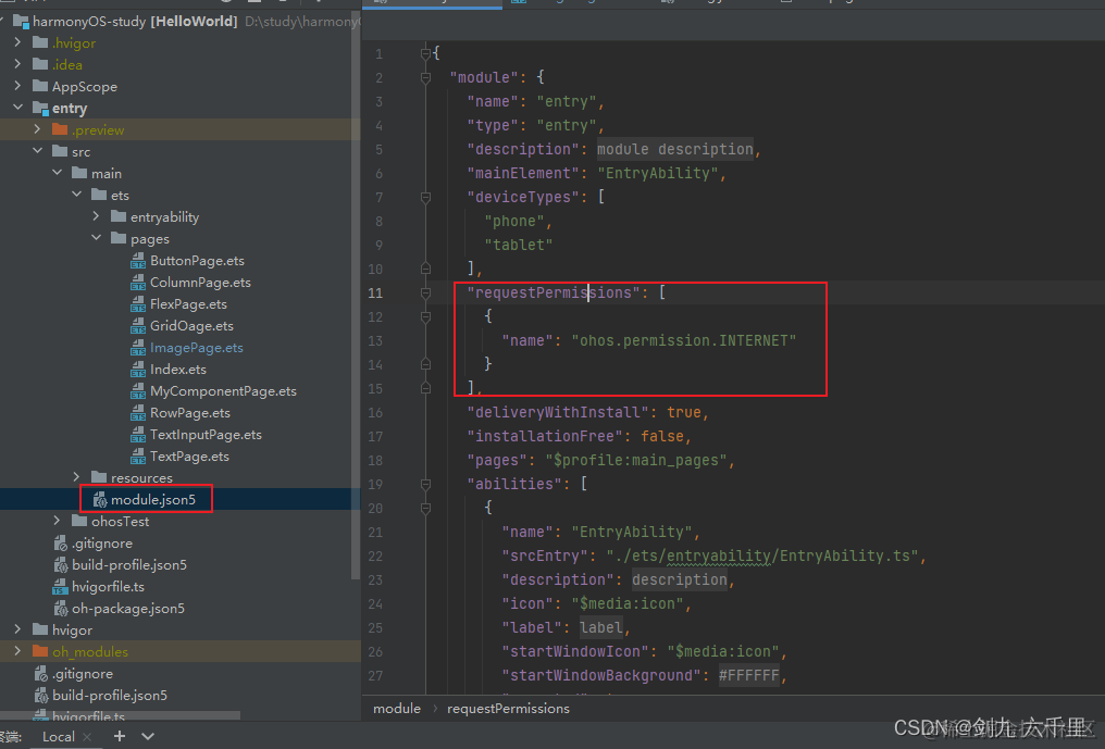
"requestPermissions": [
   {
     "name": "ohos.permission.INTERNET"
   }
],

12345
代码:
@Entry
@Component
struct ImagePage {
  build() {
    Column() {
      // 1. 网址
      // 预览:这种方式图片可以正常显示
      // 模拟器/真机:这种方式图片不能正常加载,需要在 module.json5 文件中配置网络访问权限
      // "requestPermissions": [
      // {
      //   "name": "ohos.permission.INTERNET"
      // }
      // ],
      Image('https://image.diyiyou.com/game/202109/01/1630475933_8.jpg')
        .height(100)

      // 2.resources/base/media 文件夹下面的资源
      // Image($r('app.media.icon'))
      //   .height(100)

      // 3.resources/rawfile 文件夹下面的资源
      // Image($rawfile('icon.png'))
      //   .height(150)

      // 4.自建文件夹
      // Image('/assets/images/icon.png')
      //   .height(200)
    }
      .width('100%')
      .height('100%')
  }
}
预览效果:

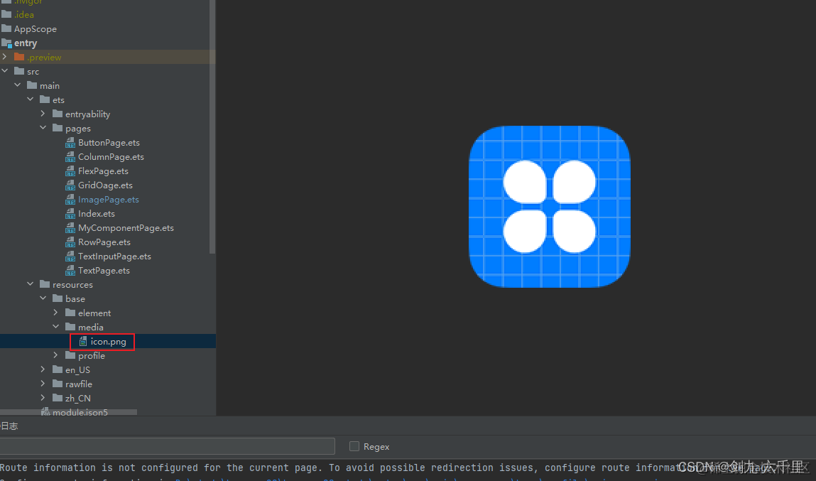
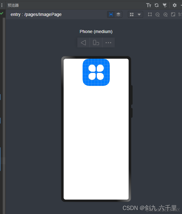
3.8.2 resources/base/media 文件夹下面的资源
资源所在位置:
代码:
@Entry
@Component
struct ImagePage {
  build() {
    Column() {
      // 1. 网址
      // 预览:这种方式图片可以正常显示
      // 模拟器/真机:这种方式图片不能正常加载,需要在 module.json5 文件中配置网络访问权限
      // "requestPermissions": [
      // {
      //   "name": "ohos.permission.INTERNET"
      // }
      // ],
      // Image('https://image.diyiyou.com/game/202109/01/1630475933_8.jpg')
      //   .height(100)

      // 2.resources/base/media 文件夹下面的资源
      Image($r('app.media.icon'))
        .height(100)

      // 3.resources/rawfile 文件夹下面的资源
      // Image($rawfile('icon.png'))
      //   .height(150)

      // 4.自建文件夹
      // Image('/assets/images/icon.png')
      //   .height(200)
    }
      .width('100%')
      .height('100%')
  }
}
预览效果:

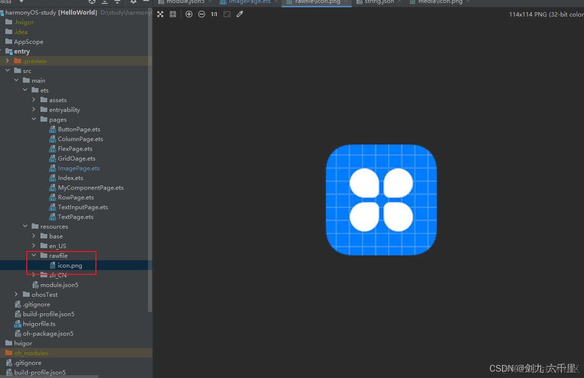
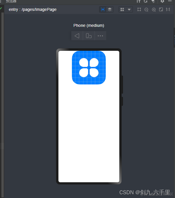
3.8.3 resources/rawfile 文件夹下面的资源
rawfile文件夹下默认没有文件,此处我们放一张图片进来:
代码:
@Entry
@Component
struct ImagePage {
  build() {
    Column() {
      // 1. 网址
      // 预览:这种方式图片可以正常显示
      // 模拟器/真机:这种方式图片不能正常加载,需要在 module.json5 文件中配置网络访问权限
      // "requestPermissions": [
      // {
      //   "name": "ohos.permission.INTERNET"
      // }
      // ],
      // Image('https://image.diyiyou.com/game/202109/01/1630475933_8.jpg')
      //   .height(100)

      // 2.resources/base/media 文件夹下面的资源
      // Image($r('app.media.icon'))
      //   .height(100)

      // 3.resources/rawfile 文件夹下面的资源
      Image($rawfile('icon.png'))
        .height(150)

      // 4.自建文件夹
      // Image('/assets/images/icon.png')
      //   .height(200)
    }
      .width('100%')
      .height('100%')
  }
}
预览效果:
3.8.4 自建文件夹下面的资源
新建一个 assets/images 文件夹,放入一张图片:

代码:
@Entry
@Component
struct ImagePage {
  build() {
    Column() {
      // 1. 网址
      // 预览:这种方式图片可以正常显示
      // 模拟器/真机:这种方式图片不能正常加载,需要在 module.json5 文件中配置网络访问权限
      // "requestPermissions": [
      // {
      //   "name": "ohos.permission.INTERNET"
      // }
      // ],
      // Image('https://image.diyiyou.com/game/202109/01/1630475933_8.jpg')
      //   .height(100)

      // 2.resources/base/media 文件夹下面的资源
      // Image($r('app.media.icon'))
      //   .height(100)

      // 3.resources/rawfile 文件夹下面的资源
      // Image($rawfile('icon.png'))
      //   .height(150)

      // 4.自建文件夹
      Image('/assets/images/icon.png')
        .height(200)
    }
      .width('100%')
      .height('100%')
  }
}
预览效果:
3.9 Toggle 切换组件
-
type: Toggle 组件的类型
- ToggleType.Checkbox
- ToggleType.Switch
- ToggleType.Button
-
isOn: 是否选中,默认 false
-
selectedColor:选中颜色
-
onChange:切换事件
-
switchPointColor: 开关组件滑块的颜色
@Entry
@Component
struct TogglePage {
  build() {
    Column() {
      // 1.复选框
      Toggle({type: ToggleType.Checkbox, isOn: true})
        .selectedColor(Color.Green)
        .onChange(() => {
          console.log('复选框切换了')
        })

      // 2.切换
      Toggle({type: ToggleType.Switch, isOn: true})
        .selectedColor(Color.Red)
        .switchPointColor(Color.Yellow)

      // 3.按钮 -- 必须有内容才能显示
      Toggle({type: ToggleType.Button, isOn: true}) {
        Text('按钮')
      }
    }
      .width('100%')
      .height('100%')
  }
}
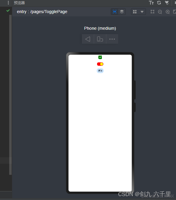
预览效果:
3.10 Slider 滑块组件
@Entry
@Component
struct SliderPage {
  build() {
    Column() {
      Slider({
        // 默认滑块位置
        value: 10,
        // 最小值
        min: 0,
        // 最大值
        max: 100,
        // 每次滑动步长
        step: 3,
        // 设置滑块与滑轨显示样式。 默认值:SliderStyle.OutSet
        style: SliderStyle.InSet,
        // 设置滑动条滑动方向为水平或竖直方向。默认值:Axis.Horizontal
        direction: Axis.Horizontal,
        // 设置滑动条取值范围是否反向,横向Slider默认为从左往右滑动,竖向Slider默认为从上往下滑动。默认值:false
        reverse: true
      })
    }
  }
}
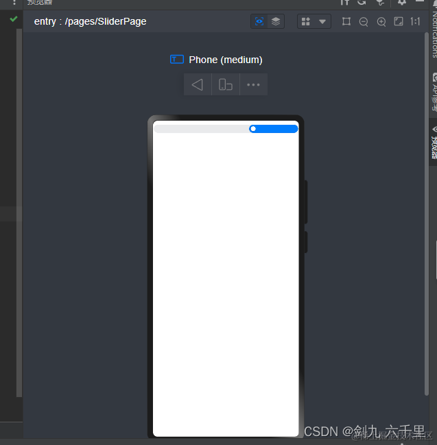
预览效果:
3.11 progress 进度条组件
-
value: 指定当前进度值。设置小于0的数值时置为0,设置大于total的数值时置为total。
-
total: 指定进度总长。默认值:100
-
type: 指定进度条类型。默认Linear
- Linear - 线性样式
- Ring - 环形无刻度样式
- Eclipse - 圆形样式
- ScaleRing - 环形无刻度样式
- Capsule - 胶囊型
-
style: 指定进度条样式
- strokeWidth - 指定进度条宽度。
- scaleWidth - 指定每个宽度。
- scaleCount - 指定进度条个数。
@Entry
@Component
struct ProgressPage {
  build() {
    Column() {
      Progress({
        // 指定当前进度值。设置小于0的数值时置为0,设置大于total的数值时置为total。
        value: 10,
        // 指定进度总长。默认值:100
        total: 100,
        // 指定进度条类型。默认Linear
        // Linear - 线性样式
        // Ring - 环形无刻度样式
        // Eclipse - 圆形样式
        // ScaleRing - 环形无刻度样式
        // Capsule - 胶囊型
        type: ProgressType.ScaleRing
      }).style({
        // 指定进度条宽度。
        strokeWidth: 10,
        // 指定每个宽度。
        scaleWidth: 5,
        // 指定进度条个数。
        scaleCount: 20
      })
    }
      .width('100%')
      .height('100%')
      .padding(20)
  }
}
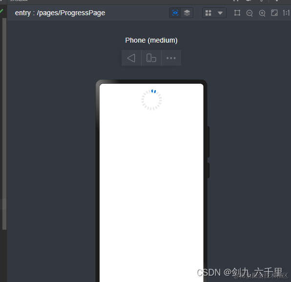
预览效果:
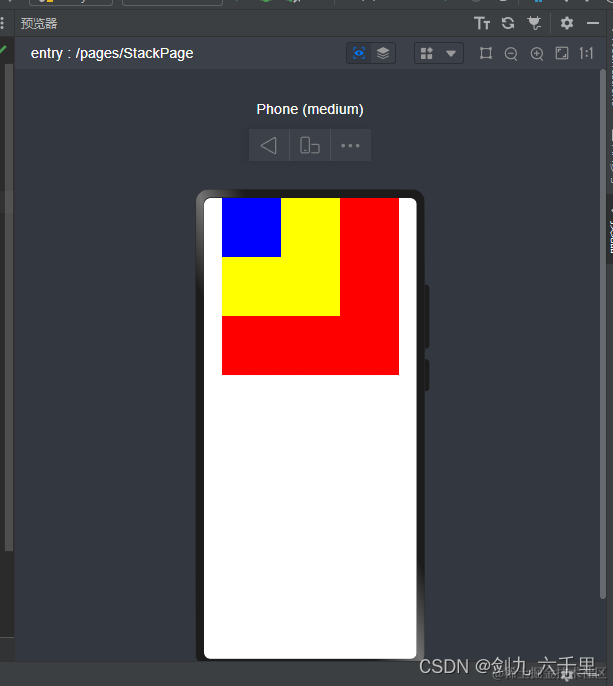
3.12 Stack 堆叠组件
3.12.1 基本用法
@Entry
@Component
struct StackPage {
  build() {
    Column() {
      Stack() {
        Row(){}
          .height(300)
          .width(300)
          .backgroundColor(Color.Red)

        Row(){}
          .height(200)
          .width(200)
          .backgroundColor(Color.Yellow)

        Row(){}
          .height(100)
          .width(100)
          .backgroundColor(Color.Blue)
      }
    }
      .height('100%')
      .width('100%')
  }
}
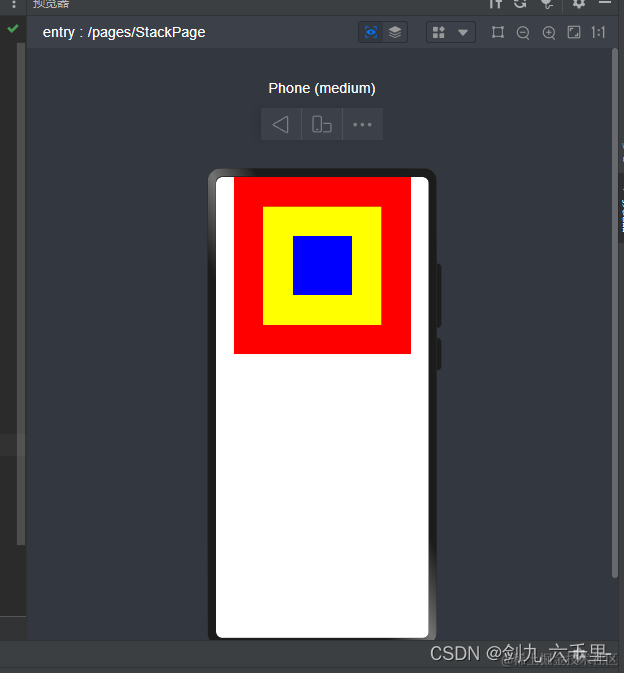
预览效果:
- alignContent : 设置子组件在容器内的对齐方式。默认值:Alignment.Center
@Entry
@Component
struct StackPage {
  build() {
    Column() {
      // alignContent - 设置子组件在容器内的对齐方式。默认值:Alignment.Center
      Stack({alignContent: Alignment.TopStart}) {
        Row(){}
          .height(300)
          .width(300)
          .backgroundColor(Color.Red)

        Row(){}
          .height(200)
          .width(200)
          .backgroundColor(Color.Yellow)

        Row(){}
          .height(100)
          .width(100)
          .backgroundColor(Color.Blue)
      }
    }
      .height('100%')
      .width('100%')
  }
}
预览效果:
3.13 Blank 组件
- Blank - 占据剩余空间
3.13.1 基本用法
@Entry
@Component
struct BlankPage {
  build() {
    Column() {
      Row() {
        Text('>')
        Text('返回')
        // Blank - 占据剩余空间
        Blank().backgroundColor(Color.Red)
      }
        .width('100%')
        .height(100)
        .backgroundColor(Color.Gray)
    }
  }
}
预览效果:

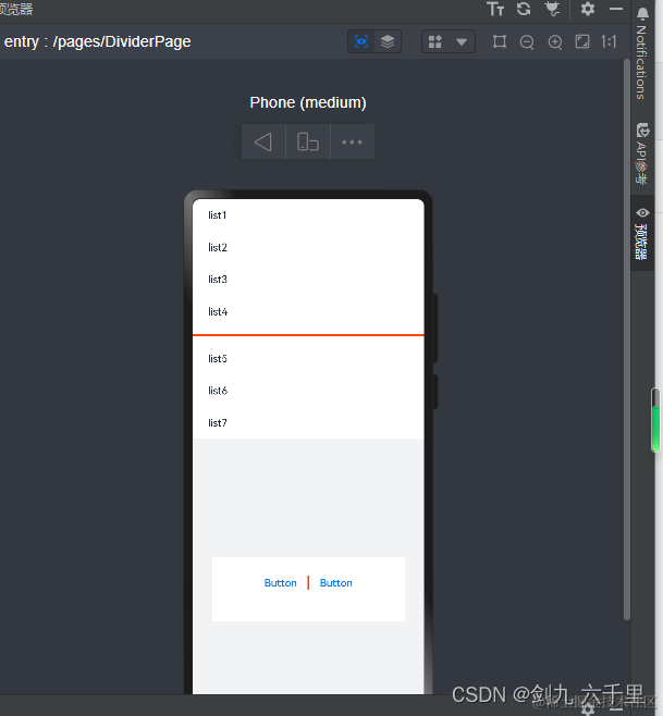
3.14 Divider 分割线组件
- strokeWidth:分割线的宽度
@Entry
@Component
struct DividerPage {
  build() {
    Column() {
      // 使用横向分割线场景
      List() {
        ForEach([1, 2, 3, 4], (item) => {
          ListItem() {
            Text('list' + item).width('100%').fontColor('#182431').textAlign(TextAlign.Start)
          }.width(244).height(50)
        }, item => item.toString())
      }.padding({ left: 24, bottom: 10 })

      Divider().strokeWidth(3).color('#F40')
      List() {
        ForEach([5, 6, 7], (item) => {
          ListItem() {
            Text('list' + item).width('100%').fontColor('#182431').textAlign(TextAlign.Start)
          }.width(244).height(50)
        }, item => item.toString())
      }.padding({ left: 24, top: 10 })

      // 使用纵向分割线场景
      Column() {
        Column() {
          Row() {
            Button('Button')
              .fontColor('#007DFF')
              .backgroundColor(Color.Transparent)
            Divider().vertical(true).strokeWidth(3).height(22).color('#F40')
            Button('Button')
              .fontColor('#007DFF')
              .backgroundColor(Color.Transparent)
          }.margin({ top: 20 })
        }
        .width(300)
        .height(100)
        .backgroundColor('#FFFFFF')
      }
      .width('100%')
      .height('60%')
      .backgroundColor('#F1F3F5')
      .justifyContent(FlexAlign.Center)
    }.width('100%')
  }
}
预览效果:
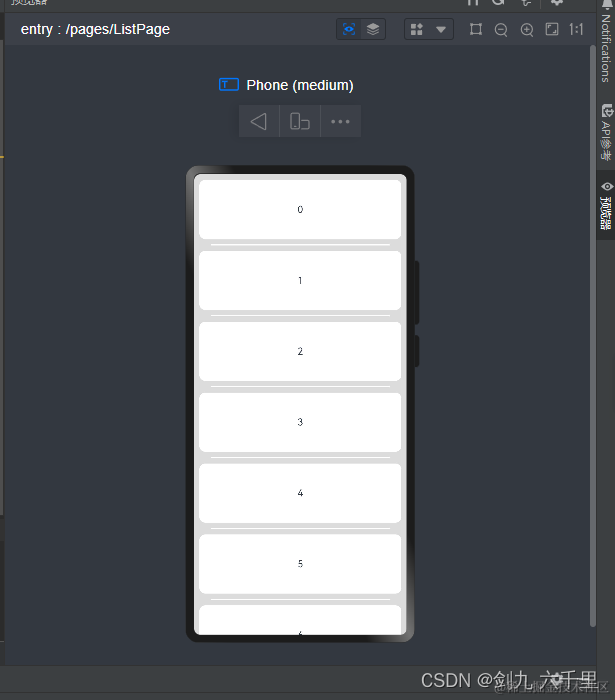
3.15 List 列表组件
3.15.1 ListItem
@Entry
@Component
struct ListPage {
  private arr: number[] = [0, 1, 2, 3, 4, 5, 6, 7, 8, 9, 10, 11]

  build() {
    Column() {
      List({ space: 20, initialIndex: 0 }) {
        ForEach(this.arr, (item) => {
          ListItem() {
            Text('' + item)
              .width('100%').height(100).fontSize(16)
              .textAlign(TextAlign.Center).borderRadius(10).backgroundColor(0xFFFFFF)
          }
        }, item => item)
      }
      .listDirection(Axis.Vertical) // 排列方向
      .divider({ strokeWidth: 2, color: 0xFFFFFF, startMargin: 20, endMargin: 20 }) // 每行之间的分界线
      .edgeEffect(EdgeEffect.Spring) // 滑动到边缘无效果
      .onScrollIndex((firstIndex: number, lastIndex: number) => {
        console.info('first' + firstIndex) // 可视页面第一条数据索引
        console.info('last' + lastIndex)   // 可视页面最后一条数据索引
      })
      .width('95%')
    }
    .width('100%')
    .height('100%')
    .backgroundColor(0xDCDCDC)
    .padding({ top: 10 })
  }
}
预览效果:
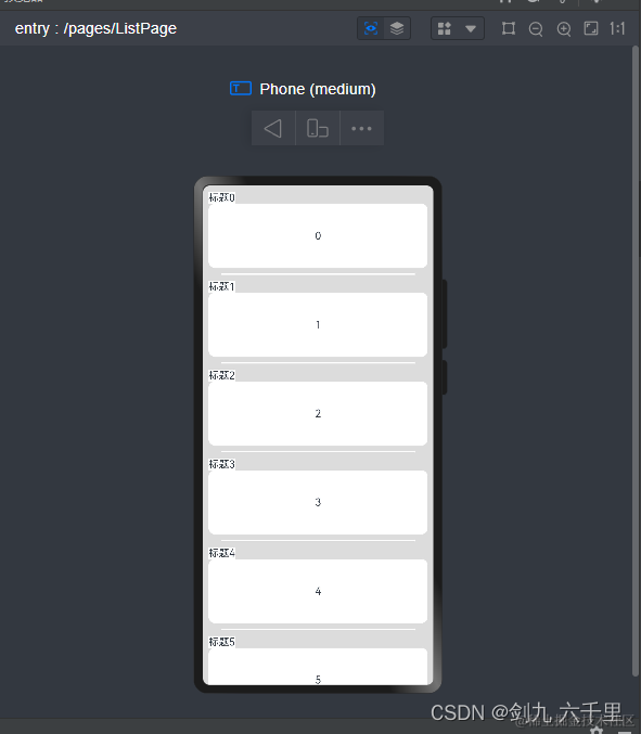
3.15.2 ListItemGroup
@Entry
@Component
struct ListPage {
  private arr: number[] = [0, 1, 2, 3, 4, 5, 6, 7, 8, 9, 10, 11]

  // 构建函数,抽取公共逻辑
  // @Builder - 装饰器 申明构建函数
  @Builder HeaderBuild(title: string, item: number) {
    Text(`${title}${item}`)
      .backgroundColor(Color.White)
  }

  build() {
    Column() {
      // List({ space: 20, initialIndex: 0 }) {
      //   ForEach(this.arr, (item) => {
      //     ListItem() {
      //       Text('' + item)
      //         .width('100%').height(100).fontSize(16)
      //         .textAlign(TextAlign.Center).borderRadius(10).backgroundColor(0xFFFFFF)
      //     }
      //   }, item => item)
      // }
      // .listDirection(Axis.Vertical) // 排列方向
      // .divider({ strokeWidth: 2, color: 0xFFFFFF, startMargin: 20, endMargin: 20 }) // 每行之间的分界线
      // .edgeEffect(EdgeEffect.Spring) // 滑动到边缘无效果
      // .onScrollIndex((firstIndex: number, lastIndex: number) => {
      //   console.info('first' + firstIndex) // 可视页面第一条数据索引
      //   console.info('last' + lastIndex)   // 可视页面最后一条数据索引
      // })
      // .width('95%')

      List({ space: 20, initialIndex: 0 }) {
        ForEach(this.arr, (item) => {
          // 传递参数给抽取的函数
          ListItemGroup({header: this.HeaderBuild('标题', item)}) {
            ListItem() {
              Text('' + item)
                .width('100%').height(100).fontSize(16)
                .textAlign(TextAlign.Center).borderRadius(10).backgroundColor(0xFFFFFF)
            }
          }
        }, item => item)
      }
      .listDirection(Axis.Vertical) // 排列方向
      .divider({ strokeWidth: 2, color: 0xFFFFFF, startMargin: 20, endMargin: 20 }) // 每行之间的分界线
      .edgeEffect(EdgeEffect.Spring) // 滑动到边缘无效果
      .onScrollIndex((firstIndex: number, lastIndex: number) => {
        console.info('first' + firstIndex) // 可视页面第一条数据索引
        console.info('last' + lastIndex)   // 可视页面最后一条数据索引
      })
      .width('95%')
    }
    .width('100%')
    .height('100%')
    .backgroundColor(0xDCDCDC)
    .padding({ top: 10 })
  }
}
预览效果:
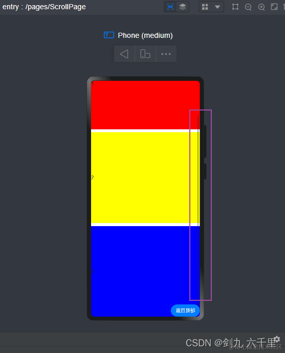
3.16 Scroll 滚动组件
@Entry
@Component
struct ScrollPage {
  build() {
    Stack({alignContent: Alignment.BottomEnd}) {
      Scroll() {
        Column({space: 10}) {
          Row(){
            Text('1')
          }.width('100%').height(300).backgroundColor(Color.Red)

          Row(){
            Text('2')
          }.width('100%').height(300).backgroundColor(Color.Yellow)

          Row(){
            Text('3')
          }.width('100%').height(300).backgroundColor(Color.Blue)
        }
      }

      Button('返回顶部')
    }
    .height('100%')
    .width('100%')
  }
}
预览效果:
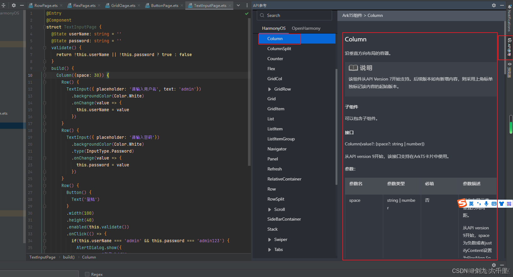
四、补充:在编辑器中查看组件文档
4.1 DevEco Studio编辑器内查看官方文档
鼠标悬停到组件上,在出来的弹窗中点击查询API参考:

在编辑器右侧可以看到文档的详细信息:


 2477
2477


 被折叠的 条评论
为什么被折叠?
被折叠的 条评论
为什么被折叠?
 到【灌水乐园】发言


