


弹出对话框对任何一个Android开发者都不是什么难事,代码也非常简单,简单的贴出来都觉得是个不光彩的事。
    public void showDialog(View v){
        AlertDialog.Builder builder=new AlertDialog.Builder(this);
        builder.setTitle("dialog");
        builder.setPositiveButton("确定", new DialogInterface.OnClickListener() {
            @Override
            public void onClick(DialogInterface dialog, int which) {
                // .....
            }
        });
        builder.setNegativeButton("取消",null);
        builder.show();
    }
如果这是一个普通的AlertDialog教程,写到此处就大功告成了。问题是,公司产品经理感觉Dialog按钮的颜色不舒服,和绿帽子一样颜色,太不爽,想改成和顶部AppBar一个颜色。
我想了想,觉得因为一个Dialog跳槽走人也说不过去,只能拍拍胸脯说没问题。
众所周知,我们可以setView()定制不同界面样式的Dialog,随便你在布局中发挥
        AlertDialog.Builder builder=new AlertDialog.Builder(this);
        builder.setView(view);
        builder.show();
但是这种方法还要去搭建一个布局文件,太不爽。
紧接着我突然想到了,通过修改Dialog主题样式从而改变Dialog按钮的颜色。天才啊~
直接打开主题样式文件 values\styles.xml。
<resources>

    <style name="AppTheme" parent="Theme.AppCompat.Light.DarkActionBar">
        <item name="colorPrimary">@color/colorPrimary</item>
        <item name="colorPrimaryDark">@color/colorPrimaryDark</item>
        <item name="colorAccent">@color/colorAccent</item>
    </style>

</resources>
当前程序采用的是AppCompat的主题,也是目前程序主流的主题。
然,并,卵!
如何修改Dialog样式了呢。上面的colorPrimary,colorAccent等分别控制什么的颜色呢。别着急,先看下面一张图:
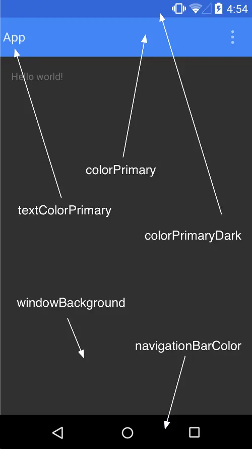
- android:colorPrimaryDark 应用的主要暗色调,statusBarColor默认使用该颜色
- android:statusBarColor 状态栏颜色,默认使用colorPrimaryDark
- android:colorPrimary 应用的主要色调,actionBar默认使用该颜色
- android:windowBackground 窗口背景颜色
- android:navigationBarColor 底部栏颜色
- android:colorForeground 应用的前景色,ListView的分割线,switch滑动区默认使用该颜色
- android:colorBackground 应用的背景色,popMenu的背景默认使用该颜色
- android:colorAccent 一般控件的选种效果默认采用该颜色
- android:colorControlNormal 控件的默认色调
- android:colorControlHighlight 控件按压时的色调
- android:colorControlActivated 控件选中时的颜色,默认使用colorAccent
- android:colorButtonNormal 默认按钮的背景颜色
- android:textColor Button,textView的文字颜色
- android:textColorPrimaryDisableOnly RadioButton checkbox等控件的文字
- android:textColorPrimary 应用的主要文字颜色,actionBar的标题文字默认使用该颜色
上面加粗的就是创建项目默认带的,哇~ 原来主题可以控制这么多颜色啊。其实这还不是全部的啊。
问题回到主题,如何修改AlertDialog按钮的颜色啊。上面没有写着啊。不要怕,咱们去看看AlertDialog的源码。
AlertDialog是通过Builder创建的。
        public Builder(Context context) {
            this(context, resolveDialogTheme(context, 0));
        }
可以看到片Build创建的时候调用了resolveDialogTheme这个方法,英语好的一眼就知道这是解析主题的意思,点进去看看这个方法:
    static int resolveDialogTheme(Context context, int resid) {
        if (resid >= 0x01000000) {   // start of real resource IDs.
            return resid;
        } else {
            TypedValue outValue = new TypedValue();
            context.getTheme().resolveAttribute(R.attr.alertDialogTheme, outValue, true);
            return outValue.resourceId;
        }
    }
核心是看这个:context.getTheme().resolveAttribute(R.attr.alertDialogTheme, outValue, true);
这个话的意思就是上下文获取当前主题解析alertDialogTheme这个属性。
原来终于明白了,我们要想修改AlertDialog样式需要在主题中设置alertDialogTheme,这个属性。
    <style name="AppTheme" parent="Theme.AppCompat.Light.DarkActionBar">
        <!-- Customize your theme here. -->
        <item name="colorPrimary">@color/colorPrimary</item>
        <item name="colorPrimaryDark">@color/colorPrimaryDark</item>
        <item name="colorAccent">@color/colorAccent</item>
        <item name="alertDialogTheme">怎么写啊??</item>
</style>问题来了,alertDialogTheme这个又该怎么写呢。这次ctrl+左键点击Theme.AppCompat.Light.DarkActionBar进去看看默认的alertDialogTheme是怎么配置的,我们按照葫芦画瓢就可以了。
进来千万不要头晕,我们来缕缕:
首先
<style name="Theme.AppCompat.Light.DarkActionBar" parent="Base.Theme.AppCompat.Light.DarkActionBar"/>继续翻家谱,点击父样式Base.Theme.AppCompat.Light.DarkActionBar
    <style name="Base.Theme.AppCompat.Light.DarkActionBar" parent="Base.Theme.AppCompat.Light">
        <item name="actionBarPopupTheme">@style/ThemeOverlay.AppCompat.Light</item>
        <item name="actionBarWidgetTheme">@null</item>
        <item name="actionBarTheme">@style/ThemeOverlay.AppCompat.Dark.ActionBar</item>

        <!-- Panel attributes -->
        <item name="listChoiceBackgroundIndicator">@drawable/abc_list_selector_holo_dark</item>

        <item name="colorPrimaryDark">@color/primary_dark_material_dark</item>
        <item name="colorPrimary">@color/primary_material_dark</item>
    </style>
发现Base.Theme.AppCompat.Light.DarkActionBar还是没有我们想要的,继续点击Base.Theme.AppCompat.Light,继续往上翻
<style name="Base.Theme.AppCompat.Light" parent="Base.V7.Theme.AppCompat.Light"></style>继续...
<style name="Base.V7.Theme.AppCompat.Light" parent="Platform.AppCompat.Light">
    ....
   <item name="alertDialogTheme">@style/Theme.AppCompat.Light.Dialog.Alert</item>
</style>
终于功夫不负有心人,找到了alertDialogTheme这个属性,看看它对应的是@style/Theme.AppCompat.Light.Dialog.Alert
我们把这个代码复制到我们的样式中,这就相当于你什么都没改:
    <style name="AppTheme" parent="Theme.AppCompat.Light.DarkActionBar">
        <item name="colorPrimary">@color/colorPrimary</item>
        <item name="colorPrimaryDark">@color/colorPrimaryDark</item>
        <item name="colorAccent">@color/colorAccent</item>
        <item name="alertDialogTheme">@style/Theme.AppCompat.Light.Dialog.Alert</item>
    </style>
于是乎我们开始自定义这个样式Theme.AppCompat.Light.Dialog.Alert
    <style name="AppTheme" parent="Theme.AppCompat.Light.NoActionBar">
        <item name="colorPrimary">@color/colorPrimary</item>
        <item name="colorPrimaryDark">@color/colorPrimaryDark</item>
        <item name="colorAccent">@color/colorAccent</item>
        <item name="alertDialogTheme">@style/Theme.AppCompat.Light.Dialog.Alert.Self</item>
    </style>

    <style name="Theme.AppCompat.Light.Dialog.Alert.Self"
           parent="@style/Theme.AppCompat.Light.Dialog.Alert">
          <!--怎么写呢?-->
    </style>
怎么自定义呢,于是乎,又需要翻看Theme.AppCompat.Light.Dialog.Alert的源码了。过程和上面雷同,需要多翻几次,就不列举了。直接说结果,最终你会发现
Theme.AppCompat.Light.Dialog.Alert继承自Base.V7.Theme.AppCompat.Light
<style name="Base.V7.Theme.AppCompat.Light" parent="Platform.AppCompat.Light">
    ....

</style>
这个是不是很眼熟啊,没错,上面的代码曾经翻到过它。这时候如果你按照正常思维模式去查看哪个属性控制按钮颜色,你还需要翻看AlerDialog源码,我只能说有点麻烦了,很不爽的。
那怎么看呢?
介绍一个小技巧。
我们先看按钮默认的颜色。

然后看Base.V7.Theme.AppCompat.Light样式下只有colorAccent 对应这个颜色。

于是乎我们可以猜测,colorAccent 这个属性可能是控制按钮的颜色。于是乎赶快添加到自定义的样式中。填写和状态栏的一样的颜色:
    <style name="Theme.AppCompat.Light.Dialog.Alert.Self"
           parent="@style/Theme.AppCompat.Light.Dialog.Alert">
        <item name="colorAccent">#3F51B5</item>
    </style>
运行看看效果吧:
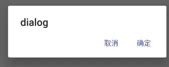
哇~ 终于改成和状态栏一个颜色了。
把最终代码粘贴出来,仅仅是改了values/styles中的主题样式:
    <style name="AppTheme" parent="Theme.AppCompat.Light.DarkActionBar">
        <!-- Customize your theme here. -->
        <item name="colorPrimary">@color/colorPrimary</item>
        <item name="colorPrimaryDark">@color/colorPrimaryDark</item>
        <item name="colorAccent">@color/colorAccent</item>
        <!--自定义AlertDialog-->
        <item name="alertDialogTheme">@style/Theme.AppCompat.Light.Dialog.Alert.Self</item>
    </style>
    <style name="Theme.AppCompat.Light.Dialog.Alert.Self"
           parent="@style/Theme.AppCompat.Light.Dialog.Alert">
        <!--修改AlertDialog按钮的颜色-->
        <item name="colorAccent">#3F51B5</item>
    </style>
</resources>
虽然,过程很复杂,但是结果确很简单。开发是非常重视结果的,但学习的时候过程的体验还是必不可少的,通过学习这个分析过程,大家可以尝试修改其它控件默认的样式啦。
原文链接:http://www.jianshu.com/p/fb671e11e455
著作权归作者所有,转载请联系作者获得授权,并标注“简书作者”。


 3459
3459

 被折叠的 条评论
为什么被折叠?
被折叠的 条评论
为什么被折叠?
 到【灌水乐园】发言


