


设置大边框的时候矩形的显示
<!DOCTYPE html>
<html lang="en">
<head>
    <meta charset="UTF-8">
    <title>绘制三角形</title>
    <style type="text/css">
        #triangle{
            display: inline-block;
            width: 100px;
            height: 100px;
            border-left: 100px solid black;
            border-right: 100px solid red;
            border-top: 100px solid orange;
            border-bottom: 100px solid blue;
        }
    </style>
</head>
<body>
    <span id="triangle"></span>
</body>
</html>
结果如下
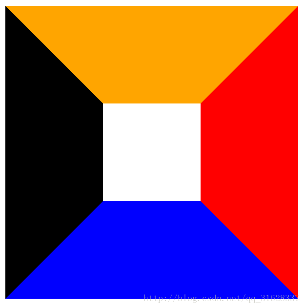
可以看到,当边框相对内容非常非常大的时候,在边框交界处会有明显交汇。
若此时将宽高改为0呢?
#triangle{
    display: inline-block;
    width: 0px;
    height: 0px;
    border-left: 100px solid black;
    border-right: 100px solid red;
    border-top: 100px solid orange;
    border-bottom: 100px solid blue;
}
结果如下
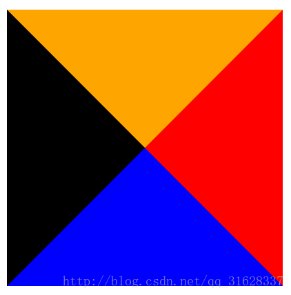
像一个正方形被分成了四个三角形!这就给用纯css写一个三角形一个提示——将左右两边的边框变成透明,选择上或者下边框留下就可以了
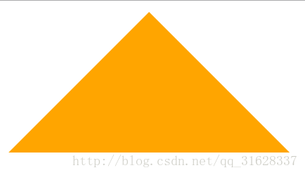
上三角
#triangle{
    display: inline-block;
    width: 0px;
    height: 0px;
    border-left: 100px solid transparent;
    border-right: 100px solid transparent;
    border-bottom: 100px solid orange;
    /*border-bottom: 100px solid blue;*/
}
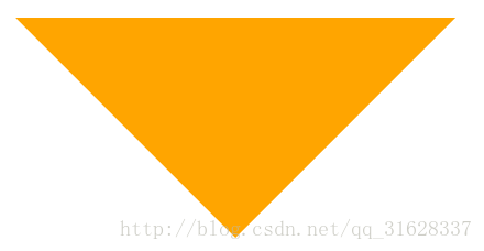
下三角
#triangle{
    display: inline-block;
    width: 0px;
    height: 0px;
    border-left: 100px solid transparent;
    border-right: 100px solid transparent;
    border-top: 100px solid orange;
    /*border-bottom: 100px solid blue;*/
}


 8832
8832

 被折叠的 条评论
为什么被折叠?
被折叠的 条评论
为什么被折叠?
 到【灌水乐园】发言


