


css布局双飞翼布局圣杯布局flex,float
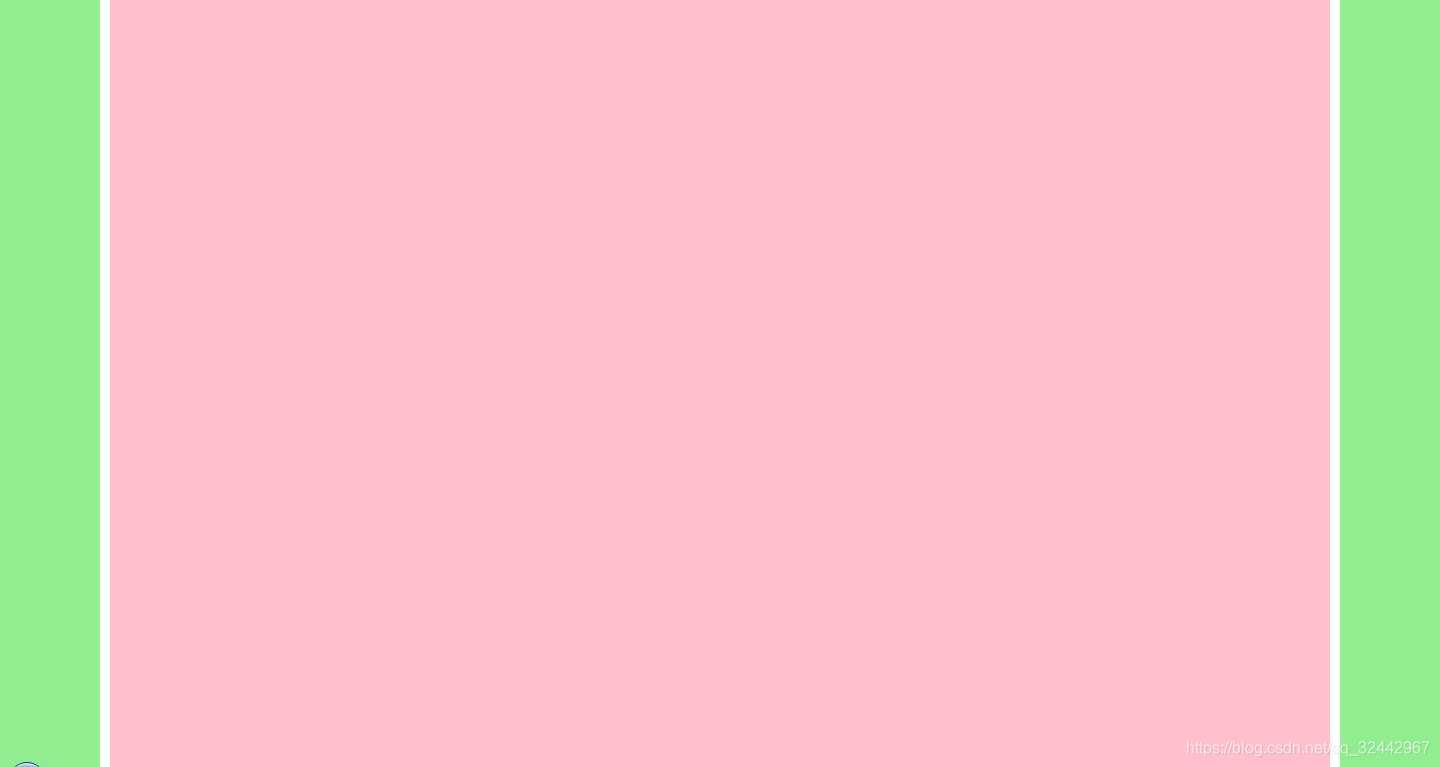
双飞翼布局 (三列布局,高度铺满,两边定宽,中间自适应)
<!DOCTYPE html>
<html lang="en">
<head>
  <meta charset="UTF-8">
  <meta name="viewport" content="width=device-width, initial-scale=1.0">
  <title>双飞翼布局 (三列布局,两边定宽,中间自适应)</title>
  <style>
    html,
    body {
      height: 100%;
      margin: 0;
    }
    .main {
      width: 100%;
      height: 100%;
      float: left;
    }
    .main .in {
      margin: 0 110px;
      background-color: pink;
      height: 100%;
    }
    .left,
    .right {
      height: 100%;
      width: 100px;
      float: left;
      background-color: lightgreen;
    }
    .left {
      margin-left: -100%;
    }
    .right {
      margin-left: -100px;
    }
  </style>
</head>

<body>
  <div class="main">
    <div class="in"></div>
  </div>
  <div class="left"></div>
  <div class="right"></div>
</body>

</html>
三栏等高布局 (高度不定,但是等高)

<!DOCTYPE html>
<html lang="en">

<head>
  <meta charset="UTF-8">
  <meta name="viewport" content="width=device-width, initial-scale=1.0">
  <title>三栏等高布局 (高度不定,但是等高)</title>
  <style>
    body {
      margin: 0;
      overflow: hidden;
    }
    ul {
      margin: 0;
      padding: 0;
      list-style: none;
    }
    .list {
      overflow: hidden;
      width: 100%;
      height: 100%;
    }
    .main {
      margin: 0 110px;
      background-color: lightgreen;
    }
    .left {
      width: 100px;
      float: left;
      background-color: pink;
    }
    .right {
      width: 100px;
      float: right;
      background-color: pink;
    }
    .main,
    .left,
    .right {
      margin-bottom: -9999px;
      padding-bottom: 9999px;
    }
  </style>
</head>

<body>
  <ul class="list">
    <li class="left">左侧文字比较少</li>
    <li class="right">
      右侧文字比较多右侧文字比较多右侧文字比较多右侧文字比较多右侧文字比较多右侧文字比较多右侧文字比较多右侧文字比较多右侧文字比较多右侧文字比较多右侧文字比较多右侧文字比较多右侧文字比较多右侧文字比较多右侧文字比较多右侧文字比较多
    </li>
    <li class="main">中间文字比较少</li>
  </ul>
</body>

</html>
圣杯布局flex

<!DOCTYPE html>
<html lang="en">

<head>
  <meta charset="UTF-8">
  <meta name="viewport" content="width=device-width, initial-scale=1.0">
  <title>圣杯布局flex</title>
</head>
<style type="text/css">
  .header,
  .footer {
    border: 1px solid #333;
    background: #ccc;
    text-align: center;
  }
  .container {
    display: flex;
  }
  .left {
    width: 200px;
    background: red;
  }
  .middle {
    flex: 1;
    background: blue;
  }
  .right {
    width: 220px;
    background: green;
  }
</style>

<body>

  <div class="header">
    header
  </div>

  <div class="container">
    <div class="left">
      <h4>left</h4>
      <p>left-content</p>
    </div>

    <div class="middle">
      <h4>middle</h4>
      <p>middle-content</p>
    </div>

    <div class="right">
      <h4>right</h4>
      <p>right-content</p>
    </div>
  </div>

  <div class="footer">
    footer
  </div>
</body>

</html>
圣杯布局float

<!DOCTYPE html>
<html lang="en">

<head>
  <meta charset="UTF-8">
  <meta name="viewport" content="width=device-width, initial-scale=1.0">
  <title>圣杯布局float</title>
</head>
<style type="text/css">
  body {
    min-width: 550px;
  }

  * {
    margin: 0;
    padding: 0;
  }

  .header,
  .footer {
    background: gray;
    width: 100%;
  }

  .footer {
    clear: both;
  }

  .main {
    height: 200px;
    padding: 0 150px 0 200px;
    background: greenyellow;
    *zoom: 1;
  }

  .left,
  .center,
  .right {
    float: left;
  }

  .center {
    width: 100%;
    height: 200px;
    background: red;
  }

  .left {
    width: 200px;
    height: 200px;
    background: yellow;
    margin-left: -100%;
    position: relative;
    left: -200px;
  }

  .right {
    width: 150px;
    height: 200px;
    background: gainsboro;
    margin-left: -150px;
    position: relative;
    left: 150px;
  }
</style>

<body>

  <div class="header">
    头部
  </div>
  <div class="main">
    <div class="center">中间中间中间中间中间中间中间后</div>
    <div class="left">左边</div>
    <div class="right">右边</div>
  </div>
  <div class="footer">
    底部
  </div>
</body>

</html>


 112
112


 被折叠的 条评论
为什么被折叠?
被折叠的 条评论
为什么被折叠?
 到【灌水乐园】发言


