


1.python绘图坐标轴不显示科学计数法
如果使用代码:ax.ticklabel_format(useOffset=False, style='plain')会报错:
AttributeError: This method only works with the ScalarFormatter.
报错原因:
该函数默认是x,y轴都不使用科学计数法,但是如果x轴是自定义时,就会报错。修改为:plt.ticklabel_format(axis="y", style='plain')
2.python设置坐标轴刻度(主、次刻度)
利用matplotlib设置坐标轴主刻度和次刻度。
(1)只显示次刻度标签位置,没有标签文本
from matplotlib.ticker import MultipleLocator, FormatStrFormatter
xmajorLocator   = MultipleLocator(a) #将x主刻度标签设置为a的倍数
xmajorFormatter = FormatStrFormatter('%1.1f') #设置x轴标签文本的格式
xminorLocator   = MultipleLocator(n) #将x轴次刻度标签设置为n的倍数

ax.xaxis.set_minor_locator(xminorLocator)
达到的效果:

(2)设置主刻度线属性(direction,width,length,color)
ax.tick_params(direction='out', length=6, width=2, colors='r',
               grid_color='r', grid_alpha=0.5)

(3)设置次刻度属性
plt.rcParams['xtick.direction'] = 'in'
ax.tick_params(axis='x',direction='in', length=6, width=1,colors='k')
注意顺序不要颠倒!
最终达到想要的效果:

参考链接:
python-----设置标题、轴标签、刻度标签(ticker部分)
3.Python 双y轴绘制
利用Python中matplotlib绘制双y轴图。
关键函数:Axes.twinx()
测试代码:
import numpy as np
import matplotlib.pyplot as plt

# Create some mock data
t = np.arange(0.01, 10.0, 0.01)
data1 = np.exp(t)
data2 = np.sin(2 * np.pi * t)

fig, ax1 = plt.subplots()

color = 'tab:red'
ax1.set_xlabel('time (s)')
ax1.set_ylabel('exp', color=color)
ax1.plot(t, data1, color=color)
ax1.tick_params(axis='y', labelcolor=color)

ax2 = ax1.twinx()  # instantiate a second axes that shares the same x-axis

color = 'tab:blue'
ax2.set_ylabel('sin', color=color)  # we already handled the x-label with ax1
ax2.plot(t, data2, color=color)
ax2.tick_params(axis='y', labelcolor=color)

fig.tight_layout()  # otherwise the right y-label is slightly clipped
plt.show()
参考:https://www.cnblogs.com/Atanisi/p/8530693.html
Plots with different scales:https://matplotlib.org/stable/gallery/subplots_axes_and_figures/two_scales.html#sphx-glr-gallery-subplots-axes-and-figures-two-scales-py
4.python不显示图片,直接保存
添加包:
import matplotlib
matplotlib.use('Agg')

#将plt.show注释
#plt.show()
plt.savefig('1.png')
当又想重新显示图片了,需要重新设置:
import matplotlib
matplotlib.use('qt5Agg')
5.python图中图
代码:
#figure的百分比,从figure 10%的位置开始绘制, 宽高是figure的80%
left, bottom, width, height = 0.1, 0.1, 0.8, 0.8
#获得绘制的句柄
ax1 = fig.add_axes([left, bottom, width, height])
ax1.plot(x, y, ‘r’)
ax1.set_title(‘area1’)
#新增区域ax2,嵌套在ax1内
left, bottom, width, height = 0.2, 0.6, 0.25, 0.25
#获得绘制的句柄
ax2 = fig.add_axes([left, bottom, width, height])
ax2.plot(x,y, ‘b’)
ax2.set_title(‘area2’)
plt.show()
关键函数:fig.add_axes(rect, projection=None, polar=False, **kwargs)
参数:rect 是位置参数,接受一个4元素的浮点数列表, [left, bottom, width, height] ,它定义了要添加到figure中的矩形子区域的:左下角坐标(x, y)、宽度、高度。
https://blog.csdn.net/sinat_32570141/article/details/103212755
6.plt.plot参数
颜色:https://blog.csdn.net/lly1122334/article/details/105556963
常用颜色:
character        color
=============    ===============================
``'b'``          blue 蓝
``'g'``          green 绿
``'r'``          red 红
``'c'``          cyan 蓝绿
``'m'``          magenta 洋红
``'y'``          yellow 黄
``'k'``          black 黑
``'w'``          white 白
=============    ===============================
点型参数:marker=’+’
character        description
=============    ===============================
``'.'``          point marker
``','``          pixel marker
``'o'``          circle marker
``'v'``          triangle_down marker
``'^'``          triangle_up marker
``'<'``          triangle_left marker
``'>'``          triangle_right marker
``'1'``          tri_down marker
``'2'``          tri_up marker
``'3'``          tri_left marker
``'4'``          tri_right marker
``'s'``          square marker
``'p'``          pentagon marker
``'*'``          star marker
``'h'``          hexagon1 marker
``'H'``          hexagon2 marker
``'+'``          plus marker
``'x'``          x marker
``'D'``          diamond marker
``'d'``          thin_diamond marker
``'|'``          vline marker
``'_'``          hline marker
=============    ===============================
线性参数:linestyle=’-’
character description
============= ===============================
'-'solid line style 实线
'--'dashed line style 虚线
'-.'dash-dot line style 点画线
':'dotted line style 点线
============= ===============================
7.绘制多Y轴图像
参考链接:https://www.cnblogs.com/Big-Big-Watermelon/p/14051994.html
8.python绘制浮动区间
plt.fill_between(x, y1, y2, facecolor=“yellow”)
https://blog.csdn.net/zxxr123/article/details/104109416
9.python绘制置信区间
利用origin生成置信区间,如图:
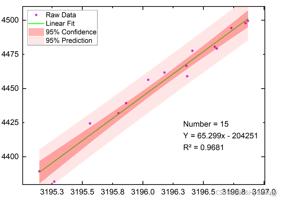
现在想利用python生成置信区间:
参考链接:https://www.cnblogs.com/cheflone/p/13290595.html
置信区间是用来描述真实均值发生在某个范围的概率。
置信区间计算公式:
ci = mean±stdN(ppf)( (1-α)/2 )
- N(ppf): 表示正态分布的百分点函数;
- α : 是显著性水平
- α的取值跟样本量有关
ci = mean-se1.64 置信水平为0.9
ci = mean-se1.98 置信水平为0.95
ci = mean-se*2.32 置信水平为0.99
实现方法:
(1)直接调用sns.regplot()函数
#绘制置信区95%(ci = mean-se1.98)
sns.regplot(x = xdata,
            y = ydata,
            ci=95,color="g")
(2)根据置信区原理自己绘图
10.python图上添加公式
https://matplotlib.org/2.0.2/users/mathtext.html
如:ax.text(2, 6, r'an equation: $E=mc^2$', fontsize=15)


 1328
1328

 被折叠的 条评论
为什么被折叠?
被折叠的 条评论
为什么被折叠?
 到【灌水乐园】发言


