


1 简介
flex 是css3 中一种新的布局模式,可以简单、完整、响应式地实现各种页面布局,非常适合移动端页面开发,使用flex布局来应对页面需要适应不同屏幕大小以及各种设备类型等问题,而且目前是市面上几乎所有浏览器都支持flex 布局,尤其是在移动端。

2 开启flex布局
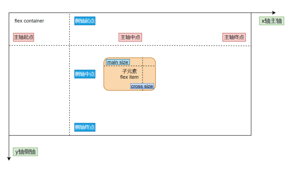
将元素的 display 属性设置为 flex,即可开启 flex 布局;
注意:开启弹性布局后,子项的 float 、clear 和vertical-align 属性将失效;
.container {
    display: flex;
}
3 容器属性
.container {
	/*01 主轴方向:从左到右(默认) | 从右到左 | 从上到下 | 从下到上*/
	flex-direction: row | row-reverse | column | column-reverse;

	/*02 换行:不换行(默认) | 换行 | 换行并且第一行在下方*/
	flex-wrap: nowrap | wrap | wrap-reverse;

	/*03 主轴方向和换行简写方式*/
	flex-flow: {flex-direction} {flex-wrap};

	/*04 主轴对齐方式: 靠左对齐(默认) | 靠右对齐 | 居中对齐 | 两端对齐 | 平均分布*/
	justify-content: flex-start | flex-end | center | space-between | space-around;

	/*05 交叉轴对齐方式: 顶部对齐(默认) | 底部对齐 | 居中对齐 | 上下对齐并铺满 | 文本基线对齐*/
	align-items:  flex-start | flex-end | center | baseline | stretch;

	/*06 多主轴对齐方式: 顶部对齐(默认) | 底部对齐 | 居中对齐 | 上下对齐并铺满 | 上下平均分布*/
	align-content: flex-start | flex-end | center | space-between | space-around | stretch;
}
3.1 flex-direction -- 主轴方向对齐
flex-direction 属性决定主轴的方向,从而决定子元素在容器中的位置,共有四个值可选
flex-direction: row | row-reverse | column | column-reverse;<!DOCTYPE html>
<html lang="en">
<head>
<meta charset="UTF-8">
<meta name="viewport" content="width=device-width,initial-scale=1,maximum-scale=1">
<meta http-equiv="X-UA-Compatible" content="IE=EDGE">
<title>flex学习</title>
<style>
.container {
display: flex;
flex-direction: column;
width: 500px;
height: 150px;
margin: 20px auto;
background-color: #ccc;
}
.item {
width: 100px;
height: 30px;
margin-right: 10px;
margin-top: 10px;
background-color: skyblue;
}
</style>
</head>
<body>
<div class="container">
<div class="item">1</div>
<div class="item">2</div>
<div class="item">3</div>
</div>
</body>
</html>(1)flex-direction:row;
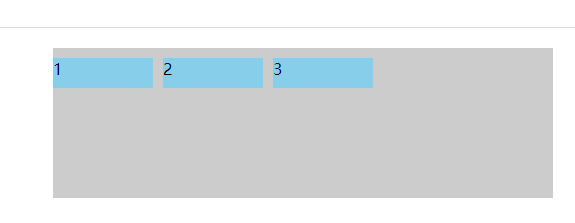
(2)flex-direction:row-reverse;
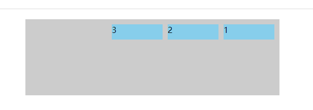
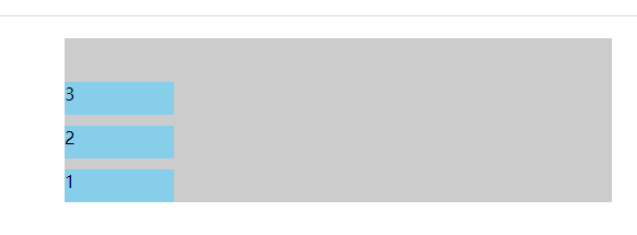
(3)flex-direction: column;
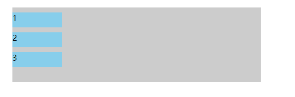
(4)flex-direction: column-reverse;
3.2 flex-wrap -- 换行
flex-wrap 属性用于指定弹性布局中子项是否换行,默认不换行,共有三个值可以选
flex-wrap: nowrap | wrap | wrap-reverse;注:使用该属性,需要为弹性容器添加固定宽度, 当弹性容器宽度超过子项宽度总和时, 值设为 wrap 或 wrap-reverse 均不起效果 ;
<!DOCTYPE html>
<html lang="en">
<head>
<meta charset="UTF-8">
<meta name="viewport" content="width=device-width,initial-scale=1,maximum-scale=1">
<meta http-equiv="X-UA-Compatible" content="IE=EDGE">
<title>flex学习</title>
<style>
.container {
display: flex;
flex-wrap: wrap;
width: 500px;
height: 150px;
margin: 20px auto;
background-color: #ccc;
}
.item {
width: 100px;
height: 30px;
margin-right: 10px;
margin-top: 10px;
background-color: skyblue;
}
</style>
</head>
<body>
<div class="container">
<div class="item">1</div>
<div class="item">2</div>
<div class="item">3</div>
<div class="item">4</div>
<div class="item">5</div>
<div class="item">6</div>
<div class="item">7</div>
</div>
</body>
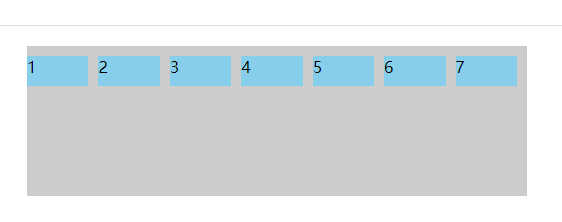
</html>(1)flex-wrap: nowrap;
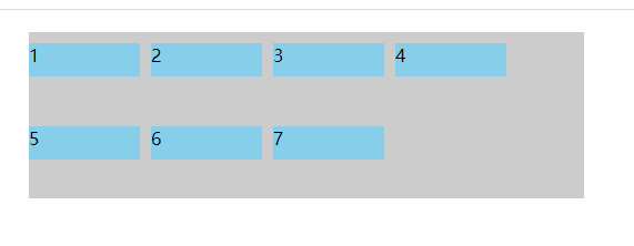
(2)flex-wrap: wrap;
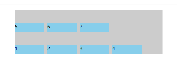
(3) flex-wrap: wrap-reverse;
3.3 flex-flow -- 主轴方向和换行简写
flex-flow 属性是 flex-direction 属性和 flex-wrap 属性的简写形式,默认值为 row nowrap;
flex-flow: {flex-direction} {flex-wrap};
flex-flow: row nowrap;
flex-flow: row wrap;
flex-flow: row wrap-reverse;
flex-flow: column nowrap;
flex-flow: column wrap;
flex-flow: column wrap-reverse;
3.4 justify-content -- 主轴对齐方式
justify-content 属性定义了子项在 主轴(水平方向x轴)上的对齐方式,可选值有:
justify-content: flex-start | flex-end | center | space-between | space-around;<!DOCTYPE html>
<html lang="en">
<head>
<meta charset="UTF-8">
<meta name="viewport" content="width=device-width,initial-scale=1,maximum-scale=1">
<meta http-equiv="X-UA-Compatible" content="IE=EDGE">
<title>flex学习</title>
<style>
.container {
display: flex;
justify-content: flex-start;
width: 500px;
height: 150px;
margin: 20px auto;
background-color: #ccc;
}
.item {
width: 100px;
height: 30px;
margin-right: 10px;
margin-top: 10px;
background-color: skyblue;
}
</style>
</head>
<body>
<div class="container">
<div class="item">1</div>
<div class="item">2</div>
<div class="item">3</div>
</div>
</body>
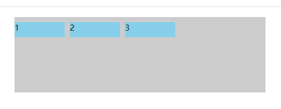
</html>(1) justify-content: flex-start;
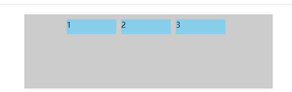
(2) justify-content: flex-end;
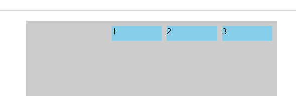
(3) justify-content: center;
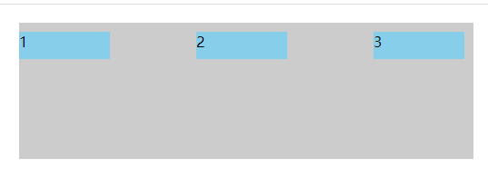
(4) justify-content: space-between;
(5)justify-content: space-around;
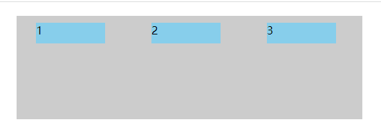
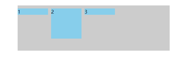
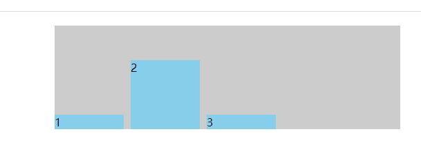
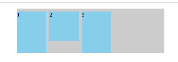
3.5 align-items -- 交叉轴对齐方式
align-items 属性定义弹性容器子项在交叉轴(垂直方向)上的对齐方式,可选值:
align-items: flex-start | flex-end | center | baseline | stretch;<!DOCTYPE html>
<html lang="en">
<head>
<meta charset="UTF-8">
<meta name="viewport" content="width=device-width,initial-scale=1,maximum-scale=1">
<meta http-equiv="X-UA-Compatible" content="IE=EDGE">
<title>flex学习</title>
<style>
.container {
display: flex;
align-items: stretch;
width: 500px;
height: 150px;
margin: 20px auto;
background-color: #ccc;
}
.item {
width: 100px;
/*height: 30px;*/
margin-right: 10px;
margin-top: 10px;
background-color: skyblue;
}
.item:nth-of-type(2) {
height: 100px;
}
</style>
</head>
<body>
<div class="container">
<div class="item">1</div>
<div class="item">2</div>
<div class="item">3</div>
</div>
</body>
</html>(1)align-items: flex-start;
(2)align-items: flex-end;
(3)align-items: center;
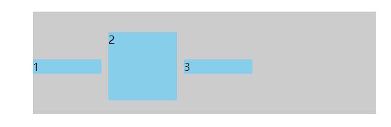
(4)align-items: baseline;
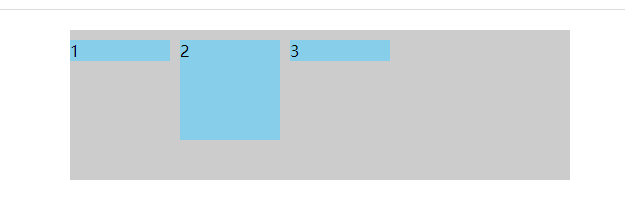
(5)align-items: stretch;
3.6 align-content -- 多主轴对齐方式
align-content 属性定义了多根轴线的对齐方式,简单说就是盒子内部的元素超过了盒子项的宽度(默认)出现了换行,也就是有多行才可以,可选值:
align-content: flex-start | flex-end | center | space-between | space-around | stretch;<!DOCTYPE html>
<html lang="en">
<head>
<meta charset="UTF-8">
<meta name="viewport" content="width=device-width,initial-scale=1,maximum-scale=1">
<meta http-equiv="X-UA-Compatible" content="IE=EDGE">
<title>flex学习</title>
<style>
.container {
display: flex;
flex-wrap: wrap;
align-content: stretch;
width: 500px;
height: 240px;
margin: 20px auto;
background-color: #ccc;
}
.item {
width: 80px;
height: 80px;
margin-right: 10px;
margin-top: 10px;
background-color: skyblue;
}
</style>
</head>
<body>
<div class="container">
<div class="item">1</div>
<div class="item">2</div>
<div class="item">3</div>
<div class="item">4</div>
<div class="item">5</div>
<div class="item">6</div>
<div class="item">7</div>
<div class="item">8</div>
<div class="item">9</div>
</div>
</body>
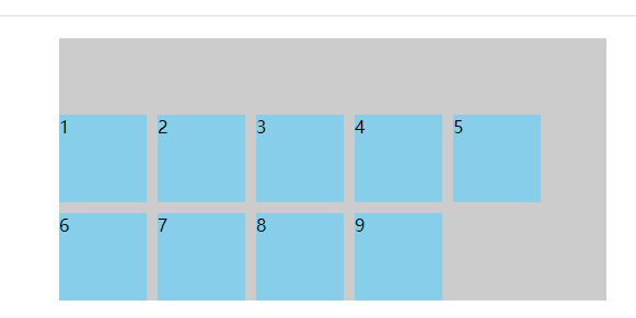
</html>(1)align-content: stretch;(默认)
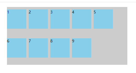
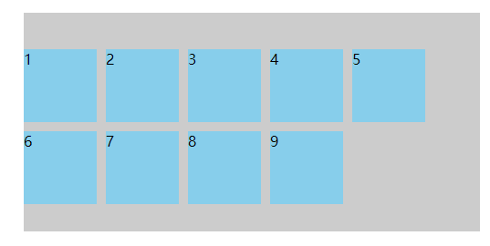
(2)align-content: flex-start;
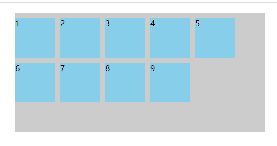
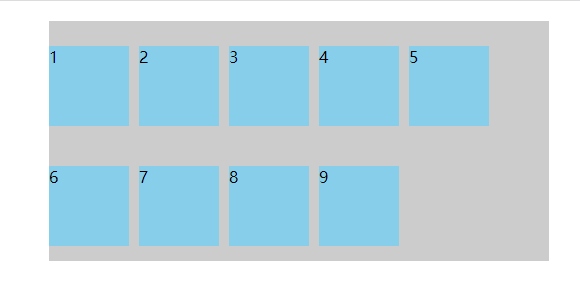
(3)align-content: flex-end;
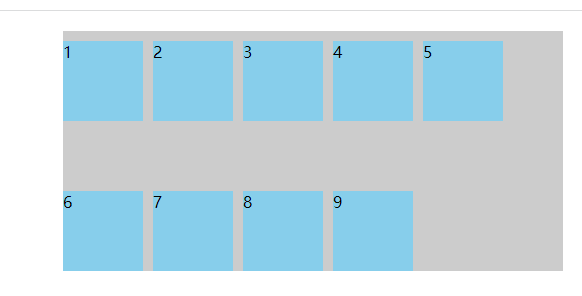
(4)align-content: center;
(5)align-content: space-between;
(6)align-content: space-around;


 4万+
4万+


 被折叠的 条评论
为什么被折叠?
被折叠的 条评论
为什么被折叠?
 到【灌水乐园】发言


