


(1). 前言
传统的布局方案,基于css盒子模型,float+display+position,TA对于很多特殊布局方案就非常不方便,必须垂直居中,
举例方案1(宽高度已知,ie9+))
    <style>
    	.outer{
    		border: 1px solid red;
    		width: 500px;
    		height: 500px;
    		position: absolute;
    		margin: auto; /*必须*/
    		left: 0;
    		top: 0;
    		right: 0;
    		bottom: 0;
    	}
    </style>
    <body>
    <div class="outer"></div>
    </body>
举例方案2(自适应高度)
外部容器需要定义宽度,内容由内部容器高度决定,自适应高
    <style>
    	.outer{
    		border: 1px solid red;
    		width: 500px;
    		position: absolute;
    		left: 50%;/*先平移50%*/
    		top: 50%;
    		/*平移回来元素宽高的一半*/
    		transform: translate(-50%,-50%);
    	}
    	.inner{
    		height: 200px;
    	}
    </style>
    <body>
    <div class="outer">
    	<div class="inner"></div>
    </div>
    </body>
Flex 是 Flexible Box 的缩写,意为"弹性布局",用来为盒状模型提供最大的灵活性。
任何元素都可以设置为flex
    /* 块级元素*/
    div{
      display: -webkit-flex; /* Safari兼容方案 */
      display: flex;
    }
    /* 行内元素*/
    span{
     display: inline-flex;
    }
(2). 兼容性
参考此链接: 兼容性链接
2009年,W3C 提出了一种新的方案----Flex 布局(弹性盒子模型),可以简便、完整、响应式地实现各种页面布局。
到目前为止,在PC端其实很乐观了,基本上主流的浏览器都已经兼容了flex的使用,但是到了移动端就不是那么好了,特别是国内浏览器,考虑到uc浏览器占了大头,但是uc从图中看到只兼容flex最老的一个版本,也就是2009年的版本,即display:box;很多现在flex的优秀特性到了它上面都不兼容了,所以建议大家在使用的时候,假如2009版本可以满足开发要求的话,还是去使用2009版本,这样风险更小。
但是假如想兼容多个浏览器,可以采用优雅降级的方式来使用,这里推荐一个scss的sass-flex-mixin,这样就可以使用最新的写法,并且兼容大部分浏览器了。
(3)基本概念
flex布局元素称为Flex容器(flex container),简称容器。他的所有子元素自动称为容器成员,称为Flex项目(flex item),简称项目。
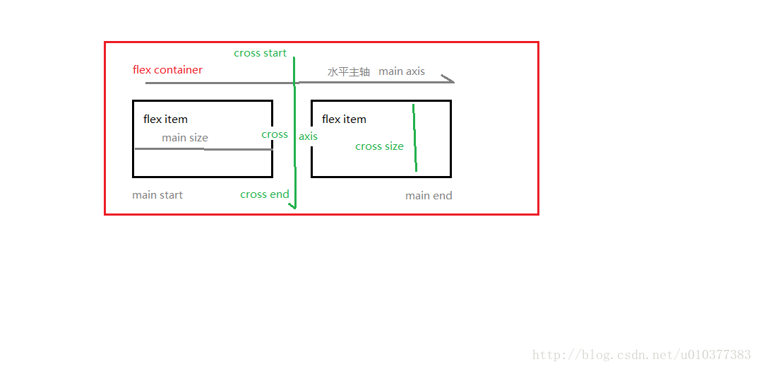
容器分为两根轴:水平主轴(main axis)和垂直的交叉轴(cross axis)。轴开始和结束分别以轴名+start或end标识。
项目默认沿着主轴排列。单个项目占据的主轴空间叫做main size,占据的交叉空间叫做cross size。
设置flex布局后的项目会变为inline-block
(4) 容器属性
常用属性:
flex-direction(主轴方向。默认row)
flex-wrap(项目在容器轴线排不下是否换行。 默认nowrap)
flex-flow(是前两个属性的缩写。 默认值为row nowrap)
justify-content(项目在容器主轴上对齐方式。默认flex-start)
align-items(项目在交叉轴上如何对齐。默认flex-start)
align-content(多根轴线的对齐方式。默认flex-start)
4.1 flex-direction属性
flex-direction属性决定主轴的方向(即项目的排列方向)。
TA的常用值为
row(默认值): 主轴水平方向,起点为左端。
row-reverse: 主轴水平方向,起点为右端。
column: 主轴垂直方向,起点为上方。
column-reverse: 主轴垂直方向,起点为下方。
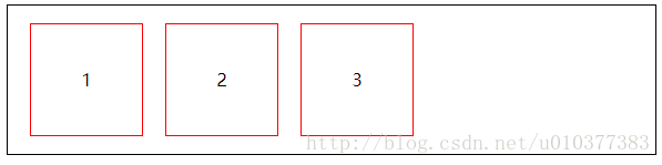
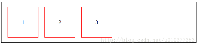
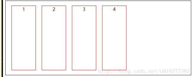
例子1(row)
<style>
    	div{
    		display: flex;
    		border: 1px solid #000;
    		flex-direction: row;
    	}
    	p{
    		border: 1px solid red;
    		width: 100px;
    		height: 100px;
    		line-height: 100px;
    		text-align: center;
    		margin-left: 20px;
    	}
    </style>
    <body>
    <div>
    	<p>1</p>
    	<p>2</p>
    	<p>3</p>
    </div>
    </body>
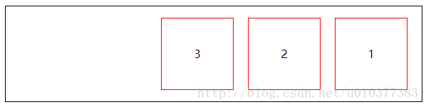
例子2(row-reverse)
    <style>
    	div{
    		display: flex;
    		border: 1px solid #000;
    		flex-direction: row-reverse;
    	}
    	p{
    		border: 1px solid red;
    		width: 100px;
    		height: 100px;
    		line-height: 100px;
    		text-align: center;
    		margin-right: 20px;
    	}
    </style>
    <body>
    <div>
    	<p>1</p>
    	<p>2</p>
    	<p>3</p>
    </div>
    </body>
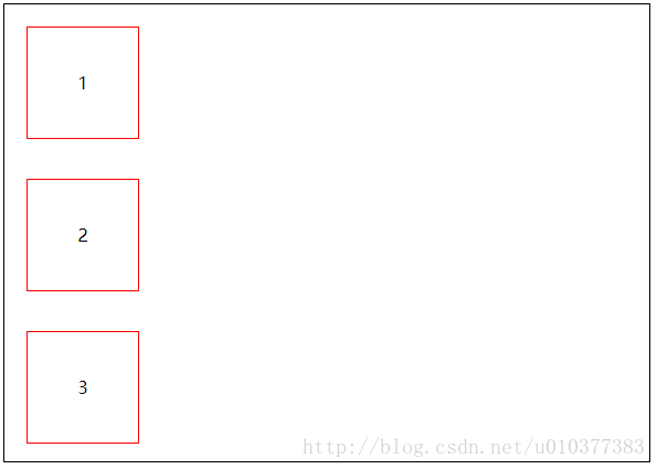
例子3(column)
<style>
    	div{
    		display: flex;
    		border: 1px solid #000;
    		flex-direction: column;
    	}
    	p{
    		border: 1px solid red;
    		width: 100px;
    		height: 100px;
    		line-height: 100px;
    		text-align: center;
    		margin-top: 20px;
    		margin-left: 20px;
    	}
    </style>
    <body>
    <div>
    	<p>1</p>
    	<p>2</p>
    	<p>3</p>
    </div>
    </body>
PS:剩下column-reverse为反转column。这里就不再举例。
4.2 flex-wrap属性
默认情况下,项目都排在一条线(又称"轴线")上。flex-wrap属性定义,如果一条轴线排不下,如何换行。
TA的常用值为
nowrap(默认值): 不换行。
wrap: 换行,第一行在上方。
wrap-reverse: 换行,第一行在下方。
例子1(nowrap)
依然用上面的代码, 多增加几个项目p
    <style>
    	div{
    		display: flex;
    		border: 1px solid #000;
    		flex-direction: row;
    		flex-wrap: nowrap;
    	}
    	p{
    		border: 1px solid red;
    		width: 100px;
    		height: 100px;
    		line-height: 100px;
    		text-align: center;
    		margin-left: 20px;
    	}
    </style>
    <body>
    <div>
    	<p>1</p>
    	<p>2</p>
    	<p>3</p>
    	<p>4</p>
    	<p>5</p>
    	<p>6</p>
    	<p>7</p>
    	<p>8</p>
    </div>
    </body>
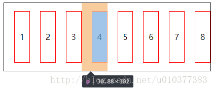
PS
上面布局我们可以看到, 容器为水平主轴, 项目本来是100px的宽度, 但是因为不换行(可以通过调整浏览器宽度), 导致项目本身发生等比缩小(如果传统浮动会发生类似换行效果)。
例子2(wrap)
    <style>
    	div{
    		display: flex;
    		border: 1px solid #000;
    		flex-direction: row;
    		flex-wrap: wrap;
    	}
    	p{
    		border: 1px solid red;
    		width: 100px;
    		height: 100px;
    		line-height: 100px;
    		text-align: center;
    		margin-left: 20px;
    	}
    </style>
    <body>
    <div>
    	<p>1</p>
    	<p>2</p>
    	<p>3</p>
    	<p>4</p>
    	<p>5</p>
    	<p>6</p>
    	<p>7</p>
    	<p>8</p>
    </div>
    </body>
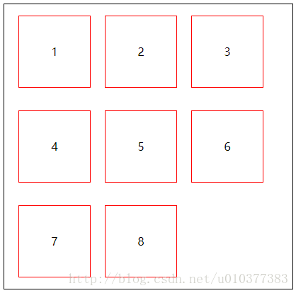
PS
上面布局我们可以看到, 因为换行, 当水平方向放不下下一个项目就会发生换行, 类似浮动(第一行在上方)。
例子3(wrap-reverse)
我们将上方代码flex-wrap修改
    <style>
    	div{
    		display: flex;
    		border: 1px solid #000;
    		flex-direction: row;
    		flex-wrap: wrap-reverse;
    	}
    	p{
    		border: 1px solid red;
    		width: 100px;
    		height: 100px;
    		line-height: 100px;
    		text-align: center;
    		margin-left: 20px;
    	}
    </style>
    <body>
    <div>
    	<p>1</p>
    	<p>2</p>
    	<p>3</p>
    	<p>4</p>
    	<p>5</p>
    	<p>6</p>
    	<p>7</p>
    	<p>8</p>
    </div>
    </body>
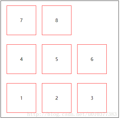
总结
与wrap不同之处在于, 第一行排列在下方。
4.3 flex-flow属性
flex-flow属性是flex-direction属性和flex-wrap属性的简写形式,默认值为row nowrap
    div {
      flex-flow: <flex-direction> || <flex-wrap>;
    }
4.4 justify-content属性
justify-content属性定义了项目在主轴上的对齐方式。
TA的常用值为
flex-start(默认值): 左对齐。
flex-end: 右对齐。
center: 居中。
space-between: 两端对齐, 项目之间间隔相等。
space-around: 每个项目两侧的间隔相等。所以,项目之间的间隔比项目与边框的间隔大一倍。
例子
    <style>
    	div{
    		display: flex;
    		border: 1px solid #000;
    		justify-content: flex-start; /*此处修改成不同值*/
    	}
    	p{
    		border: 1px solid red;
    		width: 100px;
    		height: 100px;
    		line-height: 100px;
    		text-align: center;
    		margin-left: 20px;
    	}
    </style>
    <body>
    <div>
    	<p>1</p>
    	<p>2</p>
    	<p>3</p>
    </div>
    </body>
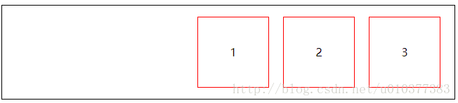
flex-start
flex-end
PS
这里是容器内项目与主轴对齐方式。要区别下当flex-direction: row-reverse(这里会反转项目顺序);而此处顺序是正常的。
center
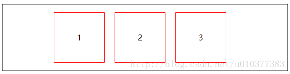
PS 对于传统布局,这种居中方式和flex的居中,是不是觉得好比飞机与步枪的区别。
space-between
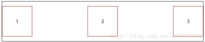
PS
此处多用于处理两端对齐, 配合align-item让项目居中。
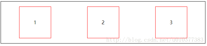
space-around
4.5 align-items属性
align-items属性定义项目在交叉轴上如何对齐。
TA的常用值为
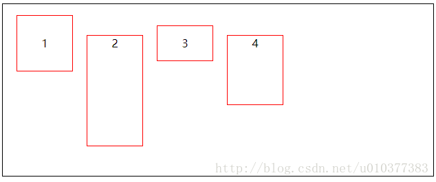
flex-start(默认值): 与交叉轴的起点对齐。
flex-end: 与交叉轴的终点对齐。
center: 与交叉轴的中点对齐。
baseline: 项目的第一行文字的基线对齐。
stretch(默认值):如果项目未设置高度或设为auto,将占满整个容器的高度。
例子
    <style>
    	div{
    		display: flex;
    		border: 1px solid #000;
    		height: 250px;
    		align-items: flex-start;
    	}
    	p{
    		border: 1px solid red;
    		width: 80px;
    		text-align: center;
    		margin-left: 20px;
    	}
    	p:nth-child(1){
    		height: 80px;
    	}
    	p:nth-child(2){
    		height: 160px;
    	}
    	p:nth-child(3){
    		height: 50px;
    	}
    	p:nth-child(4){
    		height: 100px;
    	}
    </style>
    <body>
    <div>
    	<p>1</p>
    	<p>2</p>
    	<p>3</p>
    	<p>4</p>
    </div>
    </body>
flex-start
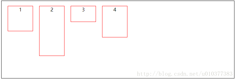
flex-start
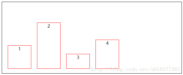
center
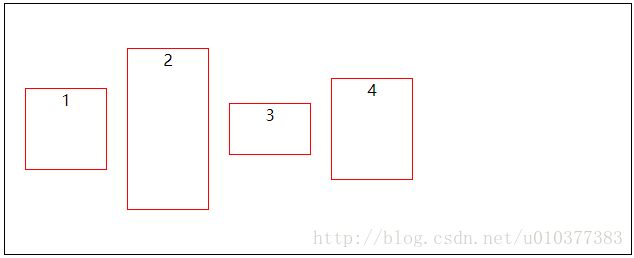
baseline
为了测试分别为上面代码增加
    p:nth-child(1){
    		height: 80px;
    		line-height: 80px; /*增加行高*/
    	}
    	p:nth-child(2){
    		height: 160px;
    	}
    	p:nth-child(3){
    		height: 50px;
    		line-height: 50px; /*增加行高*/
    	}
    	p:nth-child(4){
    		height: 100px;
    	}
PS
上面图可以看出, 项目基于第一行文字的基线对齐对齐。
stretch
去除项目的height。代码如下
    <style>
    	div{
    		display: flex;
    		border: 1px solid #000;
    		height: 250px;
    		align-items: stretch;
    	}
    	p{
    		border: 1px solid red;
    		width: 80px;
    		text-align: center;
    		margin-left: 20px;
    	}
    </style>
    <body>
    <div>
    	<p>1</p>
    	<p>2</p>
    	<p>3</p>
    	<p>4</p>
    </div>
    </body>
PS
从上图可以看出,当项目高度未设置或auto时,stretch会充满容器。
4.5 align-content 属性
align-content属性定义了多根轴线的对齐方式。如果项目只有一根轴线,该属性不起作用。
TA的常用值为
flex-start(默认值): 与交叉轴的起点对齐。
flex-end: 与交叉轴的终点对齐。
center: 与交叉轴的中点对齐。
space-between: 与交叉轴两端对齐,轴线之间的间隔平均分布。
space-around: 每根轴线两侧的间隔都相等。所以,轴线之间的间隔比轴线与边框的间隔大一倍。
stretch(默认值):轴线占满整个交叉轴。
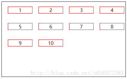
例子
    <style>
    	div{
    		display: flex;
    		border: 1px solid #000;
    		height: 250px;
    		align-items: flex-start;
    		flex-wrap: wrap;
    		align-content: flex-start;
    	}
    	p{
    		border: 1px solid red;
    		width: 80px;
    		text-align: center;
    		margin-left: 20px;
    	}
    </style>
    <body>
    <div>
    	<p>1</p>
    	<p>2</p>
    	<p>3</p>
    	<p>4</p>
    	<p>5</p>
    	<p>6</p>
    	<p>7</p>
    	<p>8</p>
    	<p>9</p>
    	<p>10</p>
    </div>
    </body>
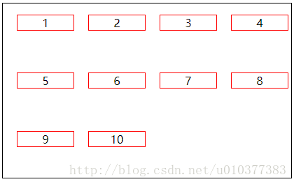
flex-start
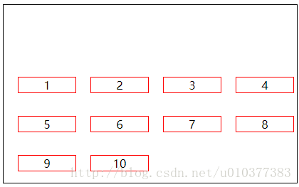
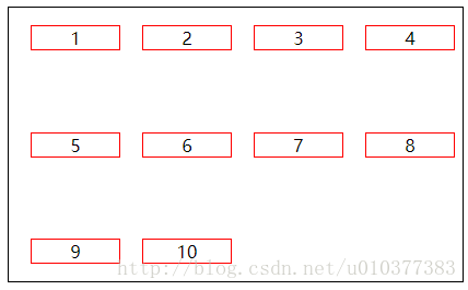
flex-end
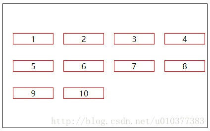
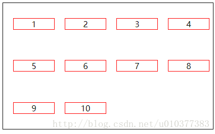
center
stretch
space-between
PS
从上图可以看出,与交叉轴两端对齐,但是轴线之间的间隔是平均分布。
space-around
PS
从上图可以看出,因为每根轴线两侧的间隔都相等。所以,轴线之间的间隔比轴线与边框的间隔大一倍。
项目属性:
- flex-shrink
- flex-group
- flex-basis
- order
- align-self
1. flex布局中,项目属性用的最多的是flex这个复合属性。其次为align-item和order
flex属性定义 子项目分配剩余空间,用flex来表示占多少份数。
.item {
	flex: <number>; /* default 0 */
}
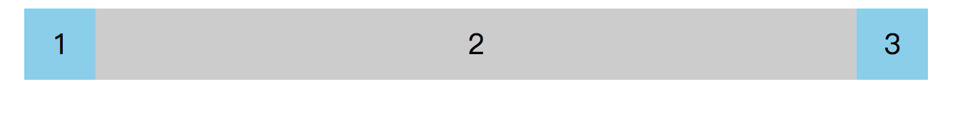
例1:两边固定大小,中间自适应
<!DOCTYPE html>
<html lang="en">
<head>
    <meta charset="UTF-8">
    <title>Title</title>
    <style>
        .box {
            display: flex;
            width: 50%;
            margin: auto;
            background: #ccc;
            height: 50px;
            text-align: center;
            line-height: 50px;
        }

        .box div:nth-child(1) {
            width: 50px;
            background: skyblue;
        }

        .box div:nth-child(3) {
            width: 50px;
            background: skyblue;
        }
        .box div:nth-child(2) {
            flex: 1;
        }
    </style>
</head>
<body>
<div class="box">
    <div>1</div>
    <div>2</div>
    <div>3</div>
</div>
</body>
</html>
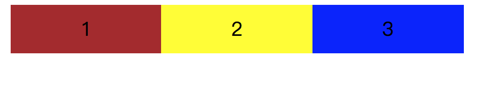
例2:三个div在一个大的div里均匀大小且自适应:
<!DOCTYPE html>
<html lang="en">
<head>
    <meta charset="UTF-8">
    <title>Title</title>
    <style>
        .box {
            display: flex;
            width: 50%;
            margin: auto;
            background: #ccc;
            height: 50px;
            text-align: center;
            line-height: 50px;
        }
        .box div {
            flex: 1;
        }

        /*.box div:nth-child(1) {*/
            /*width: 50px;*/
            /*background: skyblue;*/
        /*}*/

        /*.box div:nth-child(3) {*/
            /*width: 50px;*/
            /*background: skyblue;*/
        /*}*/
        /*.box div:nth-child(2) {*/
            /*flex: 1;*/
        /*}*/
    </style>
</head>
<body>
<div class="box">
    <div style="background: brown;">1</div>
    <div style="background: yellow;">2</div>
    <div style="background: blue;">3</div>
</div>
</body>
</html>
2. align-self控制子项自己在侧轴上的排列方式:
align-self属性允许单个项目有与其他项目不一样的对齐方式,可覆盖align-items属性。默认值为auto,表示继承父元素的align-items的属性,如果没有父元素,则等同于stretch。
	span: nth-child(2) {
		/*设置自己在侧轴上的排列方式*/
		align-self: flex-end;
	}
3. order:更优雅地调整元素顺序
    #container > div:first-child {
      order: 2;
    }
    #container > div:nth-child(2) {
      order: 4;
    }
    #container > div:nth-child(3) {
      order: 1;
    }
    #container > div:nth-child(4) {
      order: 3;
    }
order:可设置元素之间的排列顺序
- 数值越小,越靠前,默认为0
- 值相同时,以dom中元素排列为准
下面是原理讲解:容易懵逼
一、元素如何弹性伸缩应对
当flex-wrap: nowrap;不折行时,容器宽度有剩余/不够分,弹性元素们该怎么“弹性”地伸缩应对?
这里针对上面两种场景,引入两个属性(需应用在弹性元素上)
flex-shrink:缩小比例(容器宽度<元素总宽度时如何收缩)flex-grow:放大比例(容器宽度>元素总宽度时如何伸展)
1. flex-shrink: 缩小比例
来看下以下场景,弹性容器#container宽度是200px,一共有三个弹性元素,宽度分别是50px、100px、120px。在不折行的情况下,此时容器宽度是明显不够分配的。
实际上,flex-shrink默认为1,也就是当不够分配时,元素都将等比例缩小,占满整个宽度,如下图。
    #container {
      display: flex;
      flex-wrap: nowrap;
    }
元素收缩的计算方法
真的是等比缩小(每个元素各减去70/3的宽度)吗?这里稍微深究一下它的收缩计算方法。
- 弹性元素1:50px→37.03px
- 弹性元素2:100px→74.08px
- 弹性元素3:120px→88.89px
先抛结论:flex-shrink: 1并非严格等比缩小,它还会考虑弹性元素本身的大小。
- 容器剩余宽度:
-70px - 缩小因子的分母:
1*50 + 1*100 + 1*120 = 270(1为各元素flex-shrink的值) - 元素1的缩小因子:
1*50/270 - 元素1的缩小宽度为缩小因子乘于容器剩余宽度:
1*50/270 * (-70) - 元素1最后则缩小为:
50px + (1*50/270 *(-70)) = 37.03px
加入弹性元素本身大小作为计算方法的考虑因素,主要是为了避免将一些本身宽度较小的元素在收缩之后宽度变为0的情况出现。
2. flex-grow: 放大比例
同样,弹性容器#container宽度是200px,但此时只有两个弹性元素,宽度分别是50px、100px。此时容器宽度是有剩余的。
那么剩余的宽度该怎样分配?而flex-grow则决定了要不要分配以及各个分配多少。
(1)在flex布局中,容器剩余宽度默认是不进行分配的,也就是所有弹性元素的flex-grow都为0。
(2)通过指定flex-grow为大于零的值,实现容器剩余宽度的分配比例设置。
元素放大的计算方法
放大的计算方法并没有与缩小一样,将元素大小纳入考虑。
仅仅按flex-grow声明的份数算出每个需分配多少,叠加到原来的尺寸上。
- 容器剩余宽度:
50px - 分成每份:
50px / (3+2) = 10px - 元素1放大为:
50px + 3 * 10 = 80px
无多余宽度时,flex-grow无效
下图中,弹性容器的宽度正好等于元素宽度总和,无多余宽度,此时无论flex-grow是什么值都不会生效。
同理,对于flex-shrink,在容器宽度有剩余时也是不会生效的。因此这两个属性是针对两种不同场景的互斥属性。
二、弹性处理与刚性尺寸
在进行弹性处理之余,其实有些场景我们更希望元素尺寸固定,不需要进行弹性调整。设置元素尺寸除了width和height以外,flex还提供了一个flex-basis属性。
flex-basis设置的是元素在主轴上的初始尺寸,所谓的初始尺寸就是元素在flex-grow和flex-shrink生效前的尺寸。
1. 与width/height的区别
首先以width为例进行比较。看下下面的例子。#container {display:flex;}。
    <div id="container">
      <div>11111</div>
      <div>22222</div>
    </div>
(1) 两者都为0
- width: 0 —— 完全没显示
- flex-basis: 0 —— 根据内容撑开宽度
(2) 两者非0
- width: 非0;
- flex-basis: 非0
—— 数值相同时两者等效
—— 同时设置,flex-basis优先级高
(3) flex-basis为auto
flex-basis为auto时,如设置了width则元素尺寸由width决定;没有设置则由内容决定
(4) flex-basis == 主轴上的尺寸 != width
- 将主轴方向改为:上→下
- 此时主轴上的尺寸是元素的height
- flex-basis == height
2. 常用的复合属性 flex
这个属性应该是最容易迷糊的一个,下面揭开它的真面目。
flex = flex-grow + flex-shrink + flex-basis
复合属性,前面说的三个属性的简写。
一些简写
flex: 1=flex: 1 1 0%flex: 2=flex: 2 1 0%flex: auto=flex: 1 1 auto;flex: none=flex: 0 0 auto;// 常用于固定尺寸 不伸缩
flex:1 和 flex:auto 的区别
其实可以归结于flex-basis:0和flex-basis:auto的区别。
flex-basis是指定初始尺寸,当设置为0时(绝对弹性元素),此时相当于告诉flex-grow和flex-shrink在伸缩的时候不需要考虑我的尺寸;相反当设置为auto时(相对弹性元素),此时则需要在伸缩时将元素尺寸纳入考虑。
因此从下图(转自W3C)可以看到绝对弹性元素如果flex-grow值是一样的话,那么他们的尺寸一定是一样的。
三. order:更优雅地调整元素顺序
    #container > div:first-child {
      order: 2;
    }
    #container > div:nth-child(2) {
      order: 4;
    }
    #container > div:nth-child(3) {
      order: 1;
    }
    #container > div:nth-child(4) {
      order: 3;
    }
order:可设置元素之间的排列顺序
- 数值越小,越靠前,默认为0
- 值相同时,以dom中元素排列为准
四. align-self 更灵活地设置交叉轴对齐
除了在容器上设置交叉轴对齐,还可以通过align-self单独对某个元素设置交叉轴对齐方式。
- 值与
align-items相同 - 可覆盖容器的
align-items属性 - 默认值为
auto,表示继承父元素的align-items属性
#container {
  display: flex;
  align-items: flex-start;
}

#container > div:first-child {
  align-self: stretch;
}

#container > div:nth-child(3) {
  align-self: center;
}

#container > div:nth-child(4) {
  align-self: flex-end;
}


 4914
4914


 被折叠的 条评论
为什么被折叠?
被折叠的 条评论
为什么被折叠?
 到【灌水乐园】发言


