


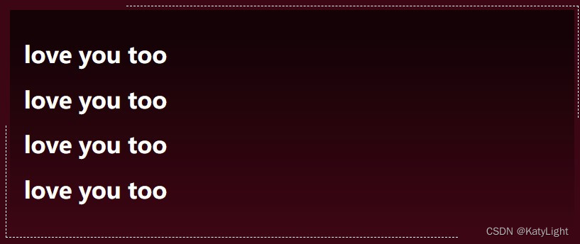
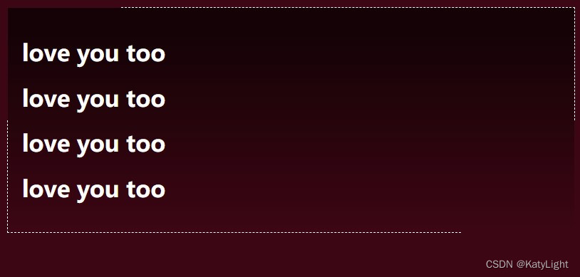
这个效果很炫酷,在hover的时候,线条会靠近文本中心。用到了两个伪类实现。
以下是代码:
<!DOCTYPE html>
<html lang="en">
<head>
  <meta charset="UTF-8">
  <title>Title</title>
  <style>
    body{
      background-color: #420713;
    }
    .incomplete{
      background-image: linear-gradient(#000000AA 10%,transparent) ;
      padding: 20px;
      color: white;
      position: relative;
      border: 10px solid transparent;
      background-clip: padding-box;
    }
    .incomplete::after{

      right:  -10px;
      top:  -10px;

      border-top: 1px dashed white;
      border-right: 1px dashed white;
    }
    .incomplete:hover::after{
      right:-1px;
      top: -1px;
      transition: all ease-in .2s;
    }
    .incomplete:hover::before{
      bottom:-1px;
      left:-1px;
      transition: all ease-in .2s;
    }
    .incomplete::after,    .incomplete::before{
      pointer-events: none;
      content: '';
      display: block;
      position: absolute;
      width: 80%;
      height: 50%;
      transition: all ease-in .2s;
    }
    .incomplete::before{

      bottom: -10px;
      left:  -10px;

      border-left: 1px dashed white;
      border-bottom: 1px dashed white;
    }
  </style>
</head>
<body>
<div class="incomplete">
  <h1>love you too</h1>
  <h1>love you too</h1>
  <h1>love you too</h1>
  <h1>love you too</h1>
</div>
</body>
</html>


 3537
3537


 被折叠的 条评论
为什么被折叠?
被折叠的 条评论
为什么被折叠?
 到【灌水乐园】发言


