


 本文展示了如何在Flutter中进行简单的控件摆放,包括使用Container、Column和Row。还详细介绍了自定义输入框LoginInput的实现,涉及到TextField、FocusNode以及监听光标变化。此外,提到了LoginButton的创建,强调了FractionallySizedBox在布局中的应用。
简单的控件摆放
import 'package:flutter/material.dart';

class HomePage extends StatefulWidget {
  const HomePage({Key? key}) : super(key: key);

  @override
  State<HomePage> createState() => _HomePageState();
}

class _HomePageState extends State<HomePage> {
  @override
  Widget build(BuildContext context) {
    return Container(
      color: Colors.white,
      alignment: Alignment.bottomLeft,
      child: Container(
        width: 300,
        height: 400,
        color: Colors.green,
        child: Column(
          mainAxisAlignment: MainAxisAlignment.start,
          crossAxisAlignment: CrossAxisAlignment.end,
          children: [
            Text(
              "HomePage",
              style: TextStyle(color: Colors.black, fontSize: 40),
            ),
            Text(
              "HomePage",
              style: TextStyle(color: Colors.black, fontSize: 40),
            ),
          ],
        ),
      ),
    );
  }
}
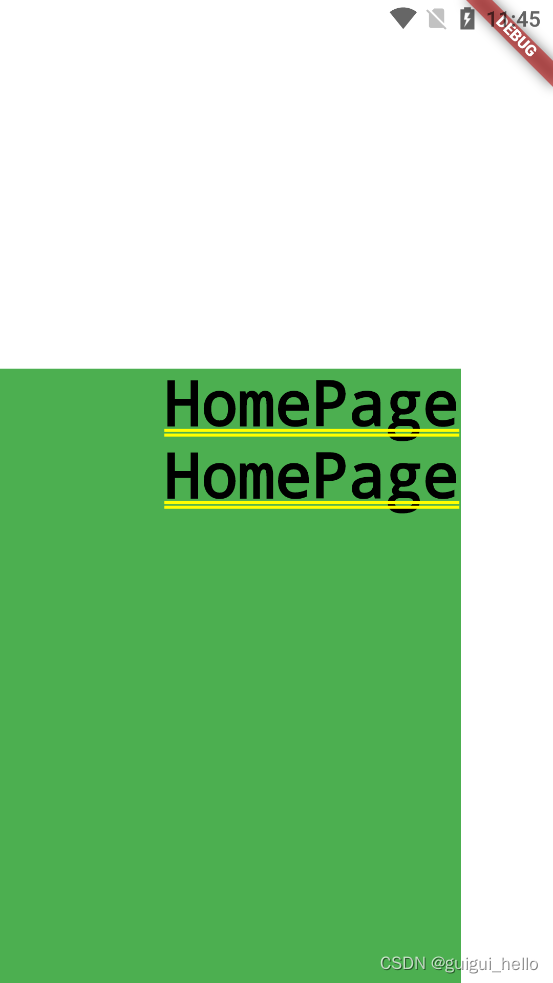
效果是这样的
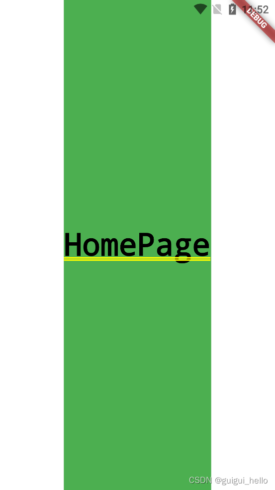
如果去掉 Container( width: 300, height: 400,)
效果是这样的
自定义输入框的坑
/**
 * 因为使用了Material 的TextField 所以,这个控件应该包在Scaffold 里
 */

class LoginInput extends StatefulWidget {
  final String title;
  final String hint;
  final ValueChanged<String>? onChanged;
  final ValueChanged<bool>? focusChanged;
  final bool lineStretch;
  final bool obscureText;
  final TextInputType? keyboardType;

  const LoginInput(this.title, this.hint,
      {Key? key,
        this.onChanged,
        this.focusChanged,
        this.lineStretch = false,
        this.obscureText = false,
        this.keyboardType})
      : super(key: key);

  @override
  _LoginInputState createState() => _LoginInputState();
}

class _LoginInputState extends State<LoginInput> {
  final _focusNode = FocusNode();

  @override
  void initState() {
    //是否获取光标的监听
    _focusNode.addListener(() {
      print("Has focus: ${_focusNode.hasFocus}");
      if (widget.focusChanged != null) {
        widget.focusChanged!(_focusNode.hasFocus);
      }
    });
    super.initState();
  }

  @override
  void dispose() {
    _focusNode.dispose();
    super.dispose();
  }

  @override
  Widget build(BuildContext context) {
    return Column(
      children: [
        Row(
          children: [
            Container(
              padding: EdgeInsets.only(left: 15),
              width: 60,
              child: Text(
                widget.title,
                style: TextStyle(fontSize: 16),
              ),
            ),
            _input()
          ],
        ),
         // 这个padding 是输入框底部的那条线
        Padding(
        //这个决定了底部那条线的到左边间距
          padding: EdgeInsets.only(left: !widget.lineStretch ? 15 : 0),
          child: Divider(
            height: 1,
            thickness: 0.5,
          ),
        )
      ],
    );
  }

  _input() {
  // 这个 TextField 使用的时候记住要包在Expanded这个控件里
    return Expanded(
        child: TextField(
          focusNode: _focusNode,
          onChanged: widget.onChanged,
          obscureText: widget.obscureText,
          keyboardType: widget.keyboardType,
          autofocus: !widget.obscureText,
          cursorColor: primary,
          style: TextStyle(fontSize: 16, fontWeight: FontWeight.w300),
          //输入框的样式
          decoration: InputDecoration(
              contentPadding: EdgeInsets.only(left: 20, right: 20),
              border: InputBorder.none,
              hintText: widget.hint,
              hintStyle: TextStyle(fontSize: 15, color: Colors.grey)),
        ));
  }
}
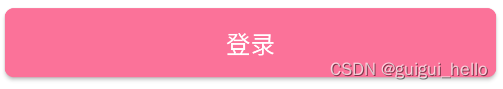
一个简单的按钮:
import 'package:demo3/main.dart';
import 'package:flutter/material.dart';

class LoginButton extends StatelessWidget {
  final String title;
  final bool enable;
  final VoidCallback? onPressed;

  const LoginButton(this.title, {Key? key, this.enable = true, this.onPressed})
      : super(key: key);

  @override
  Widget build(BuildContext context) {
  //这里注意一下这个组件:FractionallySizedBox
    return FractionallySizedBox(
      widthFactor: 1,
      child: MaterialButton(
        shape: RoundedRectangleBorder(borderRadius: BorderRadius.circular(6)),
        height: 45,
        onPressed: enable ? onPressed : null,
        disabledColor: primary[50],
        color: primary,
        child: Text(title,style: TextStyle(color: Colors.white,fontSize: 16)),
      ),
    );
  }
}
使用:
              Padding(
                padding: EdgeInsets.only(left: 20, right: 20, top: 20),
                child: LoginButton("登录", enable: true, onPressed: () => {}),
              )


 898
898

 被折叠的 条评论
为什么被折叠?
被折叠的 条评论
为什么被折叠?
 到【灌水乐园】发言


