


03-flex布局
简介
flexbox是一种一维布局,只可以处理一个维度上的东西,一行或者一列
轴线
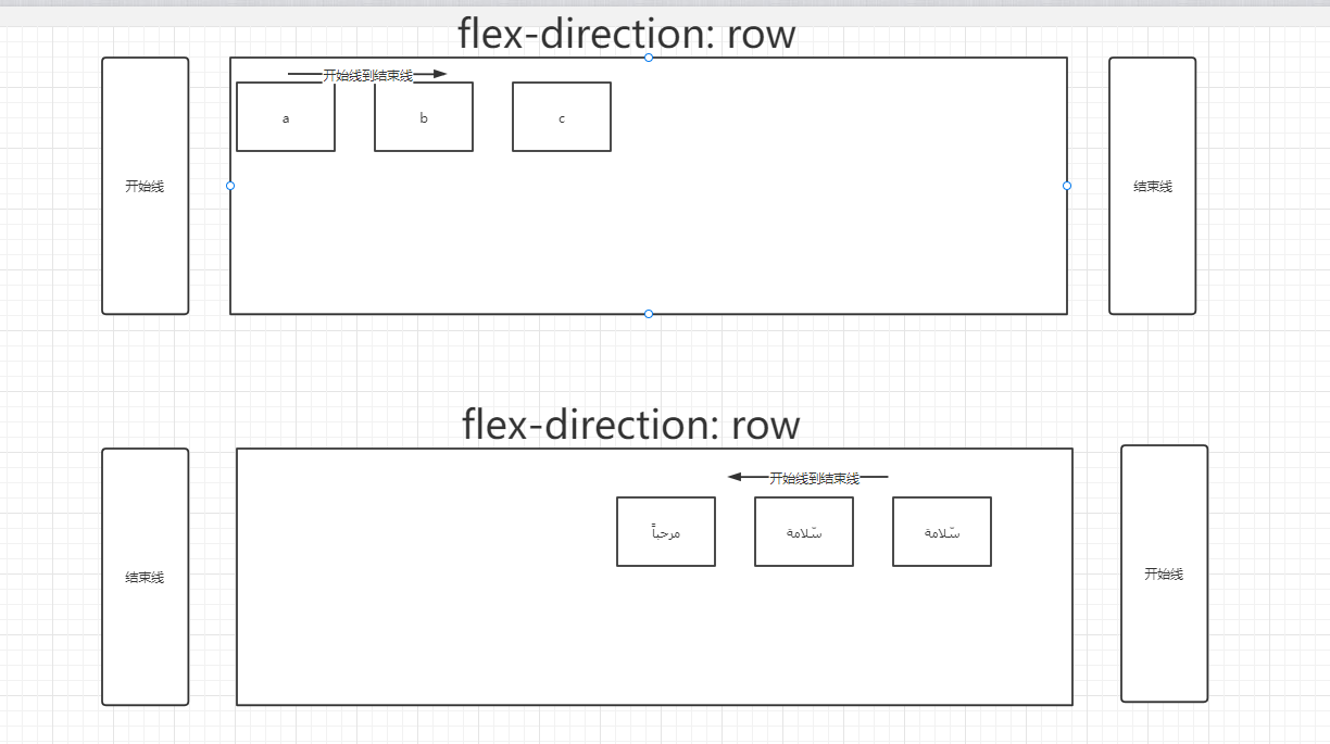
轴线是通过flex-direction进行控制的,默认是row
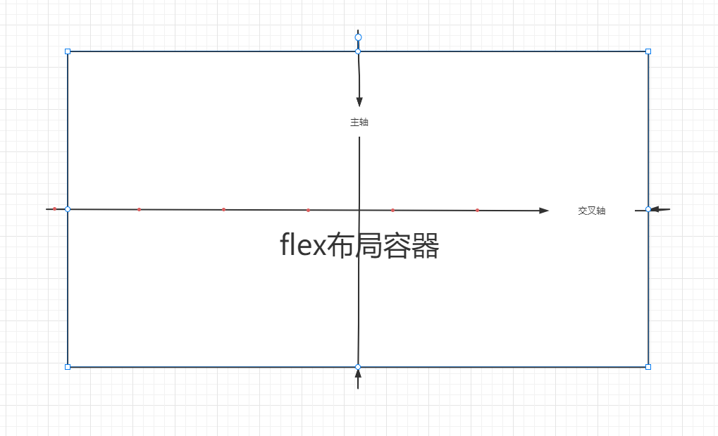
起始线和终止线
是通过flex-direction和里面的内容控制的,
如果flex-direction是row,并且是英文,起始线是从左到右面,
如果flex-direction是row,并且是阿拉伯文,起始线是从右到左
特性
- 元素会在一列或者一行(没有设置flex-wrap的情况)
- 元素从主轴的起始线开始
- 元素不会在主维度方向拉伸,但是可以缩小
- 元素被拉伸来填充交叉轴大小。
实例
<!DOCTYPE html>
<html lang="en">
<head>
    <meta charset="UTF-8">
    <title>Title</title>
    <style>
        .container {
            display: flex;
            /*height: 150px;*/
        }

        .container > div {
            width: 100px;
            /*height: 150px;*/
            /*background-color: grey;*/
        }

        /*.container > div:last-child {*/
        /*    height: 200px;*/
        /*}*/
    </style>
</head>
<body>
<div class="container">
    <div class="box1">1</div>
    <div class="box2">2</div>
    <div class="box2">3 <br/> 4 <br/> 5</div>
</div>
</body>
</html>
[外链图片转存失败,源站可能有防盗链机制,建议将图片保存下来直接上传(img-G8O29u5s-1670830004264)(https://golanage.oss-cn-beijing.aliyuncs.com/css_demo/image-20221212141127266.png)]
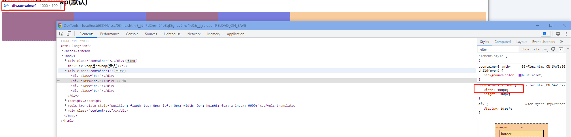
flex-wrap
可以通过flex-wrap来设置自动换行,比如父元素里面的内容宽度超出去了,那么父元素就会让里面的元素自动换行
no-wrap
<!DOCTYPE html>
<html lang="en">
<head>
    <meta charset="UTF-8">
    <title>Title</title>
    <style>
        .container1 {
            display: flex;
            width: 1000px;
        }

        .container1 > .box {
            width: 400px;
            height: 100px;
        }

        .container1 :nth-child(odd) {
            background-color: red;
        }

        .container1 :nth-child(even) {
            background-color: blueviolet;
        }
    </style>
</head>
<body>

<h2>flex-wrap是nowrap(默认)</h2>
<div class="container1">
    <div class="box"></div>
    <div class="box"></div>
    <div class="box"></div>
    <div class="box"></div>
</div>
</body>
</html>
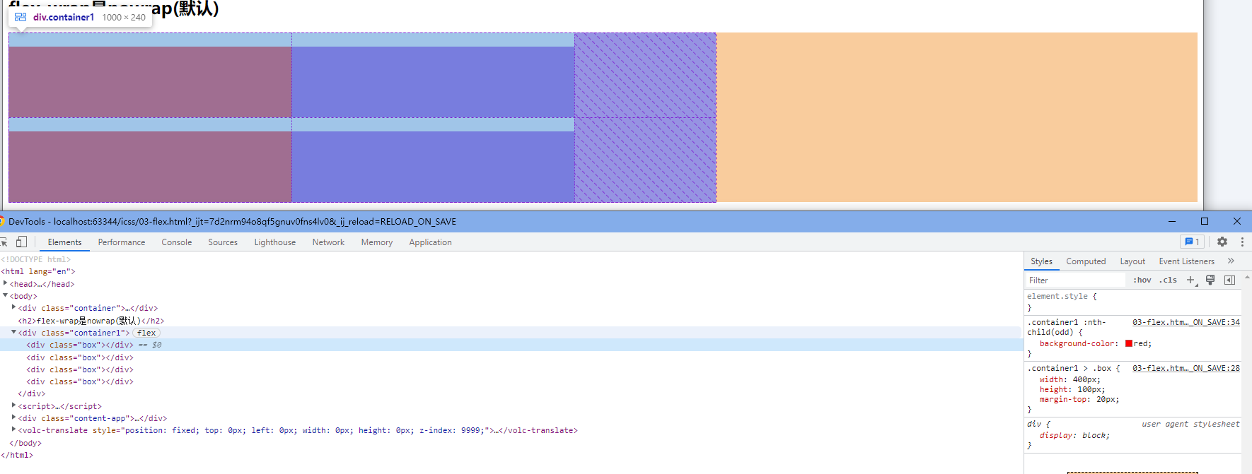
wrap
<!DOCTYPE html>
<html lang="en">
<head>
    <meta charset="UTF-8">
    <title>Title</title>
    <style>
        .container2 {
            display: flex;
            width: 1000px;
            flex-wrap: wrap;
        }

        .container2 > .box {
            width: 400px;
            height: 100px;
            margin-top: 20px;
        }

        .container2 :nth-child(odd) {
            background-color: red;
        }

        .container2 :nth-child(even) {
            background-color: blueviolet;
        }
    </style>
</head>
<body>
<h2>flex-wrap是wrap</h2>
<div class="container2">
    <div class="box"></div>
    <div class="box"></div>
    <div class="box"></div>
    <div class="box"></div>
</div>
</body>
</html>
flex-basic
指定了 flex 元素在主轴方向上的初始大小。如果不使用 box-sizing 改变盒模型的话,那么这个属性就决定了 flex 元素的内容盒(content-box)的尺寸。如果设置了flex-basic那么再给这个元素设置宽度就没有作用了
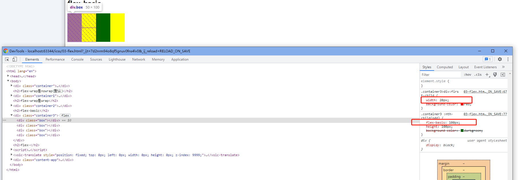
<!DOCTYPE html>
<html lang="en">
<head>
    <meta charset="UTF-8">
    <title>Title</title>
    <style>
        .container3 {
            display: flex;
            width: 200px;
        }

        .container3 > div:first-child {
            width: 20px;
            background-color: red;
        }

        .container3 :nth-child(even) {
            flex-basis: 100px;
            height: 100px;
            background-color: yellow;
        }

        .container3 :nth-child(odd) {
            flex-basis: 100px;
            height: 100px;
            background-color: darkgreen;
        }
    </style>
</head>
<body>
<h2>flex-basic</h2>
<div class="container3">
    <div class="box"></div>
    <div class="box"></div>
    <div class="box"></div>
    <div class="box"></div>
</div>

</body>
</html>
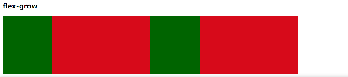
flex-grow
flex 元素会以 flex-basis 为基础,沿主轴方向增长尺寸。这会使该元素延展,并占据此方向轴上的可用空间(available space)。如果有其他元素也被允许延展,那么他们会各自占据可用空间的一部分。
<!DOCTYPE html>
<html lang="en">
<head>
    <meta charset="UTF-8">
    <title>Title</title>
    <style>

        .container4 {
            display: flex;
            width: 1000px;
            height: 200px;
        }

        .container4 :nth-child(even) {
            flex-grow: 2;
            background-color: #d70a1a;
        }

        .container4 :nth-child(odd) {
            flex-grow: 1;
            background-color: darkgreen;
        }
    </style>
</head>
<body>
<h2>flex-grow</h2>
<div class="container4">
    <div class="box"></div>
    <div class="box"></div>
    <div class="box"></div>
    <div class="box"></div>
</div>
</body>
</html>
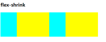
flex-shrink
同比例缩小
<!DOCTYPE html>
<html lang="en">
<head>
    <meta charset="UTF-8">
    <title>Title</title>
    <style>
        .container5 {
            display: flex;
            width: 400px;
        }

        .container5 > div {
            width: 200px !important;
            height: 100px;
        }

        .container5 :nth-child(even) {
            /*width: 100px;*/
            background-color: yellow;
            flex-shrink: 1;
        }
        .container5 :nth-child(odd) {
            /*width: 100px;*/
            flex-shrink: 2;
            background-color: aqua;
        }
    </style>
</head>
<body>
<h3>flex-shrink</h3>
<div class="container5">
    <div class="box"></div>
    <div class="box"></div>
    <div class="box"></div>
    <div class="box"></div>
</div>
</body>
</html>
flex-direction
用来修改主轴的位置


 1551
1551


 被折叠的 条评论
为什么被折叠?
被折叠的 条评论
为什么被折叠?
 到【灌水乐园】发言


