


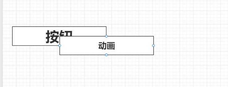
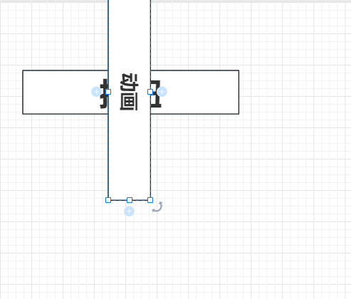
01-按钮左右到中间运动
效果图
晚上回去加
代码实现
<!doctype html>
<html lang="en">
<head>
    <meta charset="UTF-8">
    <meta name="viewport"
          content="width=device-width, user-scalable=no, initial-scale=1.0, maximum-scale=1.0, minimum-scale=1.0">
    <meta http-equiv="X-UA-Compatible" content="ie=edge">
    <title>01-鼠标悬浮上去有一个左右移动的动画</title>
    <style>
        :root {
            --btn-bg-color: #66b1ff;
            --hover_bg_color: #e11010;
            --btn-width: 200px;
            --btn-height: 30px;
        }

        .container {
            width: 100%;
            /*background-color: #000;*/
            height: 30px;
            display: flex;
            /*flex-direction: column;*/
            place-content: center;
            /*margin: 0 auto;*/
        }

        .container > button {
            outline: none;
            border: 2px solid var(--btn-bg-color);
            border-radius: 4px;
            width: var(--btn-width);
            height: var(--btn-height);
            background-color: var(--btn-bg-color);;
            cursor: pointer;
            position: relative;
            overflow: hidden;
        }

        .container > button::after {
            content: "";
            position: absolute;
            top: 50%;
            left: 50%;
            z-index: 0;
            background: var(--hover_bg_color);
            width: var(--btn-width);
            height: 0;
            /*height: var(--btn-width);*/
            transform: translateX(-50%) translateY(-50%) rotate(90deg);
            transition: all, 0.75s ease 0s;
        }

        .container > button:hover::after {
            height: var(--btn-width);
        }
    </style>
</head>
<body>
<div class="container">
    <button value="提交">提交</button>
</div>
</body>
</html>
大致逻辑
- 使用伪类创建一个元素,然后把这个元素放在按钮的上50%的位置,左50%的位置。
- 在使用transform将伪元素覆盖到之前的元素,
再将伪元素的高设置按钮的宽。注意,注意,注意,这是伪元素的高要设置为按钮的宽


 被折叠的 条评论
为什么被折叠?
被折叠的 条评论
为什么被折叠?
 到【灌水乐园】发言


