本文笔记基于「千古壹号」的GitHub项目:https://github.com/qianguyihao/web
非商业用途自由转载,保持署名,注明出处!
1. 伸缩布局
- 传统布局:设置盒子,浮动
- flex布局,举例:html中设置多个ul列表,css中在ul内做相应设置
| css代码 | 含义 |
|---|
| display: flex; | 设置伸缩盒子 |
| display: flex; flex-direction: row; | 设置伸缩盒子,横向 |
| display: flex;flex-direction: row-reverse; | 设置伸缩盒子,横向翻转序号 |
| display: flex; flex-direction: column; | 设置伸缩盒子,纵向 |
| display: flex; flex-direction: column-reverse; | 设置伸缩盒子,纵向翻转序号 |
2.对齐方式
2.1 横向对齐
- ul中均需要设置 display: flex;此外,justify-content:表示:沿主轴(横轴)方向
| css代码 | 含义 |
|---|
| justify-content: flex-start; | 横向左对齐 |
| justify-content: flex-end; | 横向右对齐 |
| justify-content: center; | 横向居中对齐 |
| justify-content: space-around; | 横向对齐,平分父盒子 |
| justify-content: space-between; | 横向两端对齐 |
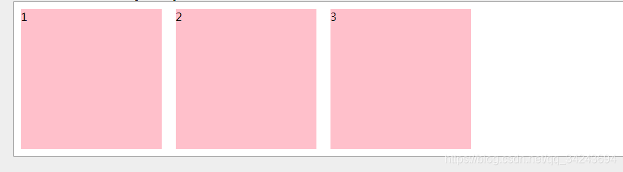
- 方式1:
2.2 侧轴对齐
- align-items:表示左侧为纵轴,但盒子排列仍然横向
| css代码 | 含义 |
|---|
| align-items:flex-start; | 靠侧轴上部,横向对齐 |
| align-items:flex-end; | 靠侧轴底部,横向对齐 |
| align-items:center; | 靠侧轴中心,横向对齐 |
| align-items:baseline; | 同方式1 |
| align-items:stretch; | 靠侧轴,盒子拉伸,横向对齐 |
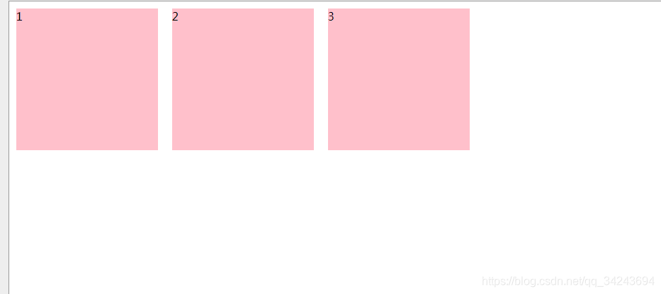
- 方式1:
3.设置属性
如有不当之处,欢迎指正!
谢谢!


 624
624


 被折叠的 条评论
为什么被折叠?
被折叠的 条评论
为什么被折叠?
 到【灌水乐园】发言


