


Seaborn其实是在matplotlib的基础上进行了更高级的API封装,从而使得作图更加容易,在大多数情况下使用seaborn就能做出很具有吸引力的图。这里实例采用的数据集都是seaborn提供的几个经典数据集,dataset文件可见于Github。本博客只总结了一些,方便博主自己查询,详细介绍可以看seaborn官方API和example gallery,官方文档还是写的很好的。
1 set_style( ) set( )
set_style( )是用来设置主题的,Seaborn有五个预设好的主题: darkgrid , whitegrid , dark , white ,和 ticks 默认: darkgrid
import matplotlib.pyplot as plt
import seaborn as sns
sns.set_style("whitegrid")
plt.plot(np.arange(10))
plt.show()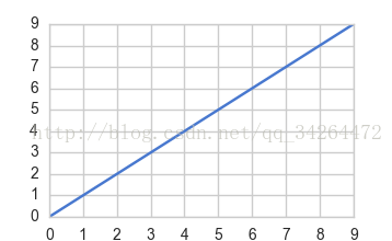
set( )通过设置参数可以用来设置背景,调色板等,更加常用。
import seaborn as sns
import matplotlib.pyplot as plt
sns.set(style="white", palette="muted", color_codes=True)     #set( )设置主题,调色板更常用
plt.plot(np.arange(10))
plt.show()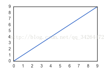
2 distplot( ) kdeplot( )
distplot( )为hist加强版,kdeplot( )为密度曲线图
import matplotlib.pyplot as plt
import seaborn as sns
df_iris = pd.read_csv('../input/iris.csv')
fig, axes = plt.subplots(1,2)
sns.distplot(df_iris['petal length'], ax = axes[0], kde = True, rug = True)        # kde 密度曲线  rug 边际毛毯
sns.kdeplot(df_iris['petal length'], ax = axes[1], shade=True)                     # shade  阴影
plt.show()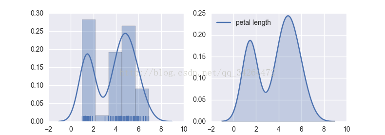
import numpy as np
import seaborn as sns
import matplotlib.pyplot as plt
sns.set( palette="muted", color_codes=True)
rs = np.random.RandomState(10)
d = rs.normal(size=100)
f, axes = plt.subplots(2, 2, figsize=(7, 7), sharex=True)
sns.distplot(d, kde=False, color="b", ax=axes[0, 0])
sns.distplot(d, hist=False, rug=True, color="r", ax=axes[0, 1])
sns.distplot(d, hist=False, color="g", kde_kws={"shade": True}, ax=axes[1, 0])
sns.distplot(d, color="m", ax=axes[1, 1])
plt.show()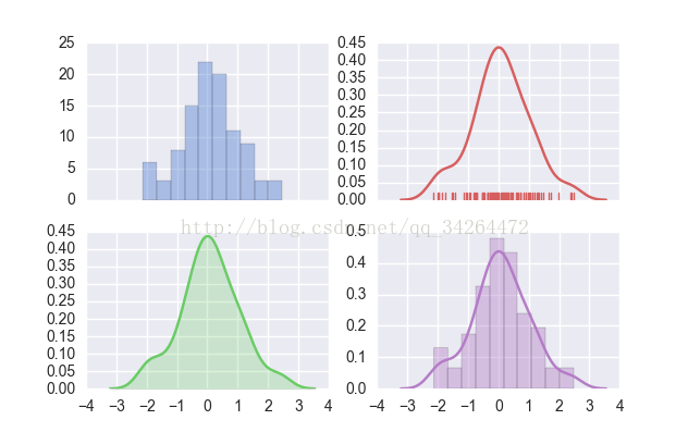
3 箱型图 boxplot( )
import matplotlib.pyplot as plt
import seaborn as sns
df_iris = pd.read_csv('../input/iris.csv')
sns.boxplot(x = df_iris['class'],y = df_iris['sepal width'])
plt.show()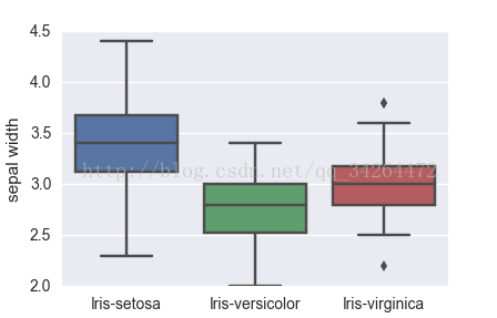
import matplotlib.pyplot as plt
import seaborn as sns
tips = pd.read_csv('../input/tips.csv')
sns.set(style="ticks")                                     #设置主题
sns.boxplot(x="day", y="total_bill", hue="sex", data=tips, palette="PRGn")   #palette 调色板
plt.show()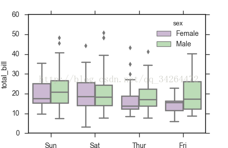
4 联合分布jointplot( )
tips = pd.read_csv('../input/tips.csv')   #右上角显示相关系数
sns.jointplot("total_bill", "tip", tips)
plt.show()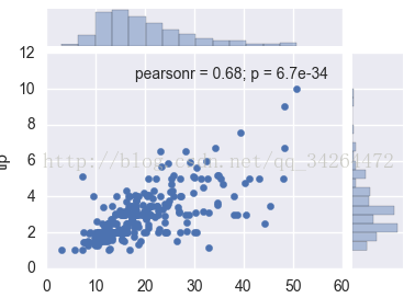
tips = pd.read_csv('../input/tips.csv')
sns.jointplot("total_bill", "tip", tips, kind='reg')
plt.show()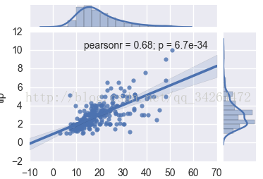
5 热点图heatmap( )
import matplotlib.pyplot as plt
import seaborn as sns
data = pd.read_csv("../input/car_crashes.csv")
data = data.corr()
sns.heatmap(data)
plt.show()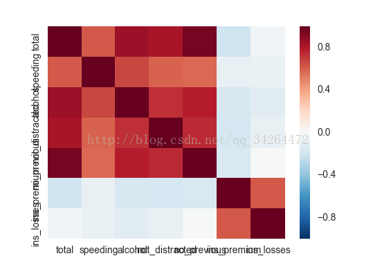
6 pairplot( )
import matplotlib.pyplot as plt
import seaborn as sns
data = pd.read_csv("../input/iris.csv")
sns.set()                        #使用默认配色
sns.pairplot(data,hue="class")   #hue 选择分类列
plt.show()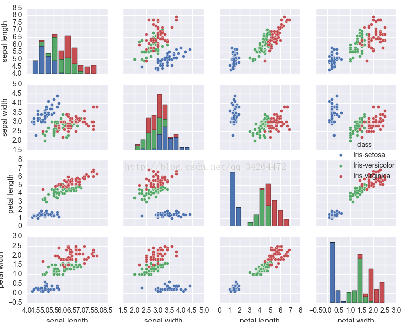
import seaborn as sns
import matplotlib.pyplot as plt
iris = pd.read_csv('../input/iris.csv')
sns.pairplot(iris, vars=["sepal width", "sepal length"],hue='class',palette="husl")
plt.show()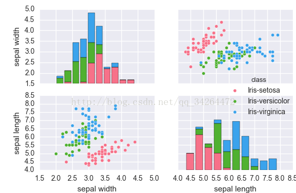
7 FacetGrid( )
import seaborn as sns
import matplotlib.pyplot as plt
tips = pd.read_csv('../input/tips.csv')
g = sns.FacetGrid(tips, col="time",  row="smoker")
g = g.map(plt.hist, "total_bill",  color="r")
plt.show()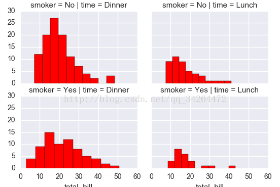
参考链接:


 2万+
2万+

 被折叠的 条评论
为什么被折叠?
被折叠的 条评论
为什么被折叠?
 到【灌水乐园】发言


