本篇文章主要介绍 flex-flow
一次介绍两个知识点是自己前期没有捋顺关系  flex-flow应该和上两篇文章一起介绍的
	但是后介绍也有后介绍的好处,通过前两篇文章我相信你对 flex-direction属性和flex-wrap属性有了很清晰的了解,而flex-flow属性是flex-direction属性和flex-wrap属性的简写形式,默认值为row nowrap。
<!DOCTYPE html>
<html lang="en">
<head>
<meta charset="UTF-8">
<meta name="viewport" content="width=device-width, initial-scale=1.0">
<meta http-equiv="X-UA-Compatible" content="ie=edge">
<title>Document</title>
<style>
.flex-box{
width: 1000px;
margin: 0 auto;
background-color: #ccc;
display: flex;
flex-flow: row wrap;
}
.box{
width: 400px;
height: 100px;
background-color: red;
color: blue;
margin-right: 50px;
margin-bottom: 10px;
}
</style>
</head>
<body>
<div class="flex-box">
<div class="box">1111111</div>
<div class="box">222222</div>
<div class="box">3333</div>
</div>
</body>
</html>
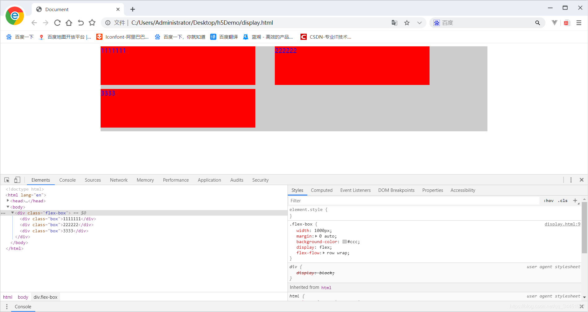
从代码可以得知 flow属性接收两个属性 第一个属性是行还是列的排序 第二个是是否换行
效果演示入下:


 143
143


 被折叠的 条评论
为什么被折叠?
被折叠的 条评论
为什么被折叠?
 到【灌水乐园】发言


