


- 自定义View的作用和场景
Android中内置的UI控件和布局⽆无法满⾜足需求的时候,就需要进⾏外观、操作都是⾃自定义的⼀一些控件, 定义View。
- 自定义View三种方式
- 继承已有的控件来实现自定义控件。
主要是当要实现的控件和已有的控件在很多方面比较类似, 通过对已有控件的扩展来满足要求。增加新的功能。
2.继承ViewGroup,把多个控件组合成一个自定义控件(组合控件)。
以上两种方式均不满足的时候,考虑完全自定义控件。
3.通过View类来完全自定义控件。
- 继承已有控件实现自定义控件(案例:NotePad)
需求:实现带下划线的文本输入框
EditText : 增加下滑线
定义类继承EditText , 重写方法
重点一:构造方法
- 一个参数的构造方法:在代码中使⽤用;类似: TextView txt = new TextView(context)。 一般必须有
- 两个或者三个参数的构造:通过 layout xml⽂文件包含控件的时候,会⾃自动调⽤用;例如:<com.qianfeng.NotePad></com.qianfeng.NotePad> 一般必须有
- 如果控件希望在layout使⽤用,控件中必须包含 两个或者三个参数的构造⽅方法,通常两个参数的构造⽅方法就⾏行了,没有强制要求三个构造⽅方法都写出来。
分析View绘制的过程:
- 布局:谁使用谁布局
- 测量:测试控件宽高---自定义控件负责
- 绘制:----重写onDraw(Canvas c)方法----该方法必须先调用super.onDraw();
绘制要素:画布---Canvas对象
位置---draw方法中前四个参数
画笔-----Paint类
重点二:自定义View绘制
- 所有 View类都包含了一个 onDraw(Canvas c)方法
- onDraw这个方法的作⽤用,就是绘制View自身;
- View显⽰示成什么样⼦子需要 onDraw 把这个样⼦子画出来。
- 调用Canvas的各种drawXxxx()方法来绘制需要的样子。
- onDraw此方法系统会频繁的一直调用。尽量避免中此方法中创建任何的对象。
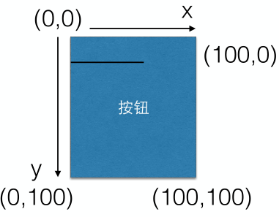
重点三:控件的坐标系统
重点四:Paint类
- Paint 主要⽤用于 Canvas 的各种绘制⽅方法中。
- 可以理解成是一个画笔。
- Paint 代表了绘制时,绘制的样式,例如颜⾊色、线宽、以及其他⽤用于绘制样式控制的属性;
- Canvas 几乎每⼀一个 drawXXXX 都会含有Paint参数
重点五:super.ondraw()
- 当继承已有控件时,注意 onDraw⽅方法内部需要调⽤用 super.onDraw 来绘制原有控件的内容。
- 因为⼦子类⾄至进⾏行特定内容的绘制,原有逻辑要保留
案例:带下划线的NotePad
实现步骤:
- 定义类继承edittext,必须重新构造方法
/**NotePadView view = new NotePadView();
* 这个构造方法必须有。
* @param context
*/
public NotePadView(Context context) {
super(context);
init(context, null, 0);
}
/**
* 这个构造方法也必须有,是为了让别人从xml布局文件中使用的
* @param context 上下文对象
* @param attrs 属性集
*/
public NotePadView(Context context, AttributeSet attrs) {
super(context, attrs);
init(context, attrs, 0);
}
/**
* 不强制提供
* @param context
* @param attrs
* @param type
*/
public NotePadView(Context context, AttributeSet attrs, int type){
super(context, attrs, type);
init(context, attrs, type);
}
//自定义的初始化方法,用于初始化画笔
private void init(Context context, AttributeSet attrs, int type) {
paint = new Paint();
//设置画笔的颜色,
paint.setColor(Color.RED);
//设置画笔的线条宽度
paint.setStrokeWidth(1);
}
- 重写onDraw方法
/*重写的onDraw方法,该方法由系统回调,用来绘制控件,我们在这里加入我们的新的绘制数据
* 画画:
* 1、笔
* 2、画布
* 参数:就是你要画的数据使用的画布
* 注意:由于onDraw方法频繁调用,应尽量避免中里面创建对象,因此画笔的创建写在了构造方法中
*/
@Override
protected void onDraw(Canvas canvas) {
//父类的super.onDraw()必须调用
super.onDraw(canvas);
//EditText提供了获得每行高度的方法
int lineHeight = getLineHeight();
//EditText有个默认的Pading
int paddingTop = getPaddingTop();
//获得当前控件的宽度
int width = getWidth();
//计算当前屏幕的行数: 屏幕的高度 / 每行的高度
int rows = getHeight() / lineHeight;
//获得已经输入的行
int lineCount = getLineCount();
//输入行数和使用屏幕高度计算出来的行数,谁大用谁
int count = rows > lineCount ? rows : lineCount;
for(int i = 0; i < count; i++){
//Paint 画笔
canvas.drawLine(0, lineHeight * (i + 1) + paddingTop, width, lineHeight * (i + 1) + paddingTop, paint);
}
}
.可选步骤:向外界提供方法,改变线条的颜色和宽度
/**
* 设置横线的颜色值
*/
public void setLineColor(int color){
paint.setColor(color);
//立马去更新视图. 使视图无效
invalidate();
}
/**
* 设置横线的宽度
* @param px
*/
public void setLineThick(int px){
paint.setStrokeWidth(px);
invalidate();
}
- 在xml文件中使用
<com.qf.day29mynote.NotePadView
android:id="@+id/notePadView"
android:layout_width="match_parent"
android:layout_height="match_parent"
android:gravity="top" android:background="@drawable/circle_ret"/>
- 组合控件(案例:组合textview 瀑布流)
- 组合控件是自定义控件的一种,只不过它是由其他几个原生控件组合而成,故名组合控件。
- 在实际项目中,GUI会遇到一些可以提取出来做成自定义控件情况。一个自定义控件的好处就是把一些需要模块化的UI和逻辑放在一起,做到了高内聚,向其他模块提供接口并很少 依赖外界,这样就是低耦合。
- 一个自定义控件就是一个封闭的王国,这里由你掌控。就像逻辑部分的模块化一样。
例 瀑布流效果图:
自定义瀑布流控件,向外界提供添加图片的方法,
1.定义类继承,scrollView
2.在scrollView中添加 一个h线性布局 在其中 装三个 V 线性布局
3.向外提供添加图片的方法

实现思路:继承ScrollView //可滚动的视图
实现步骤:
- 定义类继承于ScrollView
- 重写构造方法,在构造方法中设置布局,其中设置一个竖直方向的线性布局嵌套3个水平方向的线性布局
private void init(Context context, AttributeSet attrs, int defStyle) {
this.context = context;
colums = new ArrayList<>();
setBackgroundColor(Color.RED);
LinearLayout layout = new LinearLayout(context);
layout.setBackgroundColor(Color.RED);
LinearLayout.LayoutParams params = new LinearLayout.LayoutParams(
LinearLayout.LayoutParams.MATCH_PARENT,
LinearLayout.LayoutParams.MATCH_PARENT);
layout.setLayoutParams(params);
layout.setOrientation(LinearLayout.HORIZONTAL);
this.addView(layout);
// 宽0 高 匹配父容器 比重1
LinearLayout.LayoutParams params1 = new LinearLayout.LayoutParams(0,
LinearLayout.LayoutParams.MATCH_PARENT, 1);
for (int i = 0; i < 3; i++) {
LinearLayout layout1 = new LinearLayout(context);
layout1.setOrientation(LinearLayout.VERTICAL);
switch (i) {
case 0:
layout1.setBackgroundColor(Color.GREEN);
break;
case 1:
layout1.setBackgroundColor(Color.YELLOW);
break;
case 2:
layout1.setBackgroundColor(Color.CYAN);
break;
}
layout1.setLayoutParams(params1);
// 给外层的水平的线性布局添加控件
layout.addView(layout1);
colums.add(layout1);
}
}
- 向外提供设置图片的方法
public void addBitmap(Bitmap bitmap) {
ImageView imageView = new ImageView(context);
imageView.setImageBitmap(bitmap);
imageView.setScaleType(ScaleType.CENTER_CROP);
colums.get(bitmapCount % 3).addView(imageView);
bitmapCount++;
}
- 在activity中调用方法添加图片
MyImagesView mImagesView = (MyImagesView) findViewById(R.id.myImagesView);
AssetManager assets = getAssets();
InputStream inputStream = null;
try {
String[] list = assets.list("images");
for (int i = 0; i < list.length; i++) {
inputStream = assets.open("images/"+list[i]);
mImagesView.addBitmap(BitmapFactory.decodeStream(inputStream));
}
} catch (IOException e) {
e.printStackTrace();
}
- 完全自定义控件

- 三个构造方法至少实现两个。 (1个参数的和2个参数的)
- 覆写onMeasure。该方法比onDraw方法先执行。
- onDraw方法时绘制
- onMeasure方法
该方法用来测量控件的尺寸。
onMeasure(int widthMeasureSpec, int heightMeasureSpec)
参数:父控件传入的子控件能获得空间及关于这个空间描述的元数据。拿到这两个参数之后需要把他们给译解出来。然后和控件的宽和高,最后通过setMeasuredDimension(measuredHeight, measuredWidth)把控件的宽高保存起来。
- // 父容器传过来的宽度方向上的模式
int widthMode = MeasureSpec.getMode(widthMeasureSpec);
// 父容器传过来的高度方向上的模式
int heightMode = MeasureSpec.getMode(heightMeasureSpec);
注意:依据specMode的值,
MeasureSpec有3种模式分别是UNSPECIFIED, EXACTLY和AT_MOST)
如果是AT_MOST,specSize 代表的是最大可获得的空间(wrap_content);
如果是EXACTLY,specSize 代表的是精确的尺寸(match_parent 、100dp等);
如果是UNSPECIFIED,父元素不对子元素施加任何束缚,子元素可以得到任意想要的大小; 这种模式实际很难碰到
- MeasureSpec.getSize(widthMeasureSpec):
获取父容器传来的宽度
- setMeasuredDimension(widthSize, heightSize);
设置控件的宽高尺寸。该方法最后必须调用。
- onDraw方法
根据需要绘制自己需要的图形、字符等。

/获得描述字体的矩阵信息对象
FontMetrics fontMetrics = paint.getFontMetrics();
//获得中间到底部的宽度
fontMetrics.descent;
- OnTouchEvent方法(事件处理)
对事件进行处理。
//获得事件类型的 2.2支持多点触摸之后建议使用掩码
switch (event.getAction() & MotionEvent.ACTION_MASK) {
case MotionEvent.ACTION_DOWN:
break;
case MotionEvent.ACTION_MOVE:
break;
case MotionEvent.ACTION_UP:
break;
default:
break;
}
return true;// 该控件消耗掉该次触摸事件
}
- 实现自定义状态按钮
- 定义类,继承于view
- 重写构造方法,在其中做好一些初始化工作,例如准备好图片,获得图片宽高数据
private void init(Context context, AttributeSet attrs, int defStyleAttr) {
// TODO Auto-generated method stub
//得到背景图片的bitmap对象
slideBgOn = BitmapFactory.decodeResource(getResources(), R.drawable.slide_bg_on);
slideBgOff = BitmapFactory.decodeResource(getResources(), R.drawable.slide_bg_off);
//得到滑块图片的bitmap对象
slideBtn = BitmapFactory.decodeResource(getResources(), R.drawable.slide_btn);
//得到背景图片的宽高
bgHeight = slideBgOff.getHeight();
bgWidth = slideBgOff.getWidth();
//得到滑块的宽度
btnWidth = slideBtn.getWidth();
}
3.重写onMeasure方法,该方法用于测量
暂时先写这一句,必须写
setMeasuredDimension(bgWidth, bgHeight);
4.重写onDraw方法

5.重写onTouchEvent方法:该方法在用户手指触摸该控件的时候回调

6.向外提供改变按钮状态的方法
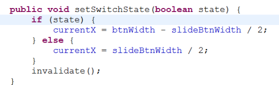
7.设置改变按钮状态的监听器
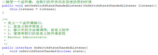
在onTouchEvent方法中,合适的地方调用接口中的方法

8.设置自定义属性---参考2.3.6
9.重写测量方法

- 实现自定义消息数量图标
- 自定义类继承于view 重写构造方法
- 重写onDraw方法,在方法中绘制

- 自定义属性
使用资源文件声明自定义属性
以下代码必须放在res/values 目录下
<?xml version="1.0" encoding="utf-8"?>
<resources>
<declare-styleable name="slide">
<attr name="slideState" format="boolean" />
</declare-styleable>
</resources>
布局文件自定控件中使用自定义属性
如果你用到了自定义属性,你都必须在activity布局文件的最开始这样声明:
|
| <?xml version="1.0" encoding="utf-8"?> <RelativeLayout xmlns:android="http://schemas.android.com/apk/res/android" xmlns:my="http://schemas.android.com/apk/res/应用程序包名" |
<自定义控件
my:slideState="true" 使用命名空间my(随意写,但是两者要一致)
</自定义控件>
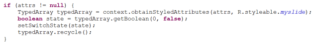
在自定的控件类中 取得自定义属性(一般写在构造方法中)
TypedArray a = context.obtainStyledAttributes(attrs,R.styleable.slide); //得到自定义的属性值组成的数组
slideState = a.getBoolean(0, false); //获取属性的值
附录:自定义属性
1. reference:参考某一资源ID。
(1)属性定义:
<declare-styleable name="名称">
<attr format="reference" name="background" />
</declare-styleable>
2. color:颜色值。
(1)属性定义:
<declare-styleable name="名称">
<attr format="color" name="textColor" />
</declare-styleable>
3. boolean:布尔值。
(1)属性定义:
<declare-styleable name="名称">
<attr format="boolean" name="focusable" />
</declare-styleable>
4. dimension:尺寸值。
(1)属性定义:
<declare-styleable name="名称">
<attr format="dimension" name="layout_width" />
</declare-styleable>
5. float:浮点值。
(1)属性定义:
<declare-styleable name="AlphaAnimation">
<attr format="float" name="fromAlpha" />
<attr format="float" name="toAlpha" />
</declare-styleable>
6. integer:整型值。
(1)属性定义:
<declare-styleable name="AnimatedRotateDrawable">
<attr format="integer" name="frameDuration" />
<attr format="integer" name="framesCount" />
</declare-styleable>
7. string:字符串。
(1)属性定义:
<declare-styleable name="MapView">
<attr format="string" name="apiKey" />
</declare-styleable>
8. fraction:百分数。
(1)属性定义:
<declare-styleable name="RotateDrawable">
<attr format="fraction" name="pivotX" />
<attr format="fraction" name="pivotY" />
</declare-styleable>
9. enum:枚举值。
(1)属性定义:
<declare-styleable name="名称">
<attr name="orientation">
<enum name="horizontal" value="0" />
<enum name="vertical" value="1" />
</attr>
</declare-styleable>
10. flag:位或运算。
(1)属性定义:
<declare-styleable name="名称">
<attr name="windowSoftInputMode">
<flag name="stateUnspecified" value="0" />
<flag name="stateUnchanged" value="1" />
<flag name="stateHidden" value="2" />
<flag name="stateAlwaysHidden" value="3" />
<flag name="stateVisible" value="4" />
<flag name="stateAlwaysVisible" value="5" />
<flag name="adjustUnspecified" value="0x00" />
<flag name="adjustResize" value="0x10" />
<flag name="adjustPan" value="0x20" />
<flag name="adjustNothing" value="0x30" />
</attr>
</declare-styleable>
(1)属性定义:
<declare-styleable name="名称">
<attr format="reference|color" name="background" />
</declare-styleable>


 2799
2799


 被折叠的 条评论
为什么被折叠?
被折叠的 条评论
为什么被折叠?
 到【灌水乐园】发言


