


通过requests爬取当地的2022年3月,10月每天最低气温的数据
并通过matplotlib进行分析气温变化趋势
要求通过散点图分析,并标注图例
导入需要模块
import requests
import re
from lxml import tree
import matplotlib.pyplot as plt
import numpy as np
from matplotlib import rc
设置plt字体,让其可以显示中文
rc('font', family="MicroSoft YaHei")  # 设置字体参数
# Tips: rc方法设置字体只能支持Linux/Windows
# Mac 修改字体的方法可自行搜索
3. 创建读取天气数据类方法
parse_data方法获取到的数据格式是:
[(日期,温度数值),(日期,温度数值),(日期,温度数值),]
为了让数据更符合y轴数据,就单独把温度值拿出来所以使用列表生成式
class ReadWeather:
    """
        创建读取天气数据类方法
    """
    headers = {
        "User-Agent": "Mozilla/5.0 (Windows NT 10.0; Win64; x64) AppleWebKit/537.36 (KHTML, like Gecko) Chrome/110.0.0.0 Safari/537.36 Edg/110.0.1587.50"
    }

    @classmethod
    def get_weather(cls, city, date):
        """
            获取天气数据的html的类方法
        """
        url = f'https://lishi.tianqi.com/{city}/{date}.html'
        res = requests.get(url, headers=ReadWeather.headers)
        if res.status_code == 200:
            return ReadWeather.parse_data(res.text)
        else:
            print(f'获取失败,网络错误,状态码:{res.status_code}')

    @classmethod
    def parse_data(cls, html_text):
        """
        传入html字符串解析天气数据
        """
        data = []
        html = etree.HTML(html_text)
        lis = html.xpath(r'/html/body/div[7]/div[1]/div[4]/ul/li')
        for li in lis:
            date = li.xpath('.//div[@class="th200"]/text()')[0]
            date = re.search(r'\d+-\d+-\d+', date).group()
            min_tem = li.xpath('.//div[@class="th140"][2]/text()')[0]
            min_tem = int(re.search(r'\d+', min_tem).group())
            data.append((date, min_tem))
            print(f'{date} | {min_tem}℃')
        return data


# -------------------------分割线-------------------------


weather_03 = ReadWeather.get_weather("beijing", "202203")  # 获取3月温度数据
weather_10 = ReadWeather.get_weather("beijing", "202210")  # 获取10月温度数据

# -------------------------分割线-------------------------


weather_03 = [data[1] for data in weather_03]  # 去除时间数据拿出天气数据
weather_10 = [data[1] for data in weather_10]
4.利用获得的数据画图
x_03 = np.arange(0, 31) # 通过数字值创建x轴,可以让3月与10月中间有一定间隔
x_10 = np.arange(50, 81)
date_list = [(f"03-{day}" if day >= 10 else f"03-0{day}") for day in range(1, 32)] + [
(f"10-{day}" if day >= 10 else f"10-0{day}") for day in range(1, 32)]
# -------------------------分割线-------------------------
# plt.scatter(x,y)方法用于绘制散点图
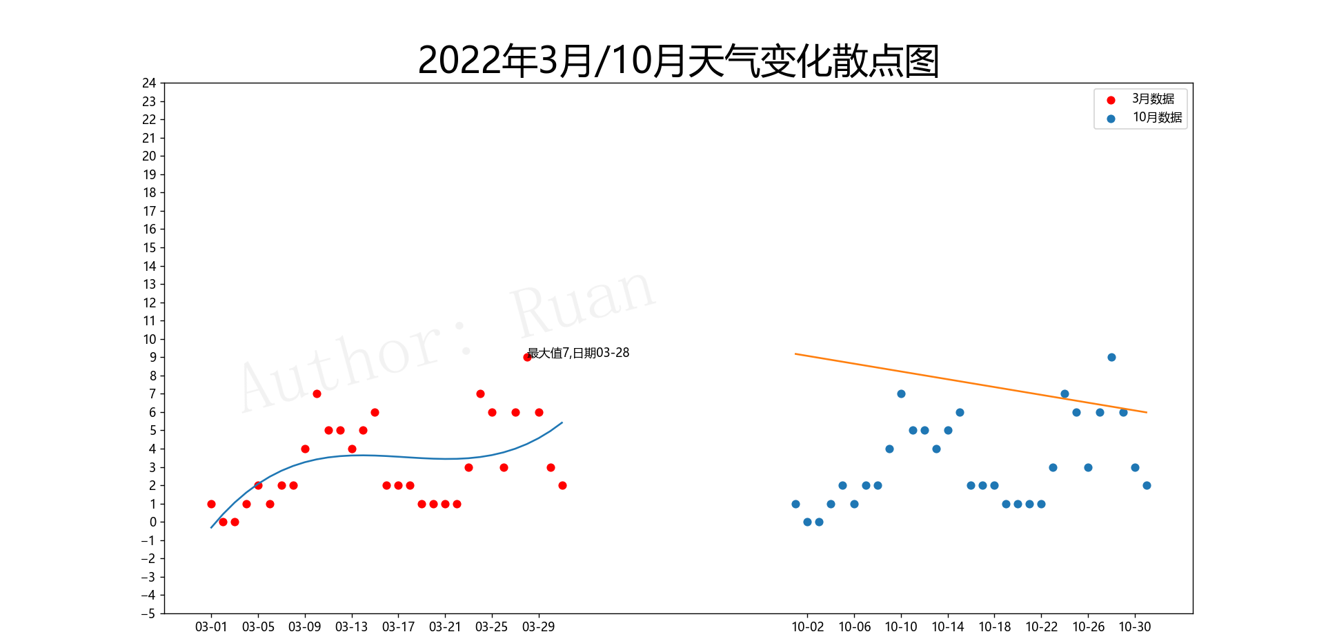
plt.figure(figsize=(20, 8), dpi=100)
plt.scatter(x_03, weather_03, label="3月数据", color="red")
plt.scatter(x_10, weather_03, label="10月数据")
plt.legend()
coeffics_03 = np.polyfit(x_03, weather_03, 3) # 获取3月的二项式三次幂拟合后系数值
fit_fun_03 = np.poly1d(coeffics_03) # 获取3月的拟合函数f(x)
coeffics_10 = np.polyfit(x_10, weather_10, 1) # 同样获取10月的拟合曲线,10月获取一次幂的
fit_fun_10 = np.poly1d(coeffics_10)
plt.plot(x_03, fit_fun_03(x_03)) # 导入x,y值,绘制拟合曲线图
plt.plot(x_10, fit_fun_10(x_10))
plt.xticks([*x_03, *x_10][::4], date_list[::4])
plt.yticks(range(-5, 25))
plt.title("2022年3月/10月天气变化散点图", size=30)
plt.annotate(text=f"最大值{weather_03[np.max(weather_03)]},日期{date_list[np.argmax(weather_03)]}",
xy=(x_03[np.argmax(weather_03)], np.max(weather_03)),
xytext=(x_03[np.argmax(weather_03)], np.max(weather_03)))
# 添加水印
plt.text(
x=20, # 文本x轴坐标
y=10, # 文本y轴坐标
s='Author: Ruan', # 文本内容
rotation=15, # 文字旋转角度
ha='center', # x=2.2是文字的左端位置,可选'center', 'right', 'left'
va='center', # y=8是文字的低端位置,可选'center', 'top', 'bottom', 'baseline', 'center_baseline'
alpha=0.1, # 透明度
fontdict=dict(
fontsize=60, # 字体大小
color='grey', # 字体颜色
family=
'YouYuan', # 字体
weight=
'light', # 磅值,可选'light', 'normal', 'medium', 'semibold', 'bold', 'heavy', 'black'
) # 字体属性设置
)
plt.savefig("./3月和10月最高气温变化.jpg", dpi=500) # 保存图表图片设置dpi500
plt.show() # 展示图表
完整代码如下:
# coding: utf-8
# @Author: Ruan
# coding:utf-8
画图后结果如下所示:


 被折叠的 条评论
为什么被折叠?
被折叠的 条评论
为什么被折叠?
 到【灌水乐园】发言


