


seaborn的热力图实现
# 导入用到的包
import pandas as pd
import matplotlib.pyplot as plt
import seaborn as sns
import matplotlib as mpl
file = r'/Users/caizhiming/Downloads/fz2019.xlsx'
df = pd.read_excel(file, sheet_name='Sheet1',index_col='月份')
df.head(10)
| 1日 | 2日 | 3日 | 4日 | 5日 | 6日 | 7日 | 8日 | 9日 | 10日 | ... | 22日 | 23日 | 24日 | 25日 | 26日 | 27日 | 28日 | 29日 | 30日 | 31日 | |
|---|---|---|---|---|---|---|---|---|---|---|---|---|---|---|---|---|---|---|---|---|---|
| 月份 | |||||||||||||||||||||
| 9月 | 21 | 26 | 24 | 19 | 25 | 33 | 57 | 73 | 63 | 61 | ... | 66 | 86 | 110 | 121 | 126 | 92 | 80 | 68.0 | 46.0 | NaN |
| 8月 | 27 | 22 | 36 | 37 | 23 | 28 | 37 | 24 | 26 | 32 | ... | 45 | 22 | 20 | 25 | 32 | 65 | 19 | 49.0 | 45.0 | 42.0 |
| 7月 | 72 | 22 | 29 | 32 | 34 | 30 | 41 | 45 | 40 | 26 | ... | 44 | 50 | 60 | 67 | 71 | 64 | 72 | 63.0 | 42.0 | 24.0 |
| 6月 | 38 | 36 | 38 | 70 | 64 | 46 | 47 | 49 | 41 | 28 | ... | 29 | 33 | 37 | 37 | 62 | 58 | 53 | 62.0 | 59.0 | NaN |
| 5月 | 47 | 85 | 73 | 91 | 64 | 62 | 66 | 57 | 52 | 83 | ... | 77 | 73 | 49 | 55 | 61 | 40 | 42 | 63.0 | 85.0 | 77.0 |
| 4月 | 58 | 51 | 40 | 43 | 48 | 71 | 74 | 82 | 62 | 52 | ... | 58 | 62 | 91 | 52 | 63 | 48 | 48 | 71.0 | 52.0 | NaN |
| 3月 | 42 | 45 | 44 | 50 | 48 | 40 | 66 | 58 | 37 | 34 | ... | 52 | 46 | 50 | 40 | 54 | 62 | 68 | 43.0 | 64.0 | 65.0 |
| 2月 | 42 | 46 | 95 | 69 | 107 | 68 | 62 | 35 | 32 | 32 | ... | 36 | 33 | 29 | 34 | 50 | 67 | 35 | NaN | NaN | NaN |
| 1月 | 29 | 35 | 35 | 52 | 55 | 44 | 43 | 48 | 33 | 57 | ... | 85 | 70 | 71 | 72 | 68 | 46 | 39 | 46.0 | 47.0 | 42.0 |
9 rows × 31 columns
# mpl.rcParams['font.sans-serif'] = ['SimHei'] #设置简黑字体
mpl.rcParams['font.sans-serif'] = ['Songti SC']
mpl.rcParams['axes.unicode_minus'] = False
cm_light = mpl.colors.ListedColormap(['tab:green','yellow','orange','red'])
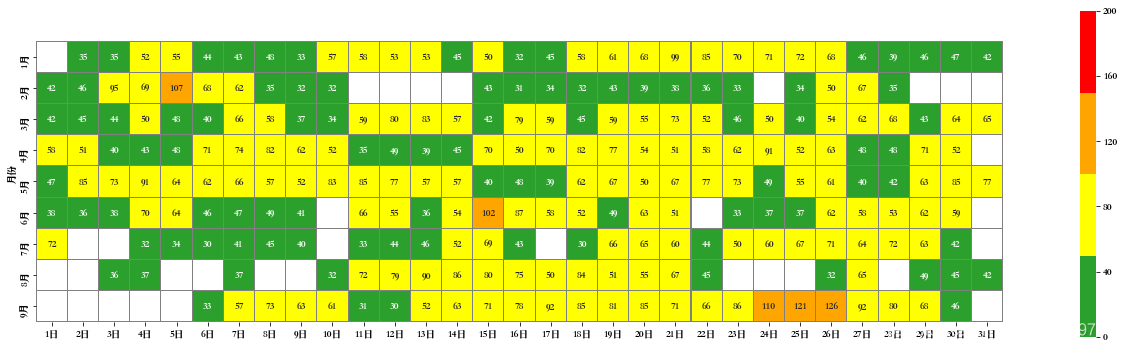
plt.figure(figsize=(22,6))
# mask标记过滤值
ax = sns.heatmap(df, square=True, annot=True, vmin=0, vmax=200, fmt='.0f', linewidths=.05
, linecolor='gray', mask=df<30, cmap=cm_light)
plt.ylim(0, len(df)+.5)
plt.xlim(0, len(df.columns)+.5)
plt.show()
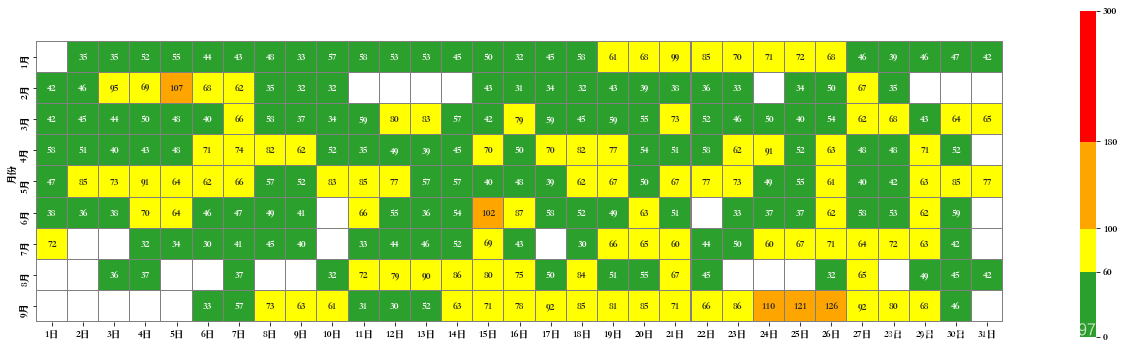
自定义颜色及调节颜色标尺的颜色区间
# 自定义黄色颜色
y = np.array([255, 255, 0])/255
colors = ['tab:green',y,'orange','red']
# 自由设定颜色区间
bounds = [0, 60, 100, 180, 300]
# bounds = [0, 75, 150, 225, 300] # 也可以均匀划分
cm_light = mpl.colors.ListedColormap(colors)
norm = mpl.colors.BoundaryNorm(bounds, cm_light.N)

plt.figure(figsize=(22,6))
# cbar_kws设定颜色标尺的ticks线性分布
ax = sns.heatmap(df, square=True, annot=True, vmin=0, vmax=200, fmt='.0f', linewidths=.05,
                linecolor='gray', mask=df<30, cmap=cm_light, norm=norm,
                 cbar_kws={'ticks': bounds, 'spacing':'proportional'})


# 防止显示不全(有的版本及操作系统会遇到这个问题)
plt.ylim(0, len(df)+.5)
plt.xlim(0, len(df.columns)+0.5)
plt.show()
使用pyecharts实现日历图
pyecharts的数据结构不同需要处理:
# 导入时间处理常用的包
import datetime
# 导入pyecharts绘制日历图的包
from pyecharts import options as opts
from pyecharts.charts import Calendar
values = df.iloc[::-1, :].to_numpy()
begin = pd.datetime(2019, 1, 1)
count, data = 0, []
for row in values:
    for val in row:
        data.append([str(begin + datetime.timedelta(count)), val])
        count += 1

c = (
    Calendar()
    .add("", data, calendar_opts=opts.CalendarOpts(range_="2019"))
    .set_global_opts(
        title_opts=opts.TitleOpts(title="2019年数据展示"),
        visualmap_opts=opts.VisualMapOpts(
            max_=200,
            min_=0,
            orient="horizontal",
            is_piecewise=True,
            pos_top="230px",
            pos_left="100px",
        ),
    )
)

c.render_notebook()


 2万+
2万+


 被折叠的 条评论
为什么被折叠?
被折叠的 条评论
为什么被折叠?
 到【灌水乐园】发言


