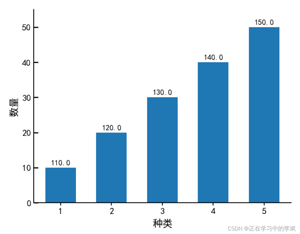
1. 单数据条形图
import matplotlib.pyplot as plt
import numpy as np
import pandas as pd
plt.rcParams["font.sans-serif"]='SimHei'
plt.rcParams['axes.unicode_minus']=False
plt.rc('axes',axisbelow=True)
y_data = range(10,60,10)
x_data = range(1,6,1)
fig=plt.figure(figsize=(8,6),dpi=100)
ax = fig.add_subplot(1,1,1)
plt.subplots_adjust(left=0.1, right=0.9, top=0.9, bottom=0.1)
ax.spines[['top','left','bottom','right']].set_linewidth(1.5)
ax.spines[['top','right']].set_color('none')
bars = ax.bar(x_data,y_data,width=0.6,align="center")
ax.tick_params(axis="x", direction='out', which='major',labelsize=16, length=5, width=1.5,)
ax.tick_params(axis="y", direction='in',which="major", labelsize=16, length=8, width=2, pad=5)
for bar in bars:
height = bar.get_height()
ax.annotate(f'{height+100:.1f}', xy=(bar.get_x() + bar.get_width() / 2, height),
fontsize=14, color='black',
xytext=(0, 4), textcoords='offset points', ha='center', va='bottom')
ax.set_ylim(0,55)
ax.set_xlabel('种类',fontsize=18,labelpad=6)
ax.set_ylabel('数量',fontsize=18,labelpad=6)
plt.show()
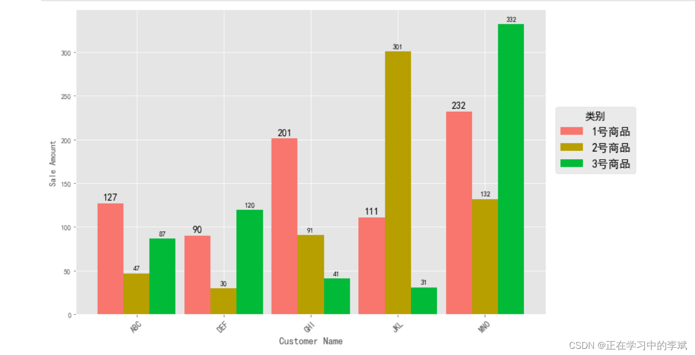
3、多类数据条形图
import matplotlib.pyplot as plt
import numpy as np
plt.style.use('ggplot')
plt.rcParams['font.sans-serif']=['SimHei']
plt.rcParams['axes.unicode_minus']=False
customers = ['ABC', 'DEF', 'GHI', 'JKL', 'MNO']
customers_index = np.arange(len(customers))
sale_amounts = [127, 90, 201, 111, 232]
sale_amounts2 = [47, 30, 91, 301, 132]
sale_amounts3 = [87, 120, 41, 31, 332]
fig = plt.figure(figsize=(12,8))
ax1 = fig.add_subplot(1,1,1)
width = 0.3
rects1 = ax1.bar(customers_index - width, sale_amounts, width=width ,align='center', color='#F8766D',label='1号商品')
rects2 = ax1.bar(customers_index , sale_amounts2, width=width ,align='center', color='#B79F00',label='2号商品')
rects3 = ax1.bar(customers_index + width, sale_amounts3, width=width ,align='center', color='#00BA38',label='3号商品')
ax1.bar_label(rects1,padding=3,**{'fontsize': 14})
ax1.bar_label(rects2,padding=3)
ax1.bar_label(rects3,padding=3)
ax1.xaxis.set_ticks_position('bottom')
ax1.yaxis.set_ticks_position('left')
ax1.set_xticks(customers_index)
ax1.set_xticklabels(customers)
ax1.xaxis.set_tick_params(labelrotation = 45, labelsize = 12)
ax1.set_xlabel('Customer Name', fontsize = 14)
ax1.yaxis.set_tick_params(which = "both", labelsize = 10)
ax1.set_ylabel('Sale Amount')
ax1.legend(title = "类别",
fontsize = 16,
title_fontsize = 15,
bbox_to_anchor = (1.01, 0.7))
plt.savefig('bar_plot.png', dpi=400, bbox_inches='tight')
plt.show()
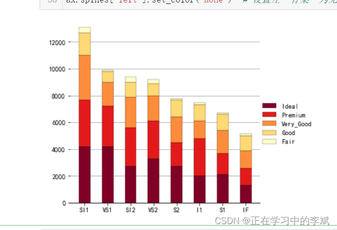
3. 普通堆叠柱状图
df=pd.read_csv('StackedColumn_Data.csv')
df=df.set_index("Clarity")
Sum_df=df.apply(lambda x: x.sum(), axis=0).sort_values(ascending=False)
df=df.loc[:,Sum_df.index]
meanRow_df=df.apply(lambda x: x.mean(), axis=1)
Sing_df=meanRow_df.sort_values(ascending=False).index
n_row,n_col=df.shape
x_value=np.arange(n_col)
cmap=cm.get_cmap('YlOrRd_r',n_row)
color=[colors.rgb2hex(cmap(i)[:3]) for i in range(cmap.N) ]
bottom_y=np.zeros(n_col)
fig=plt.figure(figsize=(5,5))
for i in range(n_row):
label=Sing_df[i]
plt.bar(x_value,df.loc[label,:],bottom=bottom_y,width=0.5,color=color[i],label=label,edgecolor='k', linewidth=0.25)
bottom_y=bottom_y+df.loc[label,:].values
plt.xticks(x_value,df.columns,size=10)
plt.legend(loc=(1,0.3),ncol=1,frameon=False)
plt.grid(axis="y",c=(166/256,166/256,166/256))
ax = plt.gca()
ax.spines['top'].set_color('none')
ax.spines['right'].set_color('none')
ax.spines['left'].set_color('none')
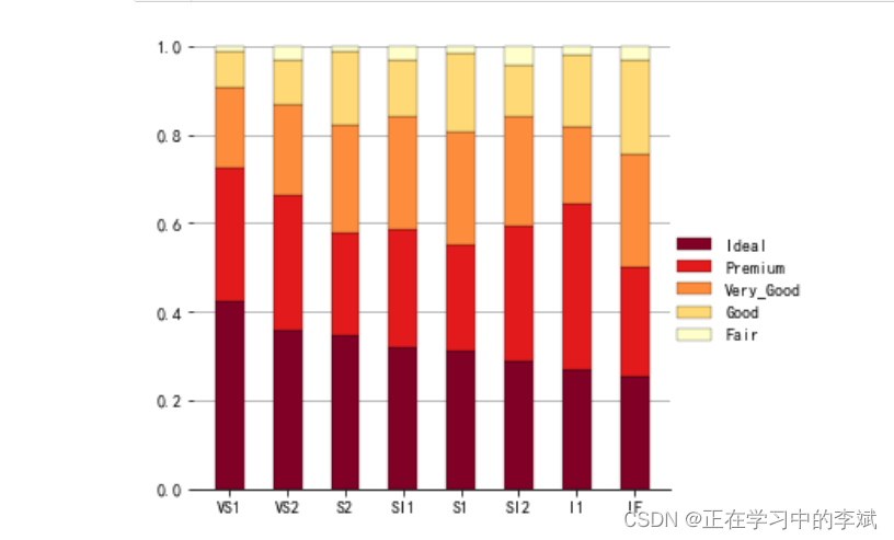
4. 百分比堆叠柱状图
df=pd.read_csv('StackedColumn_Data.csv')
df=df.set_index("Clarity")
SumCol_df=df.apply(lambda x: x.sum(), axis=0)
df=df.apply(lambda x: x/SumCol_df, axis=1)
meanRow_df=df.apply(lambda x: x.mean(), axis=1)
Per_df=df.loc[meanRow_df.idxmax(),:].sort_values(ascending=False)
Sing_df=meanRow_df.sort_values(ascending=False).index
df=df.loc[:,Per_df.index]
n_row,n_col=df.shape
x_value=np.arange(n_col)
cmap=cm.get_cmap('YlOrRd_r',n_row)
color=[colors.rgb2hex(cmap(i)[:3]) for i in range(cmap.N) ]
bottom_y=np.zeros(n_col)
fig=plt.figure(figsize=(5,5))
for i in range(n_row):
label=Sing_df[i]
plt.bar(x_value,df.loc[label,:],bottom=bottom_y,width=0.5,color=color[i],label=label,edgecolor='k', linewidth=0.25)
bottom_y=bottom_y+df.loc[label,:].values
plt.xticks(x_value,df.columns,size=10)
label_format = '{:.1f}%'
ylabels = ax.get_yticks().tolist()
ax.yaxis.set_major_locator(mticker.FixedLocator(ylabels))
ax.set_yticklabels([label_format.format(x*100) for x in ylabels])
plt.legend(loc=(1,0.3),ncol=1,frameon=False)
plt.grid(axis="y",c=(166/256,166/256,166/256))
ax = plt.gca()
ax.spines['top'].set_color('none')
ax.spines['right'].set_color('none')
ax.spines['left'].set_color('none')
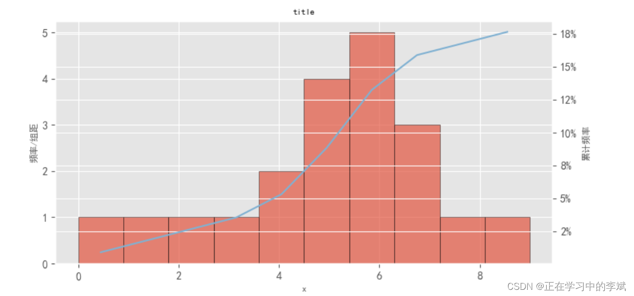
5. 柱形图加累计曲线(双Y轴坐标)
import matplotlib.pyplot as plt
import matplotlib as mpl
from matplotlib.ticker import FuncFormatter
from matplotlib.pyplot import MultipleLocator
plt.style.use('ggplot')
mpl.rcParams['font.sans-serif'] = ['Times New Roman']
mpl.rcParams['font.sans-serif'] = [u'SimHei']
mpl.rcParams['axes.unicode_minus'] = False
data = [0,1, 2, 3, 4,4,5, 5, 5, 5,6, 6, 6, 6, 6,7, 7,7,8, 9]
fig= plt.figure(figsize=(8, 4),dpi=100)
ax1 = fig.add_subplot(111)
a1,a2,a3=ax1.hist(data,bins =10, alpha = 0.65,edgecolor='k')
indexs=[]
a2=a2.tolist()
for i,value in enumerate(a2):
if i<=len(a2)-2:
index=(a2[i]+a2[i+1])/2
indexs.append(index)
def to_percent(temp,position):
return '%1.0f'%(100*temp) + '%'
dis=a2[1]-a2[0]
print('dis',dis)
freq=[f*dis for f in a1]
acc_freq=[]
for i in range(0,len(freq)):
if i==0:
temp=freq[0]
else:
temp=sum(freq[:i+1])
acc_freq.append(temp/102)
print('acc_freq',acc_freq)
print(sum(data))
ax2=ax1.twinx()
ax2.plot(indexs,acc_freq,color='#80b1d2')
ax2.yaxis.set_major_formatter(FuncFormatter(to_percent))
ax1.set_xlabel('x',fontsize=8)
ax1.set_title("title",fontsize =8)
ax1.set_ylabel('频率/组距',fontsize=8)
ax2.set_ylabel("累计频率",fontsize=8)
plt.show()
多分类并排柱状图
import numpy as np
import pandas as pd
import matplotlib.pyplot as plt
import warnings
import glob
plt.rcParams['font.family']='Times New Roman,SimHei'
plt.rcParams['axes.unicode_minus']=False
plt.rcParams['lines.linewidth'] = 2
plt.rcParams['axes.linewidth'] = 2
plt.rcParams['patch.linewidth'] = 0
plt.rcParams['font.size'] =20
warnings.filterwarnings('ignore', category=UserWarning, message="Workbook contains no default style, apply openpyxl's default")
file_path = r"./data/*.xlsx"
file_name = glob.glob(file_path)
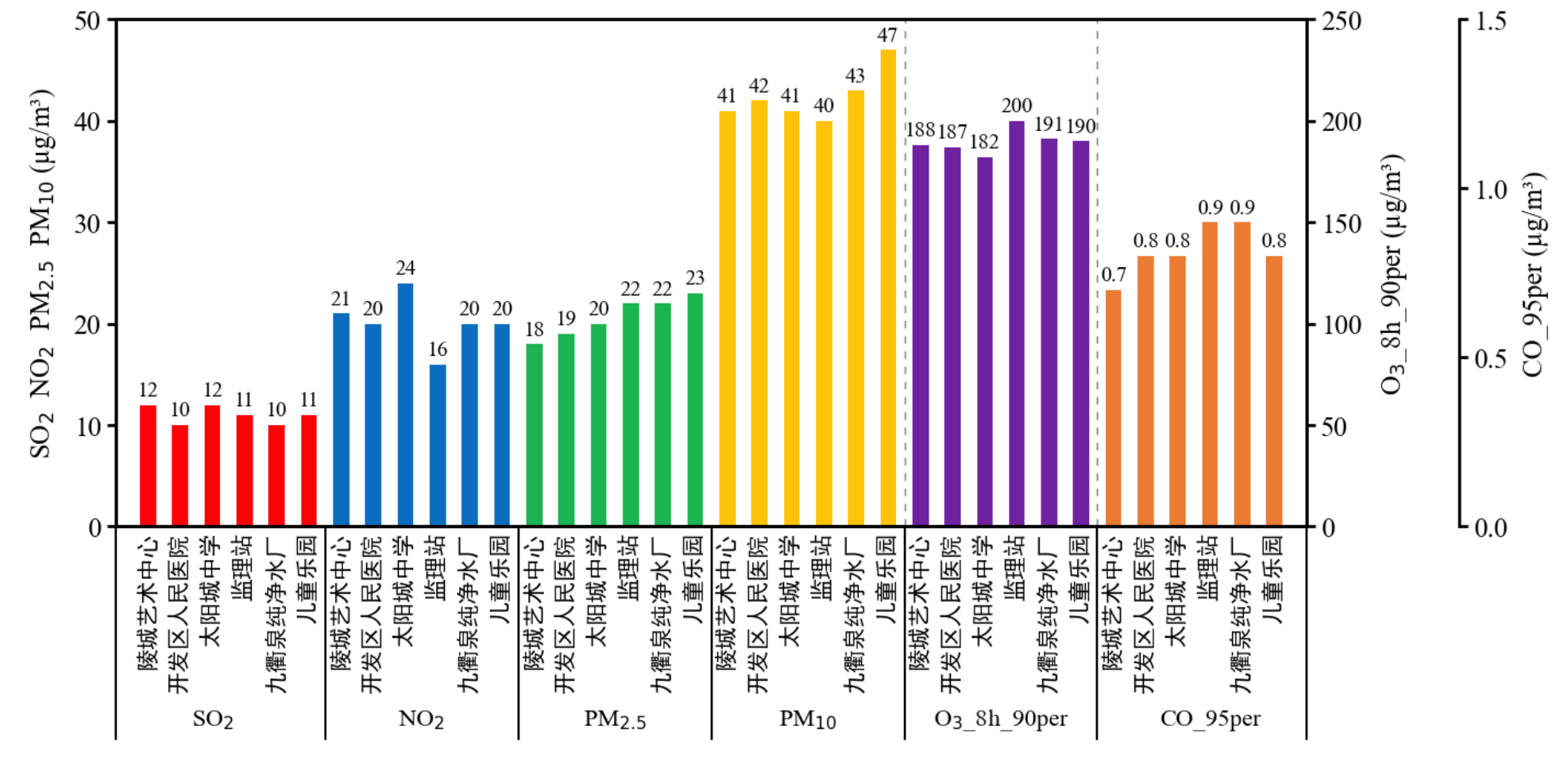
use_columns = ['站点','开始日期', '结束日期','SO2当前数据','NO2当前数据', 'O3_8h第90百分位数当前数据', 'PM2.5当前数据',
'PM10当前数据', 'CO第95百分位数当前数据']
df = pd.read_excel(file_name[0],usecols=use_columns)
file_path = r"./data/*.xlsx"
file_name = glob.glob(file_path)
use_columns = ['站点','开始日期', '结束日期','SO2当前数据','NO2当前数据', 'O3_8h第90百分位数当前数据', 'PM2.5当前数据',
'PM10当前数据', 'CO第95百分位数当前数据']
df = pd.read_excel(file_name[0],usecols=use_columns)
stations = ['陵城艺术中心', '开发区人民医院', '太阳城中学', '监理站', '九衢泉纯净水厂', '儿童乐园']
so2 = df['SO2当前数据']
no2 = df['NO2当前数据']
o3 = df['O3_8h第90百分位数当前数据']
pm25 = df['PM2.5当前数据']
pm10 = df['PM10当前数据']
co = df['CO第95百分位数当前数据']
data_len = len(so2)
width=0.5
x_1 = np.arange(data_len)
x_2 = np.arange(data_len) + data_len*1
x_3 = np.arange(data_len) + data_len*2
x_4 = np.arange(data_len) + data_len*3
x_5 = np.arange(data_len) + data_len*4
x_6 = np.arange(data_len) + data_len*5
stations_combined = stations * 6
x = np.arange(len(stations_combined))
fig, ax1 = plt.subplots(figsize=(14, 6))
bars1 = ax1.bar(x_1, so2, color='r', width=width)
ax1.bar_label(bars1,padding=3,**{'fontsize': 14})
bars1 = ax1.bar(x_2, no2, color='#0070c0', width=width)
ax1.bar_label(bars1,padding=3,**{'fontsize': 14})
bars1 = ax1.bar(x_3, pm25, color='#00b050', width=width)
ax1.bar_label(bars1,padding=3,**{'fontsize': 14})
bars1 = ax1.bar(x_4, pm10, color='#ffc000', width=width)
ax1.bar_label(bars1,padding=3,**{'fontsize': 14})
ax1.set_ylabel(r'SO$_{2}$ NO$_{2}$ PM$_{2.5}$ PM$_{10}$ (µg/m³)',size=18,labelpad=10)
ax1.tick_params(axis='y',labelsize=18,size=6,width=2)
ax1.spines[['left','bottom','top']].set_linewidth(2)
ax2 = ax1.twinx()
bars2 = ax2.bar(x_5, o3, color='#7030a0', width=width)
ax2.bar_label(bars2,padding=3,**{'fontsize': 14})
ax2.set_ylabel('O$_{3}$_8h_90per (µg/m³)',size=18,labelpad=10)
ax2.spines['right'].set_linewidth(2)
ax2.tick_params(axis='y',labelsize=18,size=6,width=2)
ax3 = ax1.twinx()
ax3.spines['right'].set_position(('outward', 100))
bars3 = ax3.bar(x_6, co, color='#ed7d31', width=width)
ax3.set_ylabel('CO_95per (µg/m³)', size=18,labelpad=10)
ax3.spines['right'].set_linewidth(2)
ax3.tick_params(axis='y',labelsize=18,size=6,width=2)
ax3.bar_label(bars6,padding=3,**{'fontsize': 14})
ax1.set_xlim(-1,data_len*6)
ax1.set_ylim(0,50)
ax2.set_ylim(0,250)
ax3.set_ylim(0,1.5)
ax3.yaxis.set_major_locator(plt.MaxNLocator(3))
ax1.set_xticks(np.arange(0, len(stations_combined), 1))
ax1.set_xticklabels(stations_combined, rotation=90,fontsize=15)
ax1.tick_params(axis='x',size=0)
ax1.axvline(x=-1, color='black',linestyle='-', linewidth=1.4, ymin=-0.42,ymax=0,clip_on=False)
ax1.axvline(x=data_len*6, color='black',linestyle='-', linewidth=1.4, ymin=-0.42,ymax=0,clip_on=False)
for i in range(data_len-1):
ax1.axvline(x=data_len*i+5.5, color='black',linestyle='-', linewidth=1.4, ymin=-0.42,ymax=0,clip_on=False)
ax1.axvline(x=23.5, color='black',linestyle=(0, (5, 5)), linewidth=1, ymin=0,ymax=1,clip_on=True, alpha=0.5)
ax1.axvline(x=29.5, color='black',linestyle=(0, (5, 5)), linewidth=1, ymin=0,ymax=1,clip_on=True,alpha=0.5)
x_label = ['SO$_{2}$','NO$_{2}$','PM$_{2.5}$','PM$_{10}$','O$_{3}$_8h_90per','CO_95per']
x_loc =[2,8.5,14.5,20.5,26.5,33]
for i,s in zip(x_loc,x_label):
ax1.text(x=i,y=-19,s=s,fontsize=16,ha='center',va='center')
plt.savefig('./out/9月6参图_移动O3.png', bbox_inches='tight',dpi=300)


 本文介绍了Python使用matplotlib库绘制不同类型的条形图,包括单数据条形图、多类数据条形图、普通堆叠柱状图和百分比堆叠柱状图。示例代码详细展示了如何设置图表样式、颜色、标签以及数值标注,帮助读者理解如何通过Python进行数据可视化。


 4万+
4万+

 被折叠的 条评论
为什么被折叠?
被折叠的 条评论
为什么被折叠?
 到【灌水乐园】发言


