


CSS3动画 - 心脏跳动
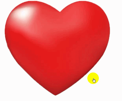
1. 效果图
2. 代码如下
<!DOCTYPE html>
<html>
<head>
	<meta charset="UTF-8">
	<title>CSS3动画 - 心脏跳动</title>
	<style type="text/css">
		.demo {
		    width: 554px;
		    height: 474px;
		    background: url(images/heart.png) no-repeat center;
		    background-size: 100%;
		    border-radius: 8px;
		    -webkit-border-radius: 8px;
		    -o-border-radius: 8px;
		    -moz-border-radius: 8px;
		    float: left;
		    font-size: 30px;
		    text-align: center;
		    font-weight: bold;
		    border: none;
		    color: #fff;
		    cursor: pointer;
		    line-height: 70px;
		    font-family: 微软雅黑;
		}
		#heart{
		    animation: breathe 1.1s infinite;
		}
		@keyframes breathe{
		  0%{ transform: scale(.99); }
		  50%{ transform: scale(1.03); }
		  100%{ transform: scale(.99); }
		}
	</style>
</head>
<body>
	<div id="heart" class="demo"></div>
</body>
</html>
以上就是关于“ CSS3动画 - 心脏跳动 ” 的全部内容。


 扫一扫
扫一扫


 7211
7211

 被折叠的 条评论
为什么被折叠?
被折叠的 条评论
为什么被折叠?
 到【灌水乐园】发言


