


可以使用HTML的<hr/>标签
height:2px;是hr的高度;
border:none;是没有边框;
border-top:2pxdotted;是设置横线的样式
none:无样式;dotted:点线;
dashed:虚线;
solid:实线;
double:双线;groove:槽线;
ridge:脊线;
inset:内凹;
outset:外凸;
groove 上颜色
skyblue 下颜色
效果如下:
案例代码
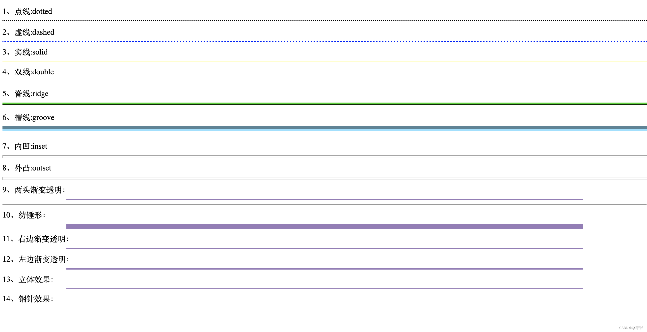
<span>1、点线:dotted<span>
<hr style=" height:2px;border:none;border-top:2px dotted black;"/>

    <span>2、虚线:dashed<span>
<hr style="height:1px;border:none;border-top:1px dashed blue;"/>

    <span>3、实线:solid<span>
<hr style="height:1px;border:none;border-top:1px solid yellow;"/>

    <span>4、双线:double<span>
<hr style="height:3px;border:none;border-top:3px double red;"/>

    <span>5、脊线:ridge<span>
<hr style="height:5px;border:none;border-top:5px ridge green;"/>

	<span>6、槽线:groove<span>
<hr style="height:10px;border:none;border-top:10px groove skyblue;"/>

    <span>7、内凹:inset<span>
<hr style="border:6 inset #ff0033" width="100%" SIZE=6>

    <span>8、外凸:outset<span>
<hr style="border:6 outset #ff0033" width="100%" SIZE=6>

    <span>9、两头渐变透明:<span>
<hr style="FILTER: alpha(opacity=100,finishopacity=0,style=3)" width="80%" color=#987cb9 SIZE=3>
<hr style="FILTER:borderLine (
    width: 100px;height:2px;
    background: -webkit-linear-gradient(left, #fff -4%, #333 50%, #fff 100%);">
    <span>10、纺锤形:<span>
<hr style="FILTER: alpha(opacity=100,finishopacity=0,style=2)" width="80%" color=#987cb9 SIZE=10>

    <span>11、右边渐变透明:<span>
<hr style="FILTER: alpha(opacity=100,finishopacity=0,style=1)" width="80%" color=#987cb9 SIZE=3>

    <span>12、左边渐变透明:<span>
<hr style="FILTER: alpha(opacity=0,finishopacity=100,style=1)" width="80%" color=#987cb9 SIZE=3>

    <span>13、立体效果:<span>
<hr style="FILTER: progid:DXImageTransform.Microsoft.Shadow(color:#987cb9,direction:145,strength:15)" width="80%"
    color=#987cb9 SIZE=1>

    <span>14、钢针效果:<span>
参考文献


 扫一扫
扫一扫


 1455
1455

 被折叠的 条评论
为什么被折叠?
被折叠的 条评论
为什么被折叠?
 到【灌水乐园】发言


