


1 type值汇总
不同的type的值对应的图表类型如下:
type: ‘bar’:柱状/条形图
type: ‘line’:折线/面积图
type: ‘pie’:饼图
type: ‘scatter’:散点(气泡)图
type: ‘effectScatter’:带有涟漪特效动画的散点(气泡)
type: ‘radar’:雷达图
type: ‘tree’:树型图
type: ‘treemap’:树型图
type: ‘sunburst’:旭日图
type: ‘boxplot’:箱形图
type: ‘candlestick’:K线图
type: ‘heatmap’:热力图
type: ‘map’:地图
type: ‘parallel’:平行坐标系的系列
type: ‘lines’:线图
type: ‘graph’:关系图
type: ‘sankey’:桑基图
type: ‘funnel’:漏斗图
type: ‘gauge’:仪表盘
type: ‘pictorialBar’:象形柱图
type: ‘themeRiver’:主题河流
type: ‘custom’:自定义系列
2 tooltip属性
tooltip ={                                  //提示框组件
    trigger: 'item',                        //触发类型,'item'数据项图形触发,主要在散点图,饼图等无类目轴的图表中使用。 'axis'坐标轴触发,主要在柱状图,折线图等会使用类目轴的图表中使用。
    triggerOn:"mousemove",                  //提示框触发的条件,'mousemove'鼠标移动时触发。'click'鼠标点击时触发。'mousemove|click'同时鼠标移动和点击时触发。'none'不在 'mousemove' 或 'click' 时触发
    showContent:true,                       //是否显示提示框浮层
    alwaysShowContent:true,                 //是否永远显示提示框内容
    showDelay:0,                            //浮层显示的延迟,单位为 ms
    hideDelay:100,                          //浮层隐藏的延迟,单位为 ms
    enterable:false,                        //鼠标是否可进入提示框浮层中
    confine:false,                          //是否将 tooltip 框限制在图表的区域内
    transitionDuration:0.4,                 //提示框浮层的移动动画过渡时间,单位是 s,设置为 0 的时候会紧跟着鼠标移动
    position:['50%', '50%'],                //提示框浮层的位置,默认不设置时位置会跟随鼠标的位置,[10, 10],回掉函数,inside鼠标所在图形的内部中心位置,top、left、bottom、right鼠标所在图形上侧,左侧,下侧,右侧,
    formatter:"{b0}: {c0}<br />{b1}: {c1}", //提示框浮层内容格式器,支持字符串模板和回调函数两种形式,模板变量有 {a}, {b},{c},{d},{e},分别表示系列名,数据名,数据值等
    backgroundColor:"transparent",          //标题背景色
    borderColor:"#ccc",                     //边框颜色
    borderWidth:0,                          //边框线宽
    padding:5,                              //图例内边距,单位px  5  [5, 10]  [5,10,5,10]
    textStyle:mytextStyle,                  //文本样式
};
3 饼图
3.1 饼图添加点击事件
var valueData = [
      {value: 33,name: '诊所'},
    {value: 29,name: '汽车服务相关'},
    {value: 27, name: '洗衣店'},
    {value: 26,name: '中介机构'},
    {value: 22,name: '汽车维修'}
];
var nameData = ['诊所', '汽车服务相关', '洗衣店', '中介机构', '汽车维修'];
var colorData = ['#A769EB', '#f69846', '#f6d54a', '#45dbf7', '#5AF6DE', '#89F6DC'];

let Option2 = {
    backgroundColor: 'rgba(0,0,0,0)',
    tooltip: {
        trigger: 'item',
        formatter: "{b} : {d}% <br/> {c}"
    },
    legend: {
        // orient: 'vertical',
        icon: 'circle',
        bottom: 20,
        x: 'center',
        y: 'top',
        data: nameData,
        textStyle: {
            color: '#fff'
        }
        //data: ['诊所', '汽车服务相关', '洗衣店', '中介机构', '汽车维修', '火车站', '人流指数', '日式简餐/快餐', 'ATM', '超市']
    },
    series: [{
        type: 'pie',
        // radius: ['20%', '40%'],
        center: ['50%', '50%'],
        left:70,
        right:70,
        color: colorData,
        data: valueData,
        labelLine: {
            normal: {
                show: true,
                length: 20,
                length2: 20,
                lineStyle: {
                    color: '#fff',
                    width: 2
                }
            }
        },
        label: {
            normal: {
                formatter: '{c|{b}}\n{a|{d}}'+ '%',
                rich: {
                    b: {
                        fontSize: 12,
                        color: '#12EABE',
                        align: 'left',
                        padding: 4
                    },
                    d: {

                        fontSize: 12,
                        align: 'left',
                        padding: 2
                    },
                    c: {
                        color: '#fff',
                        fontSize: 12,
                        align: 'left',
                        padding: 2
                    }
                }
            }
        }
    }]
}
var dom1 = document.getElementById("Box2");
var myChart1 = echarts.init(dom1);
let number = 0 //声明一个变量稍后接扇区的dataIndex
myChart1.on('click', function(param) { //添加点击事件
    console.log(param );
    myChart1.dispatchAction({ type: 'highlight', dataIndex: param.dataIndex }); //激活点击区域高亮
    if (param.dataIndex !== number) { // 当鼠标点击的时候 消除上一个扇区的高亮
        myChart1.dispatchAction({ type: 'downplay', dataIndex: number });
    }
    number = param.dataIndex //接住当前扇区的dataIndex
});
myChart1.setOption(Option2)
myChart1.dispatchAction({ type: 'highlight', dataIndex: 0 }); // 生成是默认第一条数据高亮
3.2 饼图添加图片
option = {
    graphic: { // 这个属性可以在饼图内部填充图片,文字等
        elements: [{
            type: 'image',//需要填充图片,配置image,如果不需要图片可以配置其他的, text, circle, sector, ring, polygon, polyline, rect, line, bezierCurve, arc, group,
            style: {
                image: giftImageUrl, //这里添加图片地址
                width: 110,
                height: 120
            },
            left: 'center',//
            top: 'middle' //配置图片居中
        }]
    },

    series: [{
        type: 'pie',
        radius: ['27%', '45%'],//在这里配置外半径值,和外半径可视部分的大小
        center: ['50%', '50%'],
        color: ['#0E7CE2', '#FF8352', '#E271DE', '#F8456B', '#00FFFF', '#4AEAB0'],
        data: data,
        labelLine: {
            normal: {
                show: false,
                length: 20,
                length2: 20,
                lineStyle: {
                    color: '#12EABE',
                    width: 2
                }
            }
        },

    }]
};
34 柱形图详解
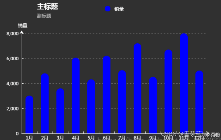
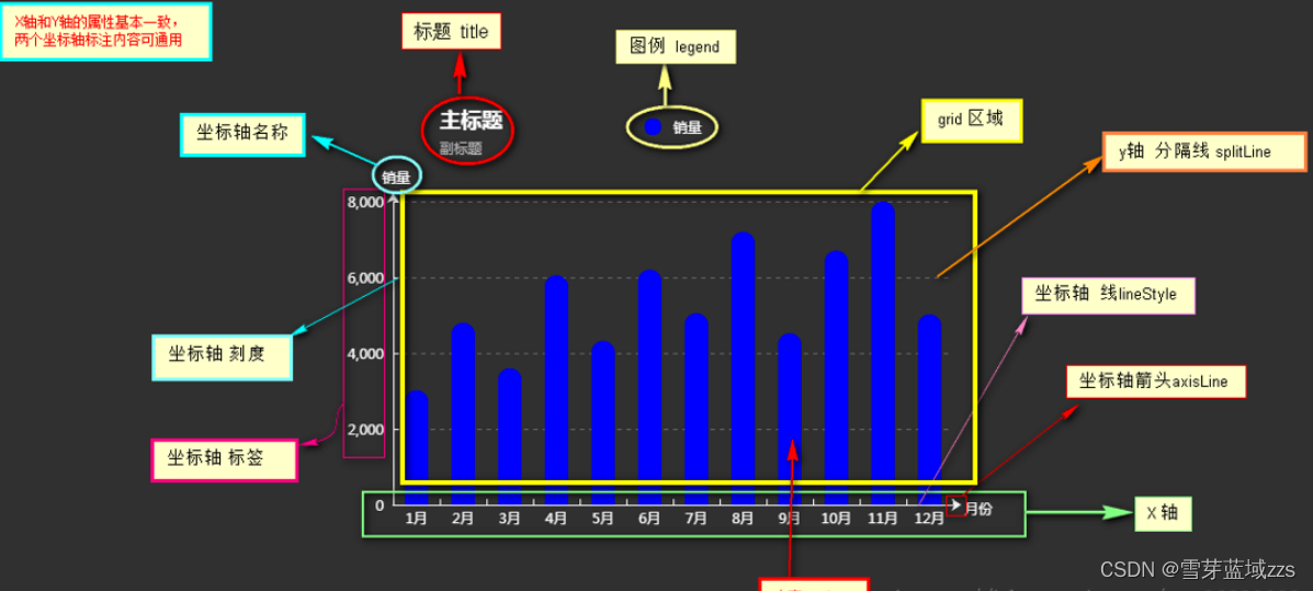
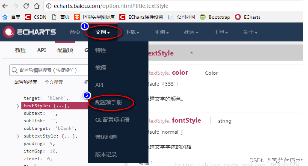
根据柱形每个部分的专业名称去寻找官网中的配置项手册对应的属性,然后实现你需要的效果
https://echarts.apache.org/examples/zh/index.html#chart-type-line
<!DOCTYPE html>
<html>
<head>
	<title>echarts</title>
</head>
<script src="js/jquery-1.11.1.min.js"></script>
<script type="text/javascript" src="js/echarts.min.js"></script>

<body style="background-color:#333;"><!--  -->
	<div id="_top" style="width:600px;height: 400px;margin-top:100px;margin-left: 300px;">
	</div>
</body>
<script type="text/javascript">
	 // 基于准备好的dom,初始化echarts实例
	 var myChart = echarts.init(document.getElementById('_top'));

	 // 指定图表的配置项和数据
        var option = {
        	//--------------    标题 title  ----------------
            title: {
                text: '主标题',
                textStyle:{					//---主标题内容样式
                	color:'#fff'
                },

                subtext:'副标题',			//---副标题内容样式
                subtextStyle:{
                	color:'#bbb'
                },

                padding:[0,0,100,100]				//---标题位置,因为图形是是放在一个dom中,因此用padding属性来定位

            },

           	//----------------   图例 legend  -----------------
            legend: {
            	type:'plain',				//----图例类型,默认为'plain',当图例很多时可使用'scroll'
            	top:'1%',					//----图例相对容器位置,top\bottom\left\right
            	selected:{
            		'销量':true,			//----图例选择,图形加载出来会显示选择的图例,默认为true
            	},
            	textStyle:{					//----图例内容样式
            		color:'#fff',				//---所有图例的字体颜色
            		//backgroundColor:'black',	//---所有图例的字体背景色
            	},
            	tooltip:{					//图例提示框,默认不显示
            		show:true,
            		color:'red',
            	},
                data:[						//----图例内容
                	{
                		name:'销量',
                		icon:'circle',			//----图例的外框样式
                		textStyle:{
                			color:'#fff',		//----单独设置某一个图例的颜色
                			//backgroundColor:'black',//---单独设置某一个图例的字体背景色
                		}
                	}
                ],
            },

            //--------------   提示框 -----------------
            tooltip: {
            	show:true,					//---是否显示提示框,默认为true
            	trigger:'item',				//---数据项图形触发
            	axisPointer:{				//---指示样式
            		type:'shadow',
            		axis:'auto',

            	},
            	padding:5,
            	textStyle:{					//---提示框内容样式
            		color:"#fff",
            	},
            },

            //-------------  grid区域  ----------------
            grid:{
            	show:false,					//---是否显示直角坐标系网格
            	top:80,						//---相对位置,top\bottom\left\right
            	containLabel:false,			//---grid 区域是否包含坐标轴的刻度标签
            	tooltip:{					//---鼠标焦点放在图形上,产生的提示框
            		show:true,
            		trigger:'item',			//---触发类型
            		textStyle:{
            			color:'#666',
            		},
            	}
            },

            //-------------   x轴   -------------------
            xAxis: {
            	show:true,					//---是否显示
            	position:'bottom',			//---x轴位置
            	offset:0,					//---x轴相对于默认位置的偏移
            	type:'category',			//---轴类型,默认'category'
            	name:'月份',				//---轴名称
            	nameLocation:'end',			//---轴名称相对位置
            	nameTextStyle:{				//---坐标轴名称样式
            		color:"#fff",
            		padding:[5,0,0,-5],	//---坐标轴名称相对位置
            	},
            	nameGap:15,					//---坐标轴名称与轴线之间的距离
            	//nameRotate:270,			//---坐标轴名字旋转

            	axisLine:{					//---坐标轴 轴线
            		show:true,					//---是否显示

            		//------------------- 箭头 -------------------------
            		symbol:['none', 'arrow'],	//---是否显示轴线箭头
            		symbolSize:[8, 8] ,			//---箭头大小
            		symbolOffset:[0,7],			//---箭头位置

            		//------------------- 线 -------------------------
            		lineStyle:{
            			color:'#fff',
            			width:1,
            			type:'solid',
            		},
            	},
            	axisTick:{					//---坐标轴 刻度
            		show:true,					//---是否显示
            		inside:true,				//---是否朝内
            		lengt:3,					//---长度
            		lineStyle:{
            			//color:'red',			//---默认取轴线的颜色
            			width:1,
            			type:'solid',
            		},
            	},
            	axisLabel:{					//---坐标轴 标签
            		show:true,					//---是否显示
            		inside:false,				//---是否朝内
            		rotate:0,					//---旋转角度
            		margin: 5,					//---刻度标签与轴线之间的距离
            		//color:'red',				//---默认取轴线的颜色
            	},
            	splitLine:{					//---grid 区域中的分隔线
            		show:false,					//---是否显示,'category'类目轴不显示,此时我的X轴为类目轴,splitLine属性是无意义的
            		lineStyle:{
            			//color:'red',
            			//width:1,
            			//type:'solid',
            		},
            	},
            	splitArea:{					//--网格区域
            		show:false,					//---是否显示,默认false
            	},
                data: ["1月","2月","3月","4月","5月","6月","7月","8月","9月","10月","11月","12月"],//内容
            },

            //----------------------  y轴  ------------------------
            yAxis: {
            	show:true,					//---是否显示
            	position:'left',			//---y轴位置
            	offset:0,					//---y轴相对于默认位置的偏移
            	type:'value',			//---轴类型,默认'category'
            	name:'销量',				//---轴名称
            	nameLocation:'end',			//---轴名称相对位置value
            	nameTextStyle:{				//---坐标轴名称样式
            		color:"#fff",
            		padding:[5,0,0,5],	//---坐标轴名称相对位置
            	},
            	nameGap:15,					//---坐标轴名称与轴线之间的距离
            	//nameRotate:270,			//---坐标轴名字旋转

            	axisLine:{					//---坐标轴 轴线
            		show:true,					//---是否显示

            		//------------------- 箭头 -------------------------
            		symbol:['none', 'arrow'],	//---是否显示轴线箭头
            		symbolSize:[8, 8] ,			//---箭头大小
            		symbolOffset:[0,7],			//---箭头位置

            		//------------------- 线 -------------------------
            		lineStyle:{
            			color:'#fff',
            			width:1,
            			type:'solid',
            		},
            	},
            	axisTick:{					//---坐标轴 刻度
            		show:true,					//---是否显示
            		inside:true,				//---是否朝内
            		lengt:3,					//---长度
            		lineStyle:{
            			//color:'red',			//---默认取轴线的颜色
            			width:1,
            			type:'solid',
            		},
            	},
            	axisLabel:{					//---坐标轴 标签
            		show:true,					//---是否显示
            		inside:false,				//---是否朝内
            		rotate:0,					//---旋转角度
            		margin: 8,					//---刻度标签与轴线之间的距离
            		//color:'red',				//---默认取轴线的颜色
            	},
            	splitLine:{					//---grid 区域中的分隔线
            		show:true,					//---是否显示,'category'类目轴不显示,此时我的y轴为类目轴,splitLine属性是有意义的
            		lineStyle:{
            			color:'#666',
            			width:1,
            			type:'dashed',			//---类型
            		},
            	},
            	splitArea:{					//--网格区域
            		show:false,					//---是否显示,默认false
            	}
            },

            //------------ 内容数据  -----------------
            series: [
	            {
	                name: '销量',				//---系列名称
	                type: 'bar',				//---类型
	                legendHoverLink:true,		//---是否启用图例 hover 时的联动高亮
	                label:{						//---图形上的文本标签
	                	show:false,
	                	position:'insideTop',	//---相对位置
	                	rotate:0,				//---旋转角度
	                	color:'#eee',
	                },
	                itemStyle:{					//---图形形状
	                	color:'blue',
	                	barBorderRadius:[18,18,0,0],
	                },
	                barWidth:'20',				//---柱形宽度
	                barCategoryGap:'20%',		//---柱形间距
	                data: [3020, 4800, 3600, 6050, 4320, 6200,5050,7200,4521,6700,8000,5020]
	            }
            ]
        };

        // 使用刚指定的配置项和数据显示图表。
        myChart.setOption(option);
</script>
</html>


 3327
3327


 被折叠的 条评论
为什么被折叠?
被折叠的 条评论
为什么被折叠?
 到【灌水乐园】发言


