


 本文详细介绍了如何在D3中使用SVG元素创建和定制四种朝向的坐标轴(顶部、底部、左侧和右侧),包括设置SVG属性、创建坐标轴实例、指定刻度和调整位置,以实现可视化图表中的轴线绘制。
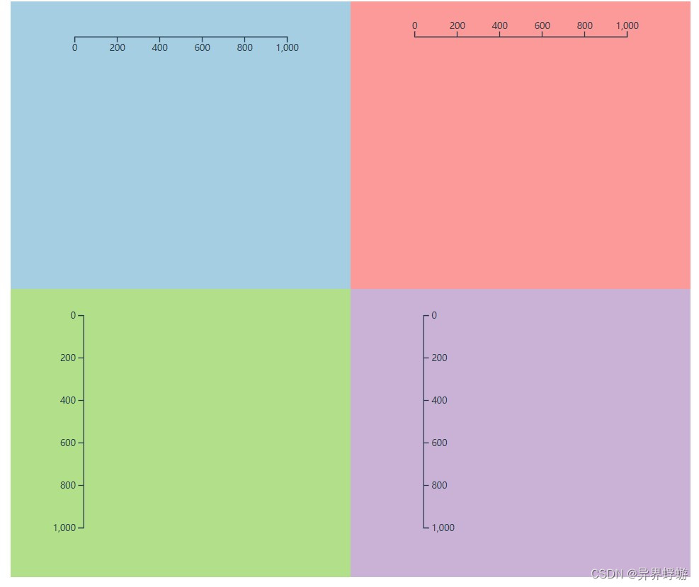
在D3中,坐标轴是在svg中绘制的,对于svg常见的属性和标签要有基本了解。D3中提供了四个朝向的坐标轴,如下图:
下面跟着我一起学习D3中坐标绘制的过程
1、创建一个Svg元素,用来包裹其它图像元素
let height = 300,
    width = 300,
    margin = 30,
    offset = 40,
    axisWidth = width - 2 * margin,
svg;- 声明Svg的宽高
- 避免绘图在边缘的不可见性,设定间距和偏移
- 宽度或者高度减去两边的间距就是坐标轴的长度
- 最后创建Svg并添加宽高等属性
const createSvg = (container) => { // 后面调用时传入容器参数
    svg = d3.select(container).append('svg')
            .attr('width', width)
            .attr('height', height)
}


HTML和CSS
<template>
    <div id="d3Container" class="container">
        <div class="axisTopBox axisBox" style="background-color: rgb(166 206 227)"></div>
        <div class="axisBottomBox axisBox" style="background-color: rgb(251 154 153)"></div>
        <div class="axisLeftBox axisBox" style="background-color: rgb(178 223 138)"></div>
        <div class="axisRightBox axisBox" style="background-color: rgb(202 178 214)"></div>
    </div>
</template>

<style lang="scss">
.container {
    font-size: 20px;
    width: 50vw;
    height: 650px;
    margin:auto;
    background-color: #fbe9d5;
    display: flex;
    flex-wrap: wrap;

    .axisBox {
        width: 50%;
        height: 50%;
        background-color: #ff9000;
    }
}
</style>
2、 坐标轴方向,创建坐标轴
- 标题在坐标轴之上 d3.axisTop
- 标题在坐标轴之下 d3.axisBottom
- 标题在坐标轴左边 d3.axisLeft
- 标题在坐标轴右边 d3.axisRight
其中左右就是竖直的坐标轴,上下是水平坐标轴
下面使用 d3.axisBottom() 创建坐标轴:
const renderAxis = () => {
    let axis = d3.axisBottom()
                .scale(  // 坐标轴的scale()给这个坐标轴提供尺度
                    d3.scaleLinear()
                        .domain([0, 1000])
                        .range([0, axisWidth])
                ).ticks(5) // 告诉D3需要渲染几个刻度

    svg.append('g')
        .attr('transform', () => { // 通过变形偏移保证在svg中的可见性
                return 'translate(' + margin + ',' + offset + ')'
        }).call(axis) // 在当前图形集合上调用call绑定坐标轴
}
其中d3.axisBottom().scale().ticks() 表示标题朝下的坐标轴,scale()为这个坐标轴提供尺度,本例中是一个线性尺度,大家可以使用任何之前学习的尺度。ticks()表示刻度个数,不过D3在大部分情况下会自动计算,除非你给的值比较可靠。
3、调用以上方法,并传入容器,坐标轴绘制完成
const renderAll = (container) => {
    createSvg(container)
    renderAxis()
}

renderAll('.axisTopBox')


HTML
<div class="axisTopBox axisBox" style="background-color: rgb(166 206 227)"></div>
CSS
.container {
    font-size: 20px;
    width: 50vw;
    height: 650px;
    margin:auto;
    background-color: #fbe9d5;
    display: flex;
    flex-wrap: wrap;

    .axisBox {
        width: 50%;
        height: 50%;
        background-color: #ff9000;
    }
}
最后给出本节的完整代码
// 效果就是开头的图片
<script setup>
import { onMounted } from "vue";
import * as d3 from "d3";

let height = 300, width = 300, margin = 30, offset = 40,
    axisWidth = width - 2 * margin,
    svg;

const createSvg = (container) => {
    svg = d3.select(container).append('svg')
            .attr('width', width)
            .attr('height', height)
}

const renderAxis = (fn, scale, i) => {
    let axis = fn()
                .scale(scale).ticks(5)
    svg.append('g')
        .attr('transform', () => {
            if([d3.axisTop, d3.axisBottom].indexOf(fn) >= 0) {
                return 'translate(' + margin + ',' +i*offset + ')'
            }else {
                return 'translate(' + i * offset + ',' + margin + ')'
            }
        }).call(axis)
}


const renderAll = (container, fn) => {
    createSvg(container)
    renderAxis(fn, d3.scaleLinear().domain([0, 1000]).range([0, axisWidth]), 1)
}


onMounted(() => {
   renderAll('.axisTopBox', d3.axisBottom)
   renderAll('.axisBottomBox', d3.axisTop)
   renderAll('.axisLeftBox', d3.axisLeft)
   renderAll('.axisRightBox', d3.axisRight)
})

</script>

<template>
    <div id="d3Container" class="container">
        <div class="axisTopBox axisBox" style="background-color: rgb(166 206 227)"></div>
        <div class="axisBottomBox axisBox" style="background-color: rgb(251 154 153)"></div>
        <div class="axisLeftBox axisBox" style="background-color: rgb(178 223 138)"></div>
        <div class="axisRightBox axisBox" style="background-color: rgb(202 178 214)"></div>
    </div>
</template>

<style lang="scss">
.container {
    font-size: 20px;
    width: 50vw;
    height: 650px;
    margin:auto;
    background-color: #fbe9d5;
    display: flex;
    flex-wrap: wrap;

    .axisBox {
        width: 50%;
        height: 50%;
        background-color: #ff9000;
    }
}
</style>


 5635
5635


 被折叠的 条评论
为什么被折叠?
被折叠的 条评论
为什么被折叠?
 到【灌水乐园】发言


