


 本文介绍了如何使用CSS实现单标签上的复杂背景效果,包括线性渐变创建的简单等比网格和不同线宽颜色的网格叠加,以及通过径向渐变生成的圆点阵列和棋盘效果。文章详细展示了各种效果的代码实现和对应的实际展示效果。
一、线性渐变:
1、简单等比网格:
<html>
<head>
<style type="text/css">
body {
    background-image:
    linear-gradient(90deg,rgba(200,0,0,.5) 50%,transparent 0),
    linear-gradient(rgba(200,0,0,.5) 50%,transparent 0);
    background-size:30px 30px;
}
</style>
</head>
<body></body>
</html>
效果图:
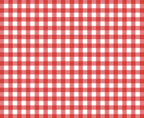
原理很简单,就是把垂直和水平的条纹叠加,而 background-image恰好支持 linear-gradient叠加效果。
但是实际条件中一般我们会选择改变格子的大小,然后网格线粗细固定,使用固定长度而不是百分比作为色标。
<html>
<head>
<style type="text/css">
body {
    background:#58a;
    background-image:
    linear-gradient(90deg,white 1px,transparent 0),
    linear-gradient(white 1px,transparent 0);
    background-size:30px 30px;
}
</style>
</head>
<body></body>
</html&g
最低0.47元/天 解锁文章


 955
955


 被折叠的 条评论
为什么被折叠?
被折叠的 条评论
为什么被折叠?
 到【灌水乐园】发言


