echart实现基金走势图十字坐标随手指滑动显示

1、目前各大券商的基金股票商城很多都是用的H5实现,而谈到基金就离不开基金股票的走势图,那么首先想到的就是用echarts来实现,走势图内容展示用echarts的折线统计图再合适不过了,数据一套就出来了。

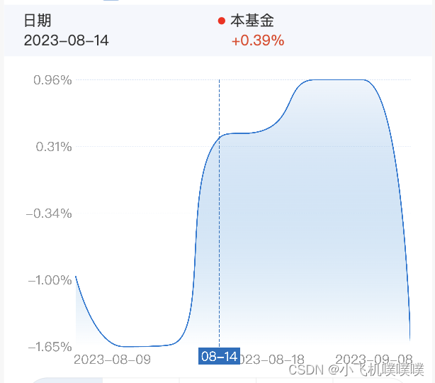
2、但是问题也来了,基金最重要的十字坐标怎么展示,即要根据手指滑动的位置实时显示基金的十字坐标点,而echarts只提供了y轴的也就是竖轴的指示线显示功能,下面图就是用echarts配置实现的y轴指示线功能。

3、下面是具体实现的echarts配置项,其中主要的是axisPointer配置项,里面的label配置用于显示y轴指示线底部的日期,而lineStyle用于配置指示线颜色等基本属性:

const option = {
      animation: false,
      tooltip: {
        trigger: 'axis',
        axisPointer: {
          type: 'cross',
          snap: true
        },
        formatter(params) {
          props.handleTooltipClick && props.handleTooltipClick(params); // 点击使用
        }
      },
      color: ['#F3402F', '#4C7CF1'],
      grid: {
        top: gridTop,
        left: '1',
        right: '1',
        bottom: '30px',
        containLabel: true
      },
      xAxis: {
        type: 'category',
        boundaryGap: false,
        axisTick: {
          show: false
        },
        axisLine: {
          lineStyle: {
            color: 'rgba(153, 153, 153, 0.2)',
            type: 'dashed'
          }
        },
        axisLabel: {
          fontSize,
          color: '#999',
          margin: 16,
          showMaxLabel: true,
          showMinLabel: true,
          interval: index => index === 0 || index === chartData.xData.length - 1 || index === Math.floor(chartData.xData.length / 2),
          formatter(value, index) {
            if (index === 0) {
              return `${space}${dayjs(value).format('YYYY-MM-DD')}`;
            } else if (index === chartData.xData.length - 1) {
              return `${dayjs(value).format('YYYY-MM-DD')}${space}`;
            }
            return dayjs(value).format('YYYY-MM-DD');
          },
          ...axisLabel
        },
        axisPointer: {
          label: {
            formatter(obj) {
              return `${obj.value.substring(4, 6)}-${obj.value.substring(6, 8)}`;
            },
            show: true,
            padding: [2, 4, 2, 4],
            fontSize,
            borderRadius: 0,
            backgroundColor: '#F24957'
          },
          lineStyle: {
            color: '#FF5800', // 指示线颜色
            type: 'dashed',
            height: 0.4
          }
        },
        data: chartData.xData
      },
      yAxis: {
        type: 'value',
        axisLabel: {
          fontSize,
          formatter(value) {
            return parseFloat(value).toFixed(toFixed) + sign;
          },
          color: '#999'
        },
        splitLine: {
          lineStyle: {
            color: 'rgba(153, 153, 153, 0.2)',
            type: 'dashed'
          }
        },
        axisPointer: {
          show: false // 隐藏y轴指示线
        },
        splitNumber: 5,
        axisTick: {
          show: false
        },
        axisLine: {
          show: false
        },
        scale: true
      },
      series: [
        {
          type: 'line',
          lineStyle: {
            normal: {
              width: lineWidth
            }
          },
          symbol: 'none',
          data: chartData.yData,
          areaStyle: {
            color: {
              type: 'linear',
              x: 0,
              y: 1,
              x2: 0,
              y2: 0,
              colorStops: [{ offset: 0, color: '#fff' }, { offset: 1, color: 'rgba(242, 73, 87, 0.1)' }],
              global: false // 缺省为 false
            },
            origin: 'start'
          }
        },
        {
          type: 'line',
          lineStyle: {
            normal: {
              width: lineWidth
            }
          },
          symbol: 'none',
          data: chartData.yData1 || []
        }
      ]
    };

4、那还剩下x轴的指示线怎么显示呢?echarts没有提供可以配置,且能根据手指滑动自动变换坐标的x轴的指示线;唯一显示的只有markLine配置项可以配置x轴的指示线,但是是静态的,并不能实时变动,因此要加上监听事件,而监听事件可以使用echarts的getZr()方法监听鼠标移动'mousemove',然后获取坐标实时更新markLine配置项,这样就能实现走势图十字坐标了。

(1)首先是markLine配置静态的x轴的指示线样式,下面是markLine配置代码
markLine: {
            data: [],
            animation: false,
            label: {
              formatter(obj) {
                const plus = parseFloat(obj.value) > 0 ? '+' : '';
                return plus + parseFloat(obj.value).toFixed(toFixed) + sign;
              },
              position: 'start',
              padding: [2, 4, 2, 4],
              fontSize,
              borderRadius: 0,
              backgroundColor: '#F24957',
              color: '#fff'
            },
            lineStyle: {
              color: '#FF5800', // 指示线颜色
              type: 'dashed',
              height: 0.4
            },
            symbol: 'none' // 去掉箭头
          },

(2)在echarts的setOption下方加上getZr()方法监听鼠标(手指)移动'mousemove',最后实时获取x轴坐标并更新markLine配置,下面是具体实现的代码:
const myChart = echarts.init(document.getElementById('lineChart'));
const option = setLineOption();
    myChart.setOption(option);
    // 模拟十字轴的横轴
    myChart.getZr().on('mousemove', (params) => {
      // 获取点击位置的坐标
      const pointInPixel = [params.offsetX, params.offsetY];
      // containPixel为true则点击位置在坐标轴内
      if (myChart.containPixel('grid', pointInPixel)) {
        // 传入鼠标位置坐标进行转化
        // convertFromPixel返回[x, y],x对应鼠标点击处数据的下标,y对应鼠标点击处的数值
        const x = myChart.convertFromPixel({ seriesIndex: 0 }, pointInPixel)[0];
        if (!data.yData.length) {
          return;
        }
        const markLineValue = data.yData[x];
        if (markLineValue) {
          const series = option.series;
          // 修改markLine的值
          series[0].markLine.data = [{ yAxis: markLineValue }];
          // 重新setOption
          // console.log(series);
          myChart.setOption({ series }, { lazyUpdate: true });
          // 设置选中的内容
          // props.handleTooltipClick({ axisValue: data.xData[x], value: data.yData[x], compRate: data.yData1 ? data.yData1[x] : '' });
        }
      } else {
        // 不在坐标轴内不展示markLine
        const series = option.series;
        series[0].markLine.data = [];
        myChart.setOption({ series }, { lazyUpdate: true });
      }
    });
    myChart.getZr().on('mouseup', () => {
      myChart.dispatchAction({
        type: 'hideTip'
      });
      myChart.dispatchAction({
        type: 'updateAxisPointer',
        currTrigger: 'leave'
      });
      myChart.setOption({ series: [{ markLine: { data: [] } }] }, { lazyUpdate: true });
      // 设置选中的内容
      // props.handleTooltipClick({ axisValue: data.xData[data.xData.length - 1], value: data.yData[data.yData.length - 1], compRate: data.yData1 ? data.yData1[data.yData1.length - 1] : '' });
    });

  • 4
    点赞
  • 6
    收藏
    觉得还不错? 一键收藏
  • 4
    评论
这个需求可以分为两部分来实现: 1. 使用 Taro + Vue 实现基金净值走势图 2. 使用 F2 实现 X 轴 Y 轴交叉十字滑动显示 下面是一个简单的实现过程: 1. 使用 Taro 和 Vue 创建项目 首先,我们需要使用 Taro 和 Vue 创建一个新项目。具体步骤如下: ```sh npm install -g @tarojs/cli taro init fund-chart --template vue cd fund-chart npm run dev:weapp ``` 启动后,我们可以在微信开发者工具中查看效果。 2. 实现基金净值走势图 在 Vue 组件中,我们可以使用 ECharts 或者 F2 来实现基金净值走势图。这里我们使用 F2。 首先,我们需要安装 F2: ```sh npm install @antv/f2 --save ``` 然后,在 Vue 组件中引入 F2: ```js import F2 from '@antv/f2' ``` 接着,在 `mounted` 阶段初始化 F2: ```js mounted() { const canvas = this.$refs.canvas const chart = new F2.Chart({ el: canvas, pixelRatio: window.devicePixelRatio, }) // ... } ``` 然后,我们需要使用 F2 的 API 来绘制基金净值走势图: ```js chart.source(data, { time: { type: 'timeCat', mask: 'yyyy-mm-dd', }, value: { tickCount: 5, min: Math.floor(minValue), max: Math.ceil(maxValue), }, }) chart.axis('time', { label: { textAlign: 'center', fill: '#979797', }, tickLine: { length: 4, stroke: '#b7b7b7', }, line: { top: true, stroke: '#b7b7b7', }, }) chart.axis('value', { label: { fill: '#979797', }, grid: { stroke: '#d8d8d8', lineDash: [2], }, }) chart.line().position('time*value').color('#1890ff').shape('smooth') chart.point().position('time*value').color('#1890ff').shape('circle') chart.render() ``` 完整的代码如下: ```vue <template> <view> <canvas ref="canvas" style="width: 100%; height: 300px;"></canvas> </view> </template> <script> import F2 from '@antv/f2' export default { name: 'FundChart', props: { data: { type: Array, default: () => [], }, }, mounted() { const canvas = this.$refs.canvas const chart = new F2.Chart({ el: canvas, pixelRatio: window.devicePixelRatio, }) const minValue = Math.min(...this.data.map(item => item.value)) const maxValue = Math.max(...this.data.map(item => item.value)) chart.source(this.data, { time: { type: 'timeCat', mask: 'yyyy-mm-dd', }, value: { tickCount: 5, min: Math.floor(minValue), max: Math.ceil(maxValue), }, }) chart.axis('time', { label: { textAlign: 'center', fill: '#979797', }, tickLine: { length: 4, stroke: '#b7b7b7', }, line: { top: true, stroke: '#b7b7b7', }, }) chart.axis('value', { label: { fill: '#979797', }, grid: { stroke: '#d8d8d8', lineDash: [2], }, }) chart.line().position('time*value').color('#1890ff').shape('smooth') chart.point().position('time*value').color('#1890ff').shape('circle') chart.render() }, } </script> ``` 3. 实现 X 轴 Y 轴交叉十字滑动显示 在 F2 中,我们可以使用 `guide()` 函数来添加十字线。具体步骤如下: 首先,我们需要在 `mounted` 阶段添加 `guide()`: ```js const guide = new F2.Guide(chart) ``` 然后,我们需要在 `onTouchstart`、`onTouchmove`、`onTouchend` 阶段实现交叉十字线的显示: ```js canvas.addEventListener('touchstart', ev => { const { x, y } = chart.getXY(ev.touches[0]) const value = chart.get('valueScale').invert(y) guide.line({ start: [0, y], end: [chart.get('width'), y], style: { stroke: '#d8d8d8', lineWidth: 1, lineDash: [2], }, }) guide.line({ start: [x, 0], end: [x, chart.get('height')], style: { stroke: '#d8d8d8', lineWidth: 1, lineDash: [2], }, }) guide.text({ position: [x, y], content: `${value.toFixed(2)}`, offsetY: -10, style: { fill: '#666', fontSize: 12, fontWeight: 'bold', }, }) chart.render() }) canvas.addEventListener('touchmove', ev => { const { x, y } = chart.getXY(ev.touches[0]) const value = chart.get('valueScale').invert(y) guide.line({ start: [0, y], end: [chart.get('width'), y], style: { stroke: '#d8d8d8', lineWidth: 1, lineDash: [2], }, }) guide.line({ start: [x, 0], end: [x, chart.get('height')], style: { stroke: '#d8d8d8', lineWidth: 1, lineDash: [2], }, }) guide.text({ position: [x, y], content: `${value.toFixed(2)}`, offsetY: -10, style: { fill: '#666', fontSize: 12, fontWeight: 'bold', }, }) chart.render() }) canvas.addEventListener('touchend', ev => { guide.clear() chart.repaint() }) ``` 完整的代码如下: ```vue <template> <view> <canvas ref="canvas" style="width: 100%; height: 300px;"></canvas> </view> </template> <script> import F2 from '@antv/f2' export default { name: 'FundChart', props: { data: { type: Array, default: () => [], }, }, mounted() { const canvas = this.$refs.canvas const chart = new F2.Chart({ el: canvas, pixelRatio: window.devicePixelRatio, }) const minValue = Math.min(...this.data.map(item => item.value)) const maxValue = Math.max(...this.data.map(item => item.value)) chart.source(this.data, { time: { type: 'timeCat', mask: 'yyyy-mm-dd', }, value: { tickCount: 5, min: Math.floor(minValue), max: Math.ceil(maxValue), }, }) chart.axis('time', { label: { textAlign: 'center', fill: '#979797', }, tickLine: { length: 4, stroke: '#b7b7b7', }, line: { top: true, stroke: '#b7b7b7', }, }) chart.axis('value', { label: { fill: '#979797', }, grid: { stroke: '#d8d8d8', lineDash: [2], }, }) chart.line().position('time*value').color('#1890ff').shape('smooth') chart.point().position('time*value').color('#1890ff').shape('circle') const guide = new F2.Guide(chart) canvas.addEventListener('touchstart', ev => { const { x, y } = chart.getXY(ev.touches[0]) const value = chart.get('valueScale').invert(y) guide.line({ start: [0, y], end: [chart.get('width'), y], style: { stroke: '#d8d8d8', lineWidth: 1, lineDash: [2], }, }) guide.line({ start: [x, 0], end: [x, chart.get('height')], style: { stroke: '#d8d8d8', lineWidth: 1, lineDash: [2], }, }) guide.text({ position: [x, y], content: `${value.toFixed(2)}`, offsetY: -10, style: { fill: '#666', fontSize: 12, fontWeight: 'bold', }, }) chart.render() }) canvas.addEventListener('touchmove', ev => { const { x, y } = chart.getXY(ev.touches[0]) const value = chart.get('valueScale').invert(y) guide.line({ start: [0, y], end: [chart.get('width'), y], style: { stroke: '#d8d8d8', lineWidth: 1, lineDash: [2], }, }) guide.line({ start: [x, 0], end: [x, chart.get('height')], style: { stroke: '#d8d8d8', lineWidth: 1, lineDash: [2], }, }) guide.text({ position: [x, y], content: `${value.toFixed(2)}`, offsetY: -10, style: { fill: '#666', fontSize: 12, fontWeight: 'bold', }, }) chart.render() }) canvas.addEventListener('touchend', ev => { guide.clear() chart.repaint() }) chart.render() }, } </script> ``` 根据以上实现,我们就可以在 Taro + Vue 中使用 F2 实现基金净值走势图,并支持 X 轴 Y 轴交叉十字滑动显示了。

“相关推荐”对你有帮助么?

  • 非常没帮助
  • 没帮助
  • 一般
  • 有帮助
  • 非常有帮助
提交
评论 4
添加红包

请填写红包祝福语或标题

红包个数最小为10个

红包金额最低5元

当前余额3.43前往充值 >
需支付:10.00
成就一亿技术人!
领取后你会自动成为博主和红包主的粉丝 规则
hope_wisdom
发出的红包
实付
使用余额支付
点击重新获取
扫码支付
钱包余额 0

抵扣说明:

1.余额是钱包充值的虚拟货币,按照1:1的比例进行支付金额的抵扣。
2.余额无法直接购买下载,可以购买VIP、付费专栏及课程。

余额充值