


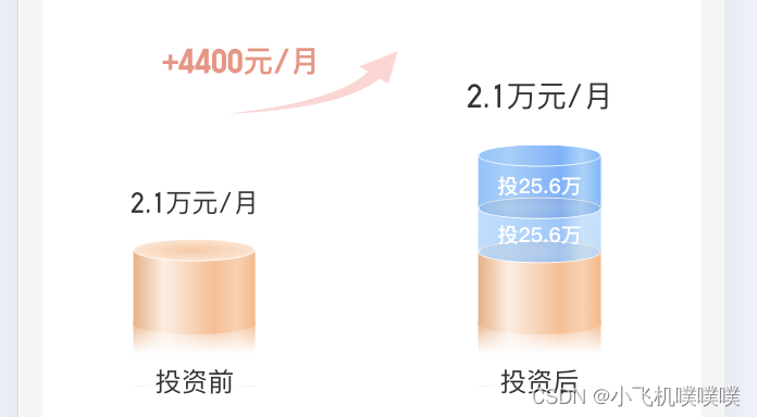
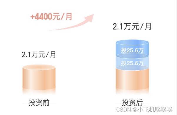
首先是产品提出需求:要实现柱状图能够动态的缓慢升高
实现步骤:
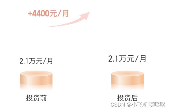
1、先画好柱状图的整体形状
左侧柱状图形状主要分为上椭圆,下椭圆和中间方形组成;
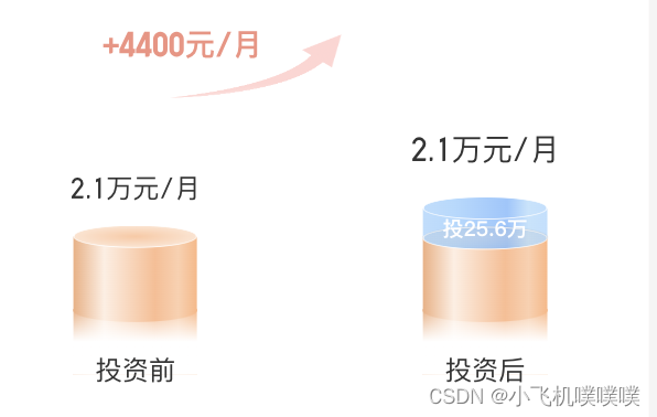
右侧柱状图是由三个左侧的柱状图堆叠而成的,其中要充分利用position相对定位,绝对定位的功能,而样式则基本上用linear-gradient渐变实现
下面是具体实现的代码:html
{/* 柱形图外壳 */}
      <div className={styles.circleCC}>
        {/* 上升箭头 */}
        <div className={styles.ccUpBox}>
          <div className={styles.ccUp}>
            <div className={styles.ccUpText}>+4400元/月</div>
            <img src={gouzi} alt='' className={styles.gouIcon} />
          </div>
        </div>
        {/* 左柱形图 */}
        <div className={styles.ccLine}>
          <div className={styles.ccLeftText}>2.1万元/月</div>
          <div className={styles.circleBox} style={{ height: `${0.8 + cHeight}rem` }}>
            {/* 柱形图内容容器 */}
            <div className={styles.cContentBox}>
              {/* 柱形图内容高度 */}
              <div className={styles.cContent} style={{ height: `${cHeight}rem` }}>
                <div className={styles.ccTop}></div>
                <div className={styles.ccBold}></div>
                <div className={styles.ccBottom}></div>
              </div>
            </div>
            <div className={styles.cBottomBox}>
              <div className={styles.cBottom}></div>
            </div>
          </div>
          <div className={(styles.ccLeftText, styles.cBottomText)}>投资前</div>
        </div>

        {/* 右柱形图 */}
        <div className={styles.ccLine}>
          <div className={styles.ccRightText}>2.1万元/月</div>
          <div
            className={styles.circleBox}
            style={{ height: `${0.6 + cHeight + cHeightT + cHeightL}rem` }}
          >
            {/* 柱形图内容容器 */}
            <div className={styles.cContentBoxLi}>
              {/* 柱形图内容高度 */}
              <div className={styles.cContent} style={{ height: `${cHeightL}rem` }}>
                {cHeightT >= 0.6 && <div className={styles.ccTop}></div>}
                <div className={styles.ccBold}>
                  {cHeightL >= 0.15 && <div className={styles.ccRateText}>投25.6万</div>}
                </div>
                {cHeightT >= 0.6 && (
                  <div className={styles.ccBottomBox}>
                    <div className={styles.ccBottom}></div>
                  </div>
                )}
              </div>
            </div>
            {/* 柱形图内容容器 */}
            <div className={styles.cContentTou}>
              {/* 柱形图内容高度 */}
              <div className={styles.cContent} style={{ height: `${cHeightT}rem` }}>
                {cHeight >= 0.9 && <div className={styles.ccTop}></div>}
                <div className={styles.ccBold}>
                  {cHeightT >= 0.2 && <div className={styles.ccRateText}>投25.6万</div>}
                </div>
                {cHeight >= 0.9 && (
                  <div className={styles.ccBottomBox}>
                    <div className={styles.ccBottom}></div>
                  </div>
                )}
              </div>
            </div>
            {/* 柱形图内容容器 */}
            <div className={styles.cContentBox}>
              {/* 柱形图内容高度 */}
              <div className={styles.cContent} style={{ height: `${cHeight}rem` }}>
                <div className={styles.ccTop}></div>
                <div className={styles.ccBold}></div>
                <div className={styles.ccBottom}></div>
              </div>
            </div>
            <div className={styles.cBottomBox}>
              <div className={styles.cBottom}></div>
            </div>
          </div>
          <div className={(styles.ccLeftText, styles.cBottomText)}>投资后</div>
        </div>
      </div>
scss
.circleCC {
  display: flex;
  align-items: flex-end;
  justify-content: space-between;
  padding: 0 0.7rem;
  width: 100%;
  height: 4.2rem;
  position: relative;

  .ccUpBox {
    position: absolute;
    top: 0.54rem;
    left: 1.04rem;
    .ccUp {
      position: relative;
      width: 2.64rem;
      height: 0.94rem;
      .ccUpText {
        position: absolute;
        top: -0.1rem;
        left: 0;
        font-size: 0.32rem;
        font-family: Ebscn, Ebscn-Medium;
        font-weight: bold;
        color: rgba(232,66,37,0.60);
        line-height: 0.6rem;
      }
    }
    .gouIcon {
      width: 2.64rem;
      height: 0.94rem;
    }
  }

  .ccLine {
    display: flex;
    flex-direction: column;
    align-items: center;
    justify-content: flex-start;
    position: relative;
  }

  .ccLeftText {
    font-size: 0.28rem;
    font-family: Ebscn, Ebscn-Regular;
    text-align: center;
    color: #333333;
    line-height: 0.5rem;
  }
  .ccRightText {
    font-size: 0.32rem;
    font-family: Ebscn, Ebscn-Regular;
    text-align: center;
    color: #333333;
    line-height: 0.6rem;
  }
  .cBottomText {
    position: absolute;
    bottom: -0.12rem;
  }
}

.circleBox {
  display: flex;
  flex-direction: column;
  justify-content: flex-start;
  align-items: center;
  position: relative;
  height: 1.7rem;
  .ccRateText {
    font-size: 0.22rem;
    font-family: PingFang SC, PingFang SC-Medium;
    font-weight: bold;
    color: #ffffff;
    line-height: 0.3rem;
    margin-top: 0.12rem;
    z-index: 8;
  }

  .cBottomBox {
    width: 1.3rem;
    height: 0.68rem;
    background: linear-gradient(90deg,#f1ae7f, #ffeee2 25%, #febc90 66%, #ffcfad 85%, #ffb682);
    position: absolute;
    bottom: 0rem;
  }
  .cBottom {
    position: relative;
    left: -0.05rem;
    width: 1.4rem;
    height: 0.68rem;
    background: linear-gradient(0deg,#ffffff 50%, rgba(255,255,255,0.00) 100%);
  }

  .cContentBoxLi {
    position: absolute;
    bottom: 1.77rem;
    z-index: 4;
    .cContent {
      position: relative;
      .ccTop {
        width: 1.3rem;
        height: 0.24rem;
        background: linear-gradient(270deg,#70bbfe, #a1d3fd 15%, #70b3ff 33%, #9fd0fc 75%, #86c5fe);
        border: 0.5px solid;
        border-color: #ffffff;
        border-radius: 50%;
        position: absolute;
        top: -0.12rem;
        z-index: 3;
      }
      .ccBold {
        width: 1.3rem;
        height: calc(100% - 0.12rem);
        background: linear-gradient(270deg,#70bbfe, #a1d3fd 15%, #70b3ff 33%, #9fd0fc 75%, #86c5fe);
        display: flex;
        align-items: center;
        justify-content: center;
      }
      .ccBottomBox {
        width: 1.3rem;
        height: 0.24rem;
        background: linear-gradient(270deg,#70bbfe, #a1d3fd 15%, #70b3ff 33%, #9fd0fc 75%, #86c5fe);
        border-radius: 50%;
        z-index: 3;
        position: absolute;
        bottom: 0rem;
        border: 0.5px solid;
        border-color: #ffffff;
        border-radius: 50%;
        .ccBottom {
          width: 1.3rem;
          height: 0.24rem;
          border-radius: 50%;
          z-index: 3;
          position: absolute;
          bottom: 0rem;
          background: radial-gradient(rgba(222,201,185,0.23), rgba(0,0,0,0.05));
        }
      }
    }
  }

  .cContentTou {
    position: absolute;
    bottom: 1.3rem;
    z-index: 3;
    .cContent {
      position: relative;
      .ccTop {
        width: 1.3rem;
        height: 0.24rem;
        background: linear-gradient(270deg,#bde0ff, #c3e4fd 15%, #96c7fe 32%, #b0daff 75%, #badefe);
        border: 0.5px solid;
        border-color: #ffffff;
        border-radius: 50%;
        position: absolute;
        top: -0.12rem;
        z-index: 3;
      }
      .ccBold {
        width: 1.3rem;
        height: calc(100% - 0.12rem);
        background: linear-gradient(270deg,#bde0ff, #c3e4fd 15%, #96c7fe 32%, #b0daff 75%, #badefe);
        display: flex;
        align-items: center;
        justify-content: center;
      }
      .ccBottomBox {
        width: 1.3rem;
        height: 0.24rem;
        background: linear-gradient(270deg,#bde0ff, #c3e4fd 15%, #96c7fe 32%, #b0daff 75%, #badefe);
        border-radius: 50%;
        z-index: 3;
        position: absolute;
        bottom: 0rem;
        border: 0.5px solid;
        border-color: #ffffff;
        border-radius: 50%;
        .ccBottom {
          width: 1.3rem;
          height: 0.24rem;
          border-radius: 50%;
          z-index: 3;
          position: absolute;
          bottom: 0rem;
          background: radial-gradient(rgba(222,201,185,0.23), rgba(0,0,0,0.05));
        }
      }
    }
  }

  .cContentBox {
    position: absolute;
    bottom: 0.54rem;
    z-index: 2;
    .cContent {
      position: relative;
      .ccTop {
        width: 1.3rem;
        height: 0.24rem;
        background: radial-gradient(#ffc7a0, #ffeee2);
        border: 0.5px solid;
        border-color: #ffffff;
        border-radius: 50%;
        position: absolute;
        top: -0.12rem;
        z-index: 2;
      }
      .ccBold {
        width: 1.3rem;
        height: calc(100% - 0.12rem);
        background: linear-gradient(90deg,#f1ae7f, #ffeee2 25%, #febc90 66%, #ffcfad 85%, #ffb682);
      }
      .ccBottom {
        width: 1.3rem;
        height: 0.24rem;
        background: linear-gradient(90deg,#f1ae7f, #ffeee2 25%, #febc90 66%, #ffcfad 85%, #ffb682);
        border-radius: 50%;
        z-index: 3;
        position: absolute;
        bottom: 0rem;
      }
    }
  }
}
2、利用setInterval定时器增加柱状图高度实现缓慢升高的功能
以上我们已经画好了柱状图的基本构造和静态图形,下面我们就开始利用定时器实现功能:
左侧只有一个柱状图,利用一个计时器就能实现,右侧有多个定时器堆叠,利用useEffect和定时器切换实现不同柱状图的接续升高
下面是具体实现的js
const [cHeightL, setCHeightL] = useState(0.12); // 当前高度
  const [cHeightT, setCHeightT] = useState(0.12); // 当前高度
  const [cHeight, setCHeight] = useState(0); // 当前高度
  const timer = useRef(null);

  useEffect(() => {
    calHeight();
  }, []);

  useEffect(() => {
    // console.log('222222', cHeight);
    if (cHeightL >= 0.68) {
      timer.current && clearInterval(timer.current);
    }
  }, [cHeightL]);

  useEffect(() => {
    // console.log('222222', cHeight);
    if (cHeightT >= 0.6) {
      timer.current && clearInterval(timer.current);
      calHeightL();
    }
  }, [cHeightT]);

  useEffect(() => {
    // console.log('222222', cHeight);
    if (cHeight >= 0.9) {
      timer.current && clearInterval(timer.current);
      calHeightT();
    }
  }, [cHeight]);

  const calHeightL = () => {
    timer.current = setInterval(() => {
      setCHeightL(prevCount => prevCount + 0.68 / 60);
      // console.log('111111', cHeight);
    }, 10);
  };
  const calHeightT = () => {
    timer.current = setInterval(() => {
      setCHeightT(prevCount => prevCount + 0.6 / 60);
      // console.log('111111', cHeight);
    }, 10);
  };
  const calHeight = () => {
    timer.current = setInterval(() => {
      setCHeight(prevCount => prevCount + 0.9 / 100);
      // console.log('111111', cHeight);
    }, 10);
  };
3、实现效果图
总结:
主要是利用setInterval定时器控制柱状图高度的变化,难点是三个柱状图堆叠后,定时器的切换和高度的接续升高,以及其中不同柱状图连接处的流畅变化。以上就是柱状图动态升高的全部内容了,有问题可以再评论区留言哦


 1942
1942


 被折叠的 条评论
为什么被折叠?
被折叠的 条评论
为什么被折叠?
 到【灌水乐园】发言


