


某次公司上了一个需求,要求做一个顺时针旋转的圆环进度条,根据百分比显示进度条比例,经过多方研究和查阅,最终决定用clipPath及坐标系计算圆环进度上x,y点的位置,然后切割圆环,留下需要的部分,就显示进度条了,话不多说,先上结果:


1、首先画两个圆,一个背景圈一个进度圈
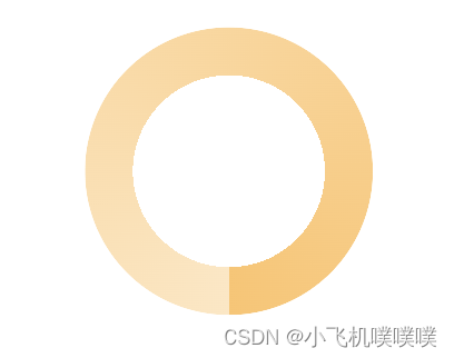
下面是两个圈的样式,运用mask的radial-gradient画出圆环渐变背景色
.circleOut {
  width: 3rem;
  height: 3rem;
  background: #FFF9EF;
  border-radius: 50%;
  -webkit-mask: radial-gradient(transparent, transparent 1rem, #000 1rem);
  mask: radial-gradient(transparent 1rem, #000 1rem);
  .circle {
    width: 3rem;
    height: 3rem;
    background: conic-gradient(
      from 180deg,
      #FFE6C1,
      #FFC369,
    );
    border-radius: 50%;
    -webkit-mask: radial-gradient(transparent, transparent 1rem, #000 1rem);
    mask: radial-gradient(transparent 1rem, #000 1rem);
  }
}
2、计算以左上角点为原点建立x,y轴坐标系,计算在不同比例下得到的圆环内上内外点的坐标。
// 计算当前进度条的点在圆上x,y轴坐标(圆心坐标axisx,axisy, 半径r)
const calAxis = (axisx, axisy, r) => {
let deg = 0;
if (rate < 0.25) {
deg = (0.25 - rate) * 360 + 90;
deg = -deg;
} else if (rate >= 0.25 && rate <= 0.75) {
deg = (0.75 - rate) * 360;
} else {
deg = -(rate - 0.75) * 360;
}
const x = axisx + r * Math.cos((deg * Math.PI) / 180);
const y = -axisy + r * Math.sin((deg * Math.PI) / 180);
console.log('11111', x, y);
return {
x: x,
y: y
};
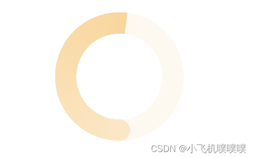
};3、计算在不同比例下clipPath切割内部进度圆环的方法(此处建议阅读clipPath方法)
// 计算切割点
  const clipPathStyle = () => {
    let clipPath = '';
    if (rate < 0.25) {
      clipPath = `polygon(0% 100%, ${axis.x * 100}% ${-axis.y * 100}%, 50% 50%, 50% 100%)`;
    } else if (rate >= 0.25 && rate <= 0.75) {
      clipPath = `polygon(0% 0%, ${axis.x * 100}% 0%, ${axis.x * 100}% ${
        -axis.y * 100
      }%, 50% 50%, 50% 100%, 0% 100%)`;
    } else {
      clipPath = `polygon(0% 0%, 100% 0%, 100% 100%, ${axis.x * 100}% ${
        -axis.y * 100
      }%, 50% 50%, 50% 100%, 0% 100%)`;
    }
    return {
      clipPath: clipPath
    };
  };
此时我们得到了切割后的圆环
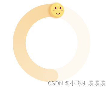
4、最后就是把笑脸定位在进度的头上,然后中间加上文案就结束了
// 计算笑脸位置
  const calAxisSmile = () => {
    const inCirle = calAxis(0.5, 0.5, (0.5 * 2) / 3);
    let top = (-axis.y * 3 + -inCirle.y * 3) / 2 - 0.36;
    let left = (axis.x * 3 + inCirle.x * 3) / 2 - 0.36;
    return {
      top: `${top}rem`,
      left: `${left}rem`
    };
  };
此时我们得到:
最后附上原代码(第一个是js的代码页,第二个是css的代码页)
import { memo, useState, useEffect, Fragment } from 'react';
import styles from './index.scss';
import smile1 from '../../../assets/smile1.png';
import smile2 from '../../../assets/smile2.png';
import smile3 from '../../../assets/smile3.png';
import smile4 from '../../../assets/smile4.png';

const IncomeCircle = ({ rate = 0.8 }) => {
  rate = rate > 1 ? 1 : rate.toFixed(2);
  // console.log('111111', rate);
  // xy坐标
  const [axis, setAxis] = useState({
    x: 0,
    y: 0
  });
  // 当前进度的类型
  // 【0%~35%)-落差巨大、【35%~60%)-勉强维持、【60%~80%)-基本持平、【80%~100%】-舒适生活
  const [type, setType] = useState({
    text: '落差巨大',
    smile: smile4
  });

  useEffect(() => {
    const initData = () => {
      setAxis(calAxis(0.5, 0.5, 0.5));
      let nowType = {
        text: '落差巨大',
        smile: smile4
      };
      if (rate <= 0.35) {
        nowType = {
          text: '落差巨大',
          smile: smile4
        };
      } else if (rate > 0.35 && rate <= 0.6) {
        nowType = {
          text: '勉强维持',
          smile: smile3
        };
      } else if (rate > 0.6 && rate <= 0.8) {
        nowType = {
          text: '基本持平',
          smile: smile2
        };
      } else {
        nowType = {
          text: '舒适生活',
          smile: smile1
        };
      }
      setType(nowType);
    };
    initData();
  }, []);

  // 计算当前进度条的点在圆上x,y轴坐标(圆心坐标axisx,axisy, 半径r)
  const calAxis = (axisx, axisy, r) => {
    let deg = 0;
    if (rate < 0.25) {
      deg = (0.25 - rate) * 360 + 90;
      deg = -deg;
    } else if (rate >= 0.25 && rate <= 0.75) {
      deg = (0.75 - rate) * 360;
    } else {
      deg = -(rate - 0.75) * 360;
    }
    const x = axisx + r * Math.cos((deg * Math.PI) / 180);
    const y = -axisy + r * Math.sin((deg * Math.PI) / 180);
    console.log('11111', x, y);
    return {
      x: x,
      y: y
    };
  };

  // 计算切割点
  const clipPathStyle = () => {
    let clipPath = '';
    if (rate < 0.25) {
      clipPath = `polygon(0% 100%, ${axis.x * 100}% ${-axis.y * 100}%, 50% 50%, 50% 100%)`;
    } else if (rate >= 0.25 && rate <= 0.75) {
      clipPath = `polygon(0% 0%, ${axis.x * 100}% 0%, ${axis.x * 100}% ${
        -axis.y * 100
      }%, 50% 50%, 50% 100%, 0% 100%)`;
    } else {
      clipPath = `polygon(0% 0%, 100% 0%, 100% 100%, ${axis.x * 100}% ${
        -axis.y * 100
      }%, 50% 50%, 50% 100%, 0% 100%)`;
    }
    return {
      clipPath: clipPath
    };
  };

  // 计算笑脸位置
  const calAxisSmile = () => {
    const inCirle = calAxis(0.5, 0.5, (0.5 * 2) / 3);
    let top = (-axis.y * 3 + -inCirle.y * 3) / 2 - 0.36;
    let left = (axis.x * 3 + inCirle.x * 3) / 2 - 0.36;
    return {
      top: `${top}rem`,
      left: `${left}rem`
    };
  };

  return (
    <div className={styles.circleBox}>
      <div className={styles.content}>
        <div className={styles.circleOut}>
          <div className={styles.circle} style={clipPathStyle()} />
        </div>
        <div className={styles.centerText}>
          <div className={styles.rateText}>{`${rate * 100}%`}</div>
          <div className={styles.wordBox}>
            <div className={styles.wordText}>{type.text}</div>
            <div className={styles.wordDivide} />
          </div>
        </div>
        <div className={styles.bottomCircle} />
        {/* 笑脸 */}
        {axis.x !== 0 && axis.y !== 0 && (
          <img className={styles.smile} src={type.smile} alt='' style={calAxisSmile()} />
        )}
      </div>
    </div>
  );
};

export default memo(IncomeCircle);
下面是css的代码
.circleBox {
  width: 100%;
  height: 4rem;
  @include flex-center();
}
.content {
  width: 3rem;
  height: 3rem;
  position: relative;
  .smile {
    position: absolute;
    width: 0.72rem;
    height: 0.72rem;
  }
  .centerText {
    position: absolute;
    width: 3rem;
    height: 3rem;
    top: 0;
    left: 0;
    background-color: transparent;
    @include flex-center(column);
    .rateText {
      color: var(--unnamed, #FF6C32);
      font-family: PingFang SC;
      font-size: 0.48rem;
      font-style: normal;
      font-weight: 500;
      line-height: 0.65rem;
    }
    .wordBox {
      position: relative;
      .wordText {
        color: var(--unnamed, #FF6C32);
        text-align: right;
        font-family: PingFang SC;
        font-size: 0.32rem;
        font-style: normal;
        font-weight: 500;
        line-height: 0.45rem;
      }
      .wordDivide {
        position: absolute;
        width: 1.42rem;
        height: 0.14rem;
        border-radius: 0.04rem;
        background: rgba(255, 108, 50, 0.10);
        bottom: 0;
        left: -0.08rem;
      }
    }
  }
  .bottomCircle {
    position: absolute;
    width: 0.5rem;
    height: 0.5rem;
    top: 2.5rem;
    left: 1.25rem;
    background: #FFE6C1;
    border-radius: 50%;
  }
}
.circleOut {
  width: 3rem;
  height: 3rem;
  background: #FFF9EF;
  border-radius: 50%;
  -webkit-mask: radial-gradient(transparent, transparent 1rem, #000 1rem);
  mask: radial-gradient(transparent 1rem, #000 1rem);
  .circle {
    width: 3rem;
    height: 3rem;
    background: conic-gradient(
      from 180deg,
      #FFE6C1,
      #FFC369,
    );
    border-radius: 50%;
    -webkit-mask: radial-gradient(transparent, transparent 1rem, #000 1rem);
    mask: radial-gradient(transparent 1rem, #000 1rem);
  }
}


 684
684


 被折叠的 条评论
为什么被折叠?
被折叠的 条评论
为什么被折叠?
 到【灌水乐园】发言


