基于react-native的简单消息确认框showModel
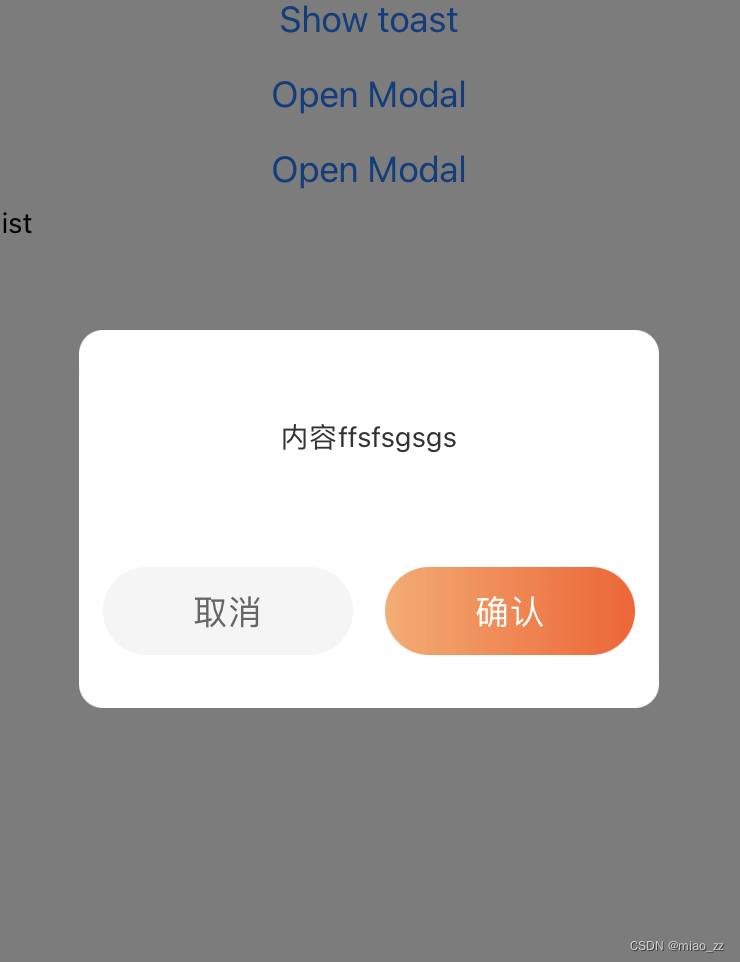
效果示例图
组件代码ShowModel/index.jsx
import React, {forwardRef, useImperativeHandle, useState} from 'react';
import {
  View,
  Text,
  Modal,
  TouchableOpacity,
  StyleSheet,
  ScrollView,
} from 'react-native';
import LinearGradient from 'react-native-linear-gradient';
import {pxToPd} from '../../common/js/device';

const ShowModal = forwardRef((props, ref) => {
  const [visible, setVisible] = useState(false);
  const [options, setOptions] = useState({
    title: '',
    content: '',
    success: null,
  });
  const hide = type => {
    setVisible(false);
    options.success(type);
  };
  const show = params => {
    setOptions({
      ...options,
      title: params.title,
      content: params.content,
      success: params.success,
    });
    setVisible(true);
  };

  const onCancel = () => {
    hide('cancel');
  };
  const onConfirm = () => {
    hide('confirm');
  };

  useImperativeHandle(ref, () => ({
    hide,
    show,
  }));
  return (
    <Modal visible={visible} animationType="fade" transparent>
      <View style={styles.modelWrap}>
        <View style={styles.modelContent}>
          {/* 标题 */}
          <View style={styles.modelTitle}>
            <Text style={styles.modelTitleText}>{options.title}</Text>
          </View>
          {/* 内容 */}
          <View style={styles.modelBlock}>
            <ScrollView>
              <Text style={styles.modelBlockText}>{options.content}</Text>
            </ScrollView>
          </View>
          {/* 底部按钮 */}
          <View style={styles.modelFooter}>
            <TouchableOpacity onPress={onCancel}>
              <View style={styles.Btn}>
                <Text style={styles.cancelBtn}>取消</Text>
              </View>
            </TouchableOpacity>

            <TouchableOpacity onPress={onConfirm}>
              <View style={styles.Btn}>
                <LinearGradient
                  colors={['#FFAA6B', '#FF5B23']}
                  start={{x: 0, y: 0}}
                  end={{x: 1, y: 0}}
                  style={{flex: 1}}>
                  <Text style={styles.submitBtn}>确认</Text>
                </LinearGradient>
              </View>
            </TouchableOpacity>
          </View>
        </View>
      </View>
    </Modal>
  );
});

const styles = StyleSheet.create({
  modelWrap: {
    flex: 1,
    justifyContent: 'center',
    alignItems: 'center',
    backgroundColor: 'rgba(0, 0, 0, 0.5)',
  },
  modelContent: {
    borderRadius: pxToPd(24),
    width: pxToPd(580),
    minHeight: pxToPd(378),
    backgroundColor: 'white',
    paddingBottom: pxToPd(35),
    paddingTop: pxToPd(35),
    paddingLeft: pxToPd(24),
    paddingRight: pxToPd(24),
  },
  modelTitle: {
    width: '100%',
  },
  modelTitleText: {
    textAlign: 'center',
    color: '#333',
    fontWeight: 'bold',
    fontSize: pxToPd(36),
  },
  modelBlock: {
    width: '100%',
    maxHeight: pxToPd(300),
    marginTop: pxToPd(24),
  },
  modelBlockText: {
    width: '100%',
    fontSize: pxToPd(28),
    fontWeight: '400',
    color: '#333',
    minHeight: pxToPd(120),
    lineHeight: pxToPd(40),
    textAlign: 'center',
  },
  modelFooter: {
    flexDirection: 'row',
    justifyContent: 'space-between',
    marginTop: pxToPd(30),
  },
  Btn: {
    width: pxToPd(250),
    height: pxToPd(88),
    borderRadius: pxToPd(44),
    overflow: 'hidden',
  },
  cancelBtn: {
    width: '100%',
    height: pxToPd(88),
    lineHeight: pxToPd(88),
    backgroundColor: '#f5f5f5',
    fontSize: pxToPd(34),
    fontWeight: '400',
    color: '#666',
    textAlign: 'center',
  },
  submitBtn: {
    width: '100%',
    height: pxToPd(88),
    lineHeight: pxToPd(88),
    fontSize: pxToPd(34),
    fontWeight: '400',
    color: '#fff',
    textAlign: 'center',
  },
});

export default ShowModal;
使用案例
在页面中引入组件
import ShowModal from '../../componets/ShowModel';

组件中注册
<ShowModal ref={showModelRef} />

使用
const showModelRef = useRef(null);
  const showMOdel = () => {
    showModelRef.current.show({
      title: '标题',
      content: '内容-加油',
      success: res => {
        console.log('[返回值-12]', res);
      },
    });
  };
device.js
import {Dimensions, StatusBar} from 'react-native';
//RN中的尺寸单位为dp,设计稿的单位为px

// 获取屏幕尺寸
const windowDimensions = Dimensions.get('window');

//设备宽度,单位pd
const deviceWidthDp = windowDimensions.width;

//设备高度
const windowHeight = windowDimensions.height;

// 获取状态栏高度
const statusBarCurrentHeight = StatusBar.currentHeight || 0;

//设计稿宽度(这里为750px),单位px
const uiWidthPx = 750;

//px转pd(设计稿中的px转RN中的dp)
//计算公式:设计稿元素宽度(px)/设计稿总宽度(px)=元素的宽度(dp)/屏幕的总宽度(dp)
export const pxToPd = uiElePx => {
  return (uiElePx * deviceWidthDp) / uiWidthPx;
};

//状态栏高度
export const statusBarHeight = () => {
  return statusBarCurrentHeight;
};

// 计算应用程序窗口的高度
// 获取导航栏高度(如果有的话) navigationBarHeight = 0; // 设置默认值
export const appWindowHeight = (navigationBarHeight = 0) => {
  return windowHeight - statusBarCurrentHeight - navigationBarHeight;
};
安装线性渐变色
1.安装
npm install react-native-linear-gradient

2.使用
import LinearGradient from 'react-native-linear-gradient';
<LinearGradient
      colors={['#FFAA6B', '#FF5B23']}
      start={{ x: 0, y: 0 }}
      end={{ x: 1, y: 0 }}
      style={{ flex: 1 }}
    >
      <View style={{ flex: 1, justifyContent: 'center', alignItems: 'center' }}>
        <Text style={{ color: 'white', fontSize: 24 }}>Hello, this is a gradient background!</Text>
      </View>
</LinearGradient>


 992
992

 被折叠的 条评论
为什么被折叠?
被折叠的 条评论
为什么被折叠?
 到【灌水乐园】发言


