使用echarts做对比图

最近的项目中用到了对比图,为了以后不再到处找资料,特记录下对比图的做法。

原理

对比图实际上是一组横向的柱状图,以x轴为度量,y轴为维度,与echarts官方给出的示例不同的是,一般x轴左右侧都需要是正值。这样的话可以建立三个坐标系来实现:第一个坐标系对应左侧部分(x轴设置inverse),第二个坐标系对应右侧部分,两个坐标系均隐藏y轴,第三个坐标系用来显示y轴(y轴一般放在左侧,视情况也可以放右侧)同时隐藏x轴。如图所示
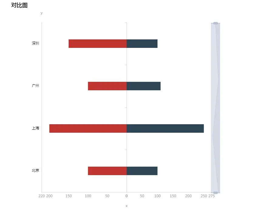
对比图

代码

const chartDom = document.getElementById('chart');
const myChart = echarts.init(chartDom);
const yData = ['北京', '上海', '广州', '深圳'];
const option = {
    title: {
        text: '对比图'
    },
    tooltip: {},
    grid: [
        { // 左侧对应坐标系
            show: false,
            left: '15%',
            top: '10%',
            bottom: '10%',
            width: '40%'
        },
        { // 右侧对应坐标系
            show: false,
            left: '55%',
            top: '10%',
            bottom: '10%',
            width: '40%'
        },
        { // 用来显示的坐标系
            show: false,
            left: '15%',
            top: '10%',
            bottom: '10%',
            width: '80%'
        }
    ],
    // x轴是度量,y轴是维度
    xAxis: [
        { // 左侧轴
            type: 'value',
            inverse: true,
            min: 0,
            max: val => {
                return Math.floor((val.max) * 1.1);
            },
            axisLine: {
                show: true,
                lineStyle: {
                    color: '#ccc'
                }
            },
            axisTick: {
                show: false
            },
            axisLabel: {
                show: true,
                textStyle: {
                    color: '#999',
                    fontSize: 12
                }
            },
            splitLine: {
                show: false
            }
        },
        { // 右侧轴
            type: 'value',
            gridIndex: 1,
            min: 0,
            max: val => {
                return Math.floor((val.max) * 1.1);
            },
            axisLine: {
                show: true,
                lineStyle: {
                    color: '#ccc'
                }
            },
            axisTick: {
                show: false
            },
            axisLabel: {
                show: true,
                textStyle: {
                    color: '#999',
                    fontSize: 12
                }
            },
            splitLine: {
                show: false
            }
        },
        { // 最左侧y轴对应x轴
            gridIndex: 2,
            name: 'x',
            nameLocation: 'center',
            nameGap: 40, // 与坐标轴距离
            nameTextStyle: {
                color: '#999999',
                fontSize: 12
            },
            axisLine: {
                show: false
            }
        }
    ],
    yAxis: [
        {
            type: 'category',
            position: 'right',
            axisLine: {
                show: false
            },
            axisTick: {
                show: false
            },
            axisLabel: {
                show: false,
                margin: 0
            },
            data: yData
        },
        {
            gridIndex: 1,
            type: 'category',
            position: 'left',
            axisLine: {
                show: true,
                lineStyle: {
                    color: '#ccc'
                }
            },
            axisTick: {
                show: true
            },
            axisLabel: {
                show: false
            },
            data: yData
        },
        {
            name: 'y',
            gridIndex: 2,
            type: 'category',
            position: 'left',
            nameLocation: 'end',
            nameGap: 25, // 与坐标轴距离
            nameTextStyle: {
                color: '#999999',
                fontSize: 12
            },
            axisLine: {
                show: true,
                lineStyle: {
                    color: '#ccc'
                }
            },
            axisTick: {
                show: false
            },
            axisLabel: {
                show: true,
                textStyle: {
                    color: '#000',
                    fontSize: 12
                }
            },
            data: yData
        }
    ],
    dataZoom: [
        {
            type: 'slider',
            yAxisIndex: [0, 1, 2],
            filterMode: 'filter',
            minSpan: 20
        },
        {
            type: 'inside',
            yAxisIndex: [0, 1, 2],
            filterMode: 'filter',
            minSpan: 20
        }
    ],
    series: [
        {
            name: '男',
            type: 'bar',
            xAxisIndex: 0,
            yAxisIndex: 0,
            barMaxWidth: '20%',
            data: [100, 200, 100, 150]
        },
        {
            name: '女',
            type: 'bar',
            xAxisIndex: 1,
            yAxisIndex: 1,
            barMaxWidth: '20%',
            data: [100, 250, 110, 100]
        }
    ]
};
myChart.setOption(option);

对比图中还加入了datazoom,将三个y轴联动起来。
最后有一个美中不足的地方,鼠标移入时tooltip暂时只能显示某一侧的内容,如果再增加坐标系或许能够解决...

您可以使用ECharts来创建对比折线。对比折线可以用来展示不同时间段的数据对比情况。在ECharts中,您可以通过设置不同系列的数据来实现这个功能。以下是一个简单的示例代码,展示了未来一周气温的变化情况: ```javascript option = { title: { text: '未来一周气温变化', }, tooltip: { trigger: 'axis' }, legend: { data:['最高气温','最低气温'] }, toolbox: { show: true, }, xAxis: { type: 'category', boundaryGap: false, data: ['周一','周二','周三','周四','周五','周六','周日'] }, yAxis: { type: 'value', axisLabel: { formatter: '{value} °C' } }, series: [ { name:'最高气温', type:'line', data:[11, 11, 15, 13, 12, 13, 10], }, { name:'最低气温', type:'line', data:[1, -2, 2, 5, 3, 2, 0], } ] }; ``` 您可以根据自己的需求修改xAxis的data值和series的name和data值来展示不同时间段的数据对比。此外,您还可以通过设置其他的option属性来调整表的样式和交互效果。希望这个示例能帮助到您。<span class="em">1</span><span class="em">2</span><span class="em">3</span> #### 引用[.reference_title] - *1* *2* [Echarts折线不同X轴的对比功能,不同段不同颜色显示](https://blog.csdn.net/seveth_/article/details/47253777)[target="_blank" data-report-click={"spm":"1018.2226.3001.9630","extra":{"utm_source":"vip_chatgpt_common_search_pc_result","utm_medium":"distribute.pc_search_result.none-task-cask-2~all~insert_cask~default-1-null.142^v93^chatsearchT3_2"}}] [.reference_item style="max-width: 50%"] - *3* [ECharts--数据对比折线](https://blog.csdn.net/weixin_43668013/article/details/102669591)[target="_blank" data-report-click={"spm":"1018.2226.3001.9630","extra":{"utm_source":"vip_chatgpt_common_search_pc_result","utm_medium":"distribute.pc_search_result.none-task-cask-2~all~insert_cask~default-1-null.142^v93^chatsearchT3_2"}}] [.reference_item style="max-width: 50%"] [ .reference_list ]
评论
添加红包

请填写红包祝福语或标题

红包个数最小为10个

红包金额最低5元

当前余额3.43前往充值 >
需支付:10.00
成就一亿技术人!
领取后你会自动成为博主和红包主的粉丝 规则
hope_wisdom
发出的红包
实付
使用余额支付
点击重新获取
扫码支付
钱包余额 0

抵扣说明:

1.余额是钱包充值的虚拟货币,按照1:1的比例进行支付金额的抵扣。
2.余额无法直接购买下载,可以购买VIP、付费专栏及课程。

余额充值