


篇章目标介绍
CollapsingToolbarLayout提供的原始的样式可能不能满足实际开发的要求,因为本文希望通过了解其内部源码,实现自定义吸顶Toolbar来满足开发的要求。
源码理解
这部分将从折叠布局的构成和源码分析两个角度展开
1.折叠布局的构成
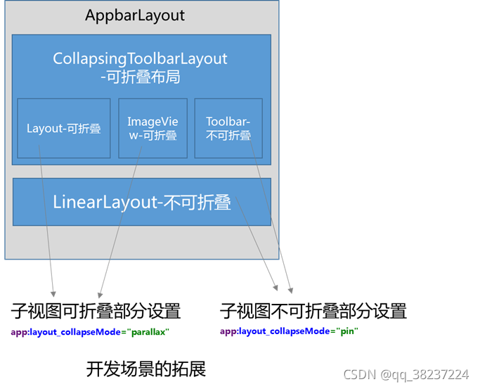
整个折叠布局的构成是通过AppBarLayout包裹CollapsingToolbarLayout折叠布局,CollapsingToolbarLayout是FrameLayout类型的布局,在其子视图的布局中,针对可折叠的部分设置折叠模式为parallax,折叠过程中将跟随平行移动;针对需要吸顶的部分设置折叠模式为pin,折叠过程中相对全局位置不变,这部分通常用来设置吸顶布局。

2.折叠过程滑动位移的计算
由于整体布局上包裹在AppBarLayout内部中,可以在其内部确认折叠布局的最大滑动范围,其内部累加全部可滑动子视图的高度,然后扣除折叠后的最小高度。
  //计算全部子视图的可滑动范围
  public final int getTotalScrollRange() {
    if (totalScrollRange != INVALID_SCROLL_RANGE) {
      return totalScrollRange;
    }

    int range = 0;
    //累加全部可滑动的子视图的高度
    for (int i = 0, z = getChildCount(); i < z; i++) {
      final View child = getChildAt(i);
      final LayoutParams lp = (LayoutParams) child.getLayoutParams();
      final int childHeight = child.getMeasuredHeight();
      final int flags = lp.scrollFlags;

      if ((flags & LayoutParams.SCROLL_FLAG_SCROLL) != 0) {
        // We're set to scroll so add the child's height
        range += childHeight + lp.topMargin + lp.bottomMargin;

        if (i == 0 && ViewCompat.getFitsSystemWindows(child)) {
          // If this is the first child and it wants to handle system windows, we need to make
          // sure we don't scroll it past the inset
          range -= getTopInset();
        }
        //如果设置了退出时折叠,那么滑动范围扣除折叠后的最小高度,即内部的Toolbar的高度
        if ((flags & LayoutParams.SCROLL_FLAG_EXIT_UNTIL_COLLAPSED) != 0) {
          // For a collapsing scroll, we to take the collapsed height into account.
          // We also break straight away since later views can't scroll beneath
          // us
          range -= ViewCompat.getMinimumHeight(child);
          break;
        }
      } else {
        // As soon as a view doesn't have the scroll flag, we end the range calculation.
        // This is because views below can not scroll under a fixed view.
        break;
      }
    }
    return totalScrollRange = Math.max(0, range);
  }
那么我们再看看Scroll过程中的滑动位移是如何传递的,其在用于解决嵌套滑动的onNestedScroll方法中调用,当发生了y向滑动,但是没有发生y向滑动的消耗,说明当前正处于头部内容的位置
    @Override
    public void onNestedScroll(
        CoordinatorLayout coordinatorLayout,
        @NonNull T child,
        View target,
        int dxConsumed,
        int dyConsumed,
        int dxUnconsumed,
        int dyUnconsumed,
        int type,
        int[] consumed) {
      if (dyUnconsumed < 0) {
      //当发生了y向滑动,但是没有发生y向滑动的消耗,说明当前正处于头部内容的位置
        // If the scrolling view is scrolling down but not consuming, it's probably be at
        // the top of it's content
        consumed[1] =
            scroll(coordinatorLayout, child, dyUnconsumed, -child.getDownNestedScrollRange(), 0);
      }
    }
...
  //计算滑动位移Offset
  final int scroll(
      CoordinatorLayout coordinatorLayout, V header, int dy, int minOffset, int maxOffset) {
    return setHeaderTopBottomOffset(
        coordinatorLayout,
        header,
        getTopBottomOffsetForScrollingSibling() - dy,
        minOffset,
        maxOffset);
  }
计算滑动位移的详细代码如下
    @Override
    int setHeaderTopBottomOffset(
        @NonNull CoordinatorLayout coordinatorLayout,
        @NonNull T appBarLayout,
        int newOffset,
        int minOffset,
        int maxOffset) {
      final int curOffset = getTopBottomOffsetForScrollingSibling();
      int consumed = 0;

      if (minOffset != 0 && curOffset >= minOffset && curOffset <= maxOffset) {
        // If we have some scrolling range, and we're currently within the min and max
        //确保newOffset不超出最大值和最小值范围
        // offsets, calculate a new offset
        newOffset = MathUtils.clamp(newOffset, minOffset, maxOffset);
        if (curOffset != newOffset) {
          final int interpolatedOffset =
              appBarLayout.hasChildWithInterpolator()
                  ? interpolateOffset(appBarLayout, newOffset)
                  : newOffset;

          final boolean offsetChanged = setTopAndBottomOffset(interpolatedOffset);
         //消耗位移即dy,并更新全部变量
          // Update how much dy we have consumed
          consumed = curOffset - newOffset;
          // Update the stored sibling offset
          offsetDelta = newOffset - interpolatedOffset;

          if (!offsetChanged && appBarLayout.hasChildWithInterpolator()) {
            // If the offset hasn't changed and we're using an interpolated scroll
            // then we need to keep any dependent views updated. CoL will do this for
            // us when we move, but we need to do it manually when we don't (as an
            // interpolated scroll may finish early).
            coordinatorLayout.dispatchDependentViewsChanged(appBarLayout);
          }
          //给所有观察者通知滑动位移offset变化
          // Dispatch the updates to any listeners
          appBarLayout.onOffsetChanged(getTopAndBottomOffset());

          // Update the AppBarLayout's drawable state (for any elevation changes)
          updateAppBarLayoutDrawableState(
              coordinatorLayout,
              appBarLayout,
              newOffset,
              newOffset < curOffset ? -1 : 1,
              false /* forceJump */);
        }
      } else {
        // Reset the offset delta
        offsetDelta = 0;
      }

      return consumed;
    }
    ...
在通知观察者的方法中我们看到其类型为BaseOnOffsetChangedListener,我们参照AppBarLayout当中的OffsetUpdateListener(为其子类)进行实现即可,后文的定义中基本就是参照这个思路
3.滑动过程的标题缩放的实现
我们可以看到效果中针对CollapsingToolbarLayout设置的标题在滑动过程中是可以实现缩放和移动的,其内部绘制文字是放在了CollapsingTextHelper类中
 //创建包含文字的Bitmap,存放在全局变量expandedTitleTexture中
  private void ensureExpandedTexture() {
    if (expandedTitleTexture != null || expandedBounds.isEmpty() || TextUtils.isEmpty(textToDraw)) {
      return;
    }

    calculateOffsets(0f);
    textureAscent = textPaint.ascent();
    textureDescent = textPaint.descent();
    //计算待绘制的文字的宽度和高度
    final int w = Math.round(textPaint.measureText(textToDraw, 0, textToDraw.length()));
    final int h = Math.round(textureDescent - textureAscent);

    if (w <= 0 || h <= 0) {
      return; // If the width or height are 0, return
    }
   //创建一个Bitmap用于布置画布Canvas绘制文字
    expandedTitleTexture = Bitmap.createBitmap(w, h, Bitmap.Config.ARGB_8888);

    Canvas c = new Canvas(expandedTitleTexture);
    //绘制文字至特定的框范围内
    c.drawText(textToDraw, 0, textToDraw.length(), 0, h - textPaint.descent(), textPaint);

    if (texturePaint == null) {
      // Make sure we have a paint
      texturePaint = new Paint(Paint.ANTI_ALIAS_FLAG | Paint.FILTER_BITMAP_FLAG);
    }
  }
绘制画布的源码如下
  public void draw(@NonNull Canvas canvas) {
    final int saveCount = canvas.save();

    if (textToDraw != null && drawTitle) {
      float x = currentDrawX;
      float y = currentDrawY;

      final boolean drawTexture = useTexture && expandedTitleTexture != null;

      final float ascent;
      final float descent;
      //需要绘制文字时,需要对其位置进行比例缩放
      if (drawTexture) {
        ascent = textureAscent * scale;
        descent = textureDescent * scale;
      } else {
        ascent = textPaint.ascent() * scale;
        descent = textPaint.descent() * scale;
      }

      if (DEBUG_DRAW) {
        // Just a debug tool, which drawn a magenta rect in the text bounds
        canvas.drawRect(
            currentBounds.left, y + ascent, currentBounds.right, y + descent, DEBUG_DRAW_PAINT);
      }

      if (drawTexture) {
        y += ascent;
      }
     //对画布进行缩放
      if (scale != 1f) {
        canvas.scale(scale, scale, x, y);
      }
      //绘制需要的文本
      if (drawTexture) {
        // If we should use a texture, draw it instead of text
        //基于Bitmap绘制,版本18以下且有缩小的情况使用此方法
        canvas.drawBitmap(expandedTitleTexture, x, y, texturePaint);
      } else {
      //直接绘制文字,除以上情况
        canvas.drawText(textToDraw, 0, textToDraw.length(), x, y, textPaint);
      }
    }
自定义吸顶RecyclerView效果
其实自定义的是AppBarLayout即可实现以下效果,如以下所示标题栏展开时大型专辑封面可以显示,缩小专辑封面不显示;在滑动折叠过程中,缩小专辑逐步显示,大型专辑封面逐步被收起;在完全折叠状态,缩小专辑完全显示,大型专辑封面收起。
展开时

折叠中

折叠后

整体视频
自定义代码说明
自定义的目标是在处于折叠状态下,能够在顶部的Toolbar中显示专辑图的缩小图片。首先需要能够监听AppBarLayout滑动位移,判断是出于展开状态,折叠状态还是过程中状态,判断的基本规则如下
| 状态 | 判断方法 |
|---|---|
| 展开状态 | 滑动offset == 0 |
| 折叠状态 | 滑动offset 超过了AppBarLayout最大可滑动范围 |
| 过程中状态 | 介于上述两种状态之间 |
定义滑动位移监听的实现类,通过实现AppBarLayout.OnOffsetChangedListener来进行,在其内部封装了对Toolbar添加一个缩小的专辑图图片,并且设置不同的状态下该ImageView设置显示,不显示,设置透明度变化来达成示例的效果
/**
 * 监听Toolbar处于展开状态,还是折叠状态,用于在折叠状态时设置Toolbar的微缩图片显示
 */
public class OffsetListener implements AppBarLayout.OnOffsetChangedListener {
    //缩小状态图像
    private ImageView mImageView;
    //Toobar对象
    private Toolbar mToolbar;
    private static final String TAG = "OffsetListener";

    @Override
    public void onOffsetChanged(AppBarLayout appBarLayout, int verticalOffset) {
        Log.d(TAG,"offset = "+verticalOffset);
        //未发生滑动时为展开状态
        boolean expandStatus = (verticalOffset == 0);
        //滑动位移超过AppBar最大可滑动距离时,视为折叠状态
        boolean collapseStatus = (Math.abs(verticalOffset) >= appBarLayout.getTotalScrollRange());
        if(expandStatus){
            hideImageView();
        }else if(collapseStatus){
            showImageView();
        }else {
            boolean almostCollapseStatus = (Math.abs(verticalOffset) >= (appBarLayout.getTotalScrollRange()/2));
            if(almostCollapseStatus){
                //折叠中状态
                showImageView();
                int alpha = 255 * Math.abs(verticalOffset) / appBarLayout.getTotalScrollRange();
                setAlpha(alpha);
            }else {
                hideImageView();
            }
        }
    }

    //初始化缩小状态图像
    private void addImageView(){
        if(null == mImageView){
            mImageView = new ImageView(mToolbar.getContext());
        }
        mImageView.setLayoutParams(new ViewGroup.LayoutParams(50,50));
        mImageView.setImageResource(R.drawable.picture_example);
        Glide.with(mImageView).load(R.drawable.picture_example).apply(RequestOptions.circleCropTransform()).into(mImageView);
        mToolbar.addView(mImageView);
        //初始状态设置微缩图片不显示
        mImageView.setVisibility(View.INVISIBLE);
    }

    //设置图像透明度
    private void setAlpha(int alpha){
        if(null == mImageView){
            return;
        }
        mImageView.setAlpha(alpha);
    }

    //显示缩小状态图像
    private void showImageView(){
        if(null == mImageView){
            return;
        }
        mImageView.setVisibility(View.VISIBLE);
    }

    //隐藏缩小状态图像
    private void hideImageView(){
        if(null == mImageView){
            return;
        }
        mImageView.setVisibility(View.INVISIBLE);
    }

    public void addToolbar(Toolbar toolbar){
        this.mToolbar = toolbar;
        addImageView();
    }


    public void removeToolbar(Toolbar toolbar){
        this.mImageView = null;
        this.mToolbar = null;
    }
}
然后通过AppBarLayout对象注册监听
    //可折叠标题栏
    private AppBarLayout mAppBar;
    mAppBar = findViewById(R.id.app_bar);
    mOffsetListener = new OffsetListener();
    //注意此处应在调用setSupportActionBar之前完成
    mOffsetListener.addToolbar(mToolbar);
    setSupportActionBar(mToolbar);
    mAppBar.addOnOffsetChangedListener(mOffsetListener);
也可以对Toolbar中的返回按键定义相应的返回逻辑,其基本代码如下
    //设置Toobar按键监听
    private void initListener(){
        mToolbar.setNavigationOnClickListener(new View.OnClickListener() {
            @Override
            public void onClick(View v) {
                Toast.makeText(MainActivity.this,"点击了Toolbar" ,Toast.LENGTH_SHORT).show();
            }
        });
    }
为了避免内存泄漏,最后注意需要在视图回收时移除监听
    @Override
    protected void onDestroy() {
        mOffsetListener.removeToolbar(mToolbar);
        super.onDestroy();
    }
学习心得
本文是以要通过自定义在Toolbar中添加一个缩小的专辑图为例来阐述折叠过程。在实际开发需要中我们仍然会有很多多样化的需求,比如我们需要实现被折叠的控件不是这里的大专辑图ImageView,而是其他控件,该怎么实现呢。其后续的拓展思路仍然是在layout布局中CollapsingToolbarLayout子视图中添加需要折叠的布局,注意要设置app:layout_collapseMode="parallax"的属性,CollapsingToolbarLayout是FrameLayout子类,按照FrameLayout的布局要求定义好要求的属性,再配合以合适的尺寸和间距定义即可实现你需要的任何效果。其布局基本样式如下,可以在示例的可折叠的ImageView之前设置需要添加的任意Layout,在布局中设置属性为可折叠即可。


 4350
4350


 被折叠的 条评论
为什么被折叠?
被折叠的 条评论
为什么被折叠?
 到【灌水乐园】发言


