


实现原理:
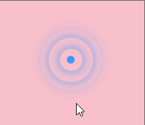
- 一个扩散圈整个为一个大盒子
- 中间有一个小圆点
- 周围有扩散的圆圈(利用动画来实现,通过控制每个小圆圈的动画延迟来实现扩散效果)
代码:
!important关键词可以提升样式权重
<!DOCTYPE html>
<html lang="en">
  <head>
    <meta charset="UTF-8" />
    <meta http-equiv="X-UA-Compatible" content="IE=edge" />
    <meta name="viewport" content="width=device-width, initial-scale=1.0" />
    <title>Document</title>
    <link rel="stylesheet" href="./style.css" />
    <style>
      .map {
        position: relative;
        width: 747px;
        height: 617px;
        background-color: pink;
        margin: 0 auto;
      }

      .city {
        position: absolute;
        color: #fff;
        top: 227px;
        right: 193px;
      }

      .dotted {
        width: 8px;
        height: 8px;
        background-color: #07fa07;
        border-radius: 50%;
      }

      /* 标签选择器之属性匹配选择 */
      .city div[class^="pulse"] {
        /* 保证小盒子水平垂直居中 */
        position: absolute;
        left: 50%;
        top: 50%;
        transform: translate(-50%, -50%);
        width: 8px;
        height: 8px;
        box-shadow: 0 0 12px #07fa07;
        border-radius: 50%;
        animation: pulse 3s linear infinite;
      }

      .city .pulse1 {
        animation-delay: 0s !important;
      }

      .city .pulse2 {
        animation-delay: 1s !important;
      }

      .city .pulse3 {
        animation-delay: 2s !important;
      }

      @keyframes pulse {
        0% {
          width: 8px;
          height: 8px;
        }
        40% {
          width: 40px;
          height: 40px;
          opacity: 1;
        }
        100% {
          width: 70px;
          height: 70px;
          opacity: 0;
        }
      }
    </style>
  </head>
  <body>
    <div class="map">
      <div class="city">
        <div class="dotted"></div>
        <div class="pulse1"></div>
        <div class="pulse2"></div>
        <div class="pulse3"></div>
      </div>
    </div>
  </body>
</html>


 1092
1092


 被折叠的 条评论
为什么被折叠?
被折叠的 条评论
为什么被折叠?
 到【灌水乐园】发言


