


用PYTHON画图 看股票/数字货币的趋势分析 带你直观理解指标
本文章将用PYTHON 画图 以比特币(BTC)为例 进行画图分析 (小白向)
Pycharm平台编写
所用到的python库
import requests
from lxml import etree
import math
import pandas as pd
import numpy as np
import matplotlib.pyplot as plt
from mplfinance.original_flavor import candlestick_ohlc
from matplotlib.pylab import date2num
import datetime
所用到的数据来源
数据从国外的coinmarketcap(需要科学上网)上提取2021.2.1-2022.2.3的数据
coinmarketcap
https://coinmarketcap.com/currencies/bitcoin/historical-data/?start=20210101&end=20220202)
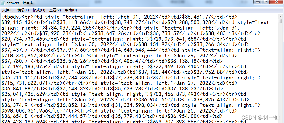
数据我就直接放网盘了,怎么爬我后面再补吧 (不过没什么用当个过度就行不用特别了解)
链接:https://pan.baidu.com/s/1C3np-mnd-AAX_4u3XlnZ_A
提取码:7bxn
爬取的是HTML格式的,后面代码转化一下
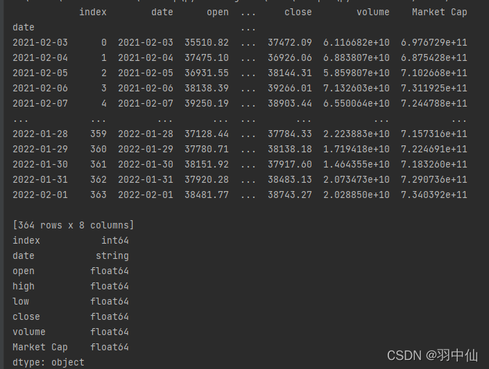
数据一共包括7个元素
‘date’:日期
‘open’:开盘价
‘high’:当日最高价
‘low’:当日最低价
‘close’:收盘价
‘volume’:当日总交易额
‘Market Cap’:当日市值
with open("data.txt", "r") as f: rd = f.read()
selector = etree.HTML(rd)

url_infos = selector.xpath('//tr')

data = []
for url_info in url_infos:
    l = []
    for i in range(7):
        d = url_info.xpath('td[%d+1]/text()' % i)
        if i == 0:
            l += d
        else:
            if d[0] == '-':
                d[0] = np.nan
                l += d
            else:
                d[0] = d[0].replace(',', '')
                d[0] = d[0].strip('$')
                d[0] = float(d[0])
                l += d
    data.append(l)

arr = np.array(data)
df = pd.DataFrame(arr)

df.columns = ['date', 'open', 'high', 'low', 'close', 'volume', 'Market Cap']
df = df.astype({'open': 'float64', 'high': 'float64', 'low': 'float64', 'close': 'float64', 'volume': 'float64', 'Market Cap': 'float64'})
df = df.reindex(index=df.index[::-1])
df.head()  # 倒序
df.reset_index(drop=True, inplace=True)  # 逆序后 重设index
df.reset_index(inplace=True)  # 重设index,原来的index汇入DataFrame中
df['date']=pd.to_datetime(df['date'])
df = df.astype({'date': 'string'})
df.index = pd.to_datetime(df['date'])  # 设置index的值
print(df)
print(df.dtypes)
df['date'] = df['date'].apply(lambda x: date2num(datetime.datetime.strptime(x, '%Y-%m-%d')))#转换日期格式
print(df.dtypes)
print(df)
输出结果如下
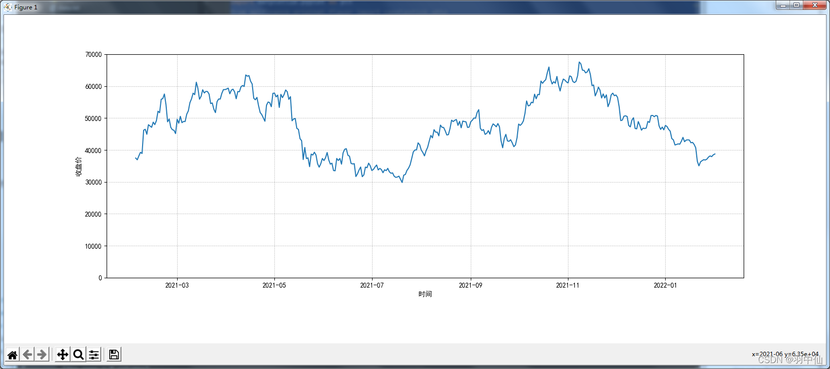
画 价格图 和 蜡烛图
价格图
先上效果图,后附可以直接运行的代码(数据用的是网盘的data.txt)
代码
from lxml import etree
import pandas as pd
import numpy as np
import matplotlib.pyplot as plt
from mplfinance.original_flavor import candlestick_ohlc
from matplotlib.pylab import date2num
import datetime


with open("data.txt", "r") as f: rd = f.read()
selector = etree.HTML(rd)
url_infos = selector.xpath('//tr')
# 从data.txt中提取需要的数据
data = []
for url_info in url_infos:
    l = []
    # 获取单行数据并做初步处理
    for i in range(7):
        d = url_info.xpath('td[%d+1]/text()' % i)
        if i == 0:
            l += d
        else:
            if d[0] == '-':
                d[0] = np.nan
                l += d
            else:
                d[0] = d[0].replace(',', '')
                d[0] = d[0].strip('$')
                d[0] = float(d[0])
                l += d
    data.append(l)

arr = np.array(data)
df = pd.DataFrame(arr)  # 将数据转为DataFrame数据类型

df.columns = ['date', 'open', 'high', 'low', 'close', 'volume', 'Market Cap']  # 设置列标题
# df['date']=df['date'].map(pd.to_datetime)#转化日期格式

df = df.astype({'open': 'float64', 'high': 'float64', 'low': 'float64', 'close': 'float64', 'volume': 'float64', 'Market Cap': 'float64'})
df = df.reindex(index=df.index[::-1])
df.head()  # 倒序
df.reset_index(drop=True, inplace=True)  # 逆序后 重设index

plt.rcParams['axes.unicode_minus'] = False# 解决坐标轴刻度负号乱码
plt.rcParams['font.sans-serif'] = ['Simhei']# 解决中文乱码问题

df.reset_index(inplace=True)  # 重设index,原来的index汇入DataFrame中
df['date']=pd.to_datetime(df['date'])
df = df.astype({'date': 'string'})
df.index = pd.to_datetime(df['date'])  # 设置index的值
print(df)
print(df.dtypes)
df['date'] = df['date'].apply(lambda x: date2num(datetime.datetime.strptime(x, '%Y-%m-%d')))#转换日期格式
print(df.dtypes)
print(df)

fig, ax2 = plt.subplots(figsize=(1200 / 72, 480 / 72))
ax2.plot(df['date'], df['close'])
ax2.grid(True)
ax2.set_ylim(0, 70000)
fig.subplots_adjust(bottom=0.2)  ## 调整底部距离
ax2.xaxis_date()  ## 设置X轴刻度为日期时间
plt.yticks()  ## 设置Y轴刻度线
plt.xlabel(u"时间")  ##设置X轴标题
ax2.set_ylabel('收盘价')
plt.grid(True, 'major', 'both', ls='--', lw=.5, c='k', alpha=.3)  ##设置网格线
plt.show()
蜡烛图
这里就直接和价格图叠加到一起显示了
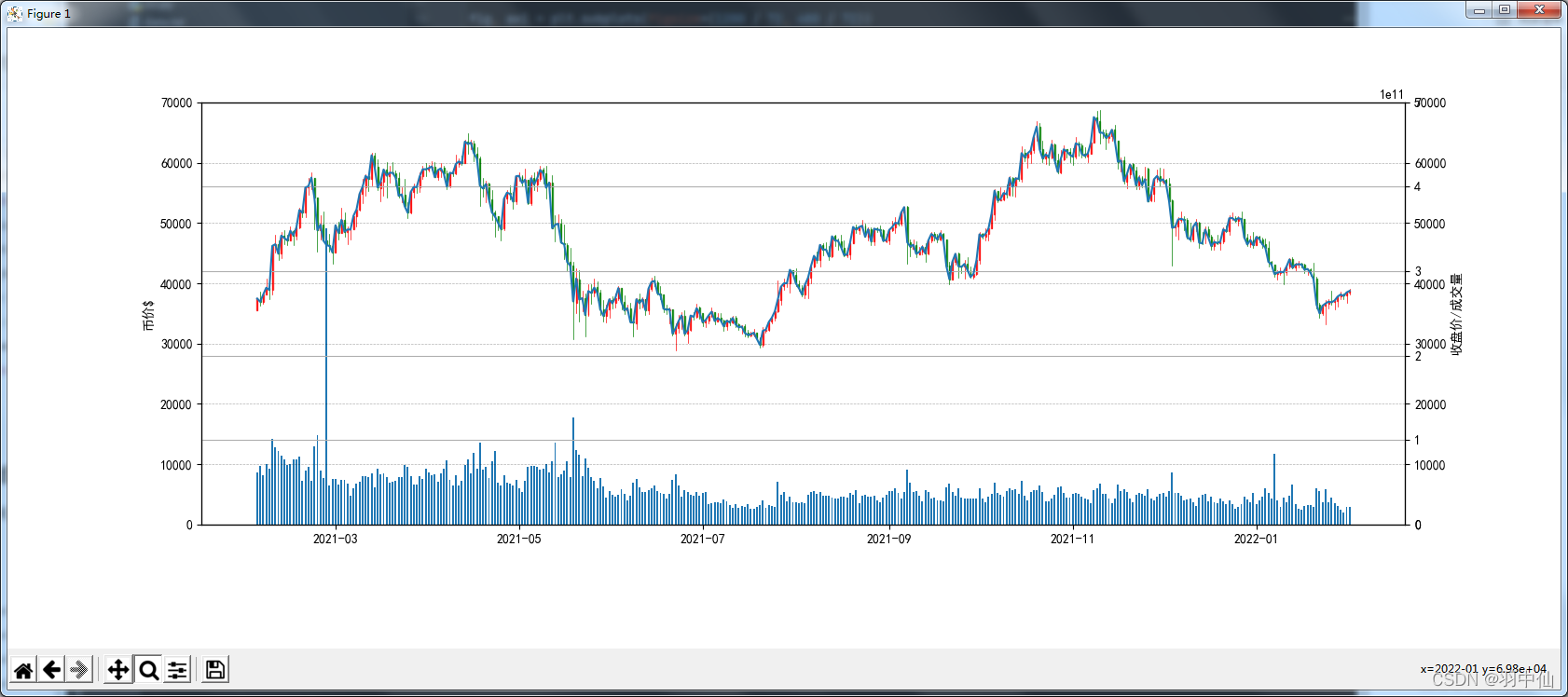
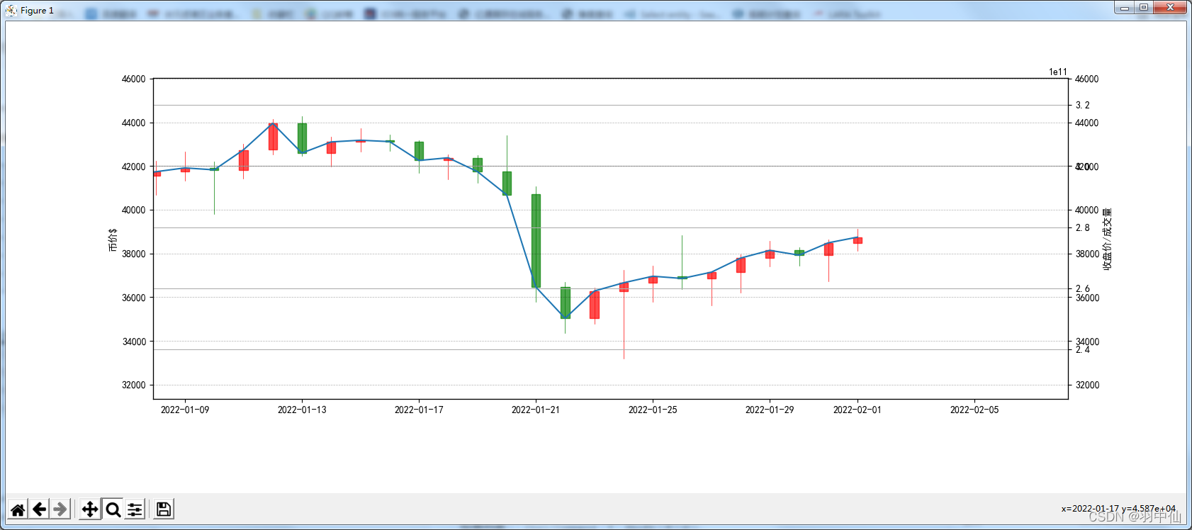
放大后是这个样子:
from lxml import etree
import pandas as pd
import numpy as np
import matplotlib.pyplot as plt
from mplfinance.original_flavor import candlestick_ohlc
from matplotlib.pylab import date2num
import datetime


with open("data.txt", "r") as f: rd = f.read()
selector = etree.HTML(rd)
url_infos = selector.xpath('//tr')
# 从data.txt中提取需要的数据
data = []
for url_info in url_infos:
    l = []
    # 获取单行数据并做初步处理
    for i in range(7):
        d = url_info.xpath('td[%d+1]/text()' % i)
        if i == 0:
            l += d
        else:
            if d[0] == '-':
                d[0] = np.nan
                l += d
            else:
                d[0] = d[0].replace(',', '')
                d[0] = d[0].strip('$')
                d[0] = float(d[0])
                l += d
    data.append(l)

arr = np.array(data)
df = pd.DataFrame(arr)  # 将数据转为DataFrame数据类型

df.columns = ['date', 'open', 'high', 'low', 'close', 'volume', 'Market Cap']  # 设置列标题
# df['date']=df['date'].map(pd.to_datetime)#转化日期格式

df = df.astype({'open': 'float64', 'high': 'float64', 'low': 'float64', 'close': 'float64', 'volume': 'float64', 'Market Cap': 'float64'})
df = df.reindex(index=df.index[::-1])
df.head()  # 倒序
df.reset_index(drop=True, inplace=True)  # 逆序后 重设index

plt.rcParams['axes.unicode_minus'] = False# 解决坐标轴刻度负号乱码
plt.rcParams['font.sans-serif'] = ['Simhei']# 解决中文乱码问题

df.reset_index(inplace=True)  # 重设index,原来的index汇入DataFrame中
df['date']=pd.to_datetime(df['date'])
df = df.astype({'date': 'string'})
df.index = pd.to_datetime(df['date'])  # 设置index的值
print(df)
print(df.dtypes)
df['date'] = df['date'].apply(lambda x: date2num(datetime.datetime.strptime(x, '%Y-%m-%d')))#转换日期格式
print(df.dtypes)
print(df)


fig, ax1 = plt.subplots(figsize=(1200 / 72, 480 / 72))
da = df[['date', 'open', 'high', 'low', 'close']]
f = da[['date', 'open', 'high', 'low', 'close']].values
ax3 = ax1.twinx()
ax2 = ax1.twinx()
candlestick_ohlc(ax1, f, colordown='g', colorup='r', width=0.3, alpha=0.7)
ax3.bar(df['date'], df['volume'], width=0.6)
ax2.plot(df['date'], df['close'])
ax2.grid(True)
ax3.grid(True)
ax3.set_ylim(0, 500000000000)
ax1.set_ylim(0, 70000)
ax2.set_ylim(0, 70000)
ax1.set_ylabel('币价$')
fig.subplots_adjust(bottom=0.2)  ## 调整底部距离
ax1.xaxis_date()  ## 设置X轴刻度为日期时间
ax2.xaxis_date()  ## 设置X轴刻度为日期时间
ax3.xaxis_date()  ## 设置X轴刻度为日期时间
plt.yticks()  ## 设置Y轴刻度线
plt.xlabel(u"时间")  ##设置X轴标题
ax2.set_ylabel('收盘价/成交量')
plt.grid(True, 'major', 'both', ls='--', lw=.5, c='k', alpha=.3)  ##设置网格线
plt.show()
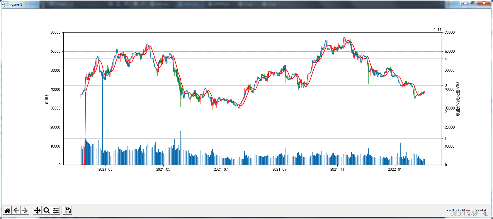
简单的分析趋势
这里用的是一个比较基础的指标:简单移动平均线 SMA(看均价用的)
具体可以参考这个文章:
https://zhuanlan.zhihu.com/p/422205612
打个比方:
一共有10天连续的收盘价:1 2 3 4 5 6 7 8 9 10
我需要话一个3SMA的线(就是3个周期的简单移动平均线)
那么我将得到一组后7天收盘价的 3SMA
(1+2+3)/3,(2+3+4)/3,…,(8+9+10)/3
现在我画一个 5SMA的图(红色的线)
计算5SMA的代码
step=5
dflen=len(df)
sma= {}
for i in range(step):
    sma[i]=0
for i in range(dflen-step):
    i+=step
    sma[i]=0
    for j in range(step):
        j+=1
        sma[i] += df['close'][i-j]
        if j==step: sma[i]=sma[i]/step
sma = pd.DataFrame.from_dict(sma,orient='index',columns=['SMA'])
print(sma)
输出图片的完整代码
from lxml import etree
import pandas as pd
import numpy as np
import matplotlib.pyplot as plt
from mplfinance.original_flavor import candlestick_ohlc
from matplotlib.pylab import date2num
import datetime


with open("data.txt", "r") as f: rd = f.read()
selector = etree.HTML(rd)
url_infos = selector.xpath('//tr')
# 从data.txt中提取需要的数据
data = []
for url_info in url_infos:
    l = []
    # 获取单行数据并做初步处理
    for i in range(7):
        d = url_info.xpath('td[%d+1]/text()' % i)
        if i == 0:
            l += d
        else:
            if d[0] == '-':
                d[0] = np.nan
                l += d
            else:
                d[0] = d[0].replace(',', '')
                d[0] = d[0].strip('$')
                d[0] = float(d[0])
                l += d
    data.append(l)

arr = np.array(data)
df = pd.DataFrame(arr)  # 将数据转为DataFrame数据类型

df.columns = ['date', 'open', 'high', 'low', 'close', 'volume', 'Market Cap']  # 设置列标题
# df['date']=df['date'].map(pd.to_datetime)#转化日期格式

df = df.astype({'open': 'float64', 'high': 'float64', 'low': 'float64', 'close': 'float64', 'volume': 'float64', 'Market Cap': 'float64'})
df = df.reindex(index=df.index[::-1])
df.head()  # 倒序
df.reset_index(drop=True, inplace=True)  # 逆序后 重设index

plt.rcParams['axes.unicode_minus'] = False# 解决坐标轴刻度负号乱码
plt.rcParams['font.sans-serif'] = ['Simhei']# 解决中文乱码问题

df.reset_index(inplace=True)  # 重设index,原来的index汇入DataFrame中
df['date']=pd.to_datetime(df['date'])
df = df.astype({'date': 'string'})
df.index = pd.to_datetime(df['date'])  # 设置index的值
print(df)
print(df.dtypes)
df['date'] = df['date'].apply(lambda x: date2num(datetime.datetime.strptime(x, '%Y-%m-%d')))#转换日期格式
print(df.dtypes)
print(df)

step=5
dflen=len(df)
sma= {}
for i in range(step):
    sma[i]=0
for i in range(dflen-step):
    i+=step
    sma[i]=0
    for j in range(step):
        j+=1
        sma[i] += df['close'][i-j]
        if j==step: sma[i]=sma[i]/step
sma = pd.DataFrame.from_dict(sma,orient='index',columns=['SMA'])
print(sma)


fig, ax1 = plt.subplots(figsize=(1200 / 72, 480 / 72))
da = df[['date', 'open', 'high', 'low', 'close']]
f = da[['date', 'open', 'high', 'low', 'close']].values
ax3 = ax1.twinx()
ax2 = ax1.twinx()
axsma=ax1.twinx()
candlestick_ohlc(ax1, f, colordown='g', colorup='r', width=0.3, alpha=0.7)
ax3.bar(df['date'], df['volume'], width=0.6)
ax2.plot(df['date'], df['close'])
axsma.plot(df['date'],sma['SMA'],color="r")
ax2.grid(True)
ax3.grid(True)
axsma.grid(True)
ax3.set_ylim(0, 500000000000)
ax1.set_ylim(0, 70000)
ax2.set_ylim(0, 70000)
axsma.set_ylim(0, 70000)
ax1.set_ylabel('币价$')
fig.subplots_adjust(bottom=0.2)  ## 调整底部距离
ax1.xaxis_date()  ## 设置X轴刻度为日期时间
ax2.xaxis_date()  ## 设置X轴刻度为日期时间
ax3.xaxis_date()  ## 设置X轴刻度为日期时间
axsma.xaxis_date()  ## 设置X轴刻度为日期时间
plt.yticks()  ## 设置Y轴刻度线
plt.xlabel(u"时间")  ##设置X轴标题
ax2.set_ylabel('收盘价/成交量/SMA')
plt.grid(True, 'major', 'both', ls='--', lw=.5, c='k', alpha=.3)  ##设置网格线
plt.show()
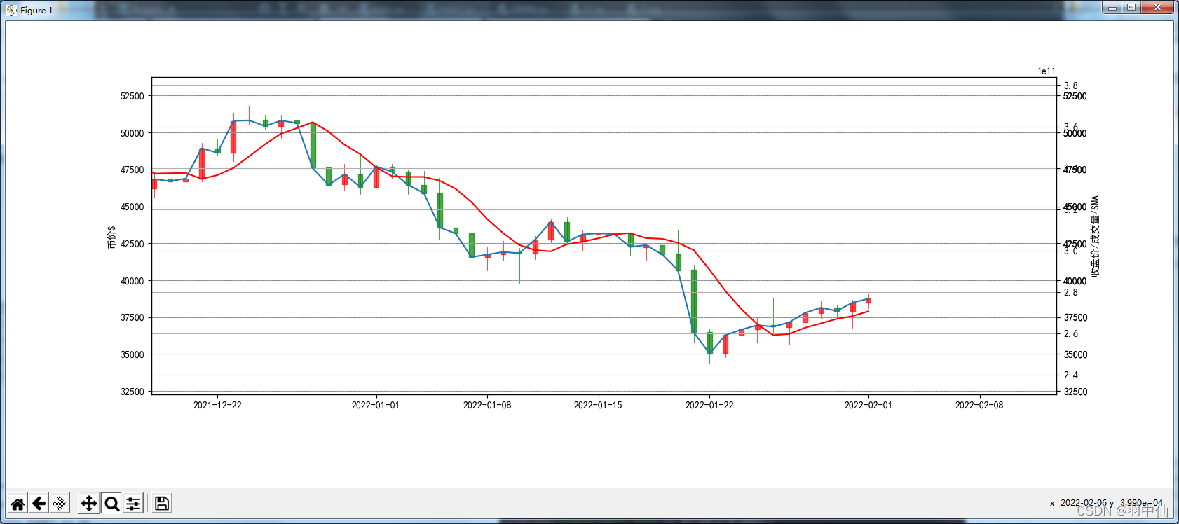
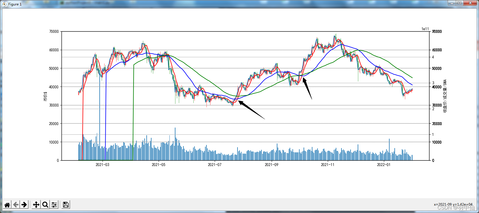
接下来把5SMA(红色) 、30SMA(黄色)、 60SMA(绿色) 反应到一张图上
2处黑色箭头显示的就是 股市里常说的一个金叉现象(不过我是个是SMA的)短线5SMA与长线60SMA底部向上交叉,一般这是一个买入信号(当时这是复盘,实战只能作为一个判断趋势的参考点)
最后分析一下这个2月3日后的BTC可能的走势
图片中可以看到 收盘价的线走在中、长期均价线的下方,总体会有向均价方向移动的趋势,买入机会应该就在60SMA于5SMA渐进时,估计就一两周吧 会有个交叉的趋势
看到这里应该理解了指标的作用 说是预测其实只是提供一些数据给你做判断,指标各种各样,各种股票 货币软件里都要各种指标的线 像是MA EMA BOLL SAR 的 欢迎各位一起来讨论分析,这篇文章也是一个小白入门文,让你理解 数据转化为图片的方式 K线图的理解
Q149021708
from lxml import etree
import pandas as pd
import numpy as np
import matplotlib.pyplot as plt
from mplfinance.original_flavor import candlestick_ohlc
from matplotlib.pylab import date2num
import datetime


with open("data.txt", "r") as f: rd = f.read()
selector = etree.HTML(rd)
url_infos = selector.xpath('//tr')
# 从data.txt中提取需要的数据
data = []
for url_info in url_infos:
    l = []
    # 获取单行数据并做初步处理
    for i in range(7):
        d = url_info.xpath('td[%d+1]/text()' % i)
        if i == 0:
            l += d
        else:
            if d[0] == '-':
                d[0] = np.nan
                l += d
            else:
                d[0] = d[0].replace(',', '')
                d[0] = d[0].strip('$')
                d[0] = float(d[0])
                l += d
    data.append(l)

arr = np.array(data)
df = pd.DataFrame(arr)  # 将数据转为DataFrame数据类型

df.columns = ['date', 'open', 'high', 'low', 'close', 'volume', 'Market Cap']  # 设置列标题
# df['date']=df['date'].map(pd.to_datetime)#转化日期格式

df = df.astype({'open': 'float64', 'high': 'float64', 'low': 'float64', 'close': 'float64', 'volume': 'float64', 'Market Cap': 'float64'})
df = df.reindex(index=df.index[::-1])
df.head()  # 倒序
df.reset_index(drop=True, inplace=True)  # 逆序后 重设index

plt.rcParams['axes.unicode_minus'] = False# 解决坐标轴刻度负号乱码
plt.rcParams['font.sans-serif'] = ['Simhei']# 解决中文乱码问题

df.reset_index(inplace=True)  # 重设index,原来的index汇入DataFrame中
df['date']=pd.to_datetime(df['date'])
df = df.astype({'date': 'string'})
df.index = pd.to_datetime(df['date'])  # 设置index的值
print(df)
print(df.dtypes)
df['date'] = df['date'].apply(lambda x: date2num(datetime.datetime.strptime(x, '%Y-%m-%d')))#转换日期格式
print(df.dtypes)
print(df)

step=5
dflen=len(df)
sma= {}
for i in range(step):
    sma[i]=0
for i in range(dflen-step):
    i+=step
    sma[i]=0
    for j in range(step):
        j+=1
        sma[i] += df['close'][i-j]
        if j==step: sma[i]=sma[i]/step
sma = pd.DataFrame.from_dict(sma,orient='index',columns=['5SMA'])
print(sma)


step=30
dflen=len(df)
sma30= {}
for i in range(step):
    sma30[i]=0
for i in range(dflen-step):
    i+=step
    sma30[i]=0
    for j in range(step):
        j+=1
        sma30[i] += df['close'][i-j]
        if j==step: sma30[i]=sma30[i]/step
sma30 = pd.DataFrame.from_dict(sma30,orient='index',columns=['30SMA'])
print(sma30)

step=60
dflen=len(df)
sma60= {}
for i in range(step):
    sma60[i]=0
for i in range(dflen-step):
    i+=step
    sma60[i]=0
    for j in range(step):
        j+=1
        sma60[i] += df['close'][i-j]
        if j==step: sma60[i]=sma60[i]/step
sma60 = pd.DataFrame.from_dict(sma60,orient='index',columns=['60SMA'])
print(sma60)


fig, ax1 = plt.subplots(figsize=(1200 / 72, 480 / 72))
da = df[['date', 'open', 'high', 'low', 'close']]
f = da[['date', 'open', 'high', 'low', 'close']].values
ax3 = ax1.twinx()
ax2 = ax1.twinx()
axsma=ax1.twinx()
axsma30=ax1.twinx()
axsma60=ax1.twinx()
candlestick_ohlc(ax1, f, colordown='g', colorup='r', width=0.3, alpha=0.7)
ax3.bar(df['date'], df['volume'], width=0.6)
ax2.plot(df['date'], df['close'])
axsma.plot(df['date'],sma['5SMA'],color="red")
axsma30.plot(df['date'],sma30['30SMA'],color="blue")
axsma60.plot(df['date'],sma60['60SMA'],color="green")
ax2.grid(True)
ax3.grid(True)
axsma.grid(True)
axsma30.grid(True)
axsma60.grid(True)
ax3.set_ylim(0, 500000000000)
ax1.set_ylim(0, 70000)
ax2.set_ylim(0, 70000)
axsma.set_ylim(0, 70000)
axsma30.set_ylim(0, 70000)
axsma60.set_ylim(0, 70000)
ax1.set_ylabel('币价$')
fig.subplots_adjust(bottom=0.2)  ## 调整底部距离
ax1.xaxis_date()  ## 设置X轴刻度为日期时间
ax2.xaxis_date()  ## 设置X轴刻度为日期时间
ax3.xaxis_date()  ## 设置X轴刻度为日期时间
axsma.xaxis_date()  ## 设置X轴刻度为日期时间
plt.yticks()  ## 设置Y轴刻度线
plt.xlabel(u"时间")  ##设置X轴标题
ax2.set_ylabel('收盘价/成交量/SMA')
plt.grid(True, 'major', 'both', ls='--', lw=.5, c='k', alpha=.3)  ##设置网格线
plt.show()
未完待续…


 2万+
2万+

 被折叠的 条评论
为什么被折叠?
被折叠的 条评论
为什么被折叠?
 到【灌水乐园】发言


