


🧑 博主简介:曾任某智慧城市类企业
算法总监,目前在美国市场的物流公司从事高级算法工程师一职,深耕人工智能领域,精通python数据挖掘、可视化、机器学习等,发表过AI相关的专利并多次在AI类比赛中获奖。CSDN人工智能领域的优质创作者,提供AI相关的技术咨询、项目开发和个性化解决方案等服务,如有需要请站内私信或者联系任意文章底部的的VX名片(ID:xf982831907)
💬 博主粉丝群介绍:① 群内初中生、高中生、本科生、研究生、博士生遍布,可互相学习,交流困惑。② 热榜top10的常客也在群里,也有数不清的万粉大佬,可以交流写作技巧,上榜经验,涨粉秘籍。③ 群内也有职场精英,大厂大佬,可交流技术、面试、找工作的经验。④ 进群免费赠送写作秘籍一份,助你由写作小白晋升为创作大佬。⑤ 进群赠送CSDN评论防封脚本,送真活跃粉丝,助你提升文章热度。有兴趣的加文末联系方式,备注自己的CSDN昵称,拉你进群,互相学习共同进步。

【数据可视化-36】基于pyecharts的学生成绩数据集可视化分析
一、引言
在教育研究中,数据可视化是分析学生成绩影响因素的有力工具。本文将利用包含学生考试成绩的数据集,从多个维度进行可视化分析,深入探讨影响学生成绩的因素以及各变量之间的关系。以下分析全部使用 pyecharts 库实现,包含完整 Python 代码,可供读者参考复现。
二、数据探索
2.1 数据集介绍
数据集包含以下变量:
- gender:学生性别
- race/ethnicity:学生种族/民族
- parental level of education:父母教育水平
- lunch:午餐类型
- test preparation course:是否参加测试准备课程
- math score:数学成绩
- reading score:阅读成绩
- writing score:写作成绩
2.2 数据清洗探索
import pandas as pd

# 加载数据
df = pd.read_csv('student_scores.csv')  # 请替换为实际文件路径

# 查看数据基本信息
df.info()
从数据基本信息可以看出:
- 数据包含8个维度;
- 性别、种族、父母教育水平等为类别型变量,成绩为数值型变量;
- 数据中存在缺失值,需进一步处理。
三、单维度特征可视化
3.1 性别分布
from pyecharts.charts import Pie,Bar
from pyecharts import options as opts

def opts_Pie(data_pair,title):
    pie = (
        Pie(
        init_opts=opts.InitOpts(width='1000px', height='800px')
        )
        .add(series_name="",
            data_pair=data_pair,
            radius=["30%",'50%'],
            center=["38%", "50%"],
            label_opts=opts.LabelOpts(is_show=False, position="center"),
            )
        .set_global_opts(
            title_opts=opts.TitleOpts(
            title=title,
            pos_top='2%',
            pos_left="29%",
            title_textstyle_opts=opts.TextStyleOpts(color='#228be6',font_size=20)
            ),
            visualmap_opts=opts.VisualMapOpts(
                is_show=False,
                max_=600,
                pos_top='70%',
                pos_left='20%',
                range_color=['blue', 'green', 'yellow', 'red']
            ),
            legend_opts=opts.LegendOpts(is_show=True, pos_right="30%", pos_top="8%",orient="vertical"),
        )
        .set_series_opts(label_opts=opts.LabelOpts(formatter="{b}: {d}%"))
    )
    return pie


# 性别分布
gender_counts = df['gender'].value_counts().reset_index()
gender_counts.columns = ['gender', 'count']
data_pair = [list(gender_counts.loc[i]) for i in range(len(gender_counts))]
pie = opts_Pie(data_pair,'性别分布')
pie.render_notebook()
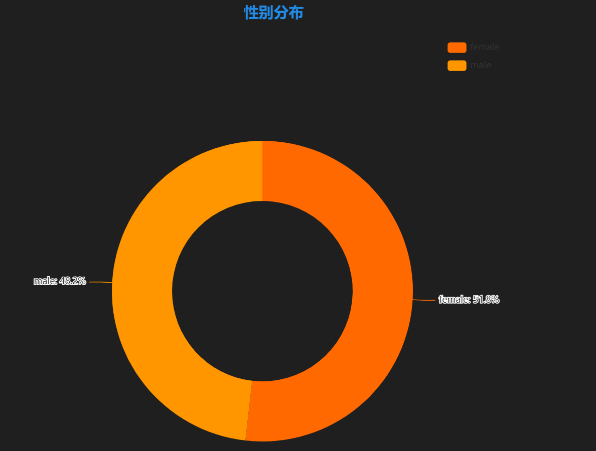
图表含义:展示学生性别分布情况。
3.2 种族/民族分布
# 种族分布
ethnicity_counts = df['race/ethnicity'].value_counts().reset_index()
ethnicity_counts.columns = ['ethnicity', 'count']

data_pair=[list(ethnicity_counts.loc[i]) for i in range(len(ethnicity_counts))]

pie = opts_Pie(data_pair,'种族/民族分布')
pie.render_notebook()
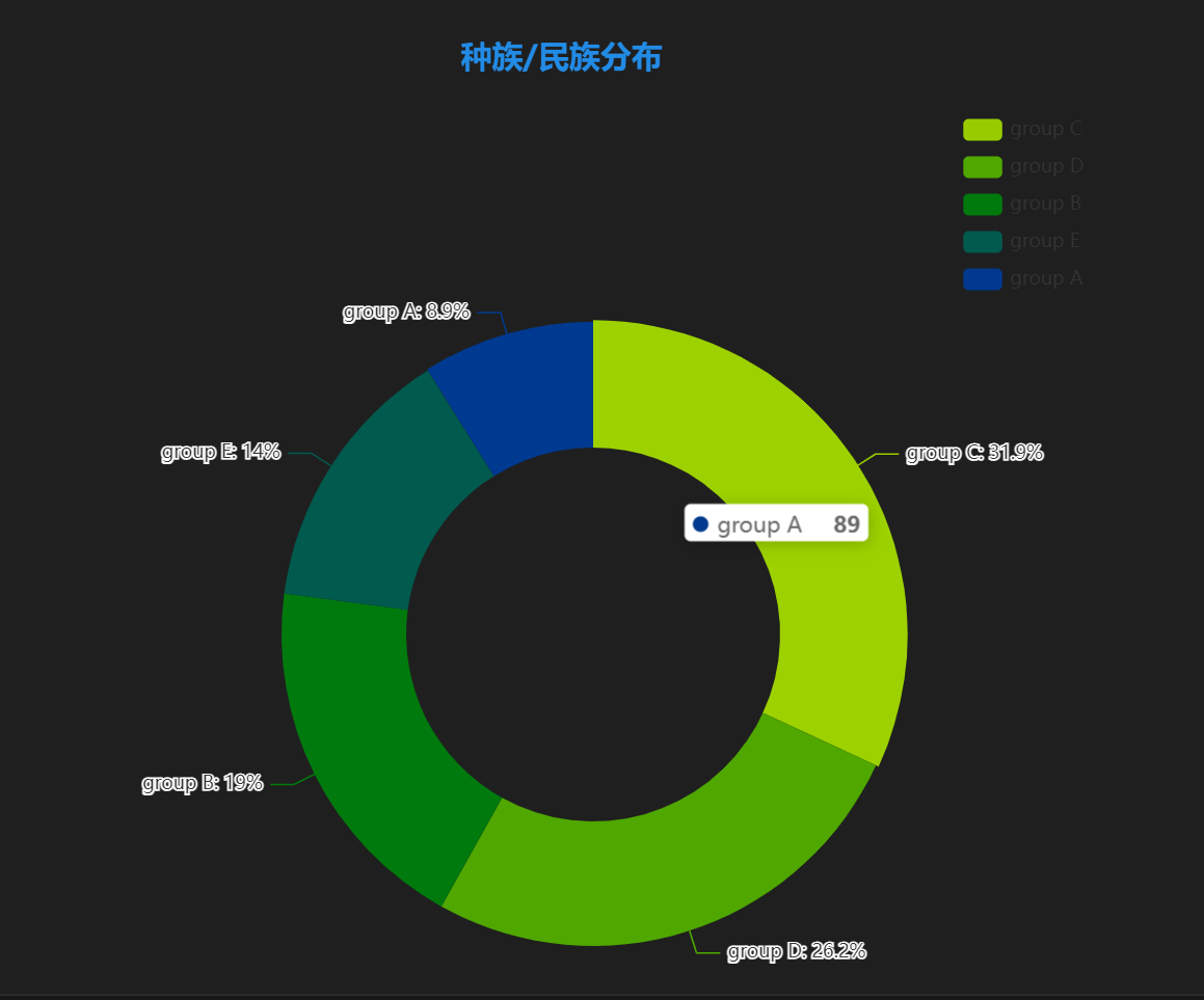
图表含义:展示学生种族/民族分布情况。
3.3 父母教育水平分布
# 父母教育水平分布
education_counts = df['parental level of education'].value_counts().reset_index()
education_counts.columns = ['education', 'count']

bar_education = Bar()
bar_education.add_xaxis(education_counts['education'].tolist())
bar_education.add_yaxis('人数', education_counts['count'].tolist())
bar_education.set_global_opts(title_opts=opts.TitleOpts(title='父母教育水平分布'))
bar_education.render('education_distribution.html')
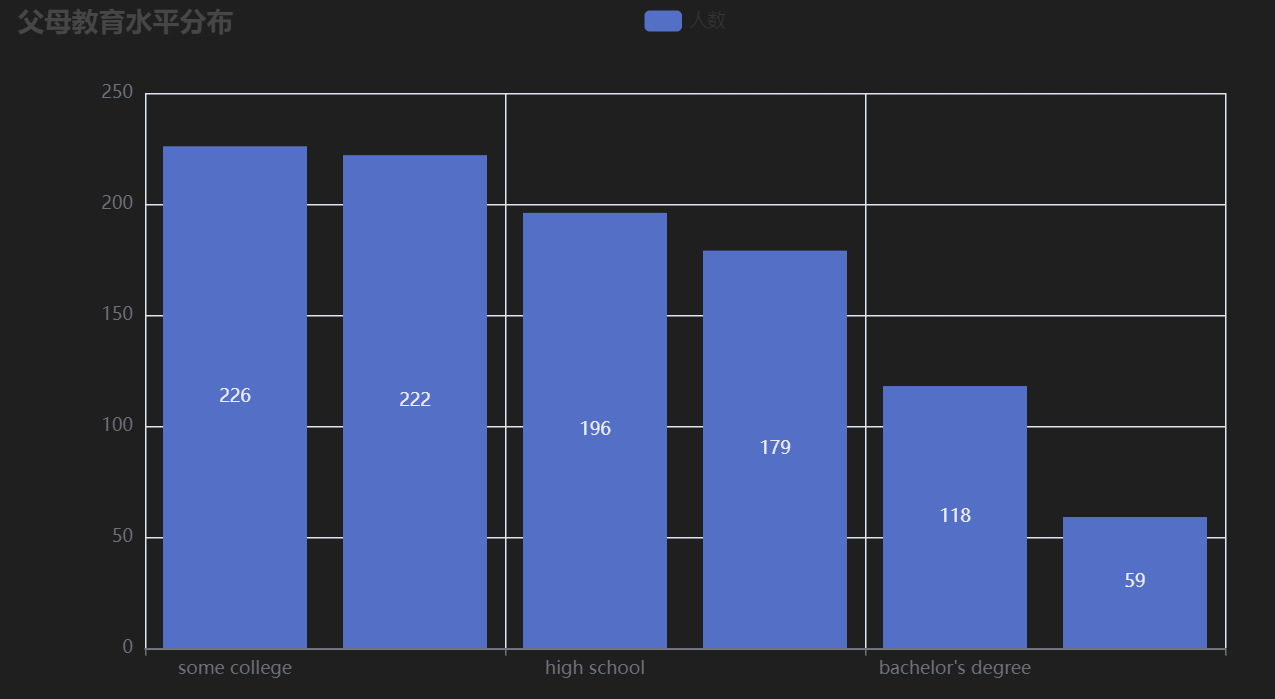
图表含义:展示学生父母教育水平分布情况。
3.4 午餐类型分布
# 午餐类型分布
lunch_counts = df['lunch'].value_counts().reset_index()
lunch_counts.columns = ['lunch', 'count']

data_pair = [list(lunch_counts.loc[i]) for i in range(len(lunch_counts))]
poe = opts_Pie(data_pair,'午餐类型分布')
pie.render_notebook()
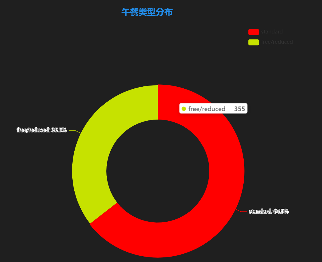
图表含义:展示学生午餐类型分布情况。
3.5 测试准备课程参与情况
# 测试准备课程参与情况
course_counts = df['test preparation course'].value_counts().reset_index()
course_counts.columns = ['course', 'count']

data_pair = [list(course_counts.loc[i]) for i in range(len(course_counts))]

pie = opts_Pie(data_pair,'测试准备课程参与情况')
pie.render_notebook()
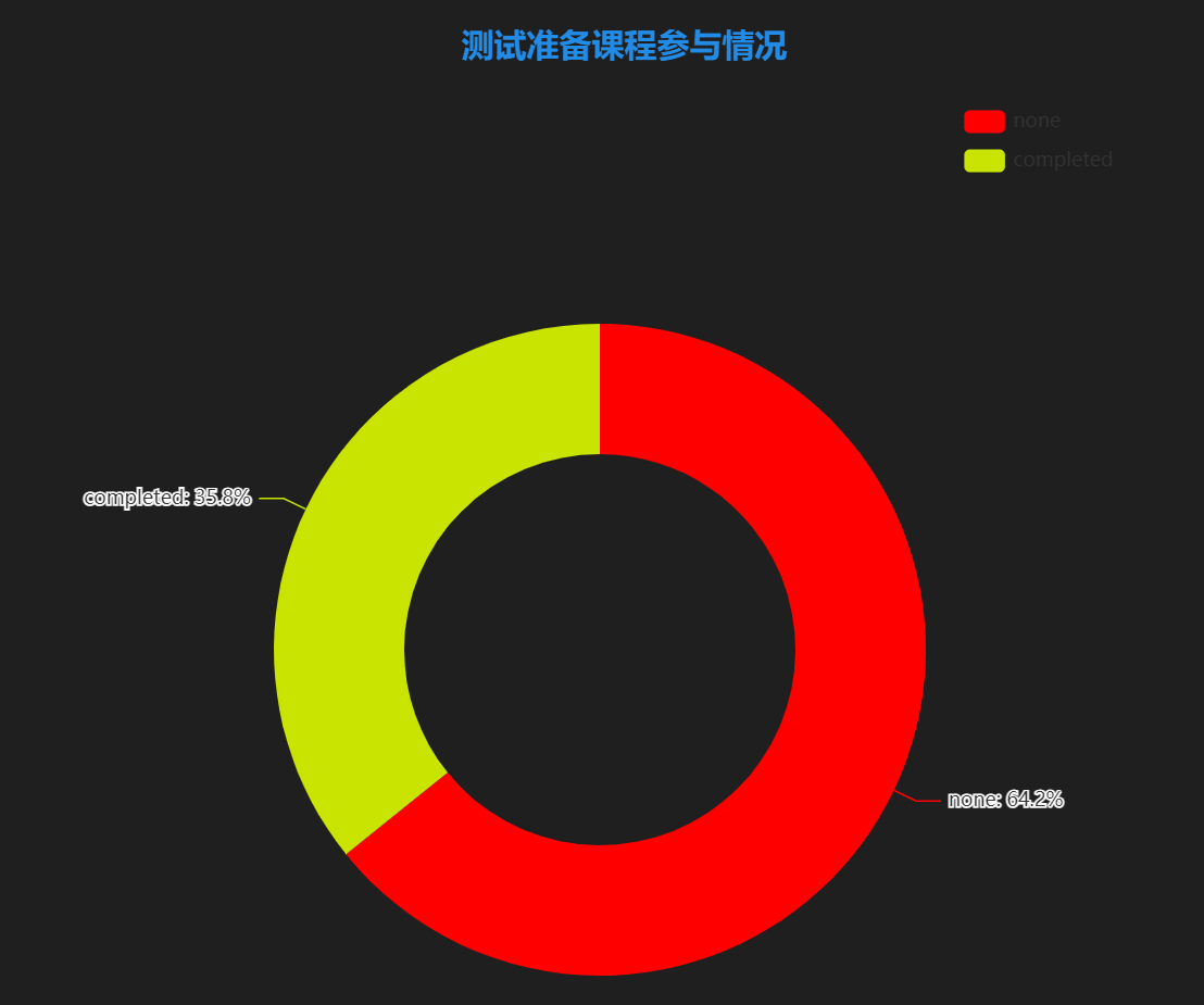
图表含义:展示学生是否参与测试准备课程的情况。
四、各个特征与成绩关系的可视化
4.1 性别与成绩关系
from pyecharts.charts import Boxplot

# 性别与成绩关系
def draw_scores_by_gender():
    male_scores = df[df['gender'] == 'male'][['math score', 'reading score', 'writing score']].values.flatten().tolist()
    female_scores = df[df['gender'] == 'female'][['math score', 'reading score', 'writing score']].values.flatten().tolist()

    boxplot = Boxplot()
    boxplot.add_xaxis(['男', '女'])
    boxplot.add_yaxis('成绩', [boxplot.prepare_data([male_scores, female_scores])])
    boxplot.set_global_opts(title_opts=opts.TitleOpts(title='性别与成绩关系'))
    boxplot.render('scores_by_gender.html')

draw_scores_by_gender()
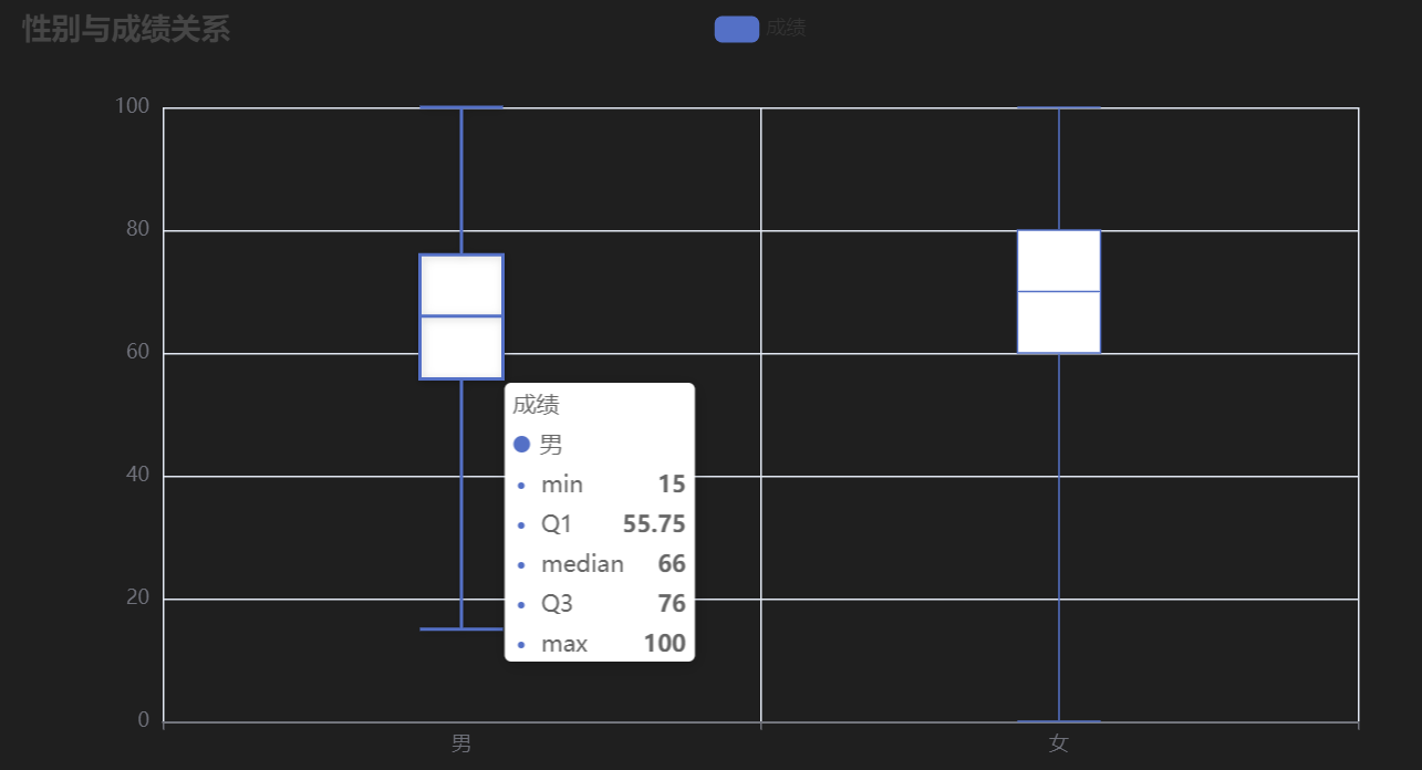
图表含义:展示不同性别学生的成绩分布情况。
4.2 种族与成绩关系
# 种族与成绩关系
ethnicity_list = df['race/ethnicity'].unique().tolist()
scores_by_ethnicity = []
for ethnicity in ethnicity_list:
    scores = df[df['race/ethnicity'] == ethnicity][['math score', 'reading score', 'writing score']].values.flatten().tolist()
    scores_by_ethnicity.append(scores)

boxplot_ethnicity = Boxplot()
boxplot_ethnicity.add_xaxis(ethnicity_list)
boxplot_ethnicity.add_yaxis('成绩', [boxplot_ethnicity.prepare_data(scores_by_ethnicity)])
boxplot_ethnicity.set_global_opts(title_opts=opts.TitleOpts(title='种族与成绩关系'))
boxplot_ethnicity.render('scores_by_ethnicity.html')
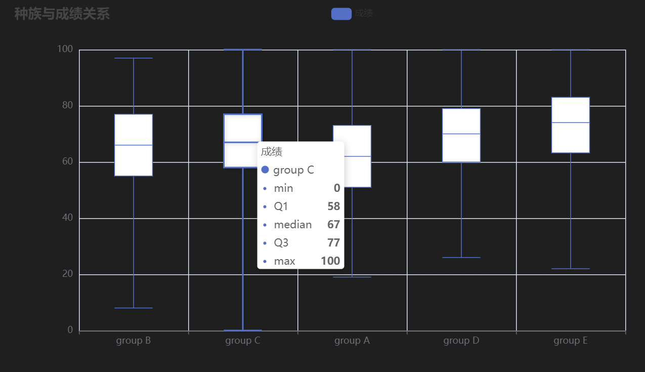
图表含义:展示不同种族学生的成绩分布情况。
4.3 父母教育水平与成绩关系
# 父母教育水平与成绩关系
education_list = df['parental level of education'].unique().tolist()
scores_by_education = []
for education in education_list:
    scores = df[df['parental level of education'] == education][['math score', 'reading score', 'writing score']].values.flatten().tolist()
    scores_by_education.append(scores)

boxplot_education = Boxplot()
boxplot_education.add_xaxis(education_list)
boxplot_education.add_yaxis('成绩', [boxplot_education.prepare_data(scores_by_education)])
boxplot_education.set_global_opts(title_opts=opts.TitleOpts(title='父母教育水平与成绩关系'))
boxplot_education.render('scores_by_education.html')
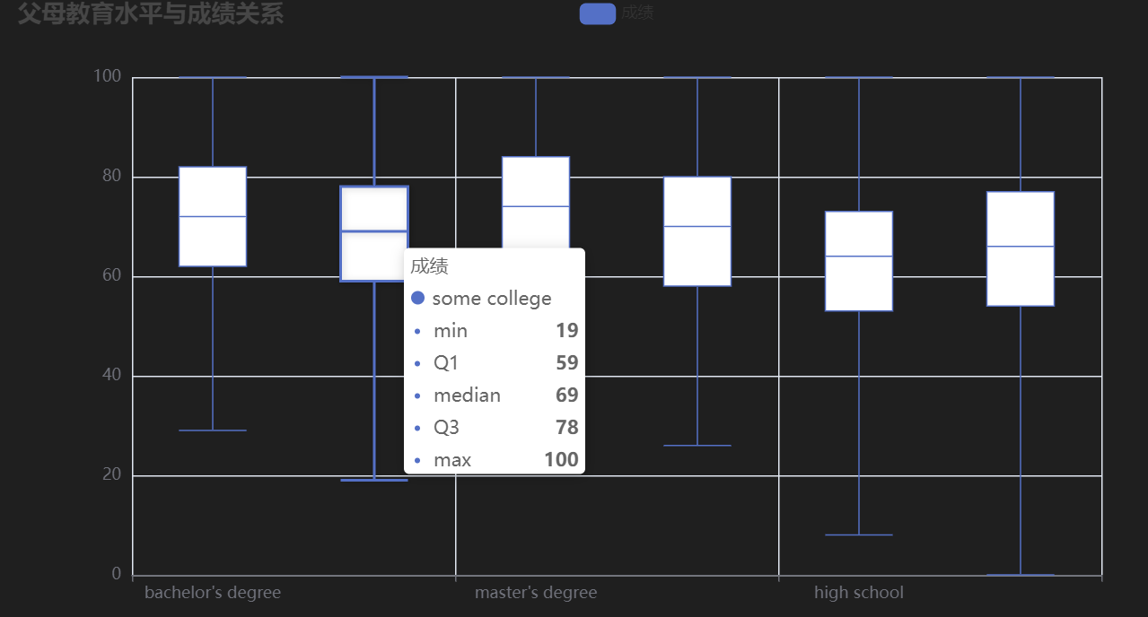
图表含义:展示不同父母教育水平学生的成绩分布情况。
4.4 午餐类型与成绩关系
# 午餐类型与成绩关系
lunch_list = df['lunch'].unique().tolist()
scores_by_lunch = []
for lunch in lunch_list:
    scores = df[df['lunch'] == lunch][['math score', 'reading score', 'writing score']].values.flatten().tolist()
    scores_by_lunch.append(scores)

boxplot_lunch = Boxplot()
boxplot_lunch.add_xaxis(lunch_list)
boxplot_lunch.add_yaxis('成绩', [boxplot_lunch.prepare_data(scores_by_lunch)])
boxplot_lunch.set_global_opts(title_opts=opts.TitleOpts(title='午餐类型与成绩关系'))
boxplot_lunch.render('scores_by_lunch.html')
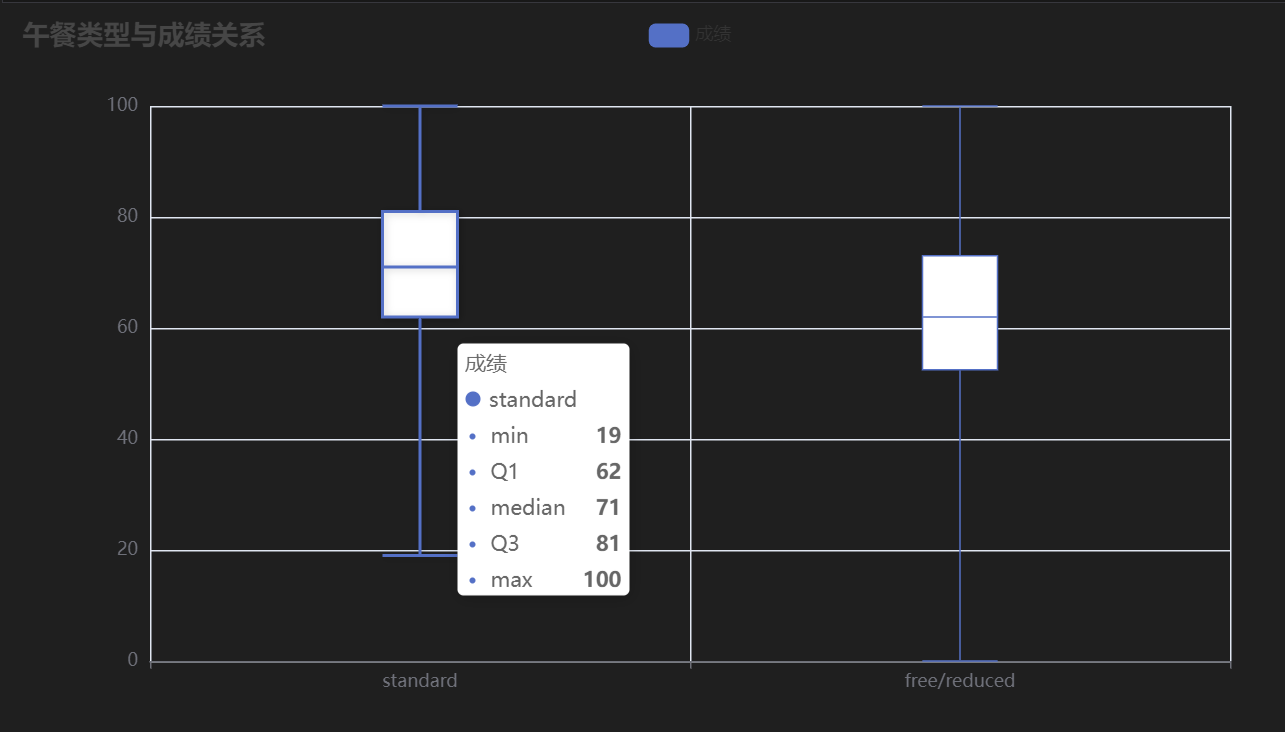
图表含义:展示不同午餐类型学生的成绩分布情况。
4.5 测试准备课程与成绩关系
# 测试准备课程与成绩关系
course_list = df['test preparation course'].unique().tolist()
scores_by_course = []
for course in course_list:
    scores = df[df['test preparation course'] == course][['math score', 'reading score', 'writing score']].values.flatten().tolist()
    scores_by_course.append(scores)

boxplot_course = Boxplot()
boxplot_course.add_xaxis(course_list)
boxplot_course.add_yaxis('成绩', [boxplot_course.prepare_data(scores_by_course)])
boxplot_course.set_global_opts(title_opts=opts.TitleOpts(title='测试准备课程与成绩关系'))
boxplot_course.render('scores_by_course.html')
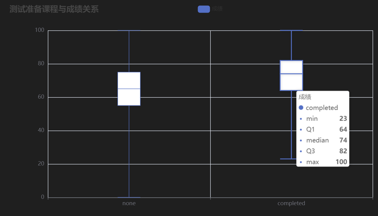
图表含义:展示是否参加测试准备课程学生的成绩分布情况。
4.6 数学成绩分布
# 数学成绩分布
# 创建柱状图
bar = Bar()
bar.add_xaxis(list(range(0, 101, 1)))
bar.add_yaxis('数学成绩分布', df['math score'].tolist())
bar.set_global_opts(
    title_opts=opts.TitleOpts(title='数学成绩分布'),
    xaxis_opts=opts.AxisOpts(name='分数段'),
    yaxis_opts=opts.AxisOpts(name='人数')
)
bar.render_notebook()
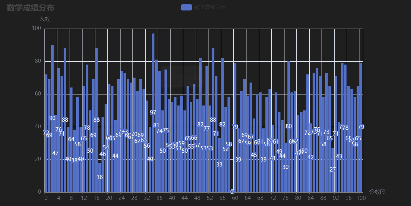
图表含义:展示学生成绩的整体分布情况。
从以上可视化结果可以看出:
- 性别与成绩:男女学生成绩可能存在差异。
- 种族与成绩:不同种族学生的成绩分布可能存在差异。
- 父母教育水平与成绩:父母教育水平可能对学生成绩有一定影响。
- 午餐类型与成绩:午餐类型可能影响学生成绩。
- 测试准备课程与成绩:参加测试准备课程可能有助于提高学生成绩。
以上分析为理解影响学生成绩的关键因素提供了多维度视角,并揭示了各变量之间的潜在关系,为进一步的教育研究和政策制定提供了数据支持。
如果您还有其他问题或需要进一步的分析,请随时告诉我!


 被折叠的 条评论
为什么被折叠?
被折叠的 条评论
为什么被折叠?
 到【灌水乐园】发言


