【pcolor数据可视化】Matlab vs. Python

1、Matlab代码及结果

  • 代码
clear;clc
load('.\nclcolormap.mat')

sl = [0,50,100,200,500,0];
el = [50,100,200,500,1000,200];

for i = 1:length(sl)
    
    file = ['..\data\static_result\VIS_Min-',num2str(sl(i)),'to',num2str(el(i)),'_yearly.npy'];
    data = readNPY(file);
    mask=readNPY('.\mask.npy');
    data =data.*mask;
    siz = 30;
    
    lat = 15:0.05:55;
    lon = 70:0.05:140.05;
    [X,Y] = meshgrid(lon,lat);
    
    set(gcf,'color',[1 1 1],'position',[10 45 1000 800*1.2]);%get(0,'screensize')
    axes('position',[0.1 0.2 0.85 0.6]);
    
    % 数据映射: 数据分布差异较大,使用分位数将数据进行映射
    datax = data(:);
    datax(isnan(datax))=[];
    percentiles = prctile(datax(:), [0,50,80,90:2:98 99.9]);
    percentiles = unique(percentiles);
    x_ = linspace(percentiles(end-1), percentiles(end), 4);
    percentiles = [percentiles(1:end-2), x_];
    percentiles = unique(percentiles);
    xx1=percentiles(1:end-1);
    xx2=percentiles(2:end);
    CC1=0;CC2=length(xx1);
    data_map=data;
    for ii=1:length(xx1)
        data_map(data>=xx1(ii)&data<xx2(ii))=ii-0.5;
    end
    
    % 画图
    mypcolor(X,Y,data_map);shading interp
    hcb=colorbar;
    map = nclcolormap.WhBlGrYeRe;
    map_ = map(round(linspace(1, length(map), CC2)),:);
    colormap(map_)
    box on;hold on
    caxis([CC1 CC2]);
    set(hcb,'xtick',[CC1:CC2],'xticklabel',num2str(percentiles','%.1f'),'FontName','Times New Roman','fontsize',siz-15)
    set(hcb,'Location', 'southoutside','position',[0.1000 0.0903 0.8500 0.0278])
    set(get(hcb,'xlabel'),'string','\fontname{Aril}频次','fontsize',siz-10);
    % 地理信息
    path = '.\China\';
    China1=shaperead([path,'省.shp']);
    China2=shaperead([path,'九段线.shp']);
    plot([China1(:).X],[China1(:).Y],'color',[0.8 0.8 0.8],'linewidth',1); hold on
    plot([China2(:).X],[China2(:).Y],'color',[0.8 0.8 0.8],'linewidth',1); hold on
    axis([70 140 15 55]);hold on
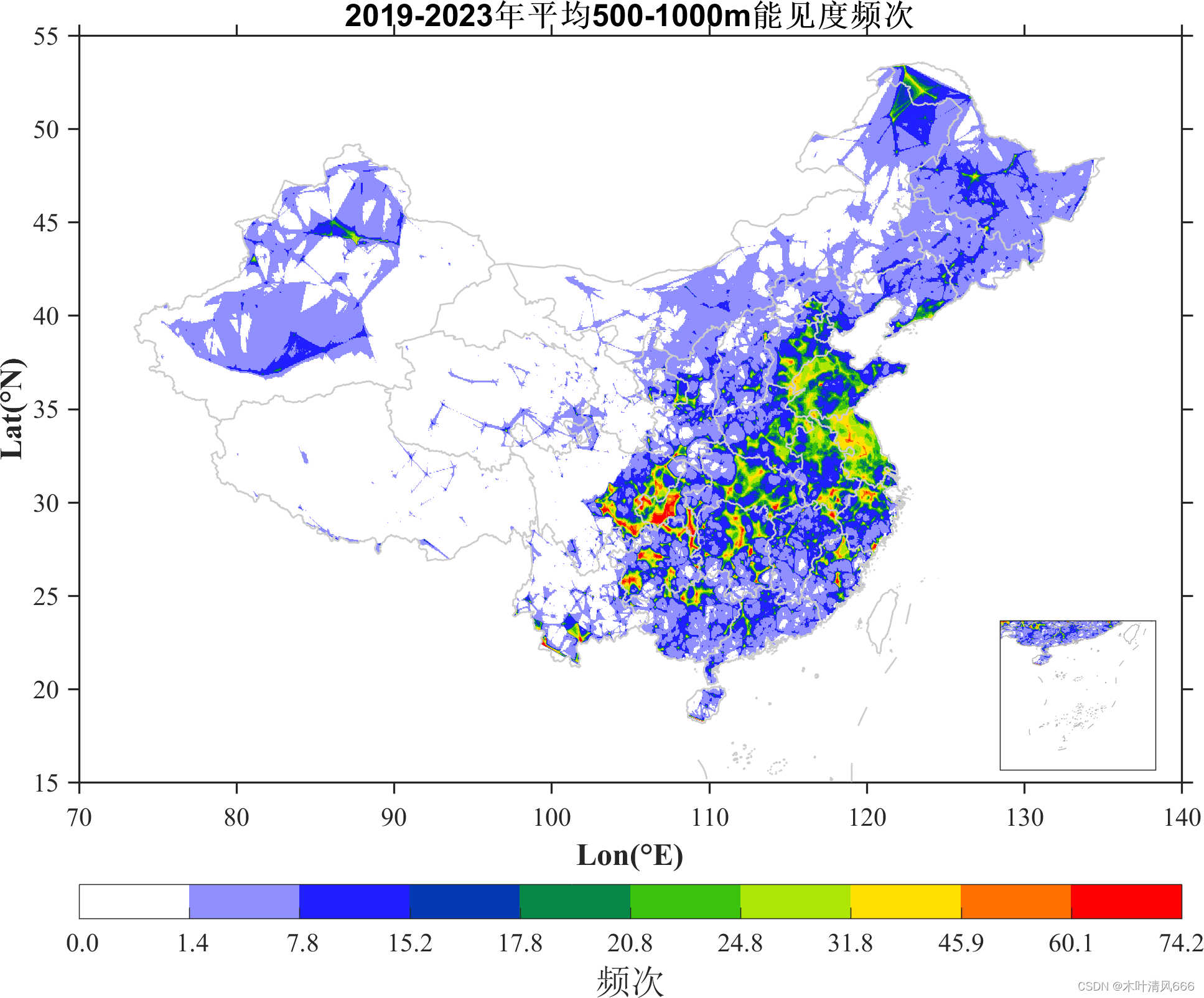
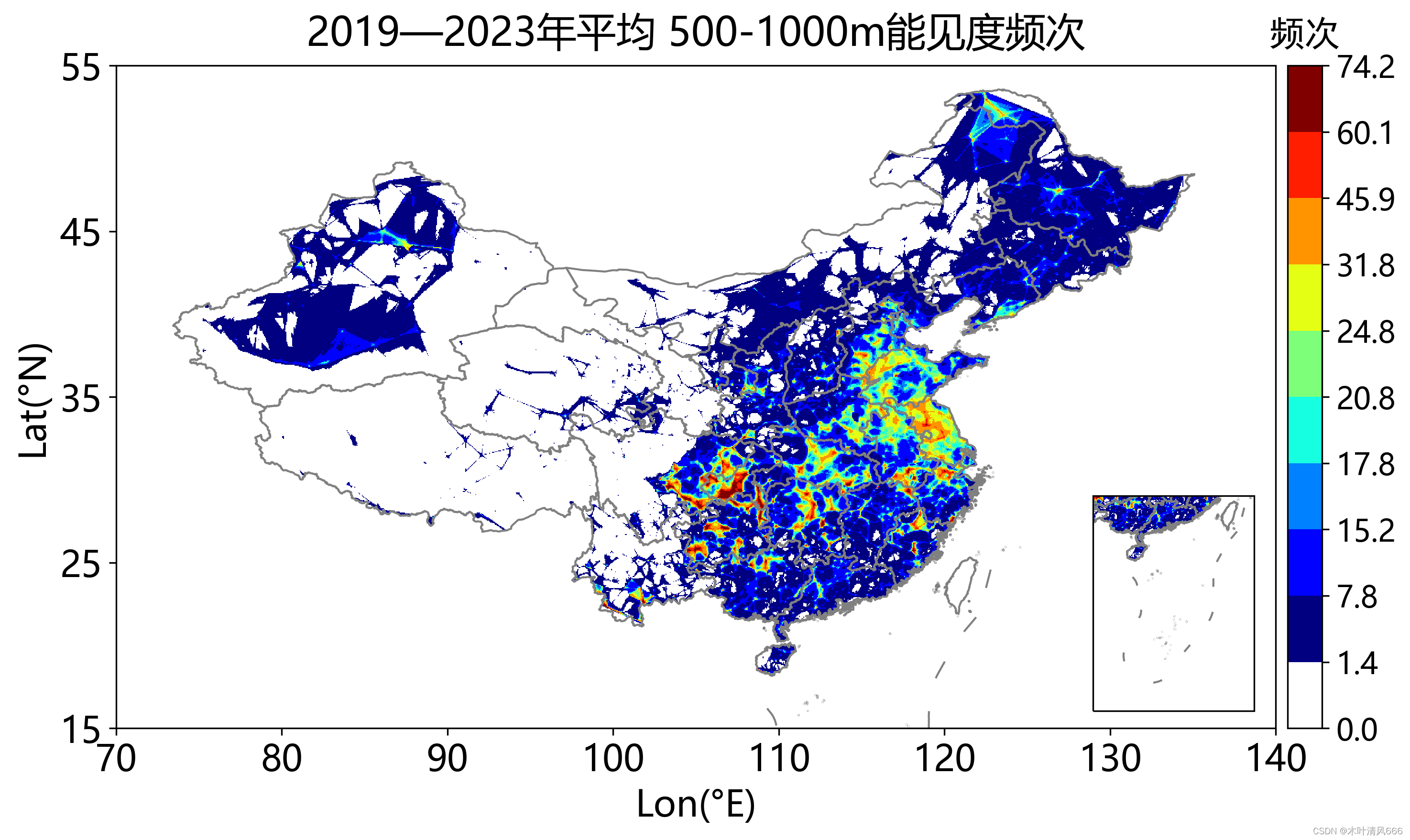
    set(gca,'fontsize',siz-15,'fontname','Times New Roman',...
        'tickdir','out','ticklength',[0.01,0.05],'linewidth',1.2);
    xlabel('Lon(\circE)', 'fontsize',siz-12,'fontweight','bold')
    ylabel('Lat(\circN)', 'fontsize',siz-12,'fontweight','bold')
    title(['\fontname{Aril}2019-2023年平均',num2str(sl(i)),'-',num2str(el(i)),'m能见度频次'],'fontsize',siz-12,'fontweight','bold');
    % 小地图
    ax2=axes('position', [0.81 0.21 0.12 0.12]);
    mypcolor(X,Y,data_map);shading interp
    caxis([CC1 CC2]);
    colormap(map_)
    box on;hold on
    plot([China1(:).X],[China1(:).Y],'color',[0.7 0.7 0.7],'linewidth',0.5); hold on
    plot([China2(:).X],[China2(:).Y],'color',[0.7 0.7 0.7],'linewidth',0.5); hold on
    axis([104.5, 124, 0, 26]);
    set(gca,'xtick','','ytick','','layer','top');
    
    save_name=['../map/matlab_map/',num2str(sl(i)),'-',num2str(el(i)),'.png'];
    export_fig(save_name,'-r200');
    clf
end
close all
  • 结果
    在这里插入图片描述

2、Python代码及结果

  • 代码
import os
import numpy as np
import matplotlib.pyplot as plt
import matplotlib.colors as mcolors
import matplotlib as mpl

import cartopy.crs as ccrs
import cartopy.io.shapereader as shpreader
from mpl_toolkits.axes_grid1.inset_locator import inset_axes
from matplotlib.colors import LinearSegmentedColormap

import regionmask
import geopandas as gpd
import warnings

warnings.filterwarnings("ignore")
import matplotlib.ticker as ticker


def map_frequency(condition = [0, 50], season = None):
    # the mask of Chinese Region: 中国区域的mask
    file = './china2.shp'
    countries = gpd.read_file(file)
    deg = 0.05
    lat = np.arange(15, 55 + deg, deg)
    lon = np.arange(70, 140 + deg, deg)
    X, Y = np.meshgrid(lon, lat)
    mask = regionmask.mask_geopandas(countries, lon, lat).to_numpy()
    mask[~np.isnan(mask)] = 1

    # colormap: 将两个colormap进行拼接
    cmap_jet = plt.cm.jet
    cmap_gray = plt.cm.gray
    gray = cmap_gray(np.linspace(0, 1, 9))
    colors = np.vstack((gray[8], cmap_jet(np.linspace(0, 1, 9))))

    # load data
    if season is None:
        file = f'../data/static_result/VIS_Min-{condition[0]}to{condition[1]}_yearly.npy'
    else:
        file = f'../data/static_result/VIS_Min{condition[0]}to{condition[1]}_yearly_{season}.npy'

    factor_dict = {'spring': 92, 'summer': 92, 'autumn': 91, 'winter': 90}
    factor = factor_dict.get(season, 365)
    data = np.load(file, allow_pickle=True)

    # plot map: 画地图
    plt.rcParams['font.family'] = ['Microsoft YaHei']
    extents = [70, 140, 15, 55]
    crs = ccrs.PlateCarree()
    fig = plt.figure(figsize=(12, 6))
    ax = fig.add_subplot(111, projection=crs)
    ax.set_extent(extents, crs)

    prov_reader = shpreader.Reader(r'.\bou2_4p.shp')
    nineline_reader = shpreader.Reader(r'.\九段线.shp')

    ax.add_geometries(prov_reader.geometries(), crs, edgecolor='gray', facecolor='none', lw=1)
    ax.add_geometries(nineline_reader.geometries(), crs, edgecolor='gray', facecolor='none', lw=1)

    ax.set_xticks(np.arange(extents[0], extents[1] + 5, 10))
    ax.set_yticks(np.arange(extents[2], extents[3] + 5, 10))
    plt.tick_params(axis='both', which='major', labelsize=18)

    # 数据分布差异较大,使用分位数对数据进行映射
    data = data * mask
    Low_VIS = data.copy()
    datax = data[~np.isnan(data)]
    level = np.unique((np.percentile(datax, np.array([0, 50, 80] + list(range(90, 99, 2)) + [99.9]))))
    if len(level) >=2:
        x_ = np.linspace(level[-2], level[-1], 4)
    else:
        x_ = np.linspace(0, 1, 4)
    level = np.unique(np.concatenate((level[:-2],x_)))
    xx1 = level[:-1]
    xx2 = level[1:]
    CC1 = 0
    CC2 = len(xx1)

    for jj in range(CC2):
        data[np.where((Low_VIS >= xx1[jj]) & (Low_VIS < xx2[jj]))] = jj + 0.5
	
	# 叠加数据层
    norm = mcolors.Normalize(vmin=0, vmax=len(level) - 1)
    cmaps = LinearSegmentedColormap.from_list('Combined', colors, N=len(level) - 1)
    map = ax.pcolormesh(X, Y, data * mask, cmap=cmaps, vmin=CC1, vmax=CC2)

    title_dict = {'spring': '春季', 'summer': '夏季', 'autumn': '秋季', 'winter': '冬季'}
    title_str = title_dict.get(season, '')
    plt.title('2019—2023年{}平均 {}-{}m能见度频次'.format(title_str, condition[0], condition[1]), fontsize=20, pad=10)
    plt.xlabel('Lon(°E)', fontsize=18)
    plt.ylabel('Lat(°N)', fontsize=18)

    # 调整colorbar与图像等高
    cb_ax = inset_axes(ax, width="3%", height="100%", loc='lower left', bbox_to_anchor=(1.01, 0., 1, 1),bbox_transform=ax.transAxes, borderpad=0)
    cbar = plt.colorbar(mpl.cm.ScalarMappable(norm=norm, cmap=cmaps), cax=cb_ax, ax=map)
    cbar.ax.set_title('频次', size=18, fontname='SimHei', pad=10)
    cbar.ax.tick_params(labelsize=15)
    tick_locs = list(range(len(level)))
    tick_labels = np.unique(np.round(level,1)).astype(str)
    cbar.locator = ticker.FixedLocator(tick_locs)
    cbar.formatter = ticker.FixedFormatter(tick_labels)
    cbar.update_ticks()
	
	# 南海小地图
    ax2 = fig.add_axes([0.74, 0.13, 0.1, 0.25], projection=crs)
    ax2.set_extent([104.5, 124, 0, 26], crs=ccrs.PlateCarree())
    ax2.add_geometries(prov_reader.geometries(), crs, edgecolor='gray', facecolor='none', lw=1)
    ax2.add_geometries(nineline_reader.geometries(), crs, edgecolor='gray', facecolor='none', lw=1)
    ax2.pcolormesh(X, Y, data * mask, cmap=cmaps, vmin=CC1, vmax=CC2)

    prov_reader.close()
    nineline_reader.close()

    save_path = '../map/interp_map'
    if not os.path.exists(save_path):
        os.makedirs(save_path)

    if season is None:
        save_name = f'{condition[0]}-{condition[1]}.png'
    else:
        save_name = f'{condition[0]}-{condition[1]}-{season}.png'
    save_file = os.path.join(save_path, save_name)

    plt.savefig(save_file, bbox_inches='tight', dpi=300)


if __name__ == '__main__':
    conditions = [[0, 50], [50, 100], [100, 200], [200, 500], [500, 1000], [0, 200]]
    for condition in conditions:
        # 年平均频次
        map_frequency(condition)
        # 分季节频次
        for season in ['spring', 'summer', 'autumn', 'winter']:
            map_frequency(condition, season)
  • 结果
    在这里插入图片描述
  • 3
    点赞
  • 1
    收藏
    觉得还不错? 一键收藏
  • 0
    评论
要使用Matlab读取洋流数据并实现可视化,可以按照以下步骤进行操作: 1. 准备洋流数据集:获取包含洋流数据的文件(例如.nc、.csv等格式),确保数据集包含所需的经纬度和洋流速度等信息。 2. 导入数据集:在Matlab中使用相关函数(如ncread函数)导入洋流数据集。根据数据集格式和结构,设置相应的导入参数,包括数据文件路径、变量名等。 3. 数据预处理:根据需要进行数据预处理,如数据插值、平滑处理等。这可以通过Matlab的矩阵操作函数和插值函数来完成。例如,可以使用griddata函数对不规则网格进行插值,以获得均匀的经纬度网格。 4. 创建可视化图表:根据所需的可视化方式,选择合适的图表类型,并用导入的洋流数据进行绘制。Matlab中有多种图表绘制函数,如pcolor、contourf、quiver等。可以根据实际需要选择合适的函数来实现可视化。 5. 设置图表属性:对生成的图表进行属性设置,如标题、标签、颜色映射、轴范围等。这可以通过Matlab的属性设置函数来完成,如title、xlabel、colormap等。 6. 显示图表:使用Matlab的绘图函数显示生成的图表。根据需要,可以在同一图表中同时显示多个洋流数据集,或者使用动态图表来展示洋流变化。这可以通过Matlab的subplot函数和动画相关函数来实现。 7. 导出图表(可选):如果需要将生成的图表保存为图像文件,可以使用Matlab的导出函数,如saveas、print等。 通过以上步骤,可以利用Matlab读取洋流数据并实现可视化。根据具体的数据集和需求,可以调整和扩展上述步骤。

“相关推荐”对你有帮助么?

  • 非常没帮助
  • 没帮助
  • 一般
  • 有帮助
  • 非常有帮助
提交
评论
添加红包

请填写红包祝福语或标题

红包个数最小为10个

红包金额最低5元

当前余额3.43前往充值 >
需支付:10.00
成就一亿技术人!
领取后你会自动成为博主和红包主的粉丝 规则
hope_wisdom
发出的红包
实付
使用余额支付
点击重新获取
扫码支付
钱包余额 0

抵扣说明:

1.余额是钱包充值的虚拟货币,按照1:1的比例进行支付金额的抵扣。
2.余额无法直接购买下载,可以购买VIP、付费专栏及课程。

余额充值