


[AI医学比赛] 百度STAGE比赛 EDA 探索性数据分析
STAGE挑战赛是由华南理工大学医疗大数据与医学智能实验室联合中山大学中山眼科中心在MICCAI 2023上举办的国际眼科赛事。
1. Intro 临床意义
本次挑战赛是使用以黄斑中央凹为中心的光学相干断层扫描(Optical Coherence Tomography, OCT)图像来预测视野(Visual Field,VF)测试的结果。本次挑战赛聚焦在如何使用客观和易于获取的结构OCT图像来预测功能性VF信息。围绕这一研究,提出了三个VF信息预测任务:
- 平均偏差(Mean Deviation,MD)值预测;
- 灵敏度图预测;
- 模式偏差概率图预测。
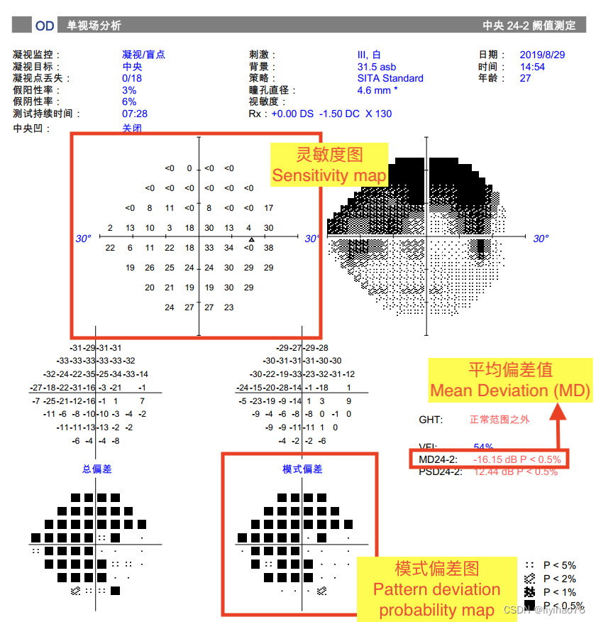
任务一:平均偏差值预测
本任务是根据黄斑OCT图像和青光眼分期信息预测24-2模式的视野报告中的平均偏差(Mean Deviation, MD)值,它反映了青光眼患者因神经节细胞死亡导致的平均视力下降,正常人的MD值在0dB左右(越小越差)。 由于眼底结构和视觉功能之间的映射关系尚不明确,这项任务仍然具有挑战性,本次任务中提供了青光眼分期信息作辅助。
任务二:灵敏度图预测
本任务的目的是使用黄斑OCT图像和青光眼分级信息来预测视野报告中的灵敏度图。灵敏度图也称为阈值图,是在视野测试中获得的原始数据,即在每个测试点可观察到的光敏度。自动视野分析仪采用阈值游标强度以dB表示光敏度,其中0dB为最强光敏度(优),100 dB为最弱光敏度(差)。24-2视野测试共有52个测试点,灵敏度图中的每个点都有对应的光敏度值,该光敏度值代表该测试点所能响应的最弱光敏度。
任务三:模式偏差概率图预测
本任务的目的是使用黄斑OCT图像和青光眼分级信息来预测视野报告中的模式偏差概率图。在视野报告中,模式偏差概率图反映了整体敏感度降低中剔除广义敏感度降低后剩余局部敏感度降低的统计显著性。即患者在某一区域出现视野缺损的概率 在去除诸如前节(如白内障、小瞳孔)等干扰因素后,可以突出有意义的局部视力缺陷。24-2模式视野测试共有52个测试点,每个测试点在模式偏差概率图中属于五类视觉损失中的一种。这5类分别为视野正常(最优)、视野正常概率小于5%、视野正常概率小于2%、视野正常概率小于1%、视野正常概率小于0.5%(最差)。其中,视野正常的概率小于0.5%是视野丧失最严重的情况。
在真值文件中,模式偏差概率类别包括以下5类:视野正常(标签为0)、视野正常概率小于5%(标签为1)、视野正常概率小于2%(标签为2)、视野正常概率小于1%(标签为3)、视野正常概率小于0.5%(标签为4)。
2. Exploratory Data Analysis
import os
import pandas as pd
import imagesize
import matplotlib.pyplot as plt
import plotly.express as px
import seaborn as sns

import plotly.offline as pyo
# Set notebook mode to work in offline
pyo.init_notebook_mode()
root ='/home/liyihao/ClusterGPU/yihao/2023/baidu/STAGE_training/STAGE_training'
filelists =  [item for item in os.listdir(os.path.join(root,'training_images')) if '.DS_Store' not in item]
filelists.sort()
OCT数据
检查size
for patient in filelists:
    patient_path = os.path.join(root,'training_images',patient)
    slices_list = [item for item in os.listdir(patient_path) if '.DS_Store' not in item]
    print('checking...',patient)
    if len(slices_list) != 256:
        print('slices diff:',patient)
        print('slices = ',len(slices_list))
    for i in slices_list:
        w,h = imagesize.get(os.path.join(patient_path, i))
        if w != 512 or h != 992:
            print('size diff:',patient)
所有病人的OCT的大小均为512x992x256,256为切片个数。
病人信息
data_info = pd.read_excel(os.path.join(root,'data_info_training.xlsx'))
stage_to_class = { 'normal' : 0,
                  'early' : 1,
                  'intermediate' : 2,
                  'advanced' : 3}
data_info['Glaucoma_class'] = data_info['Glaucoma_stage'].map(stage_to_class)
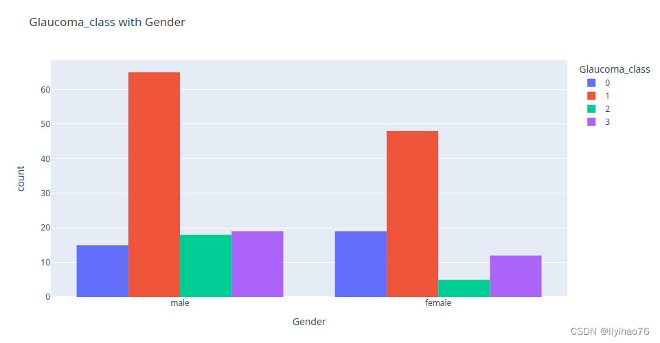
病人信息储存在’data_info_training.xlsx’文件中。在201个数据中:
- male 117, female 84
- OD 113, OS 88
- Glaucoma_stage 情况
| Glaucoma_stage | normal | early | intermediate | advanced |
|---|---|---|---|---|
| Patinets | 34 | 113 | 23 | 31 |
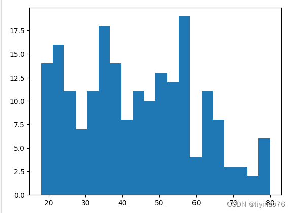
- 年龄分布
最小 18 最大 80
data_info['Age'].hist(bins=20,grid=False)
- Glaucoma_class with Gender
fig = px.histogram(data_info,
                   x="Gender",
                   color="Glaucoma_class",
                   barmode='group',
                   title='Glaucoma_class with Gender')
display(fig.show())
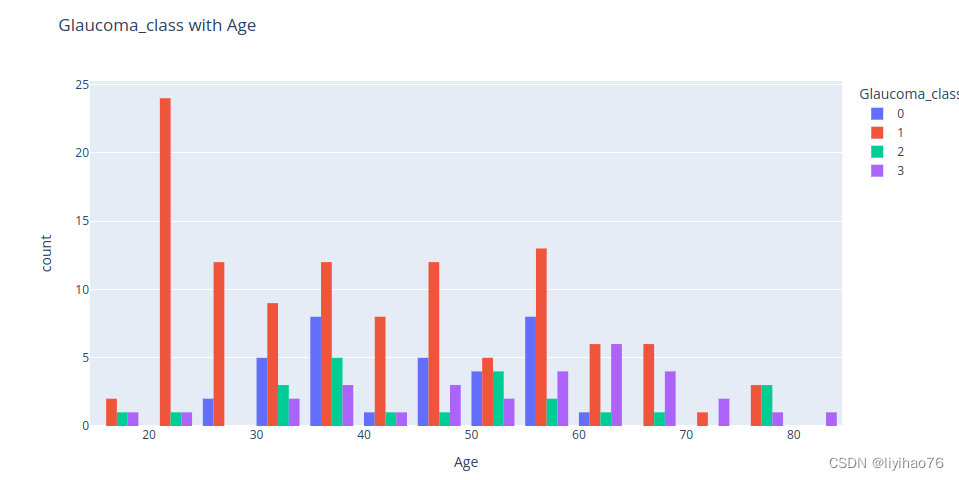
- Glaucoma_class with Age
fig = px.histogram(data_info,
                   x="Age",
                   color="Glaucoma_class",
                   barmode='group',
                   title='Glaucoma_class with Age')
display(fig.show())
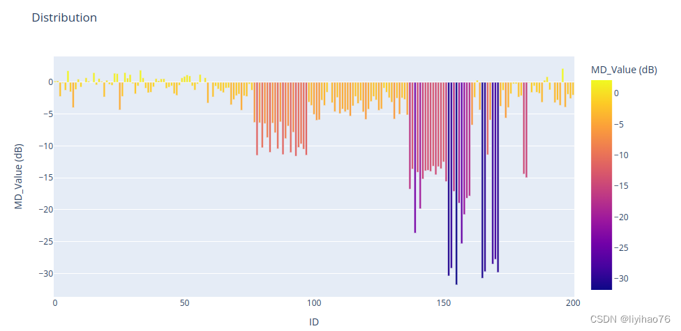
task1_GT_training.xlsx
task1_gt = pd.read_excel(os.path.join(root,'training_GT','task1_GT_training.xlsx'))
- MD_Value (dB) 分布
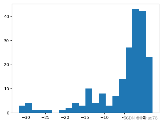
fig = px.bar(task1_gt, x='ID', y='MD_Value (dB)', color='MD_Value (dB)',title='Distribution')
fig.update_traces(textfont_size=12, textangle=0, textposition="outside", cliponaxis=False)
fig.show()
- Glaucoma_class with MD_Value (dB)
id_list = data_info['ID'].tolist()
gt1_list = []

df_gt = task1_gt
for i in range(len(id_list)):
    patient =  id_list[i]
    gt = df_gt.loc[df_gt['ID']==patient,'MD_Value (dB)'].iat[0]
    gt1_list.append(gt)
data_info['MD_Value (dB)'] = gt1_list

fig = px.histogram(data_info,
                   x="MD_Value (dB)",
                   color="Glaucoma_class",
                   barmode='group',
                   title='Glaucoma_class with MD_Value (dB)')
display(fig.show())
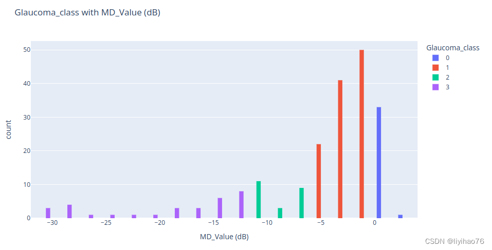
Glaucoma_class 与MD_Value (dB)有很强的联系,需要将这个信息加入模型中
task2_GT_training.xlsx & task3_GT_training.xlsx
task2_gt = pd.read_excel(os.path.join(root,'training_GT','task2_GT_training.xlsx'))
task3_gt = pd.read_excel(os.path.join(root,'training_GT','task3_GT_training.xlsx'))
patient = 100
gt2_list = task2_gt.loc[patient,'point1':'point52'].tolist()
gt3_list = task3_gt.loc[patient,'point1':'point52'].tolist()
data = pd.DataFrame({'gt2':gt2_list,'gt3':gt3_list})
corr  = data['gt2'].corr(data['gt3'])
fig = px.histogram(data,
                   x="gt2",
                   color="gt3",
                   barmode='group',
                   title='patient ' + str(patient) + ', gt3 vs gt2, corr ='+ str(corr))
display(fig.show())
看几个例子
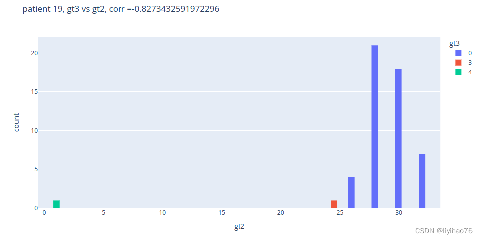
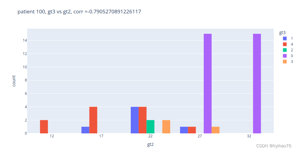
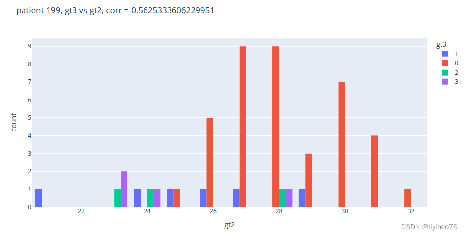
任务二和任务三之间没有明显关系


 被折叠的 条评论
为什么被折叠?
被折叠的 条评论
为什么被折叠?
 到【灌水乐园】发言


