


在这里我将介绍如下几种基本的也是在编程中最常见的几种控件:
文本类型控件:TextView(负责展示文本,非编辑) ,EditText(可编辑文本)
按钮类控件:Button 按钮 ,ImageButton 图片按钮 ,RadioButton与RadioGroup 单选按钮 ,CheckBox 复选按钮
图片控件:ImageView 负责显示图片
进度条控件 :ProgressBar 进度条
一,文本类控件
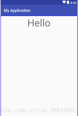
1.TextView
TextView是android控件中的最基本的控件,用于展示文字,它是不可编辑的,只能通过初始化或者在代码中修改。
<TextView
        android:layout_width="wrap_content"//用于编辑文本框的长度
        android:layout_height="wrap_content"//用于编辑文本框的高度 />
wrap_content:自动适配宽度(高)
match_parent:满屏宽度(高)
android:id = "@+id/xxx" @+id/xxx表示新增控件命名为xxxandroid:text="@string/hello_world" //两种方式,直接具体文本或者引用values下面的string.xml里面的元素//字体大小
android:textSize="24sp" //以sp为单位
//字体颜色
android:textColor="#0000FF" //RGB颜色
//字体格式
android:textStyle="normal" //normal,bold,italic分别为正常,加粗以及斜体,默认为normal
//文本显示位置
android:gravity="center" //来指定文字的对齐方式,可选值有 top、bottom、left、right、center 等
//是否只在一行内显示全部内容
android:singleLine="true" //true或者false,默认为falseTextView的显示效果
2.EditText
EditText是可以与用户进行交互的,用法也与TextView相类似。
EditText的几种基本属性:
<EditText
android:layout_width="match_parent"//宽度
android:layout_height="wrap_content"//长度
android:id="@+id/xxx"//控件id
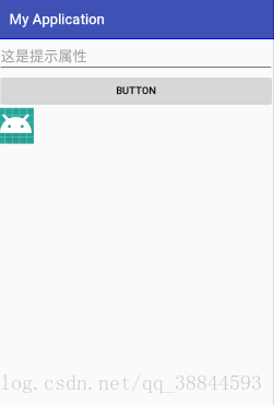
android:hint="这是提示属性"//提示文本内容
android:textSize="20sp"//字体的大小
android:textColor="@color/colorPrimary"//字体的颜色
android:maxLines="2"//设置最大限度的行数
/>其实EditText与TextView这两个其实很相似,一个可以编辑,一个不可以编辑。Android的一些控件其实用法很相似,只要先设置控件的长度与高度,再加上一个特有的id,然后再加上一些自有的属性就可以使用了。
二,按钮类控件
1.Button
button是程序用于与用户交互的一个重要的控件,用户可以通过单击 Button 来触发一系列事件,然后为 Button 注册监听器,来实现 Button 的监听事件。
<Button
        android:layout_width="match_parent"
        android:layout_height="wrap_content"
        android:id="@+id/btn1"
        android:text="BUTTON"/>
Button其实与上面介绍的控件其实都差不多,不过它可以被用户所点击,所以我们经常在Button控件上添加监听事件来完成用户所要指定的操作,这一点是非常重要的。
public class MainActivity extends Activity {
    private EditText edittext;
    private Button button;
    @Override
    protected void onCreate(Bundle savedInstanceState) {
        super.onCreate(savedInstanceState);
        setContentView(R.layout.activity_main);
        edittext=(EditText) findViewById(R.id.edit_text);
        button = (Button) findViewById(R.id.button);
        //为button按钮注册监听器,并通过匿名内部类实现
        button.setOnClickListener(new OnClickListener() {
            @Override
            public void onClick(View v) {
            //点击Button会改变edittext的文字为"点击了Button"
            edittext.setText("点击了Button");
            }
        });
    }
}
2.按钮类控件ImageButton
ImageButton和Button类似,是一个按钮,ImageButton可以实现我们任何想要的图片按钮的效果,比如我们租一个下载的按钮等等。它要比button实现的要好看,并且体验要好很多, 不过它是以图片作为背景,没有文字。利用属性android:src=”图片位置”来设置图片背景。
<ImageButton
    android:layout_width="50dp"
    android:layout_height="50dp"
    android:src="@mipmap/ic_launcher"//设置图片背景来源
    />
关于ImageButton它特有的属性,它可以设置图片的参数,它可以通过android:scaleType来设置
android:scaleType=”center” 在视图中心显示图片,并且不缩放图片
android:scaleType=”centercrop” 按比例缩放图片,使得图片长 (宽)的大于等于视图的相应维度
android:scaleType=”centerinside” 按比例缩放图片,使得图片长 (宽)的小于等于视图的相应维度
android:scaleType=”fitcenter” 按比例缩放图片到视图的最小边,居中显示
android:scaleType=”fitend” 按比例缩放图片到视图的最小边,显示在视图的下部分位置
android:scaleType=”fitstart” 把图片按比例扩大/缩小到视图的最小边,显示在视图的上部分位置
android:scaleType=”matrix” 用矩阵来绘制
我们可以将任何图片设置成按钮
3.RadioButton与RadioGroup
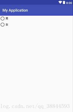
它们两个需要的是两个相互配合使用,RadioButton是单选按钮,而RadioGroup为我们提供了RadioButton单选按钮的容器。
 <RadioGroup
        android:layout_width="wrap_content"
        android:layout_height="wrap_content">
        <RadioButton
            android:layout_width="wrap_content"
            android:layout_height="wrap_content"
            android:text="男"/>
        <RadioButton
            android:layout_width="wrap_content"
            android:layout_height="wrap_content"
            android:text="女"/>
    </RadioGroup>
用RadioGroup将RadioButton包裹起来就可实现单选效果。
4.CheckBox 复选按钮
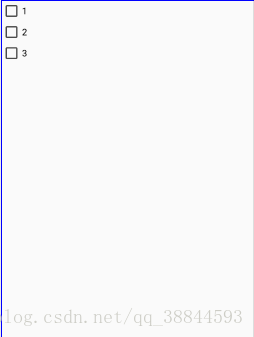
CheckBox是一个可用与多选的复选按钮
  <CheckBox
      android:layout_width="wrap_content"
      android:layout_height="wrap_content"
      android:text="1"/>
    <CheckBox
        android:layout_width="wrap_content"
        android:layout_height="wrap_content"
        android:text="2"/>
    <CheckBox
        android:layout_width="wrap_content"
        android:layout_height="wrap_content"
        android:text="3"/>
其在程序中
三,图片控件
ImageView
ImageView在界面用于显示图片
<ImageView
      android:layout_width="100dp"
      android:layout_height="100dp"
      android:src="@mipmap/tongxun"/>
其用法与ImageButton的用法相类似,可以参照它使用此控件
四,进度条控件
ProgressBar 进度条
ProgressBar 用于在界面上显示一个进度条,表示我们的程序正在加载一些数据,运行程序,会看到屏幕中有一个圆形进度条正在旋转。
 <ProgressBar
     android:layout_width="match_parent"
     android:layout_height="wrap_content"
     //默认是圆形进度条,可以知道样式设置为水平进度条
     style="?android:attr/progressBarStyleHorizontal"
     //设置进度条的最大值
     android:max="100"/>
进度条的显示
以上就是我所介绍的各种基本控件,当然了Android中的控件可不包括这几种,其他的我就不一一介绍了,毕竟能力有限吧。


 2981
2981


 被折叠的 条评论
为什么被折叠?
被折叠的 条评论
为什么被折叠?
 到【灌水乐园】发言


