一、Android View体系下的 线性布局、相对布局、约束布局
1. LinearLayout线性布局的使用(垂直、水平方向)
使用线性布局中,我们还是使用到了两个滑动控件,分别是水平滑动HorizontalScrollView和垂直滑动控件ScrollView,滑动控件只能包涵一个子控件。我们先看看运行效果:
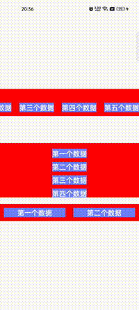
以上是运行效果图,接下来,我们看看布局源代码。
| <?xml version="1.0" encoding="utf-8"?><!--先垂直排列-->
<LinearLayout xmlns:android="http://schemas.android.com/apk/res/android"
android:layout_width="match_parent"
android:layout_height="match_parent"
android:gravity="center"
android:orientation="vertical">
<!-- 第一行数据表示水平排列数据 ,可以滑动-->
<HorizontalScrollView
android:layout_width="match_parent"
android:layout_height="wrap_content"
android:background="@color/red">
<LinearLayout
android:layout_width="wrap_content"
android:layout_height="50dp"
android:layout_margin="10dp"
android:layout_marginTop="10dp"
android:gravity="center|bottom"
android:orientation="horizontal">
<!-- 可以设置多个对其方式 ,使用 | 分割-->
<!-- android:gravity="center|bottom"-->
<TextView
android:layout_width="wrap_content"
android:layout_height="wrap_content"
android:layout_marginStart="10dp"
android:layout_marginEnd="10dp"
android:background="@color/blue"
android:text="第一个数据"
android:textColor="@color/white"
android:textSize="18sp"
android:textStyle="bold" />
<TextView
android:layout_width="wrap_content"
android:layout_height="wrap_content"
android:layout_marginStart="10dp"
android:layout_marginEnd="10dp"
android:background="@color/blue"
android:text="第二个数据"
android:textColor="@color/white"
android:textSize="18sp"
android:textStyle="bold" />
<TextView
android:layout_width="wrap_content"
android:layout_height="wrap_content"
android:layout_marginStart="10dp"
android:layout_marginEnd="10dp"
android:background="@color/blue"
android:text="第三个数据"
android:textColor="@color/white"
android:textSize="18sp"
android:textStyle="bold" />
<TextView
android:layout_width="wrap_content"
android:layout_height="wrap_content"
android:layout_marginStart="10dp"
android:layout_marginEnd="10dp"
android:background="@color/blue"
android:text="第四个数据"
android:textColor="@color/white"
android:textSize="18sp"
android:textStyle="bold" />
<TextView
android:layout_width="wrap_content"
android:layout_height="wrap_content"
android:layout_marginStart="10dp"
android:layout_marginEnd="10dp"
android:background="@color/blue"
android:text="第五个数据"
android:textColor="@color/white"
android:textSize="18sp"
android:textStyle="bold" />
</LinearLayout>
</HorizontalScrollView>
<!-- 第二行垂直排列,可以滑动-->
<ScrollView
android:layout_width="match_parent"
android:layout_height="140dp"
android:layout_marginTop="70dp"
android:background="@color/red">
<LinearLayout
android:layout_width="wrap_content"
android:layout_height="wrap_content"
android:layout_gravity="center"
android:layout_marginTop="30dp"
android:orientation="vertical">
<TextView
android:layout_width="wrap_content"
android:layout_height="wrap_content"
android:background="@color/blue"
android:text="第一个数据"
android:textColor="@color/white"
android:textSize="18sp"
android:textStyle="bold" />
<TextView
android:layout_width="wrap_content"
android:layout_height="wrap_content"
android:layout_marginTop="10dp"
android:background="@color/blue"
android:text="第二个数据"
android:textColor="@color/white"
android:textSize="18sp"
android:textStyle="bold" />
<TextView
android:layout_width="wrap_content"
android:layout_height="wrap_content"
android:layout_marginTop="10dp"
android:background="@color/blue"
android:text="第三个数据"
android:textColor="@color/white"
android:textSize="18sp"
android:textStyle="bold" />
<TextView
android:layout_width="wrap_content"
android:layout_height="wrap_content"
android:layout_marginTop="10dp"
android:background="@color/blue"
android:text="第四个数据"
android:textColor="@color/white"
android:textSize="18sp"
android:textStyle="bold" />
<TextView
android:layout_width="wrap_content"
android:layout_height="wrap_content"
android:layout_marginTop="10dp"
android:background="@color/blue"
android:text="第五个数据"
android:textColor="@color/white"
android:textSize="18sp"
android:textStyle="bold" />
</LinearLayout>
</ScrollView>
<!-- 权重占比例-->
<LinearLayout
android:layout_width="match_parent"
android:layout_height="wrap_content"
android:layout_marginTop="17dp"
android:background="@color/red"
android:gravity="center"
android:paddingTop="10dp"
android:paddingBottom="10dp">
<!-- 表示权重占比-->
<!-- android:layout_weight="1"-->
<TextView
android:layout_width="wrap_content"
android:layout_height="wrap_content"
android:layout_marginStart="10dp"
android:layout_marginEnd="10dp"
android:layout_weight="1"
android:background="@color/blue"
android:gravity="center"
android:text="第一个数据"
android:textColor="@color/white"
android:textSize="18sp"
android:textStyle="bold" />
<TextView
android:layout_width="wrap_content"
android:layout_height="wrap_content"
android:layout_marginStart="10dp"
android:layout_marginEnd="10dp"
android:layout_weight="1"
android:background="@color/blue"
android:gravity="center"
android:text="第二个数据"
android:textColor="@color/white"
android:textSize="18sp"
android:textStyle="bold" />
</LinearLayout>
</LinearLayout> |
android:orientation="vertical",表示垂直排列,android:orientation="horizontal"表示水平排列。
我们看看层级
布以前我们学的(除了RadioGroup是容器(布局)控件)都是不可以有子控件;今天我们讲的线性布局、相对布局或者约束布局,都是可以添加子控件(所有直接或间接继承于View的控件)。容器都是直接或间接继承于ViewGroup,而我们的非容器控件都是直接或者间接继承View。无论是容器控件或者非容器控件,都是继承View而来。
2. RelativeLayout 相对布局。
我们先看看布局效果。
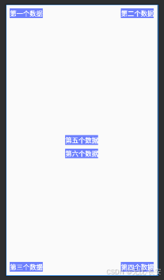
我们看看布局源代码,关键部分有注解:
| <?xml version="1.0" encoding="utf-8"?>
<RelativeLayout xmlns:android="http://schemas.android.com/apk/res/android"
android:layout_width="match_parent"
android:layout_height="match_parent">
<!-- 控件不做位置布局,默认就是左上角位置,
而且,后面放的控件会覆盖前面的控件-->
<!-- android:layout_alignParentStart="true" 左上角-->
<TextView
android:layout_width="wrap_content"
android:layout_height="wrap_content"
android:layout_alignParentStart="true"
android:layout_marginStart="10dp"
android:layout_marginTop="10dp"
android:background="@color/blue"
android:gravity="center"
android:text="第一个数据"
android:textColor="@color/white"
android:textSize="18sp"
android:textStyle="bold" />
<!-- android:layout_alignParentEnd="true" 右上角-->
<TextView
android:layout_width="wrap_content"
android:layout_height="wrap_content"
android:layout_alignParentEnd="true"
android:layout_marginTop="10dp"
android:layout_marginEnd="10dp"
android:background="@color/blue"
android:gravity="center"
android:text="第二个数据"
android:textColor="@color/white"
android:textSize="18sp"
android:textStyle="bold" />
<!-- android:layout_alignParentStart="true"
android:layout_alignParentBottom="true" 左下角-->
<TextView
android:layout_width="wrap_content"
android:layout_height="wrap_content"
android:layout_alignParentStart="true"
android:layout_alignParentBottom="true"
android:layout_marginStart="10dp"
android:layout_marginBottom="10dp"
android:background="@color/blue"
android:gravity="center"
android:text="第三个数据"
android:textColor="@color/white"
android:textSize="18sp"
android:textStyle="bold" />
<!-- android:layout_alignParentEnd="true"
android:layout_alignParentBottom="true" 右下角-->
<TextView
android:layout_width="wrap_content"
android:layout_height="wrap_content"
android:layout_alignParentEnd="true"
android:layout_alignParentBottom="true"
android:layout_marginEnd="10dp"
android:layout_marginBottom="10dp"
android:background="@color/blue"
android:gravity="center"
android:text="第四个数据"
android:textColor="@color/white"
android:textSize="18sp"
android:textStyle="bold" />
<!-- 居中-->
<!-- 水平居中 android:layout_centerHorizontal="true"-->
<!-- 垂直居中 android:layout_centerVertical="true"-->
<!-- 以上两个参数再配和{
android:layout_alignParent[Start,Top,End,Bottom,],四个参数,就做各边居中效果
我这里就不做展示了,留给小伙伴们自己去体验吧
}-->
<TextView
android:id="@+id/tvCenter"
android:layout_width="wrap_content"
android:layout_height="wrap_content"
android:layout_centerHorizontal="true"
android:layout_centerVertical="true"
android:background="@color/blue"
android:gravity="center"
android:text="第五个数据"
android:textColor="@color/white"
android:textSize="18sp"
android:textStyle="bold" />
<!-- layout_below,表示在哪一个控件的下面,值某个id 的名字-->
<!-- layout_alignStart,表示开始的位置对齐的是哪一个控件,值某个id 的名字-->
<!-- layout_alignEnd,表示结束的位置对齐的是哪一个控件,值某个id 的名字-->
<!-- layout_alignBottom,表示底部的位置对齐的是哪一个控件,值某个id 的名字-->
<TextView
android:id="@+id/tvCenter1"
android:layout_width="wrap_content"
android:layout_height="wrap_content"
android:layout_below="@+id/tvCenter"
android:layout_alignStart="@+id/tvCenter"
android:layout_alignEnd="@+id/tvCenter"
android:layout_marginTop="10dp"
android:background="@color/blue"
android:gravity="center"
android:text="第六个数据"
android:textColor="@color/white"
android:textSize="18sp"
android:textStyle="bold" />
</RelativeLayout> |
3. ConstraintLayout,约束布局。
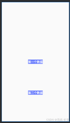
接下来我们看看布局源代码和注释。
| <?xml version="1.0" encoding="utf-8"?>
<androidx.constraintlayout.widget.ConstraintLayout xmlns:android="http://schemas.android.com/apk/res/android"
xmlns:app="http://schemas.android.com/apk/res-auto"
android:layout_width="match_parent"
android:layout_height="match_parent">
<!-- 如果不对子控件做排版布局,他会提示红色,让你去指定子控件的位置。
当然你也可以不管,直接去运行,他也会给你默认左上角布局,后面控件会覆盖前面的控件-->
<!-- layout_constraintEnd_toEndOf,表示结束的位置对齐与那个控件,
如果是某个控件,则是某个控件的id。如是父控件,则是parent即可-->
<!-- 一下参数,与上类型。
app:layout_constraintBottom_toBottomOf="parent"
app:layout_constraintStart_toStartOf="parent"
app:layout_constraintTop_toTopOf="parent"
-->
<!--
app:layout_constraintVertical_bias="0.52",表示在垂直方向上的偏向,值0-1的
app:layout_constraintHorizontal_bias="0.54",表示在水平方向上的偏向,值0-1的
-->
<TextView
android:id="@+id/tvShow1"
android:layout_width="wrap_content"
android:layout_height="wrap_content"
android:layout_weight="1"
android:background="@color/blue"
android:gravity="center"
android:text="第一个数据"
android:textColor="@color/white"
android:textSize="18sp"
android:textStyle="bold"
app:layout_constraintBottom_toBottomOf="parent"
app:layout_constraintEnd_toEndOf="parent"
app:layout_constraintHorizontal_bias="0.5"
app:layout_constraintStart_toStartOf="parent"
app:layout_constraintTop_toTopOf="parent"
app:layout_constraintVertical_bias="0.5" />
<TextView
android:id="@+id/tvShow2"
android:layout_width="wrap_content"
android:layout_height="wrap_content"
android:layout_weight="1"
android:background="@color/blue"
android:gravity="center"
android:text="第二个数据"
android:textColor="@color/white"
android:textSize="18sp"
android:textStyle="bold"
app:layout_constraintBottom_toBottomOf="parent"
app:layout_constraintEnd_toEndOf="@+id/tvShow1"
app:layout_constraintHorizontal_bias="0.5"
app:layout_constraintStart_toStartOf="@+id/tvShow1"
app:layout_constraintTop_toBottomOf="@+id/tvShow1"
app:layout_constraintVertical_bias="0.5" />
</androidx.constraintlayout.widget.ConstraintLayout> |
约束布局有一个好处,就是更改其中的一个控件位置,其他控件也会跟着变得,就不用在一个个去变更每一个子控件了。
总结:关于View下的容器(布局)还有帧布局(FrameLayout)、表格布局(TableLayout)和绝对布局(AbsoluteLayout)等,在日常开发中,我们使用上面的三种,基本可以解决99.99%的布局问题啦。感兴趣的小伙伴可以自己去网上查找资料哦。
二、Android Compose下的Column、Row、Box、AndroidView
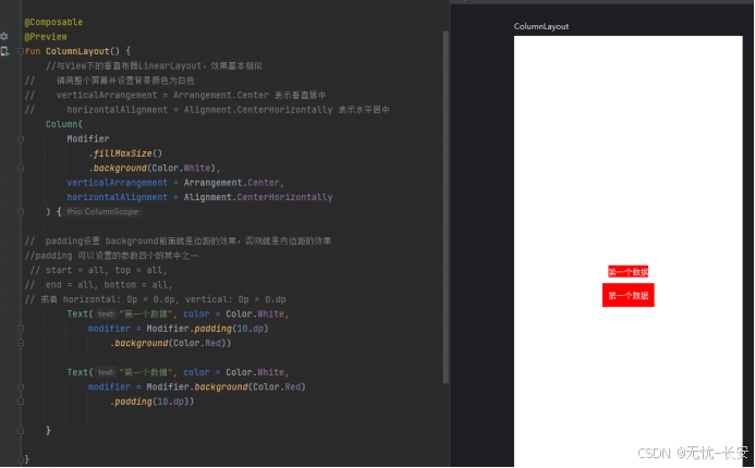
首先来看看Column布局:
再看看Row布局
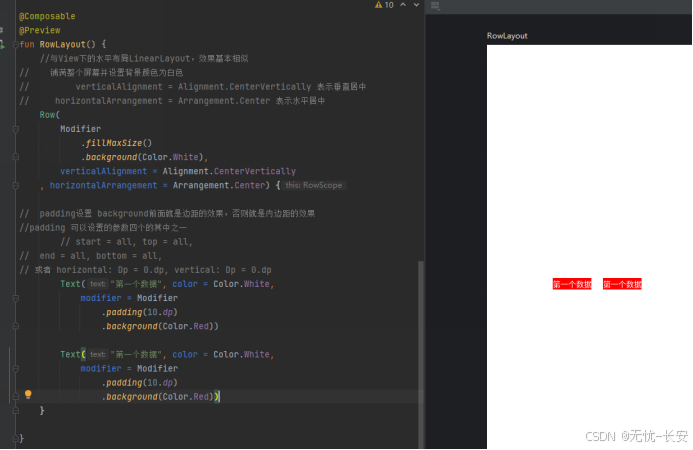
上面的和View体系下的线性布局,LinearLayout(垂直、水平方向),效果基本是一样的。
如果,数据过多需要滑动怎么办, LazyColumn、LazyRow、来做滑动,这里先不做讲解了,后续项目中,会使用到,我们在讲解。
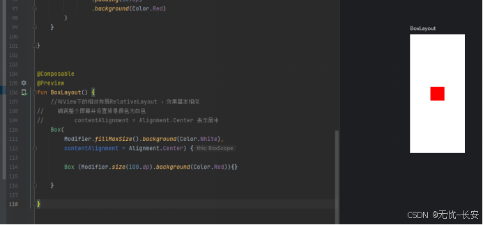
我们再看看Box下的使用:
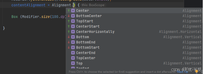
Alignment的参数,基本见名就知道是什么效果啦。
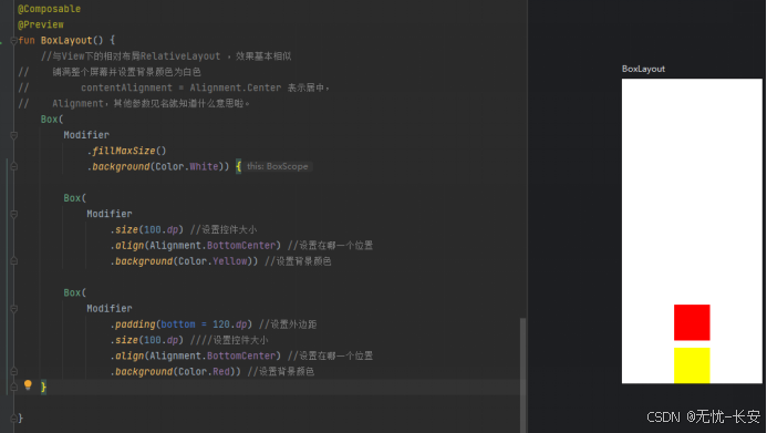
通过以上图布局,我们可以对控件的位置进行摆放,达到我们想要的效果。
我们再看看AndroidView下的使用:这个布局容器,可以让我们在compose布局下,加载Android中View体系下的所有控件
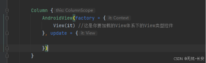
这里先简单演示一下,后续我们在做的项目中会使用View体系下的WebView,就会有到AndroidView。
三、鸿蒙开发中的布局
Column垂直平线性布局:
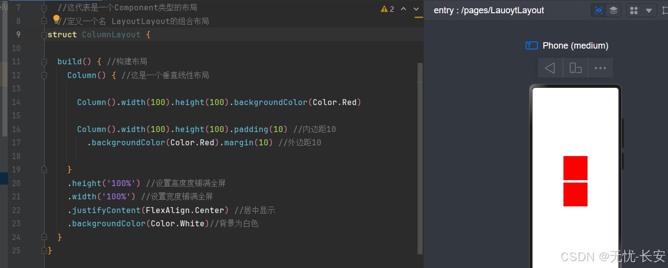
鸿蒙中垂直线性布局,与Android Compose 中的基本一致。只不过表达方式不一样。一个是是构造方法传参,一个是链式调度(也就是通过方法一个一个去设置,比较直观)。其中 stifyContent(FlexAlign.Start) //居中显示 FlexAlign其他参数见明知意。
Row水平线性布局:
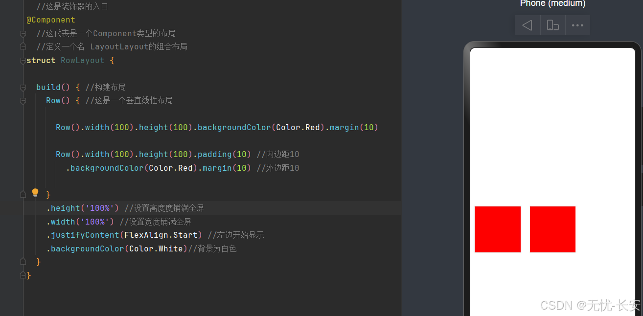
鸿蒙中水平线性布局,与Android Compose 中的基本一致。
Flex弹性布局:
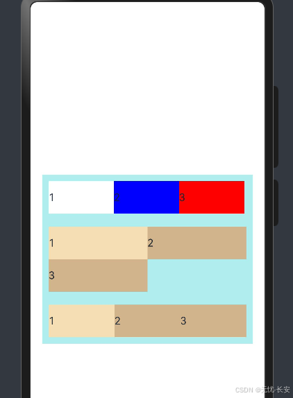
Flex弹性布局,详细请看代码
@Entry
  //这是装饰器的入口
@Component
  //这代表是一个Component类型的布局
  //定义一个名 LayoutLayout的组合布局
struct FlexLayout {

  build() { //构建布局 弹性布局,即使平均分配剩下的控件
    Column(){
      // direction: FlexDirection.Column 会垂直平局排列
      // direction: FlexDirection.backgroundColor 会垂直平局排列,倒排

      // direction: FlexDirection.RowReverse 会倒叙
      Flex({ direction: FlexDirection.Row }) {
        Text('1').width('33%').height(50).backgroundColor(Color.White)
        Text('2').width('33%').height(50).backgroundColor(Color.Blue)
        Text('3').width('33%').height(50).backgroundColor(Color.Red)
      }
      .height(70)
      .width('90%')
      .padding(10)
      .backgroundColor(0xAFEEEE)


      //换行 FlexWrap.WrapReverse 换行右边对
      Flex({ wrap: FlexWrap.Wrap }) {
        Text('1').width('50%').height(50).backgroundColor(0xF5DEB3)
        Text('2').width('50%').height(50).backgroundColor(0xD2B48C)
        Text('3').width('50%').height(50).backgroundColor(0xD2B48C)
      }
      .width('90%')
      .padding(10)
      .backgroundColor(0xAFEEEE)


      Flex(  { justifyContent: FlexAlign.Start }) {
        Text('1').width('50%').height(50).backgroundColor(0xF5DEB3)
        Text('2').width('50%').height(50).backgroundColor(0xD2B48C)
        Text('3').width('50%').height(50).backgroundColor(0xD2B48C)
      }
      .width('90%')
      .padding(10)
      .backgroundColor(0xAFEEEE)
    }.height('100%') //设置高度度铺满全屏
    .width('100%') //设置宽度铺满全屏
    .justifyContent(FlexAlign.Center) //居中显示
    .backgroundColor(Color.White)

  }
} |
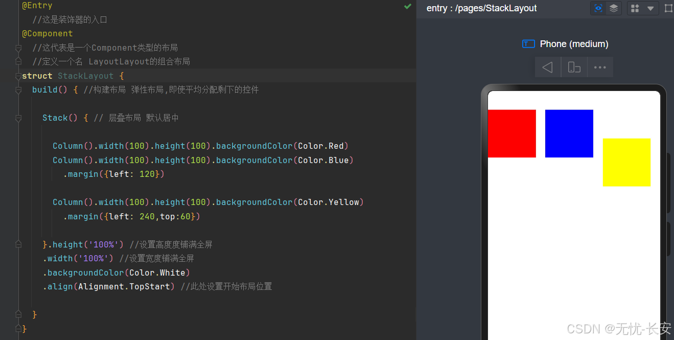
Stack布局:层叠布局,可以指定层叠的位置,然后开始布局设置距离,等等。
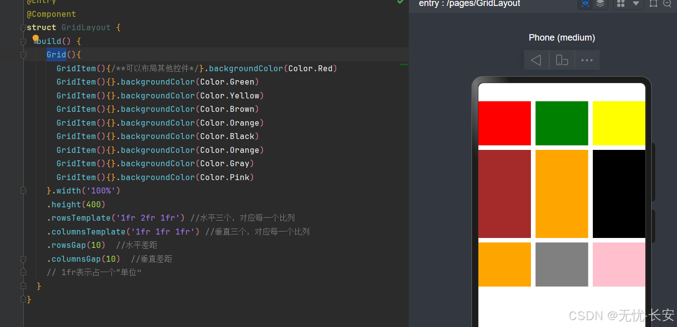
Grid布局:
在鸿蒙中,当然还有其他布局;目前上面的布局,基本已经满足使用了,当然小伙伴可以继续深入学习,比如List网格布局。


 2817
2817

 被折叠的 条评论
为什么被折叠?
被折叠的 条评论
为什么被折叠?
 到【灌水乐园】发言


