


内边距(padding)
padding属性(简写形式)可以有1~4个值
| 值的个数 | 表达意思 |
|---|---|
| padding:5px; | 1个值,代表上下左右都有5像素内边距 |
| padding:5px 10px; | 2个值,代表上下内边距是5像素,左右内边距是10像素 |
| padding:5px 10px 20px; | 代表上内边距是5像素,左右内边距是10像素,下内边距是20像素 |
| padding:5px 10px 20px 30px; | 4个值,上内边距是5像素,右内边距是10像素,下内边距是20像素,左内边距是30像素 顺时针 |
这四种情况我们实际开发中都会用到
注意事项
给盒子添加padding值后,发生了2件事情:
1.内容和边框有了距离,添加了内边距
2.padding值影响了盒子的大小
如果盒子已经有了宽度和高度,此时再指定内边距,会撑大盒子
解决方案:
如果保证盒子跟效果图大小保持一致,则让width/height减去多出来的内边距大小即可,记得上下内边距、左右内边距都要减
如果没有给子元素设置width/height,设置padding值后不会撑开父元素盒子
设置后,例如width:100%,添加padding后也会撑开
外边距(margin)
控制盒子与盒子之间的间距
margin属性值和padding(外边距)属性值的设置方法相同
元素水平居中方法
块级元素、行内块元素:margin:0 auto(上下外边距0,左右外边距自动)
行内元素:给其父元素设置text-align: center;(当成文字处理,文字水平居中)
外边距合并
margin定义块元素的垂直外边距时,可能会出现外边距的合并
嵌套块元素垂直外边距的塌陷
代码1:
<!DOCTYPE html>
<html lang="en">

<head>
    <meta charset="UTF-8">
    <meta http-equiv="X-UA-Compatible" content="IE=edge">
    <meta name="viewport" content="width=device-width, initial-scale=1.0">
    <title>Document</title>
    <style>
        .father {
            width: 500px;
            height: 500px;
            background-color: pink;
            margin-top: 50px;
        }

        .son {
            width: 300px;
            height: 300px;
            background-color: powderblue;
        }
    </style>
</head>

<body>
    <div class="father">
        <div class="son"></div>
    </div>
</body>

</html>
代码1页面效果:
![image.png]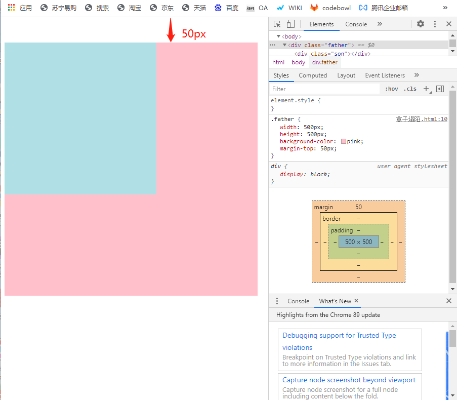
想让子元素div的上边距和父元素的div上边距之间空出一段距离,尝试给子div设置margin-top:
代码2:
<!DOCTYPE html>
<html lang="en">

<head>
    <meta charset="UTF-8">
    <meta http-equiv="X-UA-Compatible" content="IE=edge">
    <meta name="viewport" content="width=device-width, initial-scale=1.0">
    <title>Document</title>
    <style>
        .father {
            width: 500px;
            height: 500px;
            background-color: pink;
            margin-top: 50px;
        }

        .son {
            width: 300px;
            height: 300px;
            background-color: powderblue;
            margin-top: 100px;
        }
    </style>
</head>

<body>
    <div class="father">
        <div class="son"></div>
    </div>
</body>

</html>
代码2效果:
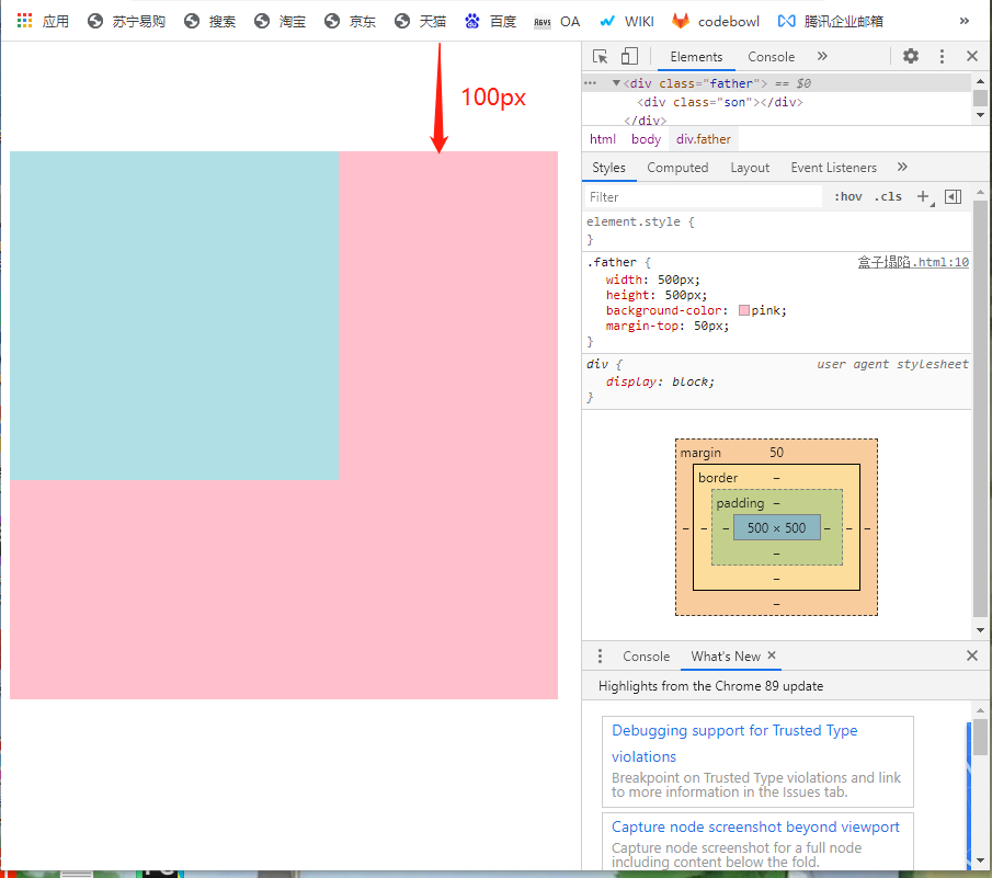
得到的效果并不是想要的,父元素跟着子元素塌下来了。
解决塌陷方法:
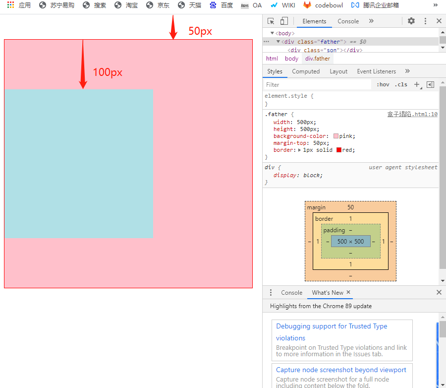
方法1.给父元素设置border,border属性或者border-top都可以
代码3:
<!DOCTYPE html>
<html lang="en">

<head>
    <meta charset="UTF-8">
    <meta http-equiv="X-UA-Compatible" content="IE=edge">
    <meta name="viewport" content="width=device-width, initial-scale=1.0">
    <title>Document</title>
    <style>
        .father {
            width: 500px;
            height: 500px;
            background-color: pink;
            margin-top: 50px;
            border: 1px solid red;
        }

        .son {
            width: 300px;
            height: 300px;
            background-color: powderblue;
            margin-top: 100px;
        }
    </style>
</head>

<body>
    <div class="father">
        <div class="son"></div>
    </div>
</body>

</html>
代码3效果:
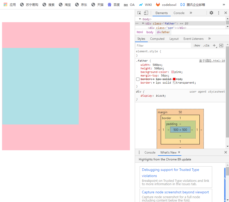
或者边框设置成透明的:
代码4:
<!DOCTYPE html>
<html lang="en">

<head>
    <meta charset="UTF-8">
    <meta http-equiv="X-UA-Compatible" content="IE=edge">
    <meta name="viewport" content="width=device-width, initial-scale=1.0">
    <title>Document</title>
    <style>
        .father {
            width: 500px;
            height: 500px;
            background-color: pink;
            margin-top: 50px;
            /* border: 1px solid red; */
            border: 1px solid transparent;
        }

        .son {
            width: 300px;
            height: 300px;
            background-color: powderblue;
            margin-top: 100px;
        }
    </style>
</head>

<body>
    <div class="father">
        <div class="son"></div>
    </div>
</body>

</html>
代码4效果:
方法2:给父元素设置内边距padding
代码5:
<!DOCTYPE html>
<html lang="en">

<head>
    <meta charset="UTF-8">
    <meta http-equiv="X-UA-Compatible" content="IE=edge">
    <meta name="viewport" content="width=device-width, initial-scale=1.0">
    <title>Document</title>
    <style>
        .father {
            width: 500px;
            height: 500px;
            background-color: pink;
            margin-top: 50px;
            /* border: 1px solid red; */
            /* border: 1px solid transparent; */
            padding: 1px;
        }

        .son {
            width: 300px;
            height: 300px;
            background-color: powderblue;
            margin-top: 100px;
        }
    </style>
</head>

<body>
    <div class="father">
        <div class="son"></div>
    </div>
</body>

</html>
代码5页面效果:
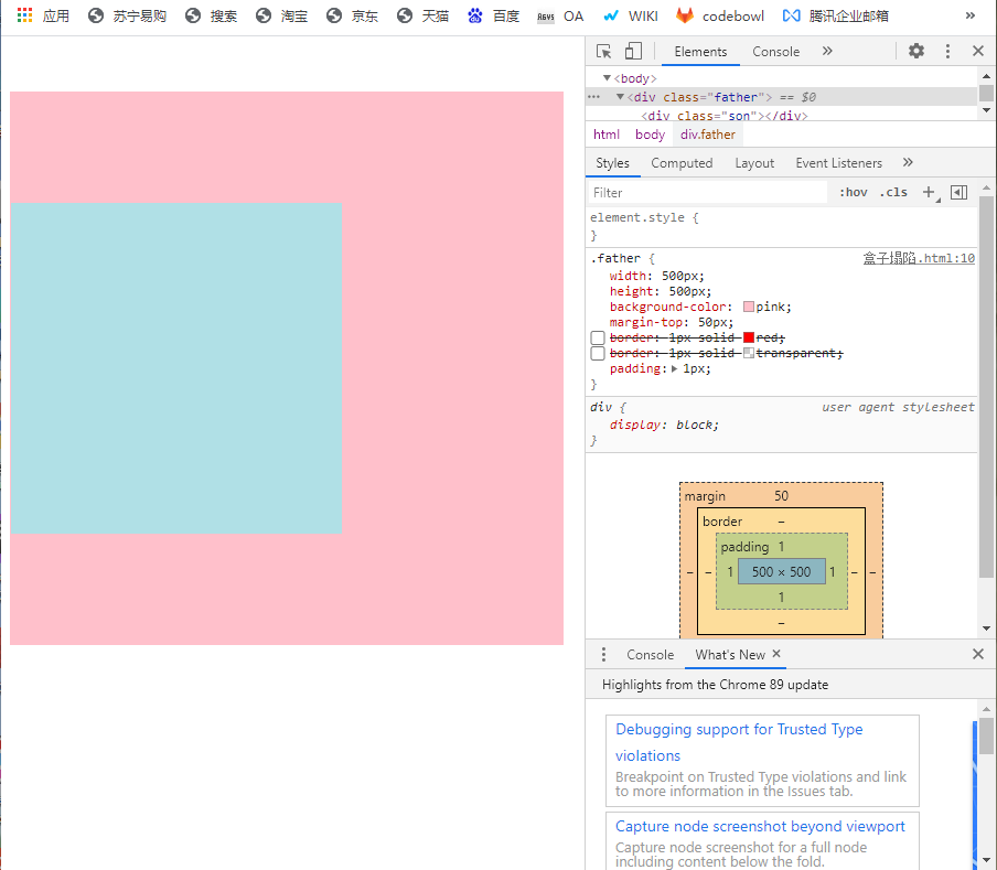
但是添加margin或者padding都会改变盒子的大小,还有下面一种方法,可以不改变盒子大小
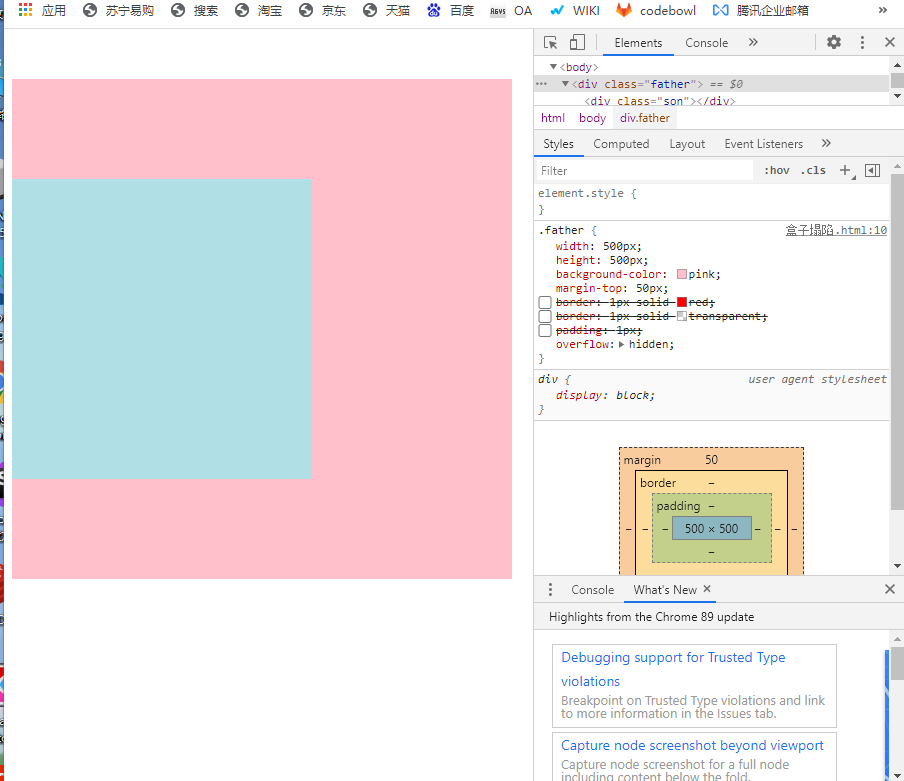
方法3:给父元素设置overflow: hidden;
代码6:
<!DOCTYPE html>
<html lang="en">

<head>
    <meta charset="UTF-8">
    <meta http-equiv="X-UA-Compatible" content="IE=edge">
    <meta name="viewport" content="width=device-width, initial-scale=1.0">
    <title>Document</title>
    <style>
        .father {
            width: 500px;
            height: 500px;
            background-color: pink;
            margin-top: 50px;
            /* border: 1px solid red; */
            /* border: 1px solid transparent; */
            /* padding: 1px; */
            overflow: hidden;
        }

        .son {
            width: 300px;
            height: 300px;
            background-color: powderblue;
            margin-top: 100px;
        }
    </style>
</head>

<body>
    <div class="father">
        <div class="son"></div>
    </div>
</body>

</html>
代码6页面效果:
清除内外边距
网页元素很多都带有默认的内外边距,而且不同浏览器默认的也不一致。所以,我们再布局前,首先先清楚一下网页元素的内外边距
* {
      margin: 0; /*清除外边距*/
      padding: 0; /*清除内边距*/
  }
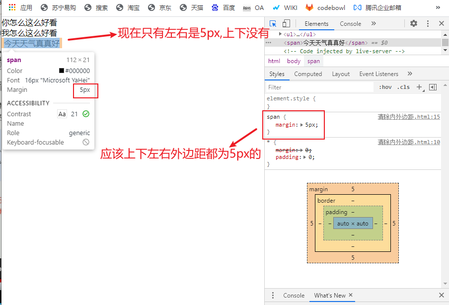
注意:行内元素为了照顾兼容性,尽量只设置左右内外边距,不要设置上下内外边距,(设置了也显示不出来上下的)。但是转换成块级和行内块元素就可以了
代码7:
<!DOCTYPE html>
<html lang="en">

<head>
    <meta charset="UTF-8">
    <meta http-equiv="X-UA-Compatible" content="IE=edge">
    <meta name="viewport" content="width=device-width, initial-scale=1.0">
    <title>Document</title>
    <style>
        * {
            margin: 0;
            padding: 0;
        }

        span {
            margin: 5px;
        }
    </style>
</head>

<body>
    <p>你怎么这么好看</p>
    <ul>
        <li>我怎么这么好看</li>
    </ul>
    <span>今天天气真真好</span>
</body>

</html>
代码7页面效果:


 4580
4580


 被折叠的 条评论
为什么被折叠?
被折叠的 条评论
为什么被折叠?
 到【灌水乐园】发言


