


往期鸿蒙全套实战文章必看:(附带鸿蒙全栈学习资料)
按钮 (Button)
Button是按钮组件,通常用于响应用户的点击操作,其类型包括胶囊按钮、圆形按钮、普通按钮、圆角矩形按钮。Button做为容器使用时可以通过添加子组件实现包含文字、图片等元素的按钮。
创建按钮
Button通过调用接口来创建,接口调用有以下两种形式:
-
通过label和ButtonOptions创建不包含子组件的按钮。以ButtonOptions中的type和stateEffect为例。
Button(label?: ResourceStr, options?: { type?: ButtonType, stateEffect?: boolean })其中,label用来设置按钮文字,type用于设置Button类型,stateEffect属性设置Button是否开启点击效果。
Button('Ok', { type: ButtonType.Normal, stateEffect: true })
  .borderRadius(8)
  .backgroundColor(0x317aff)
  .width(90)
  .height(40)
-
通过ButtonOptions创建包含子组件的按钮。以ButtonOptions中的type和stateEffect为例。
Button(options?: {type?: ButtonType, stateEffect?: boolean})只支持包含一个子组件,子组件可以是基础组件或者容器组件。
Button({ type: ButtonType.Normal, stateEffect: true }) {
  Row() {
    Image($r('app.media.loading')).width(20).height(40).margin({ left: 12 })
    Text('loading').fontSize(12).fontColor(0xffffff).margin({ left: 5, right: 12 })
  }.alignItems(VerticalAlign.Center)
}.borderRadius(8).backgroundColor(0x317aff).width(90).height(40)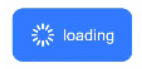
设置按钮类型
Button有四种可选类型,分别为胶囊类型(Capsule)、圆形按钮(Circle)、普通按钮(Normal)和圆角矩形按钮(ROUNDED_RECTANGLE),通过type进行设置。
-
胶囊按钮(默认类型)。
此类型按钮的圆角自动设置为高度的一半,不支持通过borderRadius属性重新设置圆角。
Button('Disable', { type: ButtonType.Capsule, stateEffect: false })
  .backgroundColor(0x317aff)
  .width(90)
  .height(40)
-
圆形按钮。
此类型按钮为圆形,不支持通过borderRadius属性重新设置圆角。
Button('Circle', { type: ButtonType.Circle, stateEffect: false })
  .backgroundColor(0x317aff)
  .width(90)
  .height(90)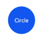
-
普通按钮。
此类型的按钮默认圆角为0,支持通过borderRadius属性重新设置圆角。
Button('Ok', { type: ButtonType.Normal, stateEffect: true })
  .borderRadius(8)
  .backgroundColor(0x317aff)
  .width(90)
  .height(40)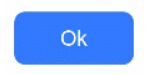
-
圆角矩形按钮
当controlSize为NORMAL时,默认圆角大小为20vp,controlSize为SMALL时,圆角大小为14vp,支持通过borderRadius属性重新设置圆角。
Button('Disable', { type: ButtonType.ROUNDED_RECTANGLE, stateEffect: true })
  .backgroundColor(0x317aff)
  .width(90)
  .height(40)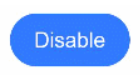
自定义样式
-
设置边框弧度。
使用通用属性来自定义按钮样式。例如通过borderRadius属性设置按钮的边框弧度。
Button('circle border', { type: ButtonType.Normal })
  .borderRadius(20)
  .height(40)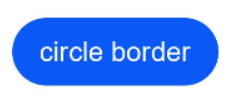
-
设置文本样式。
通过添加文本样式设置按钮文本的展示样式。
Button('font style', { type: ButtonType.Normal })
  .fontSize(20)
  .fontColor(Color.Pink)
  .fontWeight(800)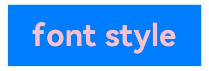
-
设置背景颜色。
添加backgroundColor属性设置按钮的背景颜色。
Button('background color').backgroundColor(0xF55A42)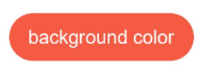
-
创建功能型按钮。
为删除操作创建一个按钮。
let MarLeft: Record<string, number> = { 'left': 20 }
Button({ type: ButtonType.Circle, stateEffect: true }) {
  Image($r('app.media.ic_public_delete_filled')).width(30).height(30)
}.width(55).height(55).margin(MarLeft).backgroundColor(0xF55A42)
添加事件
Button组件通常用于触发某些操作,可以绑定onClick事件来响应点击操作后的自定义行为。
Button('Ok', { type: ButtonType.Normal, stateEffect: true })
  .onClick(()=>{
    console.info('Button onClick')
  })
场景示例
-
用于启动操作。
可以用按钮启动任何用户界面元素,按钮会根据用户的操作触发相应的事件。例如,在List容器里通过点击按钮进行页面跳转。
// xxx.ets
@Entry
@Component
struct ButtonCase1 {
  pathStack: NavPathStack = new NavPathStack();


  @Builder
  PageMap(name: string) {
    if (name === "first_page") {
      pageOneTmp()
    } else if (name === "second_page") {
      pageTwoTmp()
    } else if (name === "third_page") {
      pageThreeTmp()
    }
  }


  build() {
    Navigation(this.pathStack) {
      List({ space: 4 }) {
        ListItem() {
          Button("First").onClick(() => {
            this.pathStack.pushPath({ name: "first_page"})
          })
            .width('100%')
        }


        ListItem() {
          Button("Second").onClick(() => {
            this.pathStack.pushPath({ name: "second_page"})
          })
            .width('100%')
        }


        ListItem() {
          Button("Third").onClick(() => {
            this.pathStack.pushPath({ name: "third_page"})
          })
            .width('100%')
        }
      }
      .listDirection(Axis.Vertical)
      .backgroundColor(0xDCDCDC).padding(20)
    }
    .mode(NavigationMode.Stack)
    .navDestination(this.PageMap)
  }
}


// pageOne
@Component
export struct pageOneTmp {
  pathStack: NavPathStack = new NavPathStack();


  build() {
    NavDestination() {
      Column() {
        Text("first_page")
      }.width('100%').height('100%')
    }.title("pageOne")
    .onBackPressed(() => {
      const popDestinationInfo = this.pathStack.pop() // 弹出路由栈栈顶元素
      console.log('pop' + '返回值' + JSON.stringify(popDestinationInfo))
      return true
    })
    .onReady((context: NavDestinationContext) => {
      this.pathStack = context.pathStack
    })
  }
}


// pageTwo
@Component
export struct pageTwoTmp {
  pathStack: NavPathStack = new NavPathStack();


  build() {
    NavDestination() {
      Column() {
        Text("second_page")
      }.width('100%').height('100%')
    }.title("pageTwo")
    .onBackPressed(() => {
      const popDestinationInfo = this.pathStack.pop() // 弹出路由栈栈顶元素
      console.log('pop' + '返回值' + JSON.stringify(popDestinationInfo))
      return true
    })
    .onReady((context: NavDestinationContext) => {
      this.pathStack = context.pathStack
    })
  }
}


// pageThree
@Component
export struct pageThreeTmp {
  pathStack: NavPathStack = new NavPathStack();


  build() {
    NavDestination() {
      Column() {
        Text("third_page")
      }.width('100%').height('100%')
    }.title("pageThree")
    .onBackPressed(() => {
      const popDestinationInfo = this.pathStack.pop() // 弹出路由栈栈顶元素
      console.log('pop' + '返回值' + JSON.stringify(popDestinationInfo))
      return true
    })
    .onReady((context: NavDestinationContext) => {
      this.pathStack = context.pathStack
    })
  }
}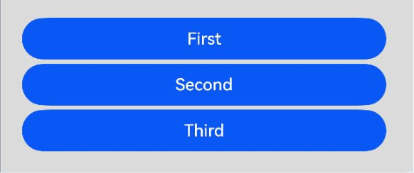
-
用于提交表单。
在用户登录/注册页面,使用按钮进行登录或注册操作。
// xxx.ets
@Entry
@Component
struct ButtonCase2 {
  build() {
    Column() {
      TextInput({ placeholder: 'input your username' }).margin({ top: 20 })
      TextInput({ placeholder: 'input your password' }).type(InputType.Password).margin({ top: 20 })
      Button('Register').width(300).margin({ top: 20 })
        .onClick(() => {
          // 需要执行的操作
        })
    }.padding(20)
  }
}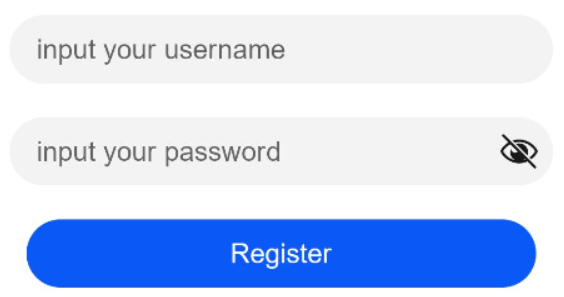
-
悬浮按钮。
在可以滑动的界面,滑动时按钮始终保持悬浮状态。
// xxx.ets
@Entry
@Component
struct HoverButtonExample {
  private arr: number[] = [0, 1, 2, 3, 4, 5, 6, 7, 8, 9]
  build() {
    Stack() {
      List({ space: 20, initialIndex: 0 }) {
        ForEach(this.arr, (item:number) => {
          ListItem() {
            Text('' + item)
              .width('100%').height(100).fontSize(16)
              .textAlign(TextAlign.Center).borderRadius(10).backgroundColor(0xFFFFFF)
          }
        }, (item:number) => item.toString())
      }.width('90%')
      Button() {
        Image($r('app.media.ic_public_add'))
          .width(50)
          .height(50)
      }
      .width(60)
      .height(60)
      .position({x: '80%', y: 600})
      .shadow({radius: 10})
      .onClick(() => {
        // 需要执行的操作
      })
    }
    .width('100%')
    .height('100%')
    .backgroundColor(0xDCDCDC)
    .padding({ top: 5 })
  }
}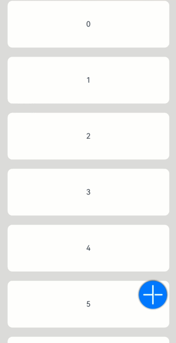


 扫一扫
扫一扫


 3161
3161

 被折叠的 条评论
为什么被折叠?
被折叠的 条评论
为什么被折叠?
 到【灌水乐园】发言


