


总目录
前言
本文主要介绍WPF资源的规划,通过规划如何使得我们的样式可以有高效的复用,以及在应对需求的改动(如换主题,或整体字体,颜色切换)的时候我们可以做到代码改动最小化。
一、总的原则
资源规划总的原则就是:
- 代码,资源最大化的复用
- 代码可以做到以最小化的改动应对最大化的需求改动
二、具体技巧
1、提取共同的属性到样式中
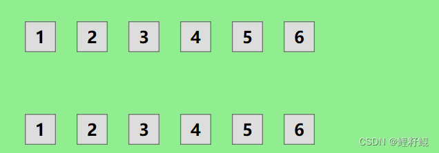
当我们实现如下效果时:
原始代码如下:
        <StackPanel Margin="20" Orientation="Horizontal" VerticalAlignment="Top">
            <Button Height="30" Width="30" Content="1" Margin="10" FontSize="16" FontWeight="Bold"></Button>
            <Button Height="30" Width="30" Content="2" Margin="10" FontSize="16" FontWeight="Bold"></Button>
            <Button Height="30" Width="30" Content="3" Margin="10" FontSize="16" FontWeight="Bold"></Button>
            <Button Height="30" Width="30" Content="4" Margin="10" FontSize="16" FontWeight="Bold"></Button>
            <Button Height="30" Width="30" Content="5" Margin="10" FontSize="16" FontWeight="Bold"></Button>
            <Button Height="30" Width="30" Content="6" Margin="10" FontSize="16" FontWeight="Bold"></Button>
        </StackPanel>
提取到样式中
        <StackPanel Margin="20" Orientation="Horizontal" VerticalAlignment="Top">
            <StackPanel.Resources>
                <Style TargetType="Button">
                    <Setter Property="Margin" Value="10"></Setter>
                    <Setter Property="Height" Value="30"></Setter>
                    <Setter Property="Width" Value="30"></Setter>
                    <Setter Property="FontSize" Value="16"></Setter>
                    <Setter Property="FontWeight" Value="Bold"></Setter>
                </Style>
            </StackPanel.Resources>
            <Button Content="1"></Button>
            <Button Content="2"></Button>
            <Button Content="3"></Button>
            <Button Content="4"></Button>
            <Button Content="5"></Button>
            <Button Content="6"></Button>
        </StackPanel>
上面案例中,只是将样式提取到StackPanel的Resources中,只是为了直观展示,正常都会提取到资源字典中,届时代码将会有极大的优化。
- 一来,我们将样式与界面上的控件进行了隔离,方便统一改动调整
- 二来,简化界面,让我们的界面代码框架更清晰
2、制定项目的基本样式
制定项目的基本样式实际操作就是在项目中创建一个BaseStyle资源文件,然后合并到App.xaml中,合并操作如下:
    <Application.Resources>
        <ResourceDictionary>
            <ResourceDictionary.MergedDictionaries>
                <ResourceDictionary Source="pack://application:,,,/MvvmDemo;component/Res/Style/BaseStyle.xaml"></ResourceDictionary>
                <ResourceDictionary Source="pack://application:,,,/MvvmDemo;component/Res/Style/MainStyle.xaml"></ResourceDictionary>
            </ResourceDictionary.MergedDictionaries>
        </ResourceDictionary>
    </Application.Resources>
项目的基本样式如下文所罗列
1.窗体样式
我们平常做项目的时候,通常会需要做无边框透明的窗体,
如下代码所示:
<Window x:Class="WpfApp4.MainWindow"
        xmlns="http://schemas.microsoft.com/winfx/2006/xaml/presentation"
        xmlns:x="http://schemas.microsoft.com/winfx/2006/xaml"
        xmlns:d="http://schemas.microsoft.com/expression/blend/2008"
        xmlns:mc="http://schemas.openxmlformats.org/markup-compatibility/2006"
        xmlns:local="clr-namespace:WpfApp4"
        mc:Ignorable="d"
        WindowStyle="None" AllowsTransparency="True" Background="Transparent"  WindowState="Normal"
        Title="MainWindow" Height="450" Width="800">
    <Grid Background="LightBlue">

    </Grid>
</Window>
这个时候如果窗体很多,每个窗体都要设置不免有些麻烦,此时我们可以如下:
- 先在基本样式的资源文件中,定义窗体样式
        <Style x:Key="CommonWindowStyle" TargetType="Window">
            <Setter Property="WindowStyle" Value="None"></Setter>
            <Setter Property="Background" Value="Transparent"></Setter>
            <Setter Property="WindowState" Value="Normal"></Setter>
            <Setter Property="AllowsTransparency" Value="True"></Setter>
        </Style>
- 引用,后续只需在需要的窗体引用该样式即可
<Window x:Class="WpfApp4.MainWindow"
        xmlns="http://schemas.microsoft.com/winfx/2006/xaml/presentation"
        xmlns:x="http://schemas.microsoft.com/winfx/2006/xaml"
        xmlns:d="http://schemas.microsoft.com/expression/blend/2008"
        xmlns:mc="http://schemas.openxmlformats.org/markup-compatibility/2006"
        xmlns:local="clr-namespace:WpfApp4"
        mc:Ignorable="d"  Style="{StaticResource CommonWindowStyle}"
        Title="MainWindow" Height="450" Width="800">
    <Grid Background="LightBlue">

    </Grid>
</Window>
2.基本字体,色调
通过定义基本的字体和色调,我们可以做到快捷的统一调整界面样式,并且做出来的界面更规整
<ResourceDictionary xmlns="http://schemas.microsoft.com/winfx/2006/xaml/presentation"
                    xmlns:x="http://schemas.microsoft.com/winfx/2006/xaml"
                    xmlns:sys="clr-namespace:System;assembly=mscorlib">

    <!--FontFamily-->
    <!--iconfont图标字体-->
    <FontFamily x:Key="IconFontFamily">pack://application:,,,/MvvmDemo;component/Res/Fonts/#iconfont</FontFamily>
    <!--项目中的主要使用字体-->
    <FontFamily x:Key="NormalFontFamily">Microsoft YaHei</FontFamily>
    <!--其他的字体也可定义在这里,如一些荧光字体-->

    <!--********************************************************************************************************-->

    <!--FontSize-->
    <!--主要字体大小-->
    <sys:Double x:Key="NormalFontSize">14</sys:Double>
    <!--标题字体大小-->
    <sys:Double x:Key="TitleFontSize">28</sys:Double>
    <!--小号字体大小-->
    <sys:Double x:Key="SmallFontSize">8</sys:Double>
    <!--其他规格字体大小也可在此定义-->

    <!--********************************************************************************************************-->

    <!--主要色调 SolidColorBrush-->
    <!--定义主要的颜色-->
    <SolidColorBrush x:Key="MainColor" Color="AliceBlue"></SolidColorBrush>
    <!--定义次要的颜色-->
    <SolidColorBrush x:Key="SecondaryColor" Color="Red"></SolidColorBrush>
    <!--定义次次要的颜色-->
    <SolidColorBrush x:Key="ThirdColor" Color="Green"></SolidColorBrush>

</ResourceDictionary>
4.基本控件效果命名&样式命名
对于样式的命名可以参考系统模板上的命名,如:
   	<SolidColorBrush x:Key="TextBox.Static.Border" Color="#FFABAdB3"/>
   	<SolidColorBrush x:Key="TextBox.MouseOver.Border" Color="#803F9EB2"/>
   	<SolidColorBrush x:Key="TextBox.Focus.Border" Color="#FF3F9EB2"/>
    <SolidColorBrush x:Key="Button.Static.Background" Color="#FF3F9EB2"/>
    <SolidColorBrush x:Key="Button.Static.Border" Color="#FF707070"/>
    <SolidColorBrush x:Key="Button.MouseOver.Background" Color="#FF3D84A2"/>
    <SolidColorBrush x:Key="Button.MouseOver.Border" Color="#FF3C7FB1"/>
    <SolidColorBrush x:Key="Button.Pressed.Background" Color="#FF3C7296"/>
    <SolidColorBrush x:Key="Button.Pressed.Border" Color="#FF2C628B"/>
    <SolidColorBrush x:Key="Button.Disabled.Background" Color="#FFF4F4F4"/>
    <SolidColorBrush x:Key="Button.Disabled.Border" Color="#FFADB2B5"/>
    <SolidColorBrush x:Key="Button.Disabled.Foreground" Color="#FF838383"/>
通过【控件.事件.属性】 这样的方式命名,会更直观的知道该属性样式的作用
另外我们对一些TextBox 和 Button 的基本MouseOver 和 Pressed的事件效果定义基本的样式,这个具体项目具体分析,如果项目中的输入框和按钮的样式基本相同,就可以统一定义,如果样式较为分散,则不适合
未完待续
结语
以上就是本文的内容,希望以上内容可以帮助到您,如文中有不对之处,还请批评指正。


 728
728


 被折叠的 条评论
为什么被折叠?
被折叠的 条评论
为什么被折叠?
 到【灌水乐园】发言


