


模式库
把css的模块整合成一个文档,这个文档就像API文档一样,提示css的用法。
Knyle Style Sheets (KSS)
kss可以实现css样式指南格式,最主要是简单好用
实例
建立在已经安装node、npm的基础上
初始化项目
在任意位置初始化一个项目:
npm init -test
npm init -y y就是项目的名称,这里是test


生成的package.json如上
添加KSS
npm install --save-dev kss
package.json{
“name”: “test”,
“version”: “1.0.0”,
“description”: “”,
“main”: “index.js”,
“scripts”: {
“test”: “echo “Error: no test specified” && exit 1”
},
“author”: “”,
“license”: “ISC”,
“devDependencies”: {
“kss”: “^3.0.1”
}
}
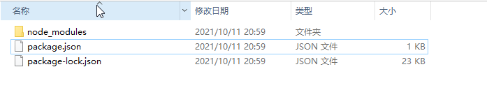
kss被安装上,创建了node_modules
配置kss
新建kss-config.json
{
  "title": "cssAPI文档",
  "source": [
    "./css"
  ],
  "destination": "docs/",
  "css": [
    "../css/styles.css"
  ],
  "js": [
    "../js/docs.js"
  ]
}
title是配置css文档的标题,source是css源文件的路劲,destination生成的文档的存放地址,css配置css的样式表文件,js配置的js的文件的路径
修改package.json使其读取配置文件,新建/css/styles.css 和 js/docs.js目录文件。
 "scripts": {
    "build": "kss --config kss-config.json",
    "test": "echo \"Error: no test specified\" && exit 1"
  },

/*
按钮

设置不同按钮的样式

Markup:
<button class="button {{modifier_class}}">
  click here
</button>

.button--success - 绿色的按钮样式表示成功
.button--danger  - 红色的按钮表示警告
.button--small   - 设置小一些的按钮的
.button--large   - 设置大一些的按钮的

Styleguide 按钮
*/
.button {
  padding: 1em 1.25em;
  border: 1px solid #265559;
  border-radius: 0.2em;
  background-color: transparent;
  font-size: 1rem;
  color: #333;
  font-weight: bold;
}

.button--success {
  border-color: #cfe8c9;
  color: #fff;
  background-color: #2f5926;
}

.button--danger {
  border-color: #e8c9c9;
  color: #fff;
  background-color: #a92323;
}

.button--small {
  font-size: 0.8rem;
}

.button--large {
  font-size: 1.2rem;
}
npm run build
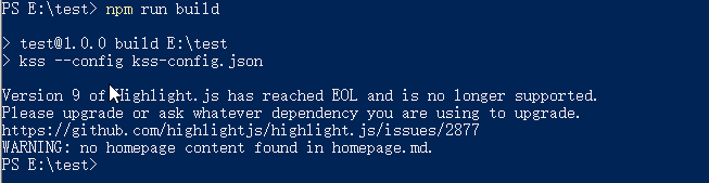
之后运行build,会生成docs目录

打开section–.html

这样就生成一个在线的api css文档
Styleguide 按钮 这个会生成左边的api文档的标题
Markup:
<button class="button {{modifier_class}}">
  click here
</button>
这个是写html的样式,中间不能断行
KSS支持分组,Styleguide button.buttonBack 这里推介使用英文
Weight 可以设置排序
kss大多都用在大型项目,第一次知道写网站知道写有css后有html的概念,刚开始的时候写的时候可能会很慢,有些需要的样式没有,你就需要添加更多的样式,你就会重新思考这样的样式到底是不是需要的。
希望我有一天也能用到css模块


 310
310


 被折叠的 条评论
为什么被折叠?
被折叠的 条评论
为什么被折叠?
 到【灌水乐园】发言


