


Matplotlib使用指南-3
文章目录
一、子图
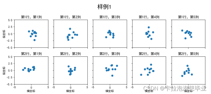
1. 使用 plt.subplots 绘制均匀状态下的子图
返回元素分别是画布和子图构成的列表,第一个数字为行,第二个为列,不传入时默认值都为1
figsize 参数可以指定整个画布的大小
sharex 和 sharey 分别表示是否共享横轴和纵轴刻度
tight_layout 函数可以调整子图的相对大小使字符不会重叠
fig, axs = plt.subplots(2, 5, figsize=(10, 4), sharex=True, sharey=True)
fig.suptitle('样例1',y=1.1,size=20)
for i in range(2):
    for j in range(5):
        axs[i][j].scatter(np.random.randn(10), np.random.randn(10))
        axs[i][j].set_title('第%d行,第%d列'%(i+1,j+1))
        axs[i][j].set_xlim(-5,5)#限制x轴的最大值和最小值
        axs[i][j].set_ylim(-5,5)
        if i==1: axs[i][j].set_xlabel('横坐标')
        if j==0: axs[i][j].set_ylabel('纵坐标')
fig.tight_layout()
subplots是基于OO模式的写法,显式创建一个或多个axes对象,然后在对应的子图对象上进行绘图操作。
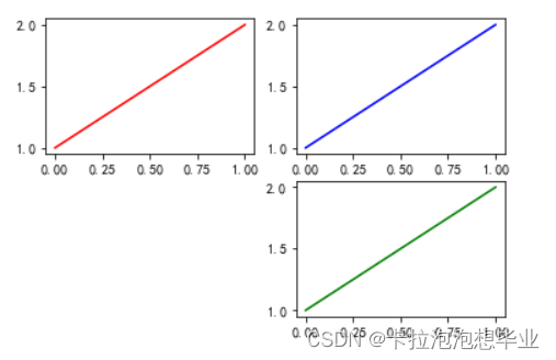
还有种方式是使用subplot这样基于pyplot模式的写法,每次在指定位置新建一个子图,并且之后的绘图操作都会指向当前子图,本质上subplot也是Figure.add_subplot的一种封装。
在调用subplot时一般需要传入三位数字,分别代表总行数,总列数,当前子图的index
plt.figure()
# 子图1
plt.subplot(2,2,1)
plt.plot([1,2], 'r')
# 子图2
plt.subplot(2,2,2)
plt.plot([1,2], 'b')
#子图3
plt.subplot(224)  # 当三位数都小于10时,可以省略中间的逗号,这行命令等价于plt.subplot(2,2,4)
plt.plot([1,2], 'g');
除了常规的直角坐标系,也可以通过projection方法创建极坐标系下的图表
N = 150
r = 2*np.random.rand(N)
theta = 2*np.pi*np.random.rand(N)
area = 200*r**2
colors = theta

plt.subplot(projection='polar')
plt.scatter(theta,r,c=colors,s=area,cmap='hsv',alpha=0.75)
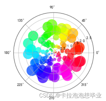
练一练:请思考如何用极坐标系画出类似的玫瑰图
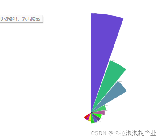
import matplotlib.pyplot as plt
import numpy as np
import xlrd
‘’’
按列读取excel文件并存入两个列表
‘’’
data=xlrd.open_workbook(r’G:/33.xlsx’)
table = data.sheets()[0] #通过索引顺序获取工作表
cols_n = table.ncols
country_list = table.col_values(0,start_rowx=1) # start_rowx默认为0,设置为1去掉列名
data_list = table.col_values(1,start_rowx=1)
print(data_list)
‘’’
计算角度
‘’’
n = table.nrows-1 #去掉列名
theta = np.linspace(0,2*np.pi,len(data_list)) # 360度等分成n份
‘’’
作图
‘’’
设置画布
fig = plt.figure(figsize=(60,60))
极坐标
ax = plt.subplot(111,projection = ‘polar’)
顺时针并设置N方向为0度
ax.set_theta_direction(-1)
ax.set_theta_zero_location(‘N’)
在极坐标中画柱形图
ax.bar(theta,
        data_list,
        width = 0.33,
        color = np.random.random((len(data_list),3)),
        # labels=str(country_list),
        align = 'edge')
'''
    显示一些简单的中文图例
'''
plt.rcParams['font.sans-serif']=['SimHei']  # 黑体
ax.set_title('亚洲国家现存确诊',fontdict={'fontsize':20})
for angle,data in zip(theta,data_list):
    ax.text(angle+0.03,data+100,str(data))


plt.axis('off')

plt.savefig('Nightingale_rose.png')
plt.show()
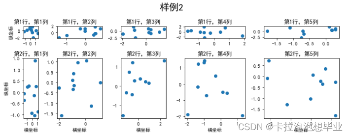
2. 使用 GridSpec 绘制非均匀子图
所谓非均匀包含两层含义,第一是指图的比例大小不同但没有跨行或跨列,第二是指图为跨列或跨行状态
利用 add_gridspec 可以指定相对宽度比例 width_ratios 和相对高度比例参数 height_ratios
fig = plt.figure(figsize=(10, 4))
spec = fig.add_gridspec(nrows=2, ncols=5, width_ratios=[1,3,3,4,5], height_ratios=[1,5])
fig.suptitle('样例2', size=20)
for i in range(2):
    for j in range(5):
        ax = fig.add_subplot(spec[i, j])
        ax.scatter(np.random.randn(10), np.random.randn(10))
        ax.set_title('第%d行,第%d列'%(i+1,j+1))
        if i==1: ax.set_xlabel('横坐标')
        if j==0: ax.set_ylabel('纵坐标')
fig.tight_layout()
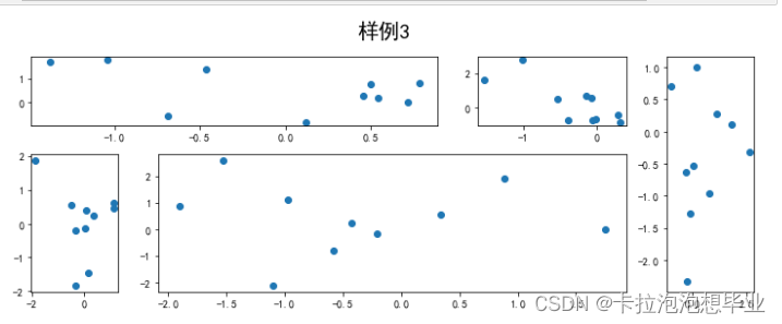
在上面的例子中出现了 spec[i, j] 的用法,事实上通过切片就可以实现子图的合并而达到跨图的共能
fig = plt.figure(figsize=(10, 4))
spec = fig.add_gridspec(nrows=2, ncols=6, width_ratios=[2,2.5,3,1,1.5,2], height_ratios=[1,2])
fig.suptitle('样例3', size=20)
# sub1
ax = fig.add_subplot(spec[0, :3])
ax.scatter(np.random.randn(10), np.random.randn(10))
# sub2
ax = fig.add_subplot(spec[0, 3:5])
ax.scatter(np.random.randn(10), np.random.randn(10))
# sub3
ax = fig.add_subplot(spec[:, 5])
ax.scatter(np.random.randn(10), np.random.randn(10))
# sub4
ax = fig.add_subplot(spec[1, 0])
ax.scatter(np.random.randn(10), np.random.randn(10))
# sub5
ax = fig.add_subplot(spec[1, 1:5])
ax.scatter(np.random.randn(10), np.random.randn(10))
fig.tight_layout()
二、子图上的方法
补充介绍一些子图上的方法
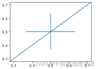
常用直线的画法为: axhline, axvline, axline (水平、垂直、任意方向)
fig, ax = plt.subplots(figsize=(4,3))
ax.axhline(0.5,0.2,0.8)
ax.axvline(0.5,0.2,0.8)
ax.axline([0.3,0.3],[0.7,0.7]);
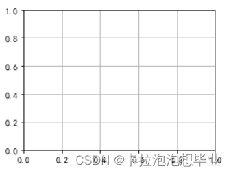
fig, ax = plt.subplots(figsize=(4,3))
ax.grid(True)
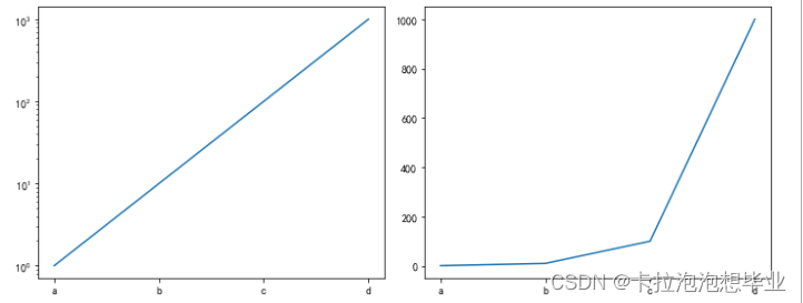
使用 set_xscale 可以设置坐标轴的规度(指对数坐标等)
fig, axs = plt.subplots(1, 2, figsize=(10, 4))
for j in range(2):
    axs[j].plot(list('abcd'), [10**i for i in range(4)])
    if j==0:
        axs[j].set_yscale('log')
    else:
        pass
fig.tight_layout()
三、思考题
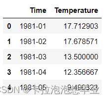
- 墨尔本1981年至1990年的每月温度情况
ex1 = pd.read_csv('../data/layout_ex1.csv')
ex1.head()
import matplotlib.pyplot as plt
from matplotlib.pyplot import MultipleLocator
import pandas as pd
import numpy as np
plt.rcParams['font.sans-serif'] = ['SimHei'] #设置字体为SimHei显示中文
plt.rcParams['axes.unicode_minus'] = False #设置正常显示字符
data = pd.read_csv('../data/layout_ex1.csv')
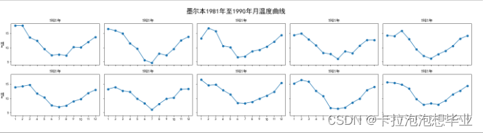
fig, axs = plt.subplots(2,5,figsize=(20,5),sharex=True,sharey=True)
fig.suptitle('墨尔本1981年至1990年月温度曲线',size=20)
index = 0
for i in range(2):
for j in range(5):
axs[i][j].plot(np.arange(1,13),data['Temperature'].values[index*12:(index*12+12)],'o-')
axs[i][j].set_title('%s年'%data['Time'].values[index][:4])
axs[i][j].xaxis.set_major_locator(MultipleLocator(1)) #把横坐标设置为1的倍数
axs[i][j].yaxis.set_major_locator(MultipleLocator(5)) #把纵坐标设置为5的倍数
if(j==0):
axs[i][j].set_ylabel('气温')
index += 1
fig.tight_layout()
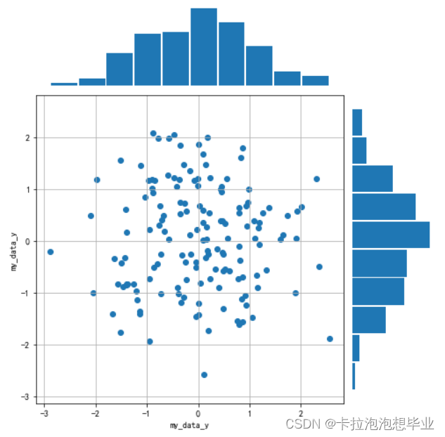
import matplotlib.pyplot as plt
import numpy as np

data = np.random.randn(2, 150)
fig = plt.figure(figsize=(7,7))
spec = fig.add_gridspec(9,9,width_ratios=np.ones((9)),height_ratios=np.ones((9)))

ax1 = fig.add_subplot(spec[2:9,0:7])
ax2 = fig.add_subplot(spec[0:2,0:7],sharex=ax1) # 与子图1共享x坐标
ax3 = fig.add_subplot(spec[2:9,7:9],sharey=ax1) # 与子图1共享y坐标

#第一个子图
ax1.scatter(data[0],data[1])
ax1.set_ylabel('my_data_y',fontsize=10)
ax1.set_xlabel('my_data_y',fontsize=10)
ax1.grid(True)

#第二个子图
ax2.hist(data[0,:],rwidth=0.94)
# 隐藏x轴标度
ax2.get_xaxis().set_visible(False)
# 隐藏y轴标度
ax2.get_yaxis().set_visible(False)
# 关闭边框
for spine in ax2.spines.values():
    spine.set_visible(False)

#第三个子图
ax3.hist(data[0,:],rwidth=0.94, orientation='horizontal')
# 隐藏x轴标度
ax3.get_xaxis().set_visible(False)
# 隐藏y轴标度
ax3.get_yaxis().set_visible(False)
# 关闭边框
for spine in ax3.spines.values():
    spine.set_visible(False)

fig.tight_layout()


 644
644


 被折叠的 条评论
为什么被折叠?
被折叠的 条评论
为什么被折叠?
 到【灌水乐园】发言


