


pyplot画图技巧
1. 一张图多组label的demo:
from matplotlib import pyplot as plt
import numpy as np

ax = plt.subplot(111)
li0 = plt.plot([1,2,3])
li1 = plt.plot([1,4,6])
l1 = plt.legend(li0+li1, ['123','146'], loc=1)
plt.plot([1,4,9], label='149')
li2 = plt.plot([1,3,9])
l2 = plt.legend(li2, ['139'], loc=4)
l3 = plt.legend(loc=8)
ax.add_artist(l1)
ax.add_artist(l2)
plt.show()
结果为:

2. latex设置字体
详见stackoverflow问答,以下指令调节latex字体为mathtext:
import matplotlib
matplotlib.rcParams['mathtext.fontset'] = 'stix'
matplotlib.rcParams['font.family'] = 'STIXGeneral'
matplotlib.rcParams['font.weight'] = 'normal'
matplotlib.rcParams['font.size'] = 15
matplotlib.rcParams['text.usetex'] = True
效果如下:

值得注意的是text.usetex设置为True可能会导致报错,因为此时会使用系统的LaTeX进行编译。以上操作可以写成matplotlibrc文件,例如:
text.usetex : True
#text.usetex : False
font.family : STIXGeneral
#font.family : DejaVu Sans
font.weight : normal
font.size   : 15
mathtext.fontset : stix

savefig.bbox : tight
savefig.format : pdf
savefig.transparent: True
#savefig.format : png
#savefig.transparent: False
在文件里可以这样调用:
import matplotlib
matplotlib.rc_file('./matplotlibrc')
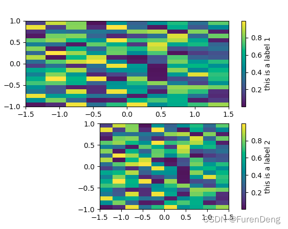
3. ax设置colorbar
import matplotlib
import matplotlib.pyplot as plt
import numpy as np

a = np.random.rand(10, 20)
x = np.linspace(-1.5, 1.5, a.shape[0]+1)
y = np.linspace(-1, 1, a.shape[1]+1)
plt.figure()
ax = plt.subplot(211)
cm = ax.pcolormesh(x, y, a.T)
cbar = plt.colorbar(cm, ax=ax)
cbar.set_label('this is a label 1')
ax = plt.subplot(212)
cm = plt.imshow(a.T, origin='lower', interpolation='nearest', extent=[x.min(), x.max(), y.min(), y.max()])
cbar = plt.colorbar(cm, ax=ax)
cbar.set_label('this is a label 2')
plt.show()
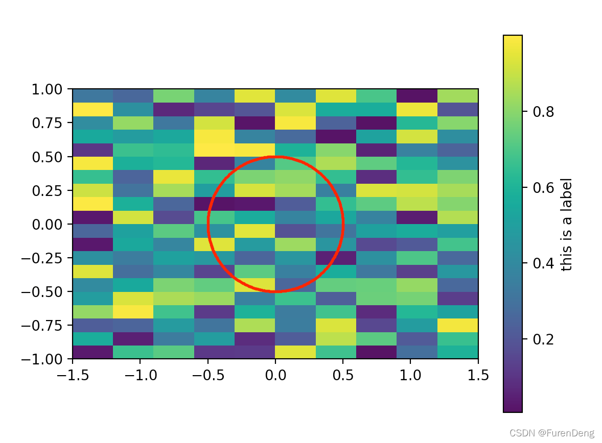
4. pcolormesh设置轴长度相同以及设置colorbar的label
import matplotlib
import matplotlib.pyplot as plt
import numpy as np

R = 0.5
phic = np.linspace(0, 2*np.pi, 501)
xc = np.cos(phic)*R
yc = np.sin(phic)*R

a = np.random.rand(10, 20)
x = np.linspace(-1.5, 1.5, a.shape[0]+1)
y = np.linspace(-1, 1, a.shape[1]+1)
ax = plt.subplot(111)
cm = ax.pcolormesh(x, y, a.T)
ax.scatter(xc, yc, c='red', s=1.0)
cbar = plt.colorbar(cm, ax=ax)
cbar.set_label('this is a label')
ax.set_aspect('equal', adjustable='box')
plt.draw()
plt.show()
5. 从figure对象中获取数据和颜色
import numpy as np
from matplotlib import pyplot as plt
import matplotlib

fig = plt.figure()
x = np.logspace(-2, 1, 21)
plt.loglog(x, x**3, '.')
plt.loglog(x, x**2, '.')
ax = fig.get_axes()[0]
lines = ax.get_lines()
xys = [l.get_data() for l in lines]
colors = [l.get_color() for l in lines]
for xy, c in zip(xys, colors):
    plt.loglog(xy[0], xy[1], c=c)
plt.show()
6. pcolormesh结果出现白线的解决方法
用pyplot的pcolormesh的时候最终结果如果存成pdf格式,某些阅读器会显示出白线,参考stackoverflow上的问答,pcolormesh是单独画一个一个小方块的,不同的阅读器处理方式不同,因此一些阅读器会出现白线。解决方法之一是使用imshow,例如:
plt.imshow(z, origin='lower', interpolation='nearest', cmap='Blues', extent=[x.min(), x.max(), y.min(), y.max()])
但是imshow只能用于x和y的网格均匀的情况,如果仍需要使用pcolormesh,可以用:
plt.pcolormesh(x,y,z,cmap="Blues",linewidth=0,rasterized=True)
在savefig的时候或许还需要调节dpi使结果更好,详细参照stackoverflow上的问答。
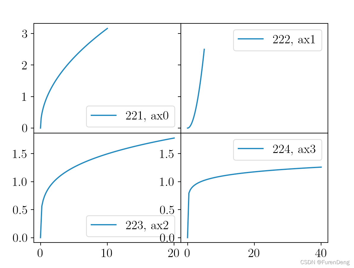
7. subplot只显示一个轴
import matplotlib.pyplot as plt
import numpy as np

x = np.linspace(0, 10, 101)
ax0 = plt.subplot(221)
plt.plot(x, np.sqrt(x), label='221, ax0')
ax1 = plt.subplot(222, sharey=ax0)
plt.plot(x/2, x**2/40, label='222, ax1')
ax2 = plt.subplot(223, sharex=ax0)
plt.plot(x*2, x**0.25, label='223, ax2')
ax3 = plt.subplot(224, sharex=ax1, sharey=ax2)
plt.plot(x*4, x**0.1, label='224, ax3')
for ax in [ax0, ax1, ax2, ax3]:
    ax.legend()

plt.setp(ax0.get_xticklabels(), visible=False)
plt.setp(ax1.get_yticklabels(), visible=False)
#plt.setp(ax3.get_yticklabels(), visible=False)
plt.subplots_adjust(hspace=.0, wspace=.0)
plt.show()
效果如下:


 1万+
1万+


 被折叠的 条评论
为什么被折叠?
被折叠的 条评论
为什么被折叠?
 到【灌水乐园】发言


