


Matplotlib
Line Graph
绘制折线图
import matplotlib.pyplot as plt
"""列表默认为y轴的值,x轴默认为1,2,3,...;c控制颜色"""
squares = [1, 4, 9, 16, 25]
plt.plot(squares, linewidth=5, c='red')

"""标题与坐标轴的参数设置"""
plt.title("Square Numbers", fontsize=24)
plt.xlabel("Value", fontsize=14)
plt.ylabel("Square of Value", fontsize=14)

"""刻度的参数设置:'both'-x和y轴;'x'-x轴;'y'-y轴"""
plt.tick_params(axis='both', labelsize=14)

"""同时设置x和y轴:plt.plot(x_axis,y_axis,**kwargs)"""
input_values = [1, 2, 3, 4, 5]
plt.plot(input_values, squares, linewidth=5)

"""图片的保存"""
plt.savefig('simple.jpg',dpi=300)
Scatter
绘制散点图
import matplotlib.pyplot as plt

"""s设置点的大小"""
x_values = list(range(1, 1001))
y_values = [x**2 for x in x_values]
plt.scatter(x_values, y_values, s=40)

"""设置坐标轴范围"""
plt.axis([0, 1100, 0, 1100000])

"""edgecolor设置边缘颜色"""
plt.scatter(x_values, y_values, edgecolor='none', s=40)

"""color设置内部颜色"""
plt.scatter(x_values, y_values, edgecolor='none', s=40)

"""用RGB数值设置"""
plt.scatter(x_values, y_values, color=(0, 0.8, 0), edgecolor='none', s=40)

"""渐变色:用c(y轴)对应颜色(cmap)深浅"""
plt.scatter(x_values, y_values, c=y_values, cmap=plt.cm.Blues,
edgecolor='none', s=40)
Multiple Graphs
import matplotlib.pyplot as plt
fig,ax=plt.subplots(2,2,figsize=(6,6))
ax1=ax[0,0]
ax2=ax[0,1]
ax3=ax[1,0]
ax4=ax[1,1]

"""
fig分配绘图区域
函数返回一个figure图像和子图ax的array列表。
figsize控制子图大小
"""
绘图如下:

隐藏坐标轴:
import matplotlib.pyplot as plt

def axis_clear(u):
    u.get_xaxis().set_visible(False)
    u.get_yaxis().set_visible(False)

fig,ax=plt.subplots(2,2,figsize=(6,6))
ax1=ax[0,0]
ax2=ax[0,1]
ax3=ax[1,0]
ax4=ax[1,1]
axis_clear(ax1)
axis_clear(ax2)
axis_clear(ax3)
axis_clear(ax4)

"""
ax.get_xaxis().set_visible(False)
ax.get_yaxis().set_visible(False)
"""
效果如下:

Plotly
用于绘制直方图
from random import randint
from plotly.graph_objs import Bar, Layout
from plotly import offline


"""模拟掷色子"""
class Die():

    def __init__(self, num_sides=6):
        self.num_sides = num_sides
    def roll(self):
        return randint(1, self.num_sides)
die = Die()
results = []
for roll_num in range(1000):
    result = die.roll()
    results.append(result)
frequencies = []
for value in range(1, die.num_sides+1):
    frequency = results.count(value)
    frequencies.append(frequency)
print(frequencies)
#[177, 187, 185, 187, 185, 179]


"""将结果呈现为直方图"""
# Visualize the results.
x_values=list(range(1,die.num_sides+1))
data=[Bar(x=x_values,y=frequencies)]

x_axis_config={'title': 'result'}
y_axis_config={'title': 'frequencies'}
my_layout=Layout(title='Rolling one D6 1000 times',
                xaxis=x_axis_config, yaxis=y_axis_config)
offline.plot({'data':data,'layout':my_layout},filename='d6.html')
"""
data对应横轴纵轴数据,格式:data=[Bar(x=...,y=...)]
Layout对应外观布局:title-图表标题;xaxis-x轴名称;yaxis-y轴名称
"""
绘图相关函数
plt.figure()
matplotlib.pyplot.figure(num=None, figsize=None, dpi=None, facecolor=None, edgecolor=None, frameon=True,
                         FigureClass=<class 'matplotlib.figure.Figure'>, clear=False, **kwargs)
plt.figure()生成一个画布。
num:画布的编号或名称,数字为编号 ,字符串为名称
figsize:画布的尺寸
dpi:分辨率
facecolor:背景颜色
edgecolor:边框颜色
frameon:是否显示边框
plt.figure(1)
"""
fig1
"""
plt.figure(2)
"""
fig2
"""
执行后会绘制两个图像,fig1和fig2 。
plt.subplot()
plt.subplot(mnk)表示在当前画布下确定一个绘制区域:将画布分为m*n的网格,在从上往下,从左往右第k个网格进行绘制。
import matplotlib .pyplot as plt
x=[1,2,3,4,5]
y=[3,6,7,9,2]
plt.figure(1,dpi=300)

plt.subplot(121)
plt.plot(x,y,label='trend1')
plt.title('title 1',fontsize=12,color='r')
plt.legend()

plt.subplot(122)
plt.plot(x,y,c='cyan',label='trend2')
plt.title('title 2')
plt.legend()
plt.show()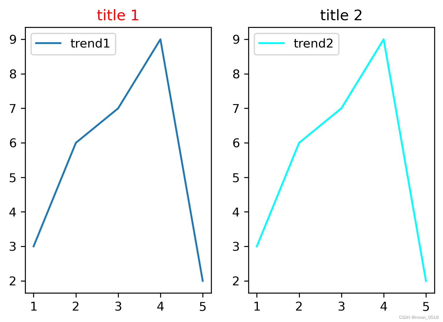
plt.legend()
绘制的曲线有label参数时,使用legend函数可以显示标签。
ax.set_title()和plt.title()
plt.XX之类的是函数式绘图,通过将数据参数传入plt类的静态方法中并调用方法,从而绘图。fig,ax=plt.subplots()是对象式编程,这里plt.subplots()是返回一个元组,包含了figure对象(控制总体图形大小)和axes对象(控制绘图,坐标之类的)。进行对象式绘图,首先是要通过plt.subplots()将figure类和axes类实例化也就是代码中的fig,ax,然后通过fig调整整体图片大小,通过ax绘制图形,设置坐标,函数式绘图最大的好处就是直观,但如果绘制稍微复杂的图像,或者过子图操作,就不如对象式绘图了,ax.set_title()是给ax这个子图设置标题,当子图存在多个的时候,可以通过ax设置不同的标题,如果仅仅是调用plt.title()给多个子图上标题,就比较麻烦了
省流:plt.title()用于单个表的标题;ax.set_title()用于多表的标题
add_subplot和add_axes()
fig.add_subplot(mnk),在m*n的网格的第k格进行绘制,好处是可以实现不规则的子图布局fig.add_axes([left,bottom,width,height]),以(left,bottom)处点为左下角的点绘制,宽高分别占figure的width,height(这两个参数都是0到1之间的小数)
fig,ax=plt.subplots()
plt.subplots()是一个函数,返回一个包含figure和axes对象的元组。因此,使用fig,ax=plt.subplots()将元组分解为fig和ax两个变量。等价写法:
fig = plt.figure()
fig.add_subplot(111)
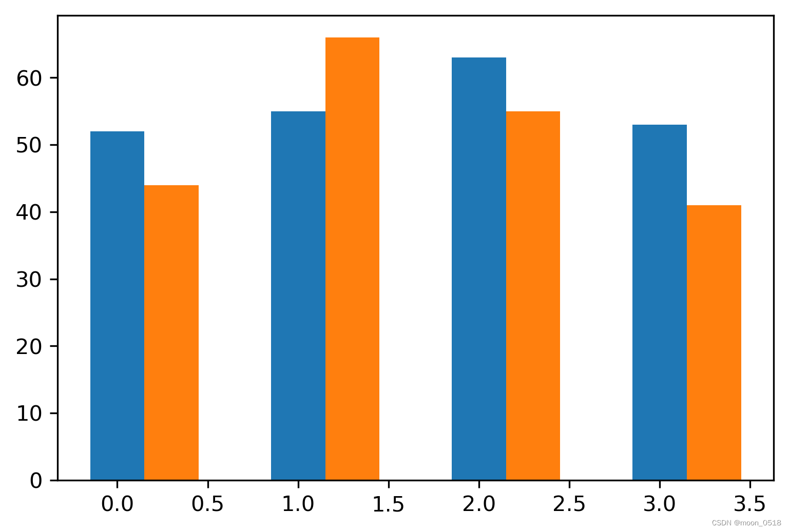
fig,ax = plt.subplots()plt.bar()函数
生成柱状图:
import numpy as np
import matplotlib.pyplot as plt

x = np.arange(4)
y1 = [52, 55, 63, 53]
y2 = [44, 66, 55, 41]
bar_width = 0.3

plt.bar(x, y1, width=bar_width)
plt.bar(x+bar_width, y2, width=bar_width, align="center")

"""
+bar_width:该柱向右平移bar_width的距离
align:控制该柱子的水平位置-center表示柱子中心与刻度对齐;edge表示左边缘与刻度对齐
np.arange(4):生成一个0到3的array,高级版的range
np.array([0,1,2,3]):将对象转化为array
"""
若要将横坐标转化为字符串,使用plt.xticks(list1,list2)函数将横坐标list1对应的值替换为list2中的值。可以通过这个技巧将横轴刻度与一簇柱状图的中心对齐。
import numpy as np
import matplotlib.pyplot as plt

x = np.arange(4)
y1 = [52, 55, 63, 53]
y2 = [44, 66, 55, 41]
bar_width = 0.3

plt.bar(x, y1, width=bar_width)
plt.bar(x+bar_width, y2, width=bar_width, align="center")

plt.xticks(x+bar_width/2,['a','b','c','d'])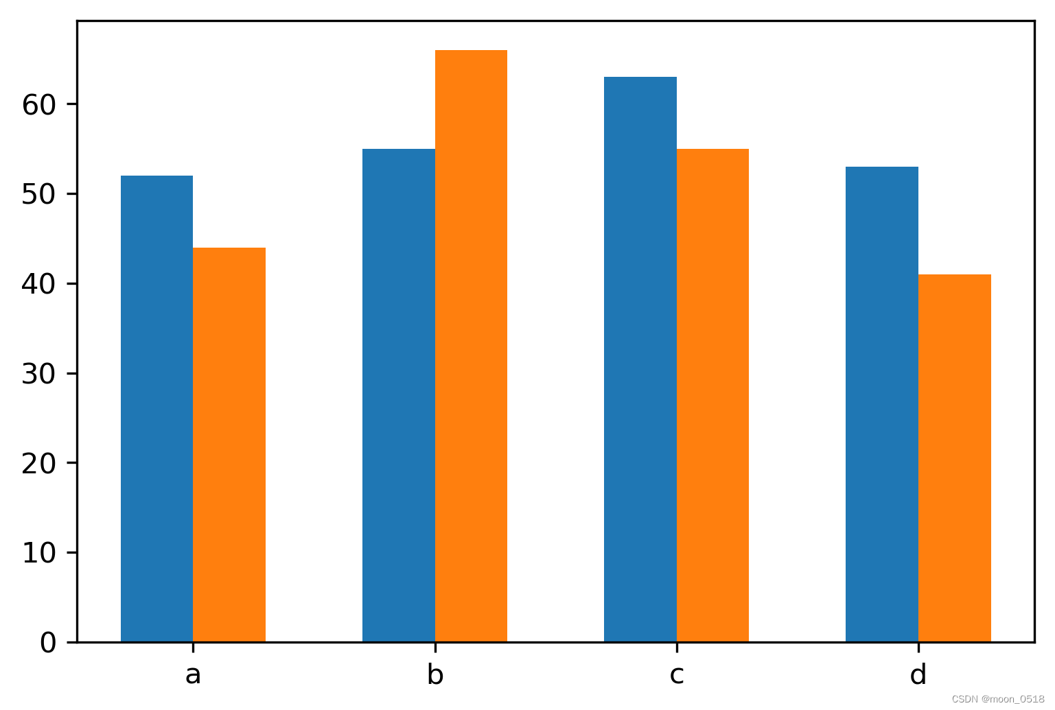
轴的参数设置
"""标题与轴的标签"""
ax.set_title("title",fontsize=10)
ax.set_xlabel("x_label",fontsize=10)
ax.set_ylabel("y_label",fontsize=10)

"""刻度标记的大小"""
ax.tick_params(axis='both',which='major',labelsize=10)


 4182
4182


 被折叠的 条评论
为什么被折叠?
被折叠的 条评论
为什么被折叠?
 到【灌水乐园】发言


