


BootStrap入门(三)全局CSS样式
BootStrap中CSS样式有许多,这里挑一些学习 过程中的来展示,更多样式移步link
一、按钮
<body>
        <a class="btn btn-default" href="#" role="button">Link</a>
        <button class="btn btn-default" type="submit">Button</button>
        <input class="btn btn-default" type="button" value="Input">
        <input class="btn btn-default" type="submit" value="Submit">
        <br>
        <!-- Standard button -->
        <button type="button" class="btn btn-default">(默认样式)Default</button>

        <!-- Provides extra visual weight and identifies the primary action in a set of buttons -->
        <button type="button" class="btn btn-primary">(首选项)Primary</button>

        <!-- Indicates a successful or positive action -->
        <button type="button" class="btn btn-success">(成功)Success</button>

        <!-- Contextual button for informational alert messages -->
        <button type="button" class="btn btn-info">(一般信息)Info</button>

        <!-- Indicates caution should be taken with this action -->
        <button type="button" class="btn btn-warning">(警告)Warning</button>

        <!-- Indicates a dangerous or potentially negative action -->
        <button type="button" class="btn btn-danger">(危险)Danger</button>

        <!-- Deemphasize a button by making it look like a link while maintaining button behavior -->
        <button type="button" class="btn btn-link">(链接)Link</button>
    </body>

二、图片
class="img-responsive"属性使图片在任意尺寸都占100%
<body>
        <img src="img/ChMkJlbg2buIfm-oADBHF9zvh9MAANIaQDEWYIAMEcv903.jpg" class="img-responsive" alt="Responsive image">
</body>
将浏览器窗口缩小:
 图片形状和边框:
圆角、圆形、边框
方形   <img src="img/ChMkJlbg2buIfm-oADBHF9zvh9MAANIaQDEWYIAMEcv903.jpg" class="img-rounded img-responsive" >
圆形   <img src="img/ChMkJlbg2buIfm-oADBHF9zvh9MAANIaQDEWYIAMEcv903.jpg" class="img-circle img-responsive">
相框   <img src="img/ChMkJlbg2buIfm-oADBHF9zvh9MAANIaQDEWYIAMEcv903.jpg" class="img-thumbnail img-responsive">

三、表格
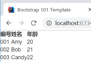
创建一个初始表格:
<table>
            <tr>
                <th>编号</th>
                <th>姓名</th>
                <th>年龄</th>
            </tr>
            <tr>
                <td>001</td>
                <td>Amy</td>
                <td>20</td>
            </tr>
            <tr>
                <td>002</td>
                <td>Bob</td>
                <td>21</td>
            </tr>
            <tr>
                <td>003</td>
                <td>Candy</td>
                <td>22</td>
            </tr>
        </table>
样式十分简陋
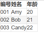
添加样式:
.table-bordered:添加边框

table-hover:鼠标悬停
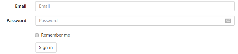
四、表单
form-horizontal属性设计水平排列的表单
<form class="form-horizontal">
  <div class="form-group">
    <label for="inputEmail3" class="col-sm-2 control-label">Email</label>
    <div class="col-sm-10">
      <input type="email" class="form-control" id="inputEmail3" placeholder="Email">
    </div>
  </div>
  <div class="form-group">
    <label for="inputPassword3" class="col-sm-2 control-label">Password</label>
    <div class="col-sm-10">
      <input type="password" class="form-control" id="inputPassword3" placeholder="Password">
    </div>
  </div>
  <div class="form-group">
    <div class="col-sm-offset-2 col-sm-10">
      <div class="checkbox">
        <label>
          <input type="checkbox"> Remember me
        </label>
      </div>
    </div>
  </div>
  <div class="form-group">
    <div class="col-sm-offset-2 col-sm-10">
      <button type="submit" class="btn btn-default">Sign in</button>
    </div>
  </div>
</form>


 4207
4207


 被折叠的 条评论
为什么被折叠?
被折叠的 条评论
为什么被折叠?
 到【灌水乐园】发言


