


1.transform之translate3d移动
**transform:translate3d(x,y,z)**
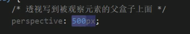
2.透视perspective
透视写在观察元素的父盒子里面
3.3D转换之旋转rotate3D
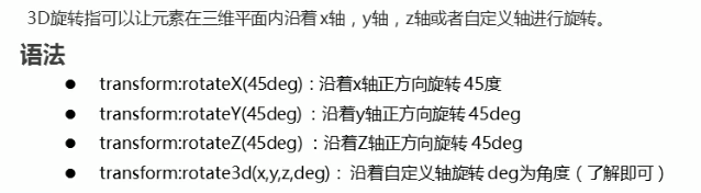

会矢量求和

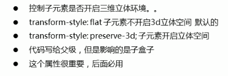
4.3D转换之transform-style
给父级加transform-style:3d
鼠标点击后变成这样

<!doctype html>
<html lang="en">
<head>
    <meta charset="UTF-8">
    <meta name="viewport"
          content="width=device-width, user-scalable=no, initial-scale=1.0, maximum-scale=1.0, minimum-scale=1.0">
    <meta http-equiv="X-UA-Compatible" content="ie=edge">
    <title>Document</title>
    <style>
        body{
            perspective: 500px;
        }
        .box{
            position: relative;
            height: 200px;
            width: 200px;
            transform-style: preserve-3d;
            margin: 100px auto;

        }
        .box:hover{
            transform: rotateY(60deg);
        }
        .box::before{
            position: absolute;
            content: '';
            height: 200px;
            width: 200px;
            background-color: #68e4ff;
        }
        .box::after{
            position: absolute;
            content: '';
            height: 200px;
            width: 200px;
            background-color: pink;
            transform: rotateX(60deg);
        }
    </style>
</head>
<body>
<div class="box">

</div>
</body>
</html>
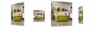
旋转木马
<!doctype html>
<html lang="en">
<head>
    <meta charset="UTF-8">
    <meta name="viewport"
          content="width=device-width, user-scalable=no, initial-scale=1.0, maximum-scale=1.0, minimum-scale=1.0">
    <meta http-equiv="X-UA-Compatible" content="ie=edge">
    <title>Document</title>
    <style>
        body{
            perspective: 800px;
        }
        section{
            position: relative;
            width: 200px;
            height: 200px;
            margin: 300px auto;
            transform-style: preserve-3d;
            animation: move 10s linear infinite;
        }
        section:hover{
            animation-play-state: paused;
        }
        @keyframes move {
            0%{

            }
            100%{
                transform: rotateY(360deg);
            }
        }
        section div{
            position: absolute;
            top: 0;
            left: 0;
            width: 100%;
            height: 100%;
            background: url("img/li.webp") no-repeat;
        }
        section div:first-child{
            transform: rotateY(0deg) translateZ(300px);
        }
        section div:nth-child(2){
            transform: rotateY(60deg) translateZ(300px);
        }
        section div:nth-child(3){
            transform: rotateY(120deg) translateZ(300px);
        }
        section div:nth-child(4){
            transform: rotateY(180deg) translateZ(300px);
        }
        section div:nth-child(5){
            transform: rotateY(240deg) translateZ(300px);
        }
        section div:nth-child(6){
            transform: rotateY(300deg) translateZ(300px);
        }
    </style>
</head>
<body>
<section>
    <div></div>
    <div></div>
    <div></div>
    <div></div>
    <div></div>
    <div></div>
</section>
</body>
</html>
5.浏览器的私有前缀


 758
758


 被折叠的 条评论
为什么被折叠?
被折叠的 条评论
为什么被折叠?
 到【灌水乐园】发言


