


matplotlib:画图
numpy:数值型数组处理
pandas:在numpy基础上,除了处理数值型数组之外,还能够处理字符串、时间序列、列表、字典等数据类型的数据
环境:Windows10、Python3,PyCharm
1、matplotlib概述
matplotlib可以将数据进行可视化
matplotlib:最流行的python底层绘图库,主要做数据可视化图表。名字取材于matlab,模仿matlab构建。
2、matplotlib使用
2.1 实例
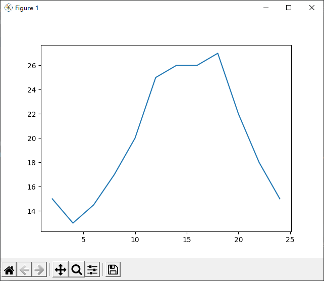
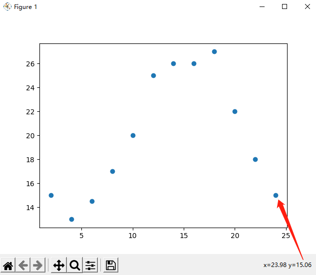
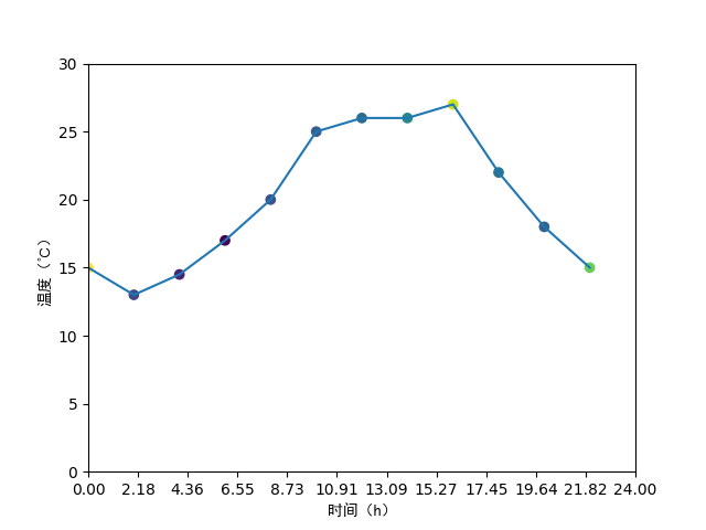
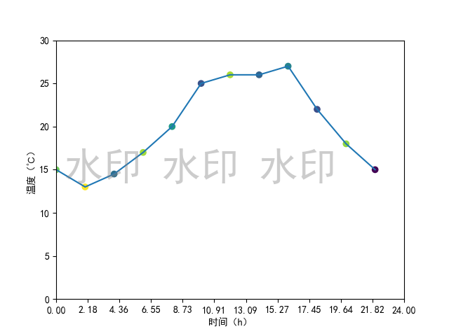
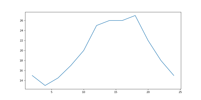
例子:
例子:假设一天中每隔两个小时range(2, 26, 2)的气温分别是:[15, 13, 14.5, 17, 20, 25, 26, 26, 27, 22, 18, 15]
使用matplotlib绘图
代码:
from matplotlib import pyplot as plt
x = range(2, 26, 2) # 数据12个:[2, 4, 6, 8, 10, 12, 14, 16, 18, 20, 22, 24] 【注意:到24结束,不是25结束,因为24到25步长为1不足2】
y = [15, 13, 14.5, 17, 20, 25, 26, 26, 27, 22, 18, 15]
# x、y轴的数据一起组成了所要绘制的坐标:(2,15),(4,13),(6,14.5),(8,17),(10,20),...,(20,22),(22,18),(24,15)
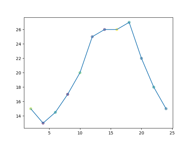
plt.plot(x, y) # 折线图
plt.scatter(x, y) # 散点图
plt.show()
绘图:
2.1.1 知识补充:range()函数
range(start, stop[, step])

参数说明:
start: 计数从 start 开始。默认是从 0 开始。例如range(5)等价于range(0,5);
stop: 计数到 stop 结束,但不包括 stop。例如:range(0, 5) 是[0, 1, 2, 3, 4]没有5
step:步长,默认为1。例如:range(0, 5) 等价于 range(0, 5, 1)
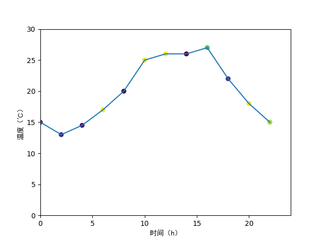
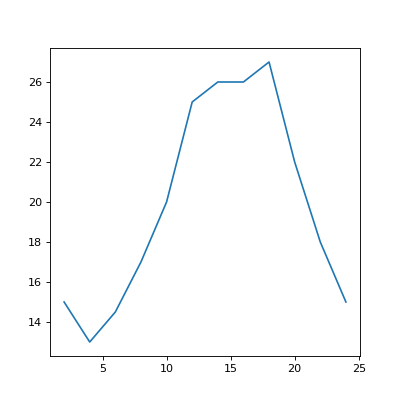
2.2 设置x轴和y轴
- x、y轴含义:
plt.xlabel()、plt.ylabel() - x、y轴范围:
plt.xlim()、plt.xlim() - 标题:
plt.title() - 调整刻度:
plt.xticks()、plt.yticks()
语法:
matplotlib.pyplot.ylabel(ylabel, fontdict=None, labelpad=None, *, loc=None, **kwargs)

ylable:标签文本
fontdict:浮动值
loc:标签位置,可取值:'bottom', 'center', 'top', default: 'center'
示例:
# 设置坐标轴含义, 中文需要加fontproperties属性
plt.xlabel('时间(h)', fontproperties='SimHei')
plt.ylabel('温度(℃)', fontproperties='SimHei')
# 设置x和y轴的范围
plt.xlim((0, 24))
plt.ylim((0, 30))
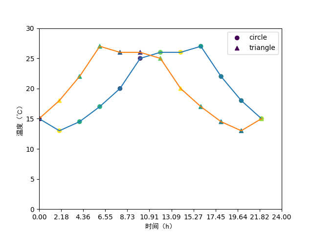
# 设置x轴和y轴的刻度
plt.xticks(x)
# 设置x轴和y轴的刻度
new_ticks = np.linspace(0, 24, 12)
plt.xticks(new_ticks)
# 设置x轴和y轴的刻度:步长——当刻度太密集的时候,使用列表步长(间隔取值)来解决
new_ticks = [i/2 for i in range(4, 49)]
plt.xticks(new_ticks[::3]) # 取步长[::3]
# plt.xticks(x[::3])
# plt.yticks(y[::3])
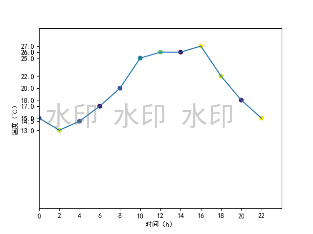
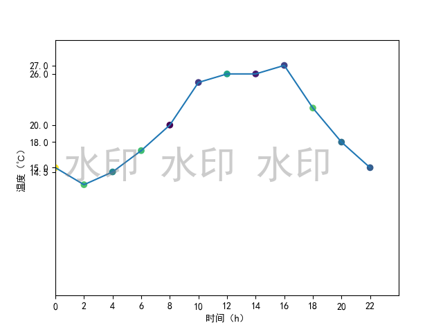
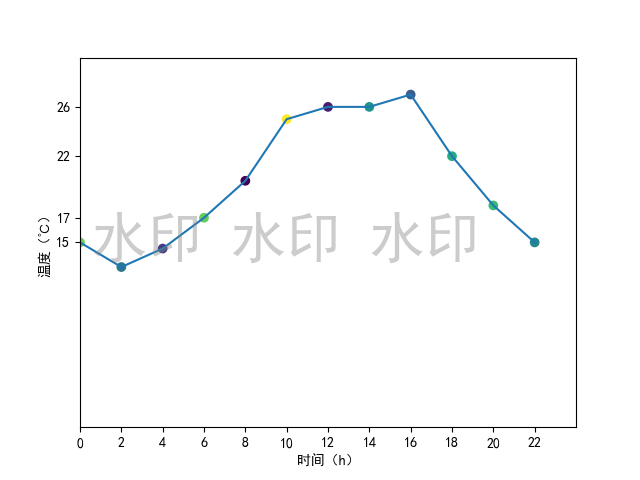
绘图:左图未设置刻度,中图设置x轴刻度,右图设置x轴刻度
绘图:刻度——x轴设置不同步长,依次为:1(缺省)、2、3
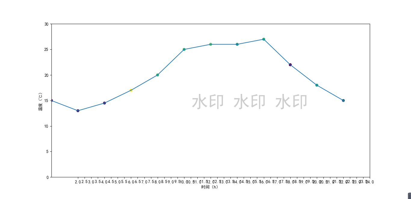
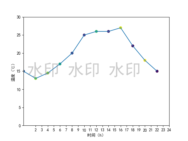
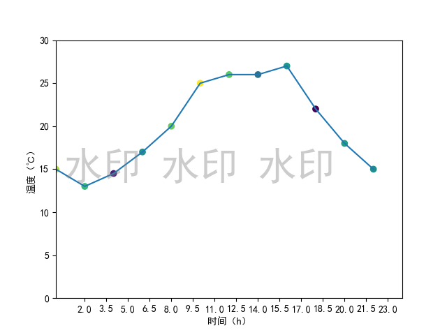
绘图:y轴设置不同步长,依次为:1(缺省)、2、3

2.2.1 知识补充:linspace()函数
numpy.linspace主要用来创建等差数列
语法:
numpy.linspace(start, stop, num=50, endpoint=True, retstep=False, dtype=None, axis=0)
参数:
start: 返回样本数据开始点
stop: 返回样本数据结束点
num: 生成的样本数据量,默认为50
endpoint:True则包含stop;False则不包含stop
retstep:If True, return (samples, step), where step is the spacing between samples.(即如果为True则结果会给出数据间隔)
dtype:输出数组类型
axis:0(默认)或-1
2.2.2 实例
实例:上午10:00–12:00每一分钟的气温变化
注:数据为随机数,不具有现实意义
import random
import matplotlib.pyplot as plt
import numpy as np

# 上午10--12点每一分钟的气温变化
x = range(0, 120)  # 时间 120min对应120个数据
y = [random.randint(20, 35) for i in range(0, 120)]  # 温度
c = np.random.rand(120)  # 散点颜色

plt.xticks(x[::10])

plt.plot(x, y)
plt.scatter(x, y, c=c)
plt.show()
绘图:步长分别为:5、10


2.3 标记特殊点—— ing
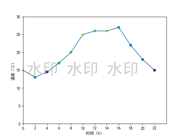
2.4 添加水印 text
使用fig.text()实现
# 添加水印——需要在绘图之前,否则会出来两个图,水印单独一个图
fig = plt.figure()
plt.rcParams['font.sans-serif'] = ['SimHei']  # 用来正常显示中文标签
fig.text(0.75, 0.45, '水印 水印 水印',
         fontsize=40, color='gray',
         ha='right', va='bottom', alpha=0.4)
绘图:
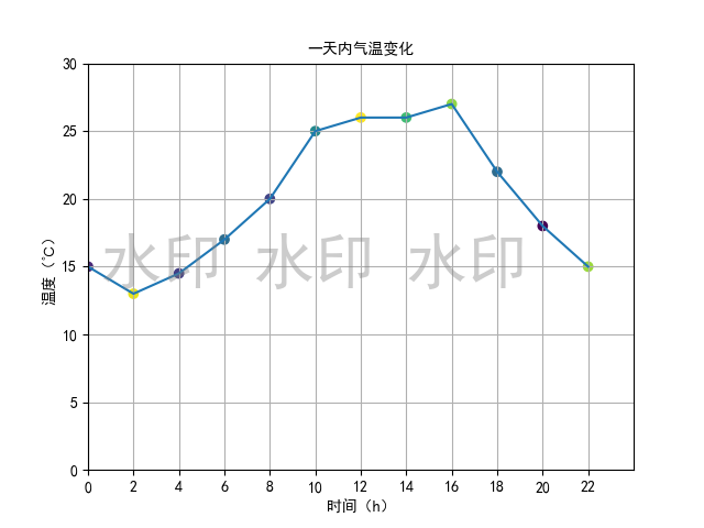
2.1-2.4 完整代码
import numpy as np
from matplotlib import pyplot as plt

x = range(0, 24, 2)  # 数据12个:0 2 4 6 8 10 12 14 16 18 20 22
y = [15, 13, 14.5, 17, 20, 25, 26, 26, 27, 22, 18, 15]
N = 12
s = (30 * np.random.rand(N)) ** 2  # 每个点随机大小  **2:2次方
c = np.random.rand(N)  # N是数据点个数

plt.plot(x, y)  # 折线图
plt.scatter(x, y, c=c, marker='o')
# 设置坐标轴含义, 中文需要加fontproperties属性
plt.xlabel('时间(h)', fontproperties='SimHei')
plt.ylabel('温度(℃)', fontproperties='SimHei')
# 设置x和y轴的范围
plt.xlim((0, 24))
plt.ylim((0, 30))
# 设置x轴和y轴的刻度
new_ticks = np.linspace(0, 24, 12)
plt.xticks(new_ticks)

plt.show()
2.5 设置图片大小 figure
实现方法:figure()
# 通过实例化一个figure并传递参数figure(num, figsize=(width, height), dpi),能够在后台自动使用该figure实例,在图像模糊的时候传入dpi参数了,让图片更加清晰
fig = plt.figure(figsize=(10, 5), dpi=80)
例子代码:
import matplotlib.pyplot as plt

# 通过实例化一个figure并传递参数figure(num, figsize=(width, length), dpi),能够在后台自动使用该figure实例,在图像模糊的时候传入dpi参数了,让图片更加清晰
fig = plt.figure(figsize=(10, 5), dpi=80)

x = range(2, 26, 2)  # 数据12个:2 4 6 8 10 12 14 16 18 20 22 24 25
y = [15, 13, 14.5, 17, 20, 25, 26, 26, 27, 22, 18, 15]

plt.plot(x, y)
# plt.savefig("pictures/sig_size.png")  # 保存图片  可以保存为svg矢量图格式,放大不会有锯齿
# plt.savefig("pictures/sig_size.svg")  # 保存图片  可以保存为svg矢量图格式,放大不会有锯齿
plt.show()
绘图:分别为figsize=(10, 5)和figsize=(5, 5)
2.6 设置显示中文 rc
matplotlib默认不支持中文字符
Windows和Linux下的方式:
import matplotlib

# 显示中文字符——修改matplotlib默认字体
font = {
    'family': 'Microsoft YaHei',
    'weight': 'bold',
    # 'size': 'larger'
}
matplotlib.rc("font", **font)


# 显示中文字符——修改matplotlib默认字体
matplotlib.rc("font", family="Microsoft YaHei")

plt.title("上午10:00--12:00每分钟的气温变化情况")
另一种方式
from matplotlib import font_manager

my_font = font_manager.FontProperties(fname="###")  # fname的值是字体的路径
plt.xticks(list(x)[::10], _xtick_labels[::10], rotation=45, fontproperties=my_font)
plt.title("上午10:00--12:00每分钟的气温变化情况", fontproperties=my_font)

完整代码:
import random
import matplotlib
import matplotlib.pyplot as plt
import numpy as np
from matplotlib import font_manager

# 上午10--12点每一分钟的气温变化(注:数据为随机数,不具有现实意义)
random.seed(10)  # 设置随机种子,让不同时候随机得到的结果都一样
x = range(0, 120)  # 时间 120min对应120个数据
y = [random.randint(20, 35) for i in range(0, 120)]  # 温度
c = np.random.rand(120)

# 显示中文字符——修改matplotlib默认字体
# font = {
    # 'family': 'Microsoft YaHei',
    # 'weight': 'bold',
    # 'size': 'larger'
# }
# matplotlib.rc("font", **font)
matplotlib.rc("font", family="Microsoft YaHei")

# 另一种方式
# my_font = font_manager.FontProperties(fname="")  # fname的值是字体的路径
plt.title("上午10:00--12:00每分钟的气温变化情况")

# 调整x、y轴刻度
_xtick_labels = ["10点{}分".format(i) for i in range(60)]
_xtick_labels += ["11点{}分".format(i) for i in range(60)]
plt.xticks(list(x)[::10], _xtick_labels[::10], rotation=45)  # rotation旋转的度数
# plt.xticks(list(x)[::10], _xtick_labels[::10], rotation=45, fontproperties=my_font)  # rotation旋转的度数

# x、y轴——使用font设置
plt.xlabel('时间(h)')
plt.ylabel('温度(℃)')
plt.title("上午10:00--12:00每分钟的气温变化情况")
# x、y轴——单独设置中文
# plt.xlabel('时间(h)', fontproperties='SimHei')
# plt.ylabel('温度(℃)', fontproperties='SimHei')
# plt.title("上午10:00--12:00每分钟的气温变化情况", fontproperties='SimHei')

plt.plot(x, y)
plt.scatter(x, y, c=c)
plt.show()
2.7 绘制网格 grid
plt.grid()
plt.grid(alpha=0.3)  # alpha透明度
2.8 绘制图例 legend
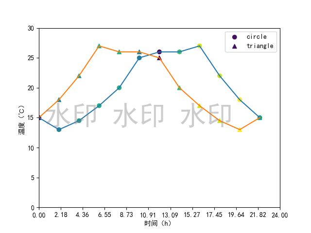
plt.scatter(x, y, c=c, marker='o', label="圆")
plt.scatter(x, y2, c=c, marker='^', label="三角")
plt.legend(loc='best', prop='SimHei')
legend参数
loc:字符串
将图例放置在轴/图形的相应角上:'upper left', 'upper right', 'lower left', 'lower right'
将图例放置在轴/图形相应边缘的中心:'upper center', 'lower center', 'center left', 'center right'
将图例放置在轴/图形的中心:'center'
'best':将图例放置在迄今为止定义的九个位置中与其他绘制的艺术家重叠最少的位置。对于具有大量数据的绘图,此选项可能会很慢;您的绘图速度可能会因提供特定位置而受益。

2.9 颜色和线型
颜色字符(color或者c) | 颜色 | 风格字符(linestyle) | 线型 |
|---|---|---|---|
| r | 红色 | - | 实线 |
| g | 绿色 | -- | 虚线,破折线 |
| b | 蓝色 | -. | 点划线 |
| w | 白色 | : | 点虚线,虚线 |
| c | 青色 | '' | 留空成空格,无线条 |
| m | 洋红 | None | 同 '' |
| y | 黄色 | solid | 同 -(实线) |
| k | 黑色 | dashed | 同 -- |
| #00ff00 | 十六进制 | dashdot | 同 -. |
| 0.3 | 灰度值 | dotted | 同 : |
plt.plot(x, y, c='orange', linestyle=":")  # 折线图
plt.plot(x, y2, c='cyan', linestyle="-.")

2.10 小结

3、matplotlib的各种图(常用)
| 类别 | 描述 | 描述 | 适用场景 |
|---|---|---|---|
| 散点图 | plt.scatter() | 用两组数据构成多个坐标点,观察坐标点的分布,判断两变量之间是否存在某种关联或总结坐标点的分布模式 | 判断变量之间是否存在数量关联趋势,展示离群点(分布规律) |
| 直方图 | plt.bar() | 连续型数据 | |
| 条形图 | plt.barh() | 类似于直方图 | 离散型数据 |
| 折线图 | plt.plot() |
3.1 散点图 scatter
matplotlib.pyplot.scatter
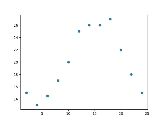
- 普通散点图
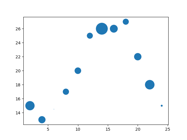
- 更改散点的大小:
s - 更改散点颜色和透明度:颜色
c,透明度alpha - 更改散点形状:官方文档–matplotlib.markers
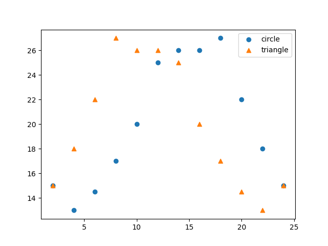
- 在一张图上绘制两组数据的散点
- 为散点设置图例:官方文档–matplotlib.pyplot.legend、matplotlib Legend 图例用法
# 普通散点图
plt.scatter(x, y)


# 更改散点的大小
s = (30 * np.random.rand(N)) ** 2  # 每个点随机大小
plt.scatter(x, y, s=s)


# 随机颜色
c = np.random.rand(N)  # N是数据点个数
plt.scatter(x, y, s=s, c=c, alpha=0.5)


# 散点形状——matplotlib.markers
plt.scatter(x, y, s=s, c=c, marker='^', alpha=0.5)


# 一张图上绘制两组数据点
plt.scatter(x1, y1, marker='o')
plt.scatter(x2, y2, marker='^')

# 设置图例
plt.scatter(x1, y1, marker='o', label="circle")
plt.scatter(x2, y2, marker='^', label="triangle")
plt.legend(loc='best')
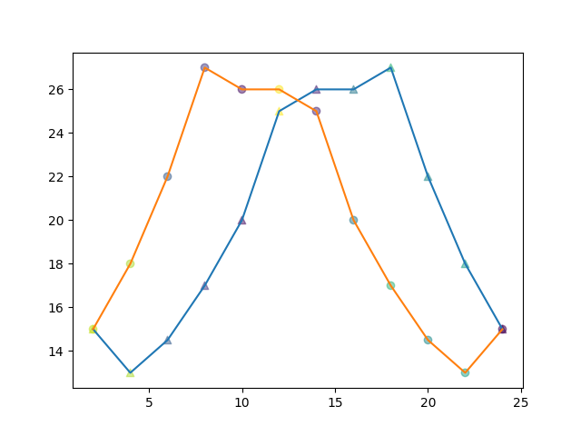
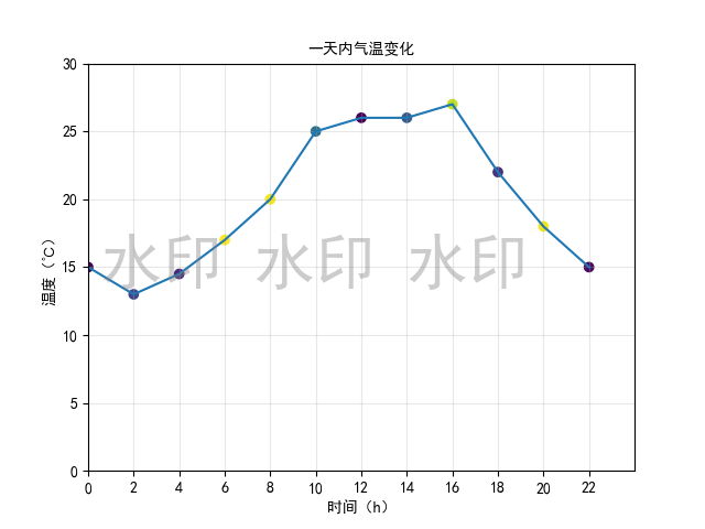
完整代码:
import numpy as np
from matplotlib import pyplot as plt
x = range(0, 24, 2) # 数据12个:0 2 4 6 8 10 12 14 16 18 20 22
y = [15, 13, 14.5, 17, 20, 25, 26, 26, 27, 22, 18, 15]
y2 = y.copy()
y2.reverse()
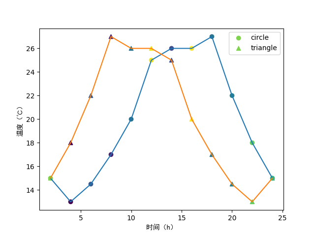
# 添加水印
fig = plt.figure()
plt.rcParams['font.sans-serif'] = ['SimHei'] # 用来正常显示中文标签
fig.text(0.75, 0.45, '水印 水印 水印',
fontsize=40, color='gray',
ha='right', va='bottom', alpha=0.4)
plt.plot(x, y) # 折线图
plt.plot(x, y2)
N = 12
s = (30 * np.random.rand(N)) ** 2 # 每个点随机大小 **2:2次方
# s = 30
c = np.random.rand(N) # N是数据点个数
# plt.scatter(x, y, s=s, c=c, marker='^', alpha=0.9) # 散点图
# plt.scatter(x, y2, s=s, c=c, alpha=0.5) # 散点图
plt.scatter(x, y, c=c, marker='o', label="circle")
plt.scatter(x, y2, c=c, marker='^', label="triangle")
plt.legend(loc='best')
# 设置坐标轴含义, 中文需要加fontproperties属性
plt.xlabel('时间(h)', fontproperties='SimHei')
plt.ylabel('温度(℃)', fontproperties='SimHei')
# 设置x和y轴的范围
plt.xlim((0, 24))
plt.ylim((0, 30))
# 设置x轴和y轴的刻度
new_ticks = np.linspace(0, 24, 12)
plt.xticks(new_ticks)
plt.show()
3.2 折线图 plot
| 功能 | 方法 |
|---|---|
| 设置图形大小 | plt.figure(figsize=(a,b),dpi=n) |
| 绘图 | plt.plot(x,y) |
| 调整xy轴刻度 | plt.xticks(), plt.yticks() |
| 显示 | plt.show() |
| 保存 | plt.savefig(“file_name”) |
| 显示中文 | matplotlib.rc 或者 font_manager |
| 一个图中绘制多个图形 | plt.plot(xi,yi) 调用多次 |
| 添加图例 | plt.plot(xi,yi,lable=“i_name”, plt.legend(loc=“position”,prop=“字体名称”)) |
| 添加图形描述 | plt.xlable(), plt.ylable(), plt.title() |
| 添加网格 | plt.grid() |
| 图形样式 | color, linestyle, alpha(透明度,0-1), linewidth |


3.3 直方图 hist
通过使用直方图可以对数据集进行分组。【直方图和柱状图、条形图是不一样的】
注:能够使用hist()统计的数据一般是没有经过hist统计的原始数据。因为hist统计之后得到的数据是分组后的数据。
语法:
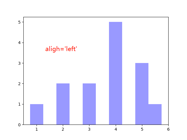
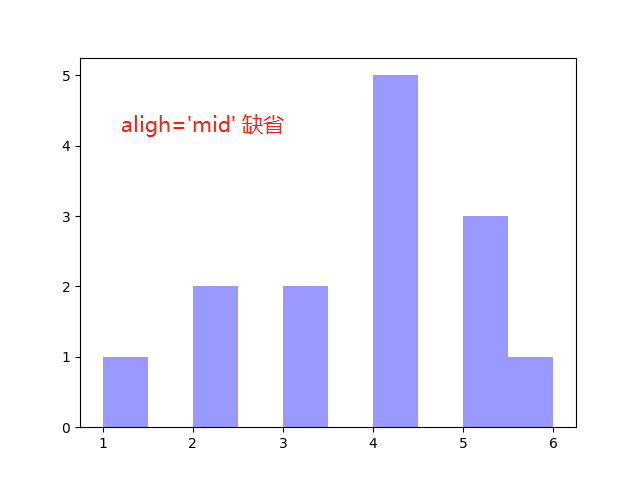
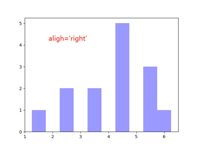
matplotlib.pyplot.hist(x, bins=None, range=None, density=False, weights=None, cumulative=False, bottom=None, histtype='bar', align='mid', orientation='vertical', rwidth=None, log=False, color=None, label=None, stacked=False, *, data=None, **kwargs)

# plt.hist(x, color, align, range=(20, 30), log=True, bottom=2, density=True, orientation='horizontal')
# plt.hist(x, color="#9999ff", align='left')
参数:
x: 数据集,数据类型:数组
bins: 分组数量
range: bin的下限和上限范围。忽略上下异常值。如果未提供,则范围为(x.min(), x.max())。如果bins是序列,则range无效。
align: 取值['left', 'mid', 'right']。left--矩形相对刻度位置居中;mid--矩形相对刻度位置居右;right--矩形相对刻度位置
orientation: 直方图方向,horizontal--水平,vertical--垂直
代码:
#https://blog.csdn.net/u010916338/article/details/105663074

import matplotlib.pyplot as plt

x = range(2, 26, 2)  # 数据12个:2 4 6 8 10 12 14 16 18 20 22 24 25
y = [15, 13, 14.5, 17, 20, 25, 26, 26, 27, 22, 18, 15]

# plt.hist(y, color="#9999ff", align='right', range=(20, 30), bottom=2, density=True, orientation='horizontal')
plt.hist(y, color="#9999ff", align='right', range=(20, 30), log=True)
plt.show()
【重点】bins如何设置分组
组距(或者分组数bins)需要设置为 x 数据集中 max(x)-min(x) 的因子,保证组距(或者分组数bins)能够被 max(x)-min(x) 整除,避免出现绘图偏移情况。
例子:有250个数据,max=156,min=78
分析:max-min=78,78能够被 1,2,3,6,13,26,39 整除,所以distance为这几个数的时候绘图不会出现偏移
结论:设置组距的时候需要设置成(max-min)这个数的因子,这样能够使得绘图不会出现偏移的情况
| 组距 | 分组数 | 是否偏移 |
|---|---|---|
2 | 39 | 否 |
3 | 26 | 否 |
| 4 | 19 | 是 |
| 5 | 15 | 是 |
6 | 13 | 否 |
| 7 | 11 | 是 |
| 8 | 9 | 是 |
| 9 | 8 | 是 |
| 10 | 7 | 是 |
| 11 | 7 | 是 |
| 12 | 6 | 是 |
13 | 6 | 否 |
| 14 | 5 | 是 |
| 15 | 5 | 是 |
| 18 | 4 | 是 |
| 19 | 4 | 是 |
| 20 | 3 | 是 |
| 25 | 3 | 是 |
26 | 3 | 否 |
| 27 | 2 | 是 |
| 38 | 2 | 是 |
39 | 2 | 否 |
| 40 | 1 | - |


3.4 柱状图 bar() 【垂直柱】
3.4.1 普通柱状图
matplotlib.pyplot.bar(x, height, width=0.8, bottom=None, *, align='center', data=None, **kwargs)
import matplotlib.pyplot as plt

films_name = ['战狼2', '美人鱼', '速度与激情8', '速度与激情7', '捉妖记', '羞羞的铁拳', '变形金刚4:\n绝迹重生', '功夫瑜伽', '寻龙诀', '西游伏妖篇', '港囧', '变形金刚5:\n最后的骑士', '疯狂动物城']
films_count = [56.83, 33.9, 26.94, 24.26, 24.21, 21.9, 19.79, 17.53, 16.79, 16.49, 16.2, 15.45, 15.3]


# plt.bar(films_name, films_count, color="orange")
# plt.xticks(fontproperties="Microsoft YaHei", rotation=45)
# 或者
plt.bar(range(len(films_name)), films_count, color="orange")
plt.xticks(range(len(films_name)), films_name, fontproperties="Microsoft YaHei")
plt.grid(alpha=0.3)
plt.ylabel("票房数量(亿)", fontproperties="Microsoft YaHei")
plt.title('近期电影票房情况', fontproperties="Microsoft YaHei")
plt.show()

3.4.2 多重柱状图
import matplotlib.pyplot as plt

# 连续三天的票房
x = ['猩球崛起3:终极之战', '敦刻尔克', '蜘蛛侠:英雄归来', '战狼2']
y_1 = [15746, 312, 4497, 319]
y_2 = [12357, 156, 2045, 168]
y_3 = [2358, 399, 2358, 362]

bar_width = 0.2  # 范围为:≤ 1/n (n为类型数量,本例中n=3)
x_1 = list(range(len(x)))
x_2 = [i+bar_width for i in x_1]
x_3 = [i+bar_width*2 for i in x_1]

# 同一x对应多个y绘图时要设置间隔,否则会重叠在一块
plt.bar(x, y_1, width=bar_width, label='9月14日')
plt.bar(x_2, y_2, width=bar_width, label='9月15日')
plt.bar(x_3, y_3, width=bar_width, label='9月16日')
plt.legend(loc='best', prop='Microsoft YaHei')
# plt.xticks(fontproperties='Microsoft YaHei')
plt.xticks(x_2, x, fontproperties='Microsoft YaHei')
plt.xlabel('电影名称', fontproperties='Microsoft YaHei')
plt.ylabel('票房数量', fontproperties='Microsoft YaHei')
plt.title('连续三天的票房', fontproperties='Microsoft YaHei')
plt.show()

3.4.3 设置x轴刻度:指定宽度
下面将在对比中进行说明:
- 直接绘制
- 设置指定宽度刻度
1、直接绘制
import matplotlib.pyplot as plt

x = [0, 5, 10, 15, 20, 25, 30, 35, 40, 45, 60, 90]
x_width = [5, 5, 5, 5, 5, 5, 5, 5, 5, 15, 30, 60]
y = [836, 2737, 3723, 3926, 3596, 1438, 3273, 642, 824, 613, 215, 47]

plt.bar(x, y)

plt.grid(alpha=0.5)
plt.show()

2、不设置x轴刻度
import matplotlib.pyplot as plt

x = [0, 5, 10, 15, 20, 25, 30, 35, 40, 45, 60, 90]
x_width = [5, 5, 5, 5, 5, 5, 5, 5, 5, 15, 30, 60]
y = [836, 2737, 3723, 3926, 3596, 1438, 3273, 642, 824, 613, 215, 47]

plt.bar(range(12), y, width=1)  # 为什么x位置写range(12)??

plt.grid(alpha=0.5)
plt.show()

3、x轴设置指定宽度刻度
import matplotlib.pyplot as plt

x = [0, 5, 10, 15, 20, 25, 30, 35, 40, 45, 60, 90]
x_width = [5, 5, 5, 5, 5, 5, 5, 5, 5, 15, 30, 60]
y = [836, 2737, 3723, 3926, 3596, 1438, 3273, 642, 824, 613, 215, 47]

plt.bar(range(12), y, width=1)  # 为什么x位置写range(12)??

# 设置x轴刻度
_x = [i-0.5 for i in range(13)]
_xtick_labels = x + [150]
plt.xticks(_x, _xtick_labels)  # xticks(ticks, labels) ticks:xtick位置列表;labels:要放置在给定刻度位置的标签

plt.grid(alpha=0.5)
plt.show()

从图中可以看出来,x轴不同刻度的宽度均相同。此时可以与第一张图做对比。
3.5 条形图 barh() 【水平柱】
matplotlib.pyplot.barh(y, width, height=0.8, left=None, *, align='center', **kwargs)
import matplotlib.pyplot as plt

films_name = ['战狼2', '美人鱼', '速度与激情8', '速度与激情7', '捉妖记', '羞羞的铁拳', '变形金刚4:绝迹重生', '功夫瑜伽', '寻龙诀', '西游伏妖篇', '港囧', '变形金刚5:最后的骑士', '疯狂动物城']
films_count = [56.83, 33.9, 26.94, 24.26, 24.21, 21.9, 19.79, 17.53, 16.79, 16.49, 16.2, 15.45, 15.3]

plt.barh(films_name, films_count, color="orange")
plt.yticks(fontproperties="Microsoft YaHei")
# 或者
# plt.barh(range(len(films_name)), films_count, color="orange")
# plt.yticks(range(len(films_name)), films_name, fontproperties="Microsoft YaHei")

plt.grid(alpha=0.3)
plt.xlabel("票房数量(亿)", fontproperties="Microsoft YaHei")
plt.show()
绘图:

4、其他类型图
- 栅栏图
- 饼图
- 小提琴图
- 箱线图
- 堆积柱形图
- 气泡图
- 热图


 2万+
2万+


 被折叠的 条评论
为什么被折叠?
被折叠的 条评论
为什么被折叠?
 到【灌水乐园】发言


